Portfolio Piece Critique
-
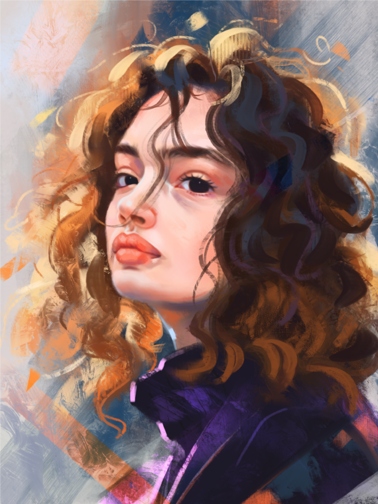
Hello! I was wondering if this community would be kind enough to give me critique on this piece? I'm hoping to include it in my currently non existent portfolio lol. It is photo referenced form this: https://www.pinterest.com/pin/695946948639917835/
and inspired by the works of Aaron Griffin and Thiago M. Januário.I'd really appreciate any and all help!


-
Sorry I have no critique. I just think it is a really beautiful portrait and would look good in your portfolio.
-
@lady-chamomile WOW great piece. I love how you did the hair.
-
This is beautiful. Love your addition of color. The only critique I have would be to maybe to sharpen it slightly. It's looking a little blurry on the face.
https://www.deviantart.com/wildweasel339/art/Sharpen-Your-Strokes-410378524
-
Stunning! I really like this! I like the quick stroke feeling you have going in the hair and jacket.
My gut instinct is to make the highlights in the hair much lighter in value. You have some beautiful highlights in the jacket and neck which really pop against the background, but the hair on the left side of the piece seems to get a little lost. Another solution would be to alter the values of the background so that they're significantly darker or lighter than the hair highlights.
Overall really nice, though. I wish I could paint like this

-
@tessaw Thank you! That's great advice. I realized too late that I had over relied on the airbrush tool for the face which gives it such a smooth texture. I do want the face to be the focal point so it should be the sharpest looking part. I painted this in Procreate, and on my desktop I use Krita... so I'll have to see if those programs have a sharpen filter. If not I'll just rework some parts. Thanks again!
-
@art-of-b Thanks so much! I'll keep that in mind as I rework some of it

-
@DOTTYP @Chip-Valecek thanks so much for the encouragement! If you like this, be sure to look up the artists I mentioned, their work is AMAZING
-
Um, yeah, this is GORGEOUS. I don't have a critique...just some admiration. I love the painterliness of it. Just beautiful.
-
This post is deleted! -
I think you made the rights decision keeping the hair and background painterly and spending more time and detail on the face. It is a good contrast.
I think there is still room for more detail in the face though. What is the focal point in the face? If it is the persons forward eye, then I would add more detail in and around it. Sharpen the details of the eye.
-
This is just gorgeous! The texture and lighting go so well together.