Mushroom Village WIP
-
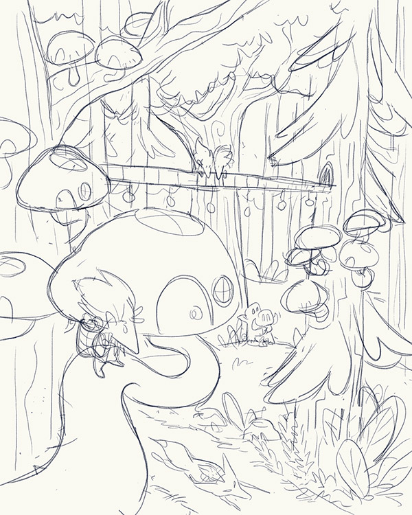
Hey all, wanted to get some feedback on my idea for the Mushroom Village prompt. I was thinking of the mushrooms that grow on trees and having the village be built high off the ground. The little wood sprites are watching a fox run by (ridden by another sprite) on the forest floor.
Here's my pencil draft:
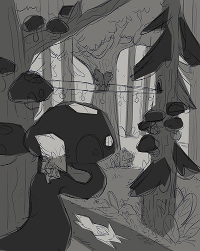
And a really rough value study:
-
@carriecopa I love the composition and the whimsical side of me thinks it's great. I love the flow of the values, the setting, and the dynamics of the composition. The biologist side of me, however, is thinking, "Mushrooms that grow on trees are mostly shelf mushrooms, not stem mushrooms." I often have an internal debates over scientific realism versus whimsical poetic license for my own illustrations and I still don't know which should win, so do what you want with that part of my comment! Other than that, I love it.
-
@carriecopa Never mind -- I was thinking about this some more and now retract my comment about tree mushrooms not having stems because if we can imagine there being little people living in mushroom villages, why can't we imagine mushrooms with stems growing on trees? That's the fun of illustration so I am ignoring my biology self -- she is such a sourpuss downer -- and going with my whimsical self that loves your sketch
 Go with it, stems and all!
 -
@carriecopa great idea. I would maybe suggest getting rid of the bird and the log across the piece. It sorta pulls my focus up. Looking forward to seeing your process on this.
-
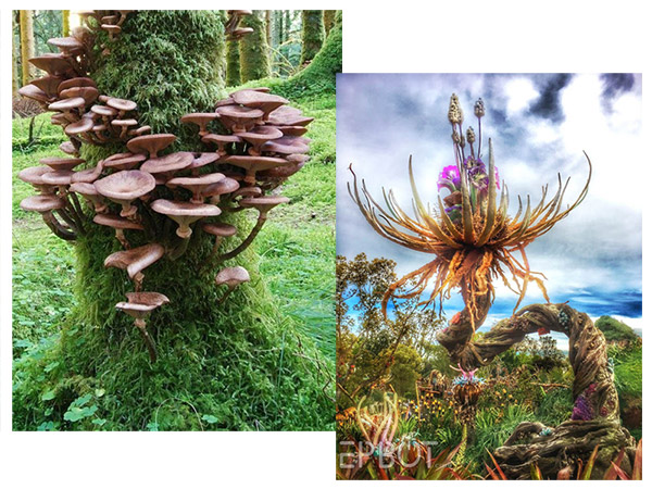
@demotlj I pulled inspiration from this picture of mushrooms, and this weird flower from the Avatar village at Animal Kingdom in FL. Thought it'd be cool to see twisty stems even though that isn't realistic. I totally respect the biology angle, and want to keep my ideas somewhat plausible, but add a fantasic/whimsical twist whenever I can. I heard another artist say once that their designs are 70% what people expect to see, and 30% something different, and thought it was a good rule to go by.
-
@chip-valecek Thanks for the feedback! I was picturing that was a bridge connecting the two trees and there are two wood sprites up there looking down at the fox as well. Made the village seem more connected and populated to me. I will try to make that more clear, or see how it looks without.
-
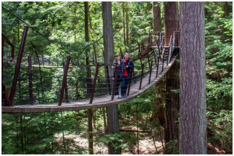
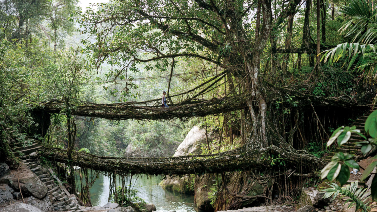
@carriecopa Straight lines draw attention, so maybe you could try an arched bridge to soften it up a little? It could either be a structured bridge arching up, or a simpler bridge (like a rope bridge) that hangs down more in the middle.
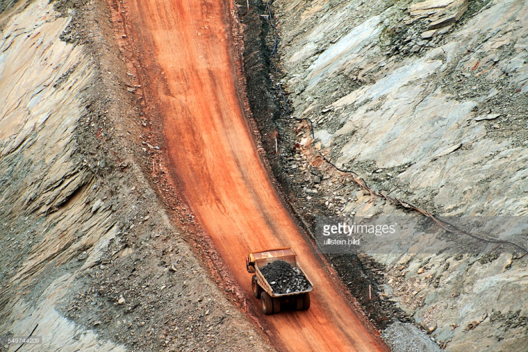
I'm not good with perspective, but I think the fox is tilted a little more towards the viewer than the rest of the image. See how you can see more of the side of the vehicles in these photos?
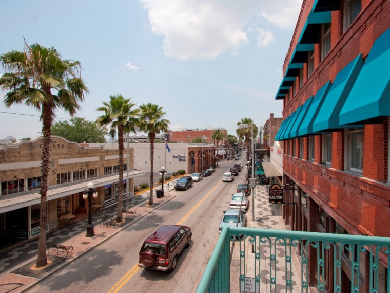
I like your sketches & the fun whimsical feel.
-
@carriecopa Fascinating and beautiful plant and I think you did a great job of incorporating that look in the painting.
-
@miriam yes, I think dipping the bridge one direction or another will work nicely! Thank you. I will tweak the perspective on the fox as well.
-
@carriecopa I love the image and your value sketch! - hope you don't mind me chiming in on the bridge - i feel that if it just sagged a bit(even a vey small amount) like a rope bridge might or even had two sagging sections on either side of a supported middle - it may read a bit more as being a bridge - the eye catching straight lines would would be gone also - Anyways...feel free to ignore - love the image

-
@kevin-longueil I really like the idea of making it more like a rope bridge. That seems like something you'd see in the trees, and it will look more natural.
-
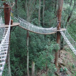
@carriecopa Here are some photos that might help with ideas:
-
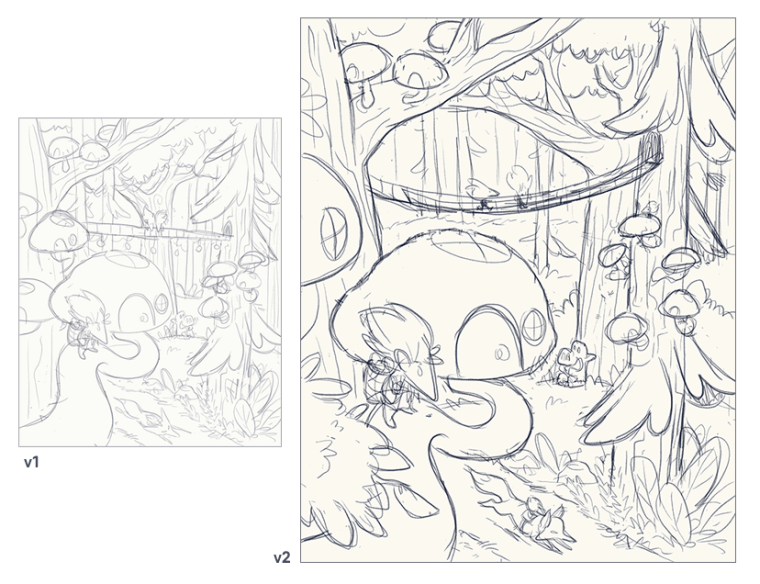
Updated my sketch based on your feedback, I'm feeling pretty good about it!
I noticed that giving myself several days to develop a sketch (taking time to walk away for a bit, think about it, get your feedback, and add more details) has been working really well. I'm much happier with my drawings than trying to rush something out in one sitting (like when I feel pressure to create something for social media). It may be slower, but the results are much better.
-
@carriecopa Wow I love seeing the progress of how you improved the piece with everyone's feedback
 It's much clearer to read the image now. Looking forward to this in colour!
 -
@carriecopa I think it looks great! I started to sit on my larger pieces as well. Give a day or two and come back. Then on the weekends I will knock a quick one out in a couple hours. I feel it really gets my imagination flowing. Looking forward to how you color it.
-
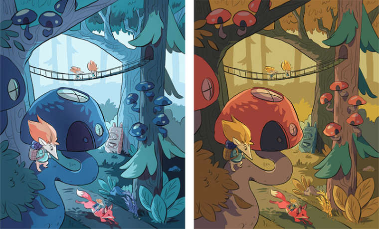
Hey all, I have color tests and would love your feedback! One is a cool blue look (which makes the red fox stand out more), and one is normal autumn afternoon. I'll be doing more with lighting and line coloring.
-
@carriecopa I prefer the warmer pallet to me the blue is too blue and feels a bit cold
-
@carriecopa I love the warm color scheme more.
-
@sweta-roy-choudhury @rcartwright
I did the blue one because I wanted something different, that didn't have the traditional red mushroom that often comes to mind. But the feedback here and elsewhere is hands-down the autumn one, so there must be something really working there! Thanks for your input.
-
I prefer the cool blue one.