Chachine of the Moose People, HELP! =)x
-
Hi! I am having trouble with this piece.
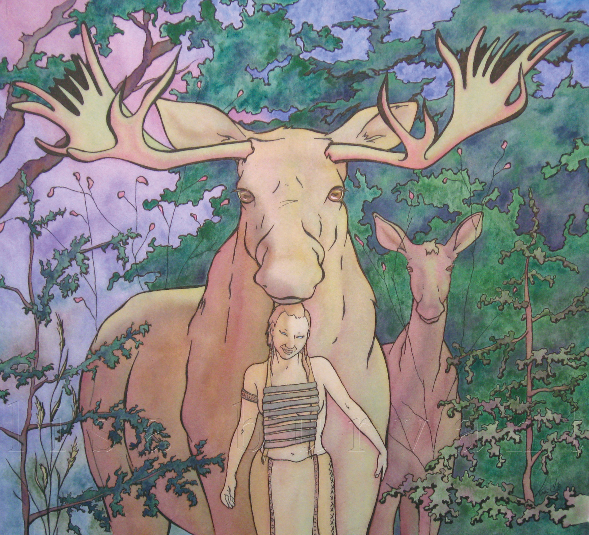
This is a piece from a series that I am doing. Its number 6 is the series. I actually did a version of this as the first painting that inspired me to do the series. I gave that painting away so I need to do it again. I like to have my values similar so that the paintings are luminous. Maxfield Parrish is one of my favorites and I'm trying to copy him. BUT, with this one, I'm trying to get the focus on Chachine AND the Moose prince. I've messed with the color so many times in PS that I'm just frustrated now. Any hints in a right direction would be greatly appreciated.
This is in ink on watercolor board. I'm just doing the color theory part in photoshop. I like the composition, just trying to nail the color and focus.

This is the original
Lisa Burvant
www.lisaburvant.com
Instagram & Twitter & SVS: @burvantill -
What an interesting piece! And a great start. If you want both to read easily, maybe instead of having them a similar color/value, which makes them blend together, you could make her silhouette distinct from the moose—so you have the moose silhouetted against the background, then her silhouette against the moose. Just an idea. Maxfield Parrish did awesome stuff that I don’t feel ready to touch so you’re ahead of me there

-
@sarah-luann Oooh. I like that idea. Thanx!!!


-
Hi Lisa, great job so far! I know you're going for a certain style so take my suggestions with a grain of salt, as I may miss what you are trying to achieve.
First, I would suggest implementing some strategic darker values. It doesn't need to be extreme, but I feel it would allow you to play with focal points better. In my opinion a luminous effect has more to do with how you manipulate values, hues, and saturation, rather than keeping the value range compressed. Maxfield Parrish for example, utilizes quite a wide value range and still achieves luminosity.
Another thing to think about is to differentiate the local values and colors between Chachine and the Moose Prince. What color is the Moose Prince supposed to be? What color is Chachine's clothing and hair? Right now they all appear to be the same value and color. It looks like maybe they are all a muted light yellow color. Even if objects are in the same strong yellow light, their values and colors will be different from each other.
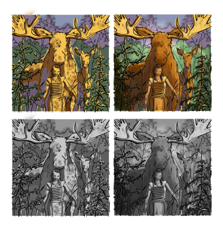
I hope you don't mind, but I did a quick paint-over, trying to keep the same basic theme you've achieved, but trying to differentiate between local colors and values a bit.
Anyways, those are my thoughts! It looks like a really cool project. I'm excited to see the final piece in ink!
Website: www.tessawrathall.com
Instagram: www.instagram.com/tessawrathall_art/
-
@tessaw LOL! You did exactly what @sarah-luann was talking about. I was going to work it out but you did it for me, haha! I am going to utilize the value advice but I'm going to push the color saturation. At least thats what I'm telling myself. When it comes down to it, sometimes my brain thinks I'm going too far, when I really WANT to exaggerate it, but I don't. I need to break out of my controlled shell and just do it and not worry about screwing it up. Thankyou both for the help!
-
@tessaw do you have a drawing tablet? how did you do this so fast? I have Photoshop but I have yet to get a drawing tablet to go with. Still using a mouse like my prepress days.
Lisa Burvant
www.lisaburvant.com
Instagram & Twitter & SVS: @burvantill -
It´s a really beautiful composition and subject matter - I like how it`s centered, yet asymmetric. I agree with what has been mentioned already - you need to extend the value range if you want to achieve a luminous effect. There’s no sense of light without shadows, and Maxfield Parrish definitely did not compress the value range.
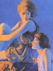
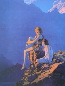
His darkest darks are nearly black and there are several instances where he goes all the way to white and overexposure (not in this one). His medium light and shadow values tend to be very saturated - but this depends partly on what kind of light situation you want. Parrish liked to have his images always immersed in a golden light - morning, evening or magical.
It´s really clever to do color studies in PS before you go to canvas. You could play around with different value ranges and colors and that should help you with exaggerating things before tackling the real painting! -
@smceccarelli thanx. You’re good at this.

-
@burvantill Yes, I do have a tablet. Can't imagine doing it with a mouse! If you are going to be doing color roughs like this for all your pieces, think about investing in a cheap tablet. It helps a lot!
")
-
@Sarah-LuAnn , @TessaW & @smceccarelli , Thank you for your help. I have come up with a rough draft that I like. Time to make a watercolor painting! I am loving this back and forth of ideas with other artsy fartsies. (said with love =)x) Thanx ladies!

-
@tessaw Hi! Quick question. How did you post these pictures? I thought that we could only post to the forum if there was an actual URL link to like facebook or instagram, etc. But these don't seem to have a link. It would be great to know how to do that so I don't need to post forum picts to my facebook page. =)x
Lisa Burvant
www.lisaburvant.com
Instagram & Twitter & SVS: @burvantill -
I use the upload file icon. It's the last icon on the right. It uploads straight from your computer. Just make sure it's not too large of a file. Maybe 1200px for a horizontal format and 900-1000px for portrait format. Also make sure it loads in your preview screen before you post.
Website: www.tessawrathall.com
Instagram: www.instagram.com/tessawrathall_art/
-
@tessaw Thankyou! I knew it had to be something obvious. Lol!