Draw 50 Things WIP
-
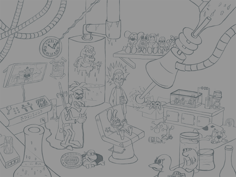
So what started off as a simple two person piece I was going to do turned into the draw 50 things. I know since it is a fan art piece I can not use it as a portfolio piece, but I have enjoyed working on it so far.
Anyway if you have any critiques on it so far please let me know. I have put the most time into this piece then any I have done with any others.
When its complete I do plan to print it. It is 24x18 with lots of little details. I am complying the list of all the characters and references to some of my favorite movies and cartoons.

-
@chip-valecek I really like this, its lot of fun I got caught up trying to pick out all the references! Could just be me but even tho i can tell the focal point is Ren my eye keeps getting drawn to the cables in the top left - because they converge like an 'x marks the spot'. Also lion o's sword kinda looks like its jutting out of Doofenshmirtz's back. I want to know what they're plotting

Why you can't have a fan art section in your portfolio and long as its clearly marked as fan art?
-
Hi Chip! This ones interesting
 I like how I start noticing familiar characters, is that a gremlin in the box at the back?
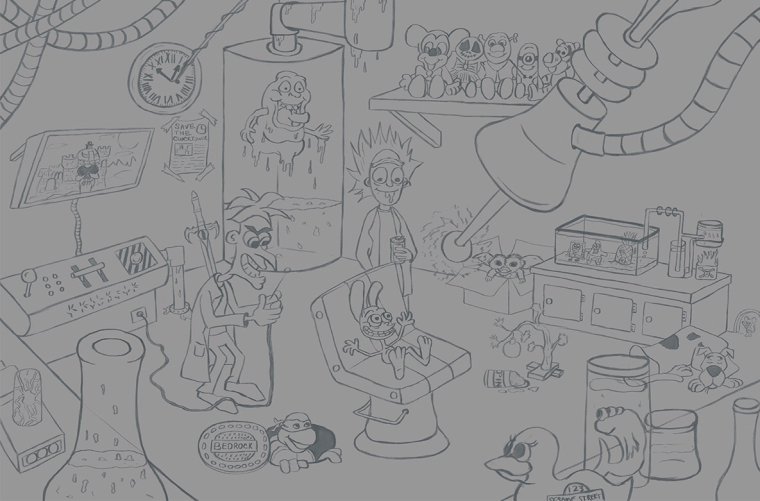
Assuming the focal point is around the three figures I’m tempted to crop this one as I’m finding elements at the top of the drawing distracting from all the interesting things that are going on below, Something like this maybe?

Also the perspective on table/shelf in the bottom left feels a little off to me?
I’m looking forward to seeing how this one progresses!
-

-
@sheri_p79 and @rachy thank you for the feedback. I will move the sword and have it lean up on slimmers tank. And I will remove one of the hoses in the top left. By doing that and then also cropping it some will help.
-
@chip-valecek I'm really enjoying your illustration so far. The details and expressions on the faces are super fun(ny). I also enjoy your lines, esp. the wonky/wavy ones (like in the central chair). There's a lot of energy here.
A few thoughts:
Agree with @sheri_p79 about the cables in the top left drawing the eye and the sword coming out of the scientist's back. Perhaps arrange the cables so they draw the eye to your main focus (Ren). Also, there are tangents where the mad scientist's nose and ear touch the perimeter of the water tank behind him.I read the items in the bottom right corner as a shelf higher up than the table on the lower left, however, the size of the vessel in the lower left then seems too big, or at least, I'm unsure about that particular object and how it's situated in the room.
The eye-shaped cylindrical tank in the back has a pipe above whose line is very close and follows the top edge of the frame. Perhaps lift that up so that that line is above that edge and not visible.
Regarding the expression on the character's faces, they all seem content or happy. It might give the scene more tension and storytelling if the onlooking characters were expressing concern, shock, outrage or fear for Ren.
Looking forward to seeing how this evolves.
-
Looks great Chip, I can really see you applying the lessons from SVS in composition. My only suggestion would be to vary the sizes of the items in your mid ground, and maybe move the rabbit to the rule of thirds -great work so far!!!
-
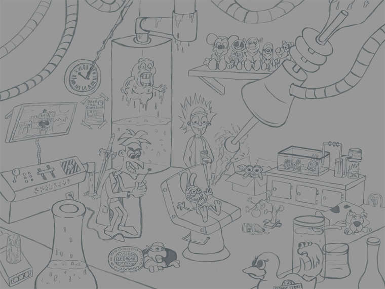
I made the changes and here is where I am with it. I started to add bricks to the walls but it started to make confusing, so i turned those layers off for now. It will work once i get color and line work into it. I will sit on this for a few days while I start the mushroom contest. Again any feedback before I start on line work would be greatly appreciated.

-
@chip-valecek It's got potential! It's also more than I've done in a single illustration. I'm not daring enough to try this challenge yet so take this as you want. One thing I noticed that might really hurt the overall feel in the end is how flat the sewer lid looks next to the turtle, the ellipse on the beaker in the left foreground (and tangent with the power chord), and the box next to that. You have a perspective defined by other objects in the room but these seem to be on different planes. You threw in some really cool ideas and cameo's and I'm looking forward to seeing this one finished.
-
@jon-anderson The beaker and the sewer lead I will fix up. I believe the box you are talking about is next to the beaker? That would be the portal gun from Rick & Morty, It has a handle that is out of view which would raise the back up higher then the front. That might be the reason it looks out of perspective. Not sure how to handle that unless I brought the whole gun into view which would then move the beaker more toward the center and I think that might take away from the focal point. What do you think?
-
@chip-valecek I don't watch Rick and Morty so I didn't recognize the gun. Though I don't know exactly what it looks like I'll ask if maybe you can make it bigger and move it more to the right so that the beaker is overlapping yet you can see enough for fans to recognize it? That is of course if that still fits the perspective and depth you've established already.
-
Loving this!!
-
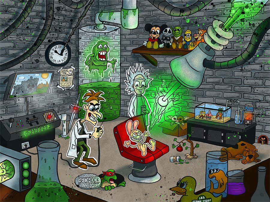
So its been a long time since I posted in this thread, but I am happy to say I finally completed this one. I am really struggling to find my "style" but for some reason I keep going back to this. As much as I try different styles and or techniques this is the one I keep coming back to. It feels most natural to me. Anyway, here is it. How many cartoon/movie references can you find?
