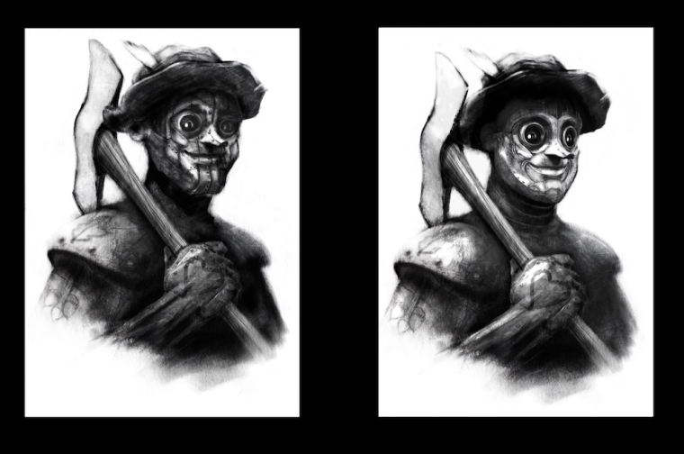
Redo of Tin Man - side by side - Work in progress
-
Going back and trying to improve my weakest pieces - the Tin Man looks like a bit of a mess to me a year later - @Will-Terry mentioned in the original critique that he needed work and i'm finally getting to it - i feel like it is looking much better but i have gotten mixed reactions from folks - my 7 year old daughter who is my most brutal and strangely articulate critic is strongly in favor of the new version - i am liking it too but was wondering if anyone might be willing to give there opinion on this?

-
@kevin-longueil I am liking the new version better as well, however I like the eyes of the original. But your values on the new version are much better.
-
@kevin-longueil I really like how you focused the detail on his face. I like the face of the new one better, and the personality and uniqueness the buggy large eyes give the design. The first one seems like he's looking more at us, so I'd just tweak the second to get that same feeling. Maybe you could add the seams and rivets to the ax head and beat it up and weather a bit, to match the tin and wear and tear of his body. I like this a lot and the whole series looks awesome!
-
@chip-valecek @Teju-Abiola Thank you both for your feedback - it is very helpful
