First photoshop piece (WIP)
-
Switching over the photoshop was kinda of scary after getting so comfortable with procreate over the years. So far it has been a pretty smooth change over. If anyone has any good resources for learning different aspects of photoshop feel free to drop a link in the comments.
-
@eric-castleman my biggest influence still till this day is Aaron Blaise. He has tons of videos on his youtube channel that breaks down his process and how to use photoshop. https://www.youtube.com/user/AaronBlaiseArt
There are a few other tricks I have learned along the way but I pretty much learned how to paint using his process.
-
@chip-valecek good one. I just looked up some of his videos and he has exactly what I am looking for in regards to textures.
Something else I am wonder is why my colors become some less vibrant when looking at it on any other device than my cintiq. It is an extreme change. @smceccarelli do you have any advice on this?
-
@eric-castleman Hi Eric, this is a really good start!
The colors look different on my Cintiq too, but I have the opposite problem - they are duller than on the other monitor. Sometimes I also have some weird „color flash“, where the colors become suddenly much more intense on the Cintiq. I`ve learnt that it´s a PS-Cintiq relationship problem probably. I just need to switch briefly to another window (finder or e-mail) and the flash is gone. It has not happened in a while, so maybe they have fixed a bug in PS. There are also some issues with the GPU preview in all Adobe software - you could try to switch it on or off, depending in which state you are right now.
I don't know how much of a problem it is for you, but I am very used to having the piece I am working on on both monitors (either with a large navigator window or with a duplicate of the PS window) to keep any difference in check. Images will look different on any monitor and different applications will preview also with a different color-management. The only thing to really calibrate accurately is the printer ;-))
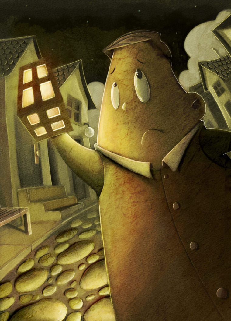
If I may advance some suggestions on this piece, it´s very monochromatic. Unless that is your intent, I would try to add some color tension with colder accents: purple or blue. Also, it took me a while to understand that the character is holding a lantern - it looked like a part of the houses at first glance. Just some thoughts! -
Was there anything specific in photoshop you had trouble with or parts you want to learn? One thing I would suggest when using photoshop is to set up your own shortcuts. Sometimes it feels like I am playing the piano the way I am just around different tools and adjusting things with my shortcuts, which speeds up my process and saves a lot of time.
Another thing to consider is how you deal with your layers. I personally dislike working with loads of layers and groups, but there are some artists who have a ton of active layers. I do like to make a copy of my main layer once it has been flattened before I continue working on it further. It's quite nice to flip back to see whether the adjustments worked well. Oh and don't forget to save incrementally, but i'm sure you already know that
")
I also second issues with the lantern as I thought it was a window at first
-
@smceccarelli @Gary-Wilkinson check out my website and tell me if that version looks better.
-
@eric-castleman I think adding more illumination from it helps it a bit, but it's more because of the angle and shape of it which is an issue to me. I usually imagine a hand lantern to be more cylindrical, although there are box shape ones which is fine. However, with most lanterns though the light does not come from the base and the lack of seeing him holding the handle could be where I see an issue.