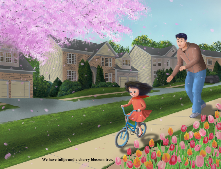
Please critique! Thank you so much!
-
-
@lisa-ngan I would watch your shadows. If you look at shadows cast by house's they have hard edge. Also the shadow under the bike almost makes it look like she is not on the ground. Also the shadow in the grass between the street and sidewalk looks out of place.
I really like your characters, i feel you nailed their posture.
-
I remember seeing your sketches for this and really liking them! One of the things I admire about the illustration at this stage is the way the petals look like they're falling. So cool. Overall, I think the piece has a really nice feeling to it.
I noticed from your other post that this is a story about an Asian immigrant family. I'm interested in learning about portraying people from particular ethnic backgrounds in a way that speaks to people's nobility and the beauty of their race, so it's cool to see your project feature a family with a particular ethnicity. I find it challenging to overcome visual stereotypes that are subconsciously engrained in my mind, but find that it helps to collect lots of reference photos, especially photos put out by people of that ethnicity. But that's just me. If this was my project, I think I would find it challenging to portray an Asian family with such simple facial features because I live in a Caucasian-dominant society, and I find that this trains my mind to draw European influenced figures, even if subconsciously. To me it looks like your characters, especially the dad, are European figures with dark hair. It could be that looking at slight facial details like the distance between nose and mouth, the contour of the side of the face by the eye, the length of the chin, etc. (depending on where in Asia they are from) might be able to pay homage to this family's ethnicity in a truer way while still being super simple and sweet like it is now. Like I said, I would find it difficult, so feel free to take these thoughts with a grain of salt!
")
-
Not sure if you are worried about text placement but the space for the text is very tight and causing tension by the tulps
-
Hi Lisa!
I love the way the picture tells a story and how expressive the characters are! There's lots of movement, especially with the falling flower petals and the girl's hair blowing in the wind. I think it is a really pretty piece over all ^_^For my critiques, I would say to be careful about the use of textures. The houses look like they were made with more solid, hard line, while the plants and grass look more burred and soft. I think it is important to try and make the whole piece in one particular style so that it looks more cohesive (eg. everything with more solid linework, or everything more soft). I would also be careful about over rendering things that you don't want to draw focus to (lots of detail in the houses in the background, and lots of details in the flowers in the foreground). These things can distract from the main focus of the piece, which is the father and the daughter ^_^
I can't wait to see what you create next!! Great job!
-
@Chip-Valecek @KathrynAdebayo @rcartwright @Tania-Lyons Thank you so much for stopping by with your valuable insights. I really appreciate your time and suggestions!
-
Hi Lisa, This is a really great image and I think it's working overall.
One thing though, it feels like there is different levels of rendering and different styles competing in the image. The foreground tulips have a childlike quality to the painting, then the tree is done almost realistically with a texture brush. Then it looks like a photo texture is used for the grassy area next to the sidewalk. Then the house is handled with simple stylized bricks and wood lines which isn't used anywhere else in the piece. So overall this gives it a look that feels a bit confusing and makes it not feel cohesive. Then the text feels like it was added as an afterthought in the design of the image.
I agree with Tania about focusing on the area you want people to focus on. The cherry blossom tree is drawing a lot of attention with it's light value and pink hue.
I'd try to get the text to work a bit better and also figure out which style you are going for and trying to make it work together a bit more.
-
@lisa-ngan Have you thought about getting rid of the tulips. I am always getting rid of things in my pictures sometimes till there is nothing left haha. Anyway here is a quick paint over to show you what it could look like without the tulips, it might help.
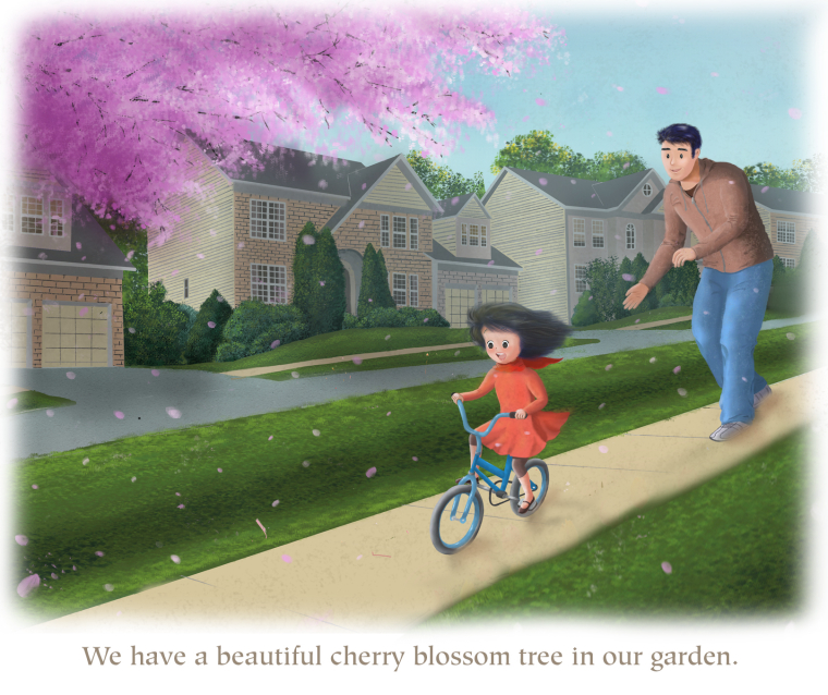
I made the houses a little further away with a light sky colour layer and got rid of the car because of its placement near the dads butt haha. Sorry I am a big kid... there is also a bit of extra texture here and there... I think it is a really nice picture
-
@lee-white Thank you so much for your critique! I will work on that...i think it takes time to develop a style right? I am just starting to learn everything, and as I paint this picture I was stopping at different tutorials to learn how to paint each item (trees,flowers, grass, skin, hair, etc), I think that's why it came out that way. I painted the grass and the tree with different texture brushes, and the lines on the houses are from the original pencil sketch. I am actually not quite sure how I can achieve a style that unifies everything. But maybe this is not a question that can be easily answered and a style just takes time to develop and find?
-
@jason-bowen Thank you so much for taking the time to show me...it looks so much better! You're right; I don't really need the tulips as the dad-daughter relationship is what I want to focus on. And I don't know why I didn't think of pulling the text out of the picture. I was also trying to get some darker shades in the cherry blossom tree but couldn't figure out how. And I totally agree about the car! Really appreciate your time!
-
@lisa-ngan No problem as long as it helps