Help with some advice, please
-
Hello all,
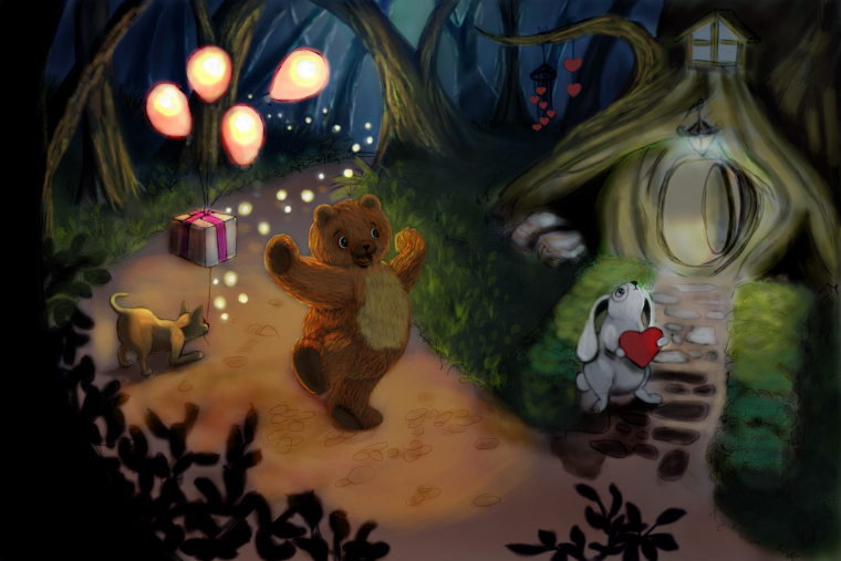
I wonder if you could please give me some guidance with this piece. It is the first time I try an illustration in Photoshop following the instructions in some of the classes, but some reason I keep struggling with the software and getting stuck. I feel a bit (or a lot) lost and rather suffering the process overall. I don't want the piece to look digital. Could somebody point me in the right direction? I want the lights in the side of the bunny be blue and cold (giving the impression of loneliness and longing) and the lights on the side of the bear being warm, giving the mood of hope. I have no idea how to correctly have them meet and where. Anyway, thank you very much for your time.
Alex

-
Hi Alex,
It seems you are struggling more with fundamental problems of lighting and value rather than with Photoshop (or maybe besides photoshop). It´s very tricky to do illustrations with two or more light sources in the best of cases, and if you are learning Photoshop, I would suggest you start with something simple - a character vignette or even some simple still life images. Once you have a good grasp of the software you can try something more complex. I know it seems boring, but the best object to learn about painting light and shadow is the simple sphere. I must have painted hundreds of them throughout the years and sometimes I paint one at the beginning of an illustration to define the lighting direction, color and reflected light.
With regard to this illustration, your value structure seem to need some refinement. The lights are very bright while the rest of the image is very dark. The eye gets stuck at the lights and the rest of the image disappears. To give the impression of a light source you need to lighten up considerably the areas touched by the light: the tree trunks, the street and the back of the bear. -
First thing is you are just trying to do way too much at one time. Photoshop get easier with time and at first I just made a list of the methods and tools I didn't understand and then started picking up more info from places like y-tube and ctrl paint. It is a lot like driving you just get more smooth with practice. When you learn to drive you do it in a parking lot not on the freeway. Practice Photoshop with basic sketching and painting of simple stuff and do some studies of objects. Take the color classes to improve your fundamentals and your work will start to improve.
-
@alex-diaz You're totally not alone in wanting to get the traditional painterly feel while working digitally. Adding textures would help (there are some SVS classes that focus on this), as well as going with a lighter colors. One thing you might consider is drawing and painting traditionally first (but not finishing it, keeping it at an early stage), then scanning the whole thing into Photoshop and continuing to work on it there. So at least, you've captured some of the texture from working traditionally.
Regarding lighting, right now your painting feels divided due to the two different light sources (and probably the composition, as well). Thus, it doesn't feel like the bear and rabbit are existing in the same space. Start with one light source first, treating all the characters the same. Then you can try introducing a secondary, less prominent light source, but do it gradually.
Re: composition, who do you wish to be the focus? The bear, or the rabbit? Or both together? And what about the cat? Right now, focus is evenly given to the cat, the bear and the rabbit. By shifting the position and scale of characters and environment, you can better establish the focus of your illo.
-
So there are two issues at play.
-
Getting comfortable with photoshop- this will come with time and following tutorials. While I think it's fine to do an ambitious piece, as others have said, it will also be helpful to do more simple pieces. That way, you are focusing more of your attention to photoshop rendering techniques, rather than art fundamentals, and you may get more out of it.
-
You are struggling with art fundamentals of composition, lighting and color. Others have made some really good points, so some of my opinions are repetitive- but I think your light sources are competing too much. The fireflies, the balloons, and the house all seem to have equal illumination strength. It doesn't allow the eyes to flow through the piece smoothly. I'm also confused at the intent as far as the rabbit goes. You say you want it to convey loneliness and longing. But I'm not sure how it relates to the bear. Is it ignoring the bear? Is it shy? Is it snobby? Does it want to give the bear a valentine, but is hesitant? The gesture and expression are unclear.
All that being said, it looks like you are on a good path, as far as what I see here. It looks like you have a fair understanding of color/light/value, you just need to put in more mileage and study. Well done!
-
-

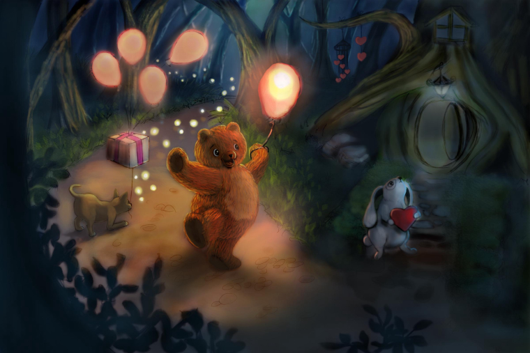
Maybe this quick paint over will give you an idea how to make the bear more illuminated and warm? Also I cooled things down on the other side and got rid of some of the darkest darks (basically by doing that your focus goes to the bears balloon and not into the deep shadows)
Just some ideas from another student, hope you don't mind my paint over.

-
Thank you very much for your insight and input. I do recognize I chose a very ambitious idea for this piece and I tried to tackle too many elements at once. My greatest weakness has always been trying to run before learning to walk. I also omitted the decision about the focal point and it shows. The story behind this scene is a bunny that is waiting for its perfect valentine to fall from the sky, and in doing so, he's giving his back or not appreciating the love that is closer and real.
I will work on the things you kindly pointed out. Thanks again. -
Hi, Alex! You have a great concept going on here. I love the cat and the glowing balloons---good lighting, good colors. However, there are a few things you can work on:
- The illustration is too dark. Your shadows are just too dark. The piece would do better with lighter shadows.
- Too many subjects fighting for attention. When I look at the painting, I don't know where to focus on. Should I focus on the cat, the bear, or the bunny? Perhaps what you need to do is choose which character you want to be the center of attention, use vibrant colors for that character, make the light shine/focus on him, and use desaturated colors on the side characters.
- More than one source of light. You can definitely make this work but it's tricky especially if you choose closely similar colors. The light from the glowing balloons are great but the light coming from the lamp is just not working. I suggest to let the lamp emit a bright bluish light that way it will complement the yellow-orange light of your balloons.
This is all I got. I hope this helps. Happy painting!
-
@nyrryl-cadiz I disagree on your comments about his shadows
-
@rcartwright I guess it's just me. I tend to like brightly lit illustrations. Thanks for your opinion.

-
I am just learning Photoshop and I feel your pain! That being said, You already have some beautiful brush work. It does not look like a first try. Well done! I really like the bark on the trees! I love the concept. And the idea of cool colors for the sad bunny and warm for the bear that is coming are great! I like the magic of fireflies and balloons. Since we read from left to right, what would you think about reversing the image? Sad bunny on the left, and help coming on the right. Then we would see the bunny first and feel worried for him, and then see the bear coming and feel relieved. Maybe put the bear a little farther back, around a bend in the road so that we can see him coming, but he is far enough away for the rabbit to not yet notice him.
-
@nyrryl-cadiz Thank you for your comments. I had this feeling the piece was still too dark in general and not congruent with the light sources. I think I need to push the lights in some places and work on the contrast of the main character. I planned the light of the entrance be blueish but I need to push that a bit more too. I really appreciate it.
-
@juliepeelart Great idea reversing the image. It sounds logic and I agree it would help to read the message better. Thank you very much for the comment!