Some help needed on this illustration
-
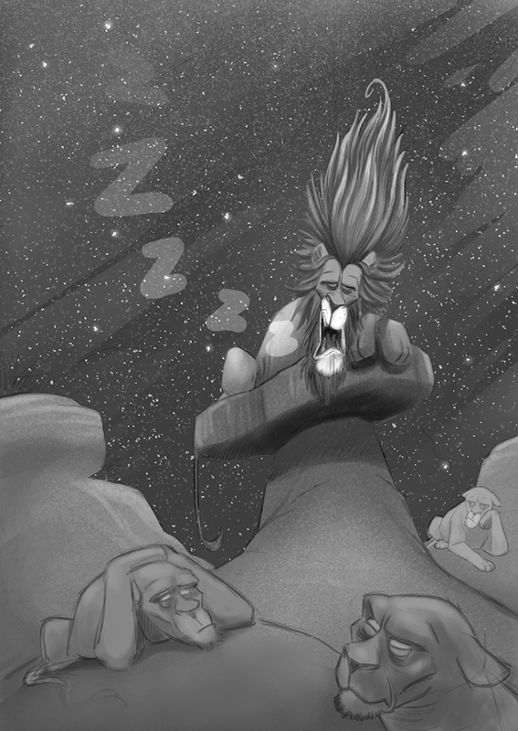
I need a little help with this one. There's a couple things which I'm struggling with. The first is trying to make the lion look like he's snoring loudly. It's not working for me. Second, the composition doesn't seem right. I know the values need some work as well so any thoughts on that are welcome.

-
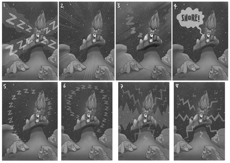
I did these little tests for the snoring effect. They're quick and crude but show what I'm thinking. I actually like the simple solution of image 4 and the speech bubble. The font being used is a place holder and not the final font. I've also changed the composition of 6, 7 & 8 making the snoring lion central. Thoughts?

-
@ians I like version 3 the best. The faces on the lions below look to be more ape then feline.
-
What if you change the sleeping lion's position so it looks more like he's sleeping? On first glance he looks awake because his head is straight vertical and his mane being so tall isn't helping. If it was tilted more so he's really leaning on his paws that could help. Or if you completely flip him upside down with his feet sticking in the air, or on his side. Right now his position is very alert and sleeping is more like... draping, melting, sinking and heavy...if that makes sense?
-
@lydia-m That makes perfect sense! I think I got too attached to the idea of that big mane. Thanks for the feedback!
-
@chip-valecek I totally see that now. I think in trying to add expression I inadvertently made them more monkey like. Thanks for pointing that out!
-
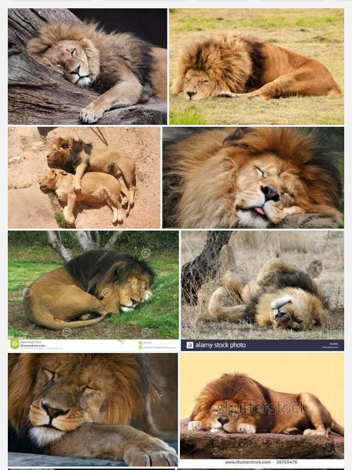
I took a screenshot of some images of lions sleeping from google (attached below). May be good to just google "lion sleeping" to find references. What if his snoring is so powerful that its breaking a stone or shaking the body of another lion... Something like that may help you emphasize his snoring. And you can rely less on the "zzz" imagery.

-

Maybe something like this? -
Very funny idea!
I actually like the composition and values. I think you could improve the values slightly by darkening the background behind the lion so he becomes a clearer focal point. And just make sure you other lions are a little different in value from the background. A little like @holleywilliamson did actually
I think the biggest problem as others pointed out is the snoring lion's posture. @Diego_BioSteam shared awesome references. My favorite is the one with the lion on it's back but really they would all work quite well! (except the spooning one and the one with its tongue sticking out

-
This post is deleted! -
@ians 2 and 3 are my favorite. I wouldn't go with any of the other ones because the visuals of the lion sleeping is enough to convey the message(like#2) and in #3 the "z's" are suttle enough to not cause annoying noise
-
I like your idea and the expression on the secondary characters faces looks great. I don't think you need any snoring effects if you work on your main character unless you are trying to do a comic book or graphic novel page. You need the head tilt but you also need to relax the face muscles in the character and let him become more fleshy you can also use his hair to better effect by having it drooping down.
-
Thanks for all the feedback! It a real help.