Finished Portfolio Piece
-
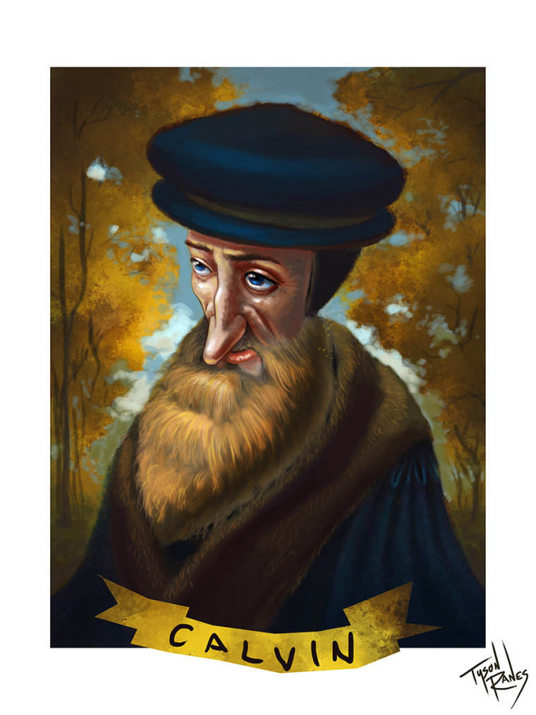
Here is a illustration of John Calvin I plan on adding to my portfolio. After looking at it i can see some tweaks that might need to be done. The hat at the top edge I left raw intentionally but that is just one of the things that has now got me thinking of doing some more editing.
-
Wow! Very nice indeed. I agree, the hat looks like a mistake, everything else looks great.
-
@tyson-ranes I agree, I would clean up the top edge of the hat a little. And maybe do something different with the ribbon on the bottom. Looks great.
-
Very Nice!
-
@tyson-ranes Vey Nice work!
-
Very cool! I agree about the hat and the ribbon. You have hinted that the robe has a satin quality to it with those highlights on his shoulder. I wonder if the hat needs a bit of this treatment, since it looks like it's the same fabric? I think the ribbon could use a bit of shading and the text could use a bit of attention as well. The text looks a little sloppy, especially since it's right next to your very well executed signature. I kind of want to see the left edge of the ribbon come down a tad as well.
Love your color palette. Great job.
-
Personally I wouldn't do too much to the hat simply because that isn't the main place you want people looking. Lose the ribbon or fix it and add a drop shadow. The ribbon needs a smooth flow to it I would use the pen tool. The one area I would look at is the hard edge on the left cheek bone. Over all nice work though
-
I keep looking at the edge where his beard meets the collar of his robe. I wish the beard would overlap the collar, as the line separating them is strangely blurry fuzzy, which is at odds with the rest of the beard with the sharp hair lines, and the lines of the fur on the collar. I would say either tighten it up more, or just eliminate that edge by bringing the collar in more, underneath his bear.