Is my work professional
-
Would anyone be willing to tell me if my work is at a professional level. You can be honest. My website is http://www.chrisperrydraw.com/.
Thanks for taking a look. -
At first look my answer is yes, I am new to illustration so not the best judge, I am sure others which are more seasoned will chime in. My favorite pieces where the top ones on your website. Thank you for sharing.
-
@chris-perry Heck yes!
-
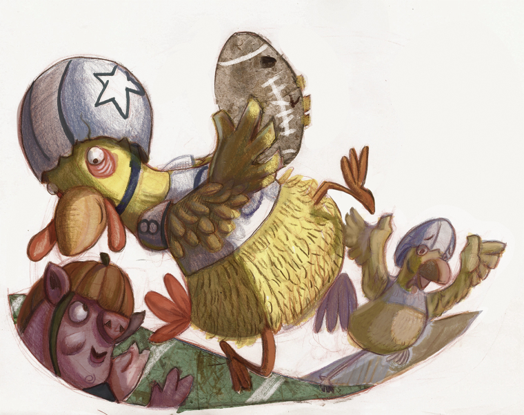
I hesitate to offer feedback as I feel this is an area I am struggling with currently, BUT my critique would be that there is a little bit of lack of consistency in style and execution. Some of the images are much better quality than others, and that might make art buyers hesitate. My favorite images are the rooster illustrations, both for style and quality of execution. I would love to see more of that type of work.
Bringing whimsical creatures to life.
www.stringfellowart.com
www.instagram/stringfellowart -
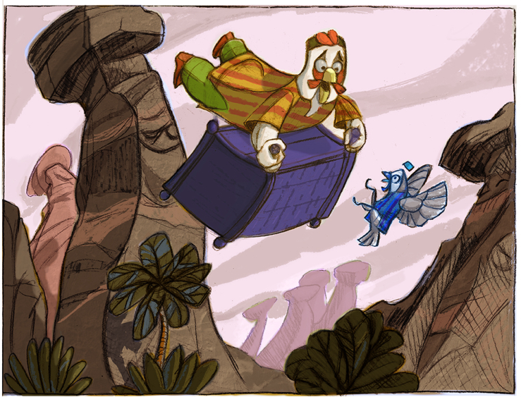
@stringfellowart Thanks for taking a look at my work. Are you talking about the pieces with the flying trunk? The bird in the striped clothes?
-
@laurel-aylesworth Thank you for looking. I appreciate the vote of confidence.
-
@lmrush thank you. Glad you like them.
-
Hi Chris. I'm not the best person to answer either, but I agree with @stringfellowart.
Here is what I see as your strengths: Your characters and storytelling are appealing. Overall, your color choices are great too, but I think there's a bit room for improvement there. Here's what I think could be improved most: rendering execution.
In my opinion, these are the strongest in terms of rendering. The sketchy texture over the more digital looking coloring works well. I also like the texture you have going in the football and grass, and I think it might be worth exploring using more of this throughout your work.
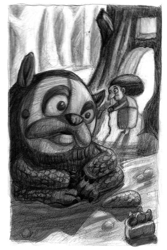
This next one I feel is weaker in terms of rendering. There is a mushy digital quality to it. I think if you brought in more of that sketchy texture and lines over top, it would strengthen the appeal of this piece and some of the others that have the same quality to it.
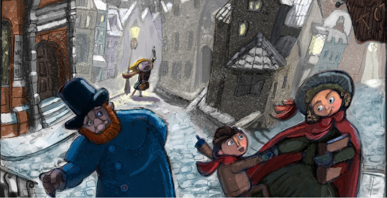
This next piece looks blurry on the upper half to me. I almost looks like you had a duplicate layer on top of the other, and offset one of them.
I think if you could go through your current portfolio and unify the rendering a bit, that it would really bump up the professional feel.
Website: www.tessawrathall.com
Instagram: www.instagram.com/tessawrathall_art/
-
Hi there, I think you are asking the same question that we all have asked sometime to ourself.
")
In my humble opinion, your work is enough professional.
But, I think you should to take some art classes, I recomend you "Choosing Colors for Storytelling "... it´s really helpful.