3rd Thursday Drawing/Value Study (Charlie)
-
Hi again!
I started obsessing about a couple details and decided to make a few more composition tweaks before moving on to the final rendering. The triceratops silhouette and placement was bothering me, and I felt that the right side of the frame needed some overlap with the foreground tree to create a sense of depth. I also added a branch to the upper left. Still leaning toward the number 2 color scheme. Hopefully the final render will go smoothly.
Thanks again for all the great feedback so far!
Jason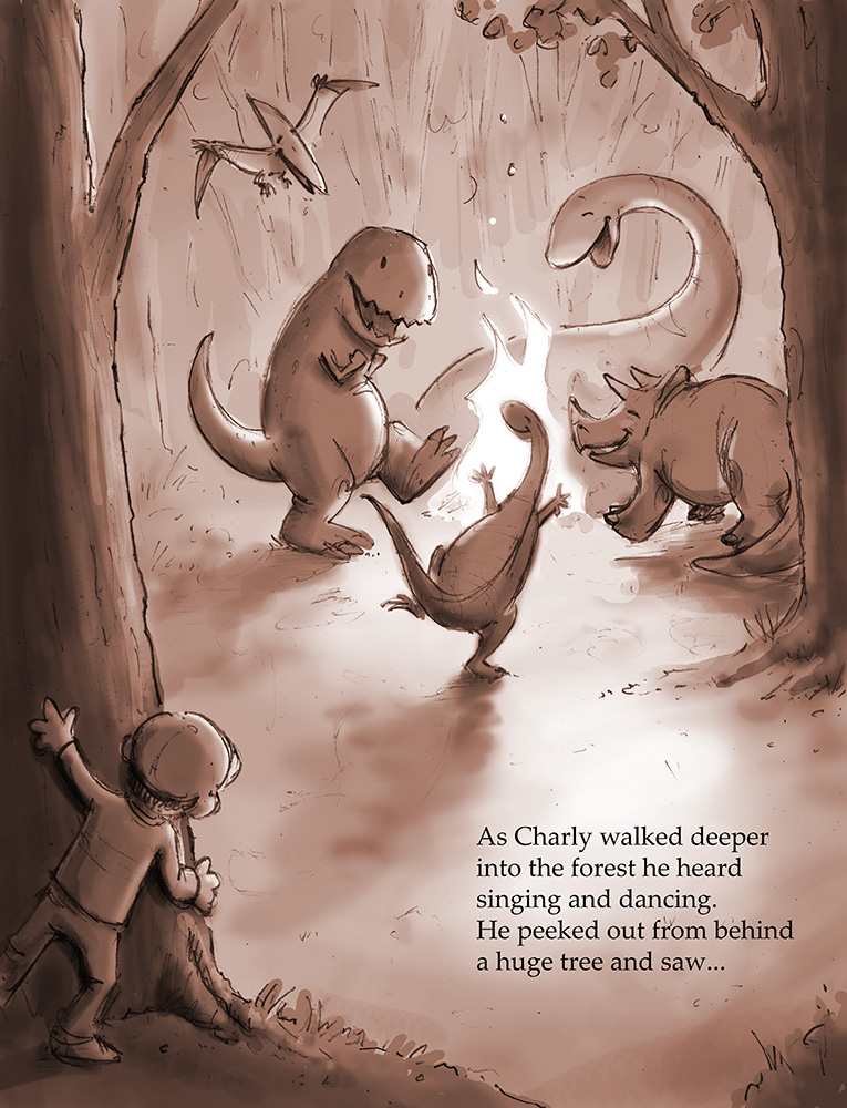
-
For me the last version is a better composition - a very successful composition - i think if the triceratops seems like a tangent with the tree i would try moving the back left leg a tiny bit in away from the tree....that composition really flows nicely ...its an excellent piece
-
Your doing really well, I love your process. I would try and create more distance between your dinos, and the background, otherwise great work
-
Sorry - meant back right leg.....
")
-
Thanks very much Kevin and Steve - your comments have been really helpful! I'll post another update soon.
Best,
Jason -
@baskin I'm late to the party here but you have some great things going with this design. The trex is my favorite. I'm also siding with Naroth and choosing #3. This would make a great limited palette color image using those colors. Great work!!
-
Hi again, everyone-
Here is a first pass at my final rendering. I think some of my other schemes might have also worked, but ultimately I settled on version 2 since it seemed to be the most popular.
I'm not sure if I should try pushing this further to lose the original pencil lines, or if I should keep them. As mentioned earlier, I am still pretty new to the digital process, and generally prefer the look of traditional media. If I can find time, I may even try to re paint this in oil or watercolor for comparison.
I'd love to hear your feedback, as always.
Thanks in advance,
Jason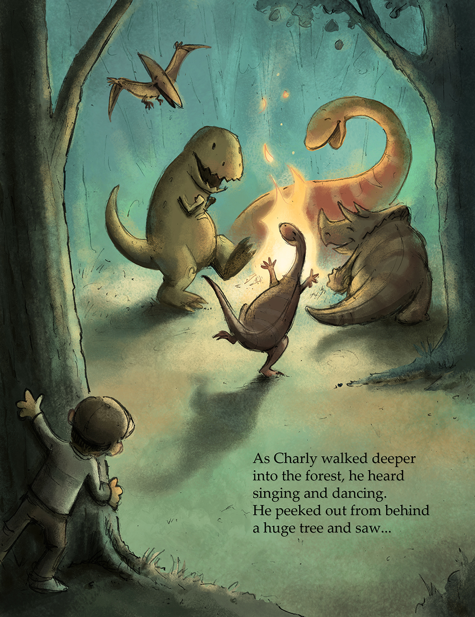
Twitter @baskindraws
www.baskindraws.com -
This is beautiful! I love the color palette, and the pencil lines are hardly noticeable. If anything, they add to the picture
 Sorry I can't offer anything to improve it, i think it is splendid!
 -
Wonderful, I would keep the pencil lines they make it work really well. Great stuff.
-
Thanks very much for the kind words, Lynn and Steve! I really appreciate your feedback.
Best,
Jason -
@baskin Great job. This turned out perfectly!
-
This came out great! Lovely lighting and also dinos are so cute. They make me smile as if i'm part of the picture
-
This is so great! Everything about it just works!
-
@baskin SO much fun! Love the colour! Definitely keep the pencil lines, it gives it charm
The only thing that trips me up is Charley's hands - there a bit too round like a puppet's rather than a human boy's.
-
Thanks very much for all the encouragement, everyone! If I can find the time to explore other rendering techniques, I'll be sure to post updates to this thread.
Thanks again!
Jason -
@baskin I really like your style and how this final image turned out. There is something so joyful about the dino's celebrating around the fire. And the combination of colors and your pencil line work really make this have energy and come to life in a way that feels like classic book illustrations. Really fantastic job and I best of luck at the critique tonight. Definitely a favorite of mine!!!