3rd Thursday Drawing/Value Study (Charlie)
-
Thanks for all the feedback, everyone! Sounds like #2 is in the lead at the moment, but I'll hold off for a day or two before committing to a final color scheme. The upper left corner of the composition felt a little too linear to me so I roughly sketched in another branch. Do you all think this is an improvement?
Thanks again!
Jason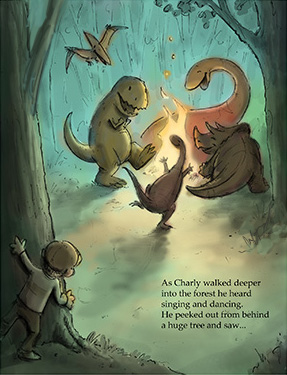
-
Yep I think it is.
-
I wonder if you did a little color shift to blue near the edges of the green if it would cool off and push the distant trees into the background (like the blue in 3 and 4) just an idea, looks great though! You never stop inspiring me to do great work, thanks Baskin!
-
@baskin Hi Jason, Love the illustration! What I really like is the effort you put in it to see what works! Now you can pick your favorite, or let your audience pick the best. for now I like nr two best. Maybe its nice if you give the dinosaur on the left some sparkles in his eyes? My Youngest son would love to have a print in his bedroom, I am sure!
-
Great suggestions - thanks, Jason and Leontine! I'll be sure to explore those options too.
All the best,
JasonTwitter @baskindraws
www.baskindraws.com -
@baskin XD
-
Hi again!
I started obsessing about a couple details and decided to make a few more composition tweaks before moving on to the final rendering. The triceratops silhouette and placement was bothering me, and I felt that the right side of the frame needed some overlap with the foreground tree to create a sense of depth. I also added a branch to the upper left. Still leaning toward the number 2 color scheme. Hopefully the final render will go smoothly.
Thanks again for all the great feedback so far!
Jason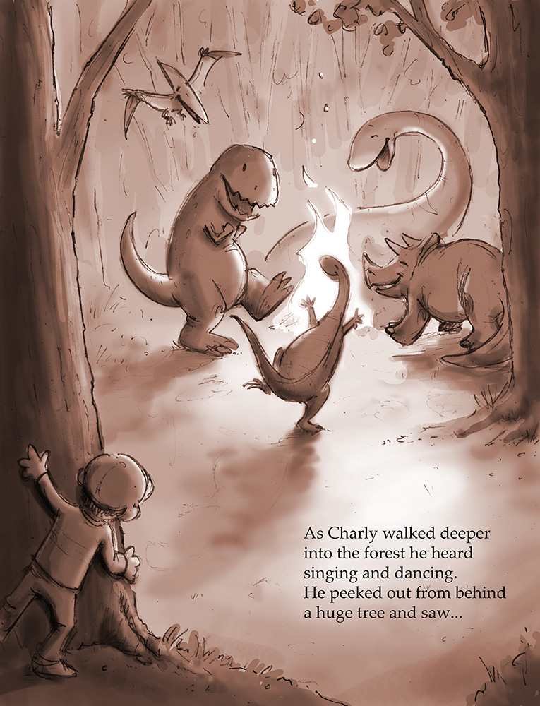
-
For me the last version is a better composition - a very successful composition - i think if the triceratops seems like a tangent with the tree i would try moving the back left leg a tiny bit in away from the tree....that composition really flows nicely ...its an excellent piece
-
Your doing really well, I love your process. I would try and create more distance between your dinos, and the background, otherwise great work
-
Sorry - meant back right leg.....
")
-
Thanks very much Kevin and Steve - your comments have been really helpful! I'll post another update soon.
Best,
Jason -
@baskin I'm late to the party here but you have some great things going with this design. The trex is my favorite. I'm also siding with Naroth and choosing #3. This would make a great limited palette color image using those colors. Great work!!
-
Hi again, everyone-
Here is a first pass at my final rendering. I think some of my other schemes might have also worked, but ultimately I settled on version 2 since it seemed to be the most popular.
I'm not sure if I should try pushing this further to lose the original pencil lines, or if I should keep them. As mentioned earlier, I am still pretty new to the digital process, and generally prefer the look of traditional media. If I can find time, I may even try to re paint this in oil or watercolor for comparison.
I'd love to hear your feedback, as always.
Thanks in advance,
Jason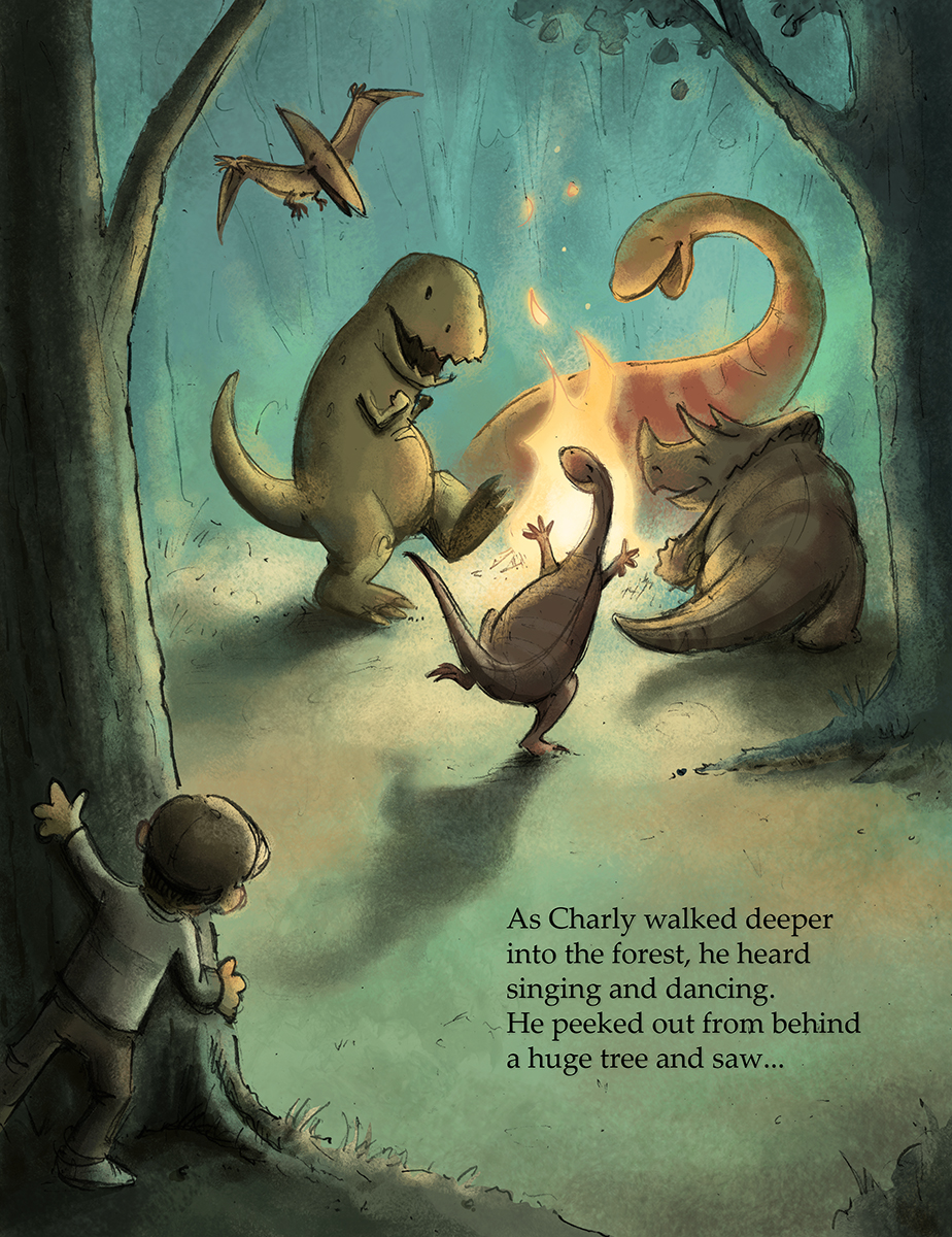
Twitter @baskindraws
www.baskindraws.com -
This is beautiful! I love the color palette, and the pencil lines are hardly noticeable. If anything, they add to the picture
 Sorry I can't offer anything to improve it, i think it is splendid!
 -
Wonderful, I would keep the pencil lines they make it work really well. Great stuff.
-
Thanks very much for the kind words, Lynn and Steve! I really appreciate your feedback.
Best,
Jason -
@baskin Great job. This turned out perfectly!
-
This came out great! Lovely lighting and also dinos are so cute. They make me smile as if i'm part of the picture
-
This is so great! Everything about it just works!
-
@baskin SO much fun! Love the colour! Definitely keep the pencil lines, it gives it charm
The only thing that trips me up is Charley's hands - there a bit too round like a puppet's rather than a human boy's.