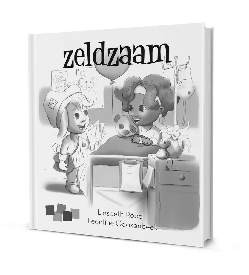
Cover illustration update
-
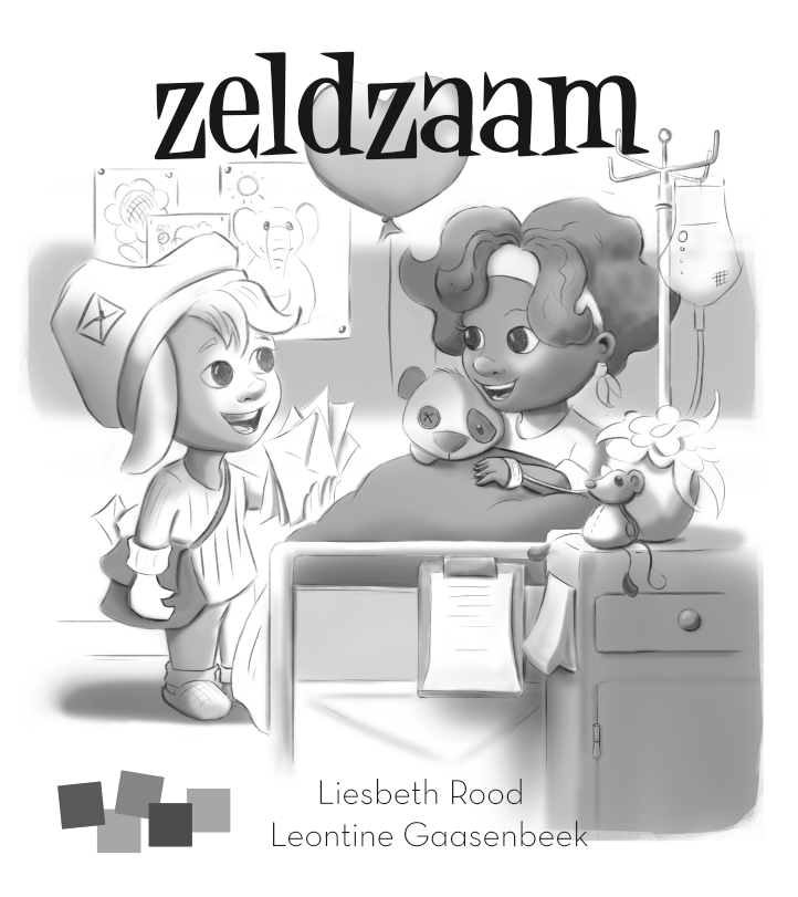
Hi Guys, I am working on a new Childrens-book. Its about two children who have to stay in the hospital, they help each other when it gets hard and become friends
Here is the cover design, I really like you to give your opinion before I start painting.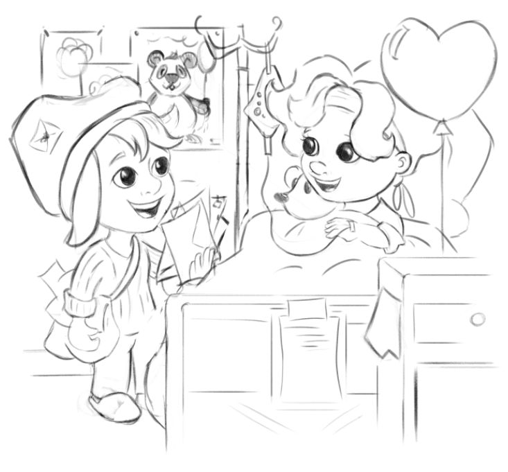
Leontine
"A picture is worth a thousand words."https://leontineillustrator.com
https://www.instagram.com/leontine.illustrator/
http://www.facebook.com/leontineillustration -
Hello Leontine,
I absolutely LOVE this concept! Your characters and design are super cute and very appealing. And the setting is awesome. I look forward to seeing the finished piece.
A few small things.
-
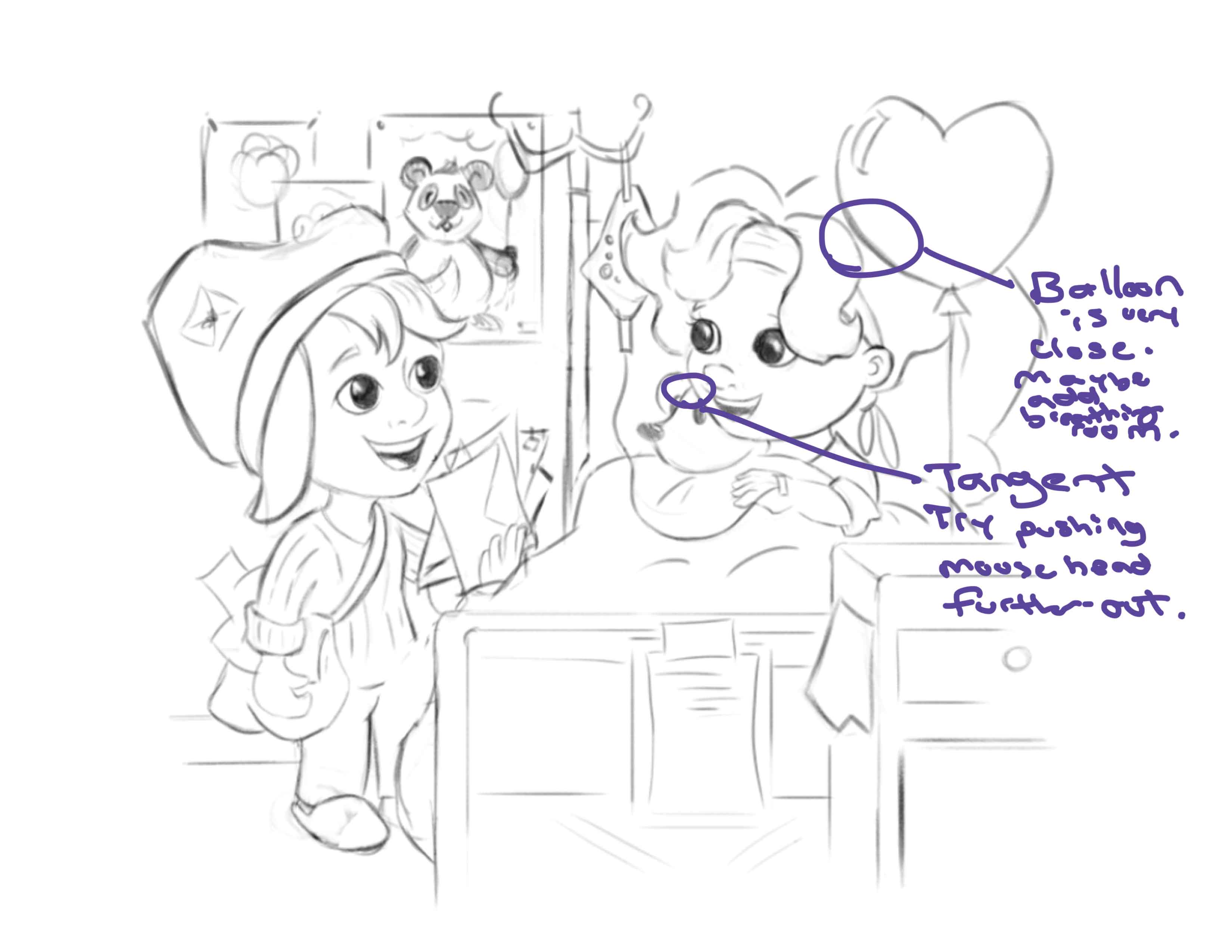
Watch out for tangents. This can flatten the piece. There is a lot going on in the area between the stuffed mouse and the girl's face.
-
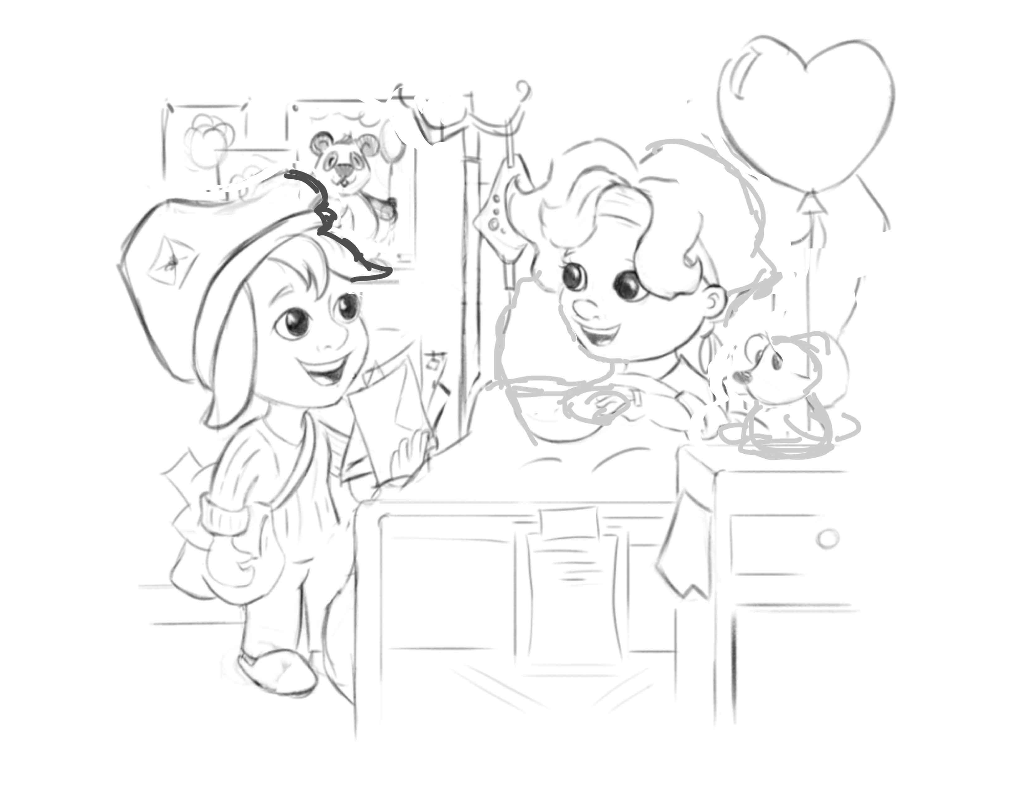
I like all the small details in the scene, have you thought about spreading some of the items out? I sketched out a very rough idea of what I was thinking that may give the image a little more breathing room.
-
In my rough sketch I moved the stuffed animal on the table, but you could still keep the stuffed animal in her hands but make him not so close to her cheek, or you could have him laying on the corner of the bed if you wanted to fill that space. Then on that small desk in the foreground you could have the balloon connected to a weight sitting on it or even a small vase with a flower?
-
I think it is okay to have more diverse shapes, meaning having items be from small, medium, to large. Like playing with the size of the balloon or posters in the back? I like how everything is blown up bigger but it might be worth trying.
-
Where will the title of the book be going? Will it be going above the image?
Overall very lovely work. Keep it up!
-
-
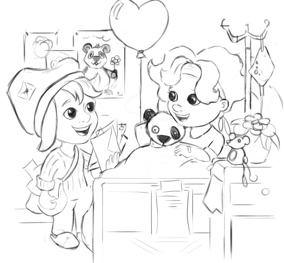
I like what Joslyn suggested. The tangents are a great consideration and should be easy to fix. I'm new to this so please take my thoughts with a grain of salt. I personally am ok with the stuffed animal next to the girl as you have it but I think being able to see the her other hand may help the form and reduce that tangent. I'm not sure. Also, the circling of the tube from one side of the bed to the arm on the other side feels weird. Maybe you could play around with switching the balloon and the Iv fluid or having the tube go to the arm that's on the same side and see what you think it does for the composition. I love the character design and look forward to seeing the finished product.
-
@Joslyn-Schmitt, @Jon-Anderson Thanks so much for your effort to give some feedback and draw over! Its super helpful! Ill go and work on the idea's you gave! Stay tuned for the next version!
-
here's an update! really changed the position of the girl a bit, her arm looked strange.
Leontine
"A picture is worth a thousand words."https://leontineillustrator.com
https://www.instagram.com/leontine.illustrator/
http://www.facebook.com/leontineillustration -
@Leontine You are welcome! I love the redesign. It seems to flow better in my novice opinion. One thing that still catches my eye and flattens the image is where the bottom of the panda's body (poster) flows right into the girl on the left's hair. Something simple, say moving the line for the panda up a little, to remove the tangent should fix it.
-
@Leontine This is super sweet! I love the kids' big eyes and the panda on the wall is adorable.
The one thing that jumps out at me is how the standing kid is holding the mail. Something about it feels broken/awkward. Maybe her hand is too rotated towards us and her arm is slightly too short? -
This is looking really good! A couple notes though:
I like to use a wholistic approach to cover design. Meaning I design the cover within the boundaries of the book dimensions, the title space, and any other graphic design elements or type that will be a part of the finished cover.
So while this illustration looks great, it's hard to tell if it looks good as a cover if we are seeing it out of context.
The next thing I'd like to see is this illustration with the cover's border around the edges, and the space for the title and type blocked in.
-
@Jake-Parker Hi Jake, Something like this? (sorry, the title is in dutch) I am working on a value scheme right now. Please let me know what you idea's are. If you have some time, thanks in advance.
Leontine
"A picture is worth a thousand words."https://leontineillustrator.com
https://www.instagram.com/leontine.illustrator/
http://www.facebook.com/leontineillustration -
@Leontine Yes! Context!
This looks great, though now that we see where the title is, I think you should eliminate the heart balloon or lower it all together.
-
@Jake-Parker thanks Jake!, I will take your advice.