Help with some finishing touches.
-
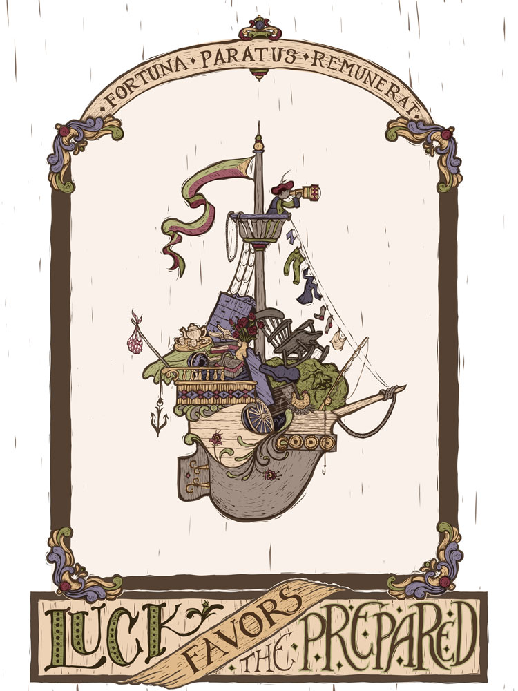
Recently a favorite artist of mine, James C. Christensen, passed away. I had been wanting to do a piece imitating his style for awhile, and it felt like it was the right time.
Some motifs in his work were flying ships, clever titles/sayings, and latin phrases.
I created a piece incorporating those things, but I don't feel like it's quite working. Originally I was going to put a simple landscape in the background, but with the busy-ness of the foreground (which I could also use some thoughts on) it wasn't working. I thought, why not leave it out?
(
But, I didn't love that.
I tried some water--not all of his ships were flying, he did many in the water as well, so it still could work with my original idea.
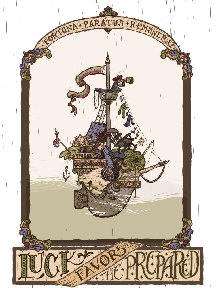
This was just a mock up of the idea, I can put more work into the water texture if it is working. The question is.... IS it working? Should I try something else?What are your thoughts?
-
@Sarah-LuAnn I like the second, the first felt like it needed grounding then I scrolled down and was like "Ah yes , like that!"
-
Yeah, I like the water looks good.
-
Definitely the second! Beautiful typography too! Christensen is also one of my favorites....you could add a flying fish to make the citation complete...
-
Really nice! I also had a wow effect when scrolling down to the second.
")
-
I think the water works very well.
-
I love the water. I think the whole thing is just lovely.
I have a tiny composition suggestion. What if the bouquet of roses switched places with the teapot, then the dark roses could stand out against the light background and the tea set against the darker background. I think it would be easier to read that way.
-
@Sarah-LuAnn I think the water is a really nice touch. It's subtle and adds a nice lower third break to the piece.
I know this is not done, so take things with a grain of salt. As you finish rendering this I would consider using more saturated colors and maybe more variety if you're imitating Christensen. Also, and maybe you were going to do this anyway, losing the line work, or at least making it thinner, will probably help add dimension and reduce unwanted busyness in all of the intentional busyness. I think one of the reasons his work works so well with all the clutter is that shapes are crisply defined by shape and color and he tends to put ambient occlusion behind them which gives that nice layered dimensionality. Am I making sense? If not, ignore me
Looking forward to seeing the finished piece!
Nat Iwata
www.iwataillustration.com -
I guess I should clarify that I'm not trying to make my piece 100% in Christensen's style, not at all! I wanted to do a piece in my printmaking style using subject matter inspired by his work. So yes, if I were to go 100% James C Christensen's style I would do it more as a painting with a different color scheme. My goal was to do kind of a melding of his style with mine :-).
-
@Sarah-LuAnn ooooh! Sorry, then just ignore me
-
@natiwata Hey no problem, my fault for not being clear. Your advice was spot on for what you thought I was going for.
-
@natiwata Yes, I would say the "style" is not necessarily James Christensen but the subject matter is. I suppose it is Christensen-esq. I don't know if I would have immediately thought of him had I just seen this image.
This is very good in it's own right @Sarah-LuAnn !
-
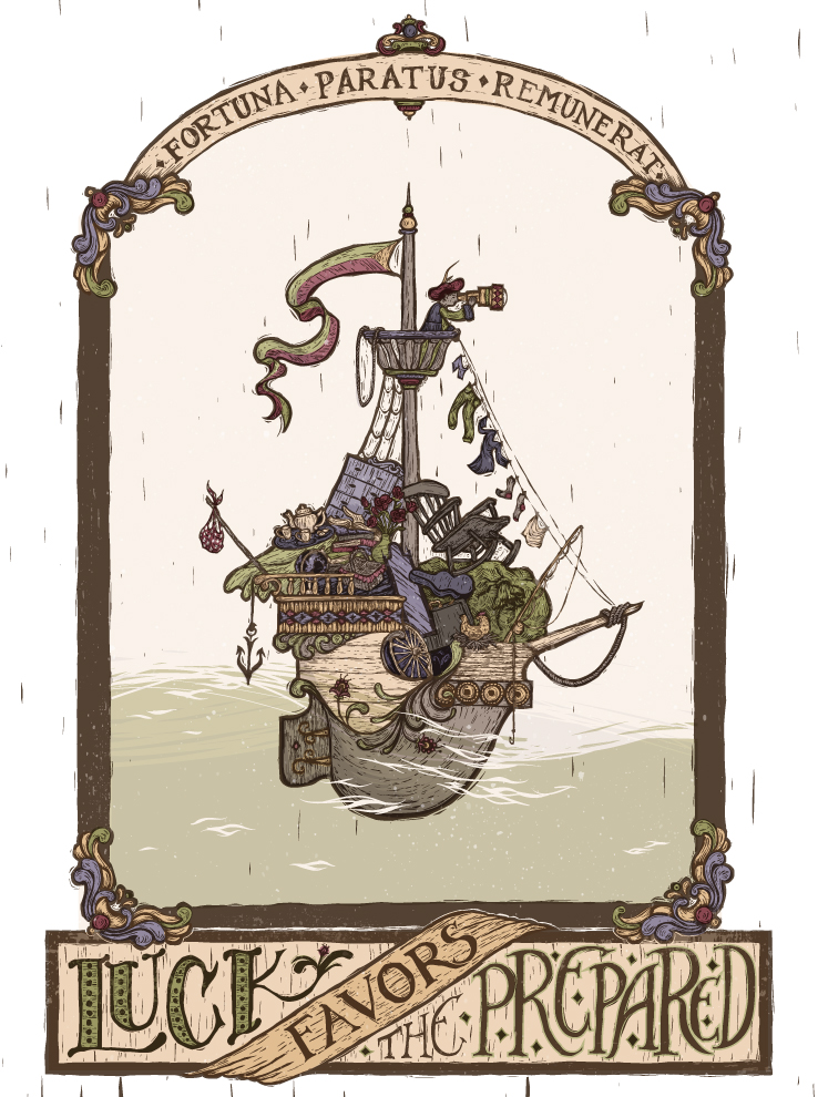
I made some changes and I think the piece is done, for now at least. I played around with the values without moving the drawing to hopefully get it to work a bit better--yes, the lazy way out.
Funny to see Will's challenge after making this piece. I've watched the creative composition course but I need to review. In a funny way, I think that making a piece with this many items and having a few issues with it was kind of a necessary experience, if that makes sense. Now, I know what to look for and avoid much better, since before my understanding previously was only theoretical. So though that part of the piece isn't perfect, I'm happy for what I learned and am ready to take a break from looking at this already.... unless there are any big flaws to fix that you all can point out to me
")
-
@Sarah-LuAnn would tipping the boat a little forward to give it some motion with the water work? It's a great piece!
-
Love your restrained color pallet; the texture; and the scale of the image within the frame. Like the water being added.
The two things I notice are a) the oversized scale of the objects in the boat in relation to the character in the crows nest, and b) the lack of emotion in the character's stance and expression.
Hope this helps!
~Ruby -
@Chip-Valecek Good call--I tipped it a little bit, though not so much that the image feels off. Thanks for the suggestion.
@Ruby-T you are completely right. I think my issue with the scale is I didn't push it enough actually--James C Christensen played with weird scale a lot in his images and I was kind of doing the same thing, but since I've never done it before I was timid and didn't take it far enough. On the one hand, part of the joke of the image is that there are a whole lot of random things in the boat, so I wanted to keep them small enough to fit, but big enough to see. I probably didn't hit the right balance there but I feel that it is what it is at this point.
With the character, again you're absolutely right, but I'm going to argue, again, often James C Christensen's figures are not very "emotional" (for lack of a better term) and also that the character is not the focus or point of the image.
So your critiques are spot on, and I think they could help the piece, but at this point I am choosing to acknowledge those weaknesses and keep the piece as it is. Maybe I'm lazy but that's my decision.
-
@Sarah-LuAnn And I respect that. Looking forward to seeing your next post.