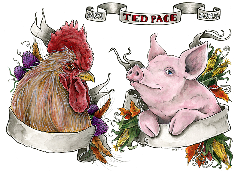
In Memoriam - Watercolor Piece for my Grandfather
-
So my comfort zone as an artist has really been silly, whimsical, and hyper "noodle-y". But my background is more formal with hints of realism. I made this piece a few weeks ago when my grandfather passed away at 87. He was a sailor, and had a tattoo of a pig and a rooster on the tops of his feet. I did this piece as a way to honor him.
I'd love some feedback or critiques. I wanted it to have a touch of realism and reference tattoo design without being overly stylized. I dunno. I also was playing with trying to do more detail (which I usually avoid). I know I goofed up laying it out, so it feels a little tight to the edge of the frame. Other thoughts or things I can improve in the future? thanks so much guys!
Ink wash and watercolor
http://zerbetron.com
http://kimchizerbe.com
ig: @kimchizerbe -
This is fantastic. I am sorry to hear about your grandfather
-
thanks for your thoughts. I really appreciate you taking the time to comment
-
@kimchizerbe Hi Erin - I think it is a wonderful tribute to your Grandfather and showcases your drawing and water color skills very nicely.
Where I think this begins to have issues, as you mention yourself, is in the layout/design of the three components we see here.
I hope you don't mind but I took this into Photoshop and made some adjustments and moved some things around to give you an idea of how this might all come together in a more cohesive way.
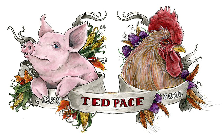
For starters you have these nice scrolling banners wrapping around the two animals but you have left them blank and then added in a third banner which I am not sure is necessary. And it further throws off the balance of your piece. So I worked all three of these main elements into each other. Granted if you were drawing this from scratch you would need to make further adjustments but hopefully this gives you some ideas.
Next I scaled down the size of the rooster a little bit, he was looking too large in comparison with the pig and I think he is more balanced out now.
I also got rid of the tail of his banner from behind his head and just a mirror of the one from the pig, to once again bring in that symmetry between them. If you were to do a fresh drawing, it does not have to be the exact same - but I do think keeping it similar in size/shape is appealing.
You will also see I copied bits and pieces of the flowers/plants to fill in areas here and there.
And of course you will notice I swapped the position of the rooster and the pig. I think them facing out, but their eyes clearing staring back at us is so much more powerful looking.
Anyway - I hope you find some of this helpful and like I said your drawing/watercolor skills are really beautiful here!
-
@kimchizerbe Sorry for your loss, this is a wonderful piece. I do agree with what @Rich-Green has mentioned. Although I would like to see them looking at each other and adjust the eyes. Not sure if these changes could be made since it is a traditional piece.
-
@Rich-Green wow I really appreciate the feedback! When I first brainstormed the piece, I wanted the info to be in the banners, but because I'm lazy and rush right into the drawing, instead of thumbnailing (I know I gotta start doing that) I ended up with a layout that doesn't work.
The adjustments you suggest and illustrate here are super helpful! I'm pretty savvy in PS so I might take this and try to see if I can make some of those changes you recommend. Seriously, thanks for taking the time and energy to offer this kind of feedback. I am super appreciative!
@Chip-Valecek - that is a great thought about the eyes. I would maybe be able to alter it in PS with a little time and effort. I'm gonna do some mock ups and re-post them. Sincerely, thank you guys for taking the time to offer your thoughts and feedback. Critique is how we grow!
")
-
@kimchizerbe It looks like you've got some great feedback already - i would just like to say that i am sorry to hear that your Grandfather has passed away.
-
@Kevin-Longueil thanks so much for your thoughts and condolences. What a wonderfully thoughtful community here. I certainly appreciate it
-
I like them. I'd make the ribbon with the rooster a little wider so it doesn't look like it's chocking his neck.