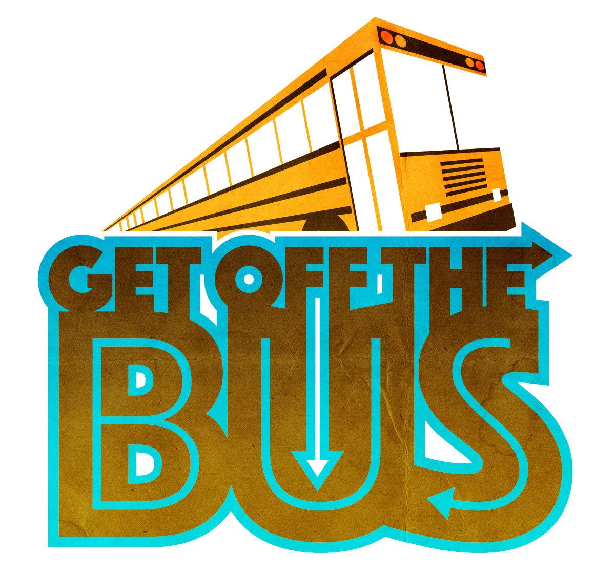
LOGO DESIGN - "GET OFF THE BUS"
-
Logo design for my day job… Fairly happy with how it came out.
Andy Jewett
ILLUSTRATOR | DESIGNERPORTFOLIO: andyjewett.com
TW/IG: @andyjewett -
@andyjewett This looks great - love the texture in the lettering - not sure if you are looking for feedback on this? i did have two things that popped up for me - the line of the top edge of the bus where it hits the text and the spacing of the windows - not really issues i think but they are the things that catch my eye - for some reason i want to erase that little bit of roofline between the last widow and text - i did a quick draw over to show my thoughts...hope you don't mind - i included the grid technique for making evenly spaced receding lines - i'm sure you know how to do that but it might be new to someone - anyways.. those are my thoughts - feel free to ignore
")
-
@Kevin-Longueil thanks for the thoughts! Always open to constructive crits... thanks again!
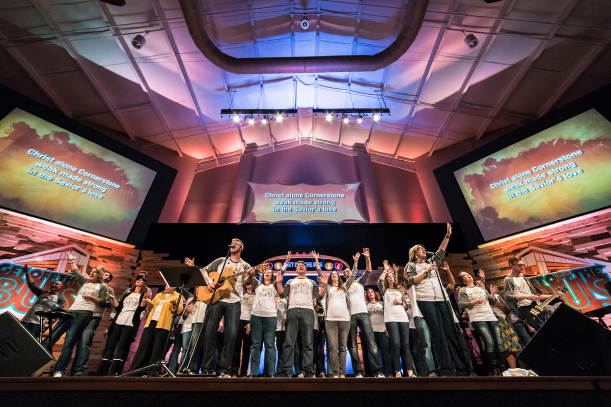
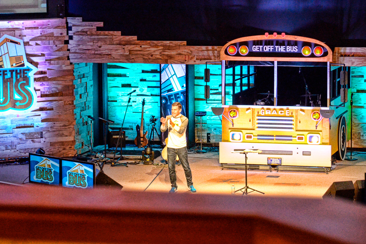
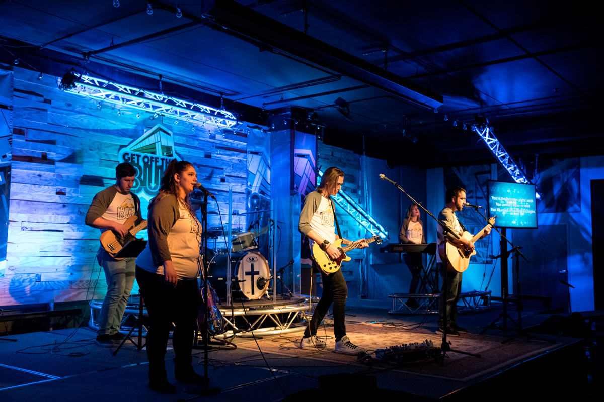
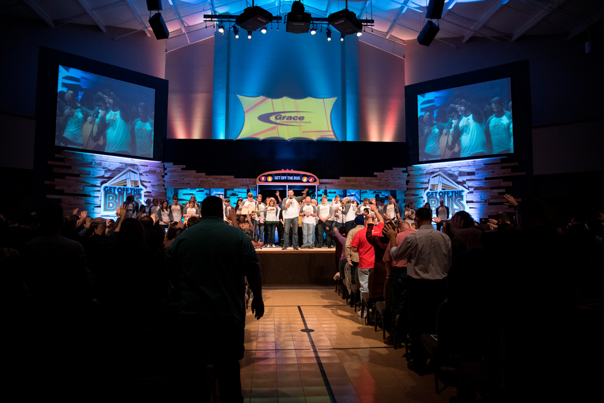
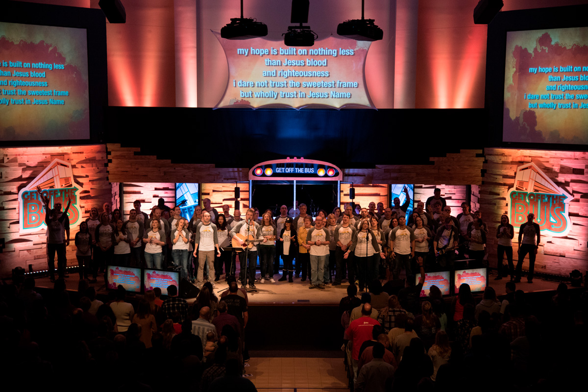
I still have to build a bus on stage to scale as well. So yeah, good times.
-
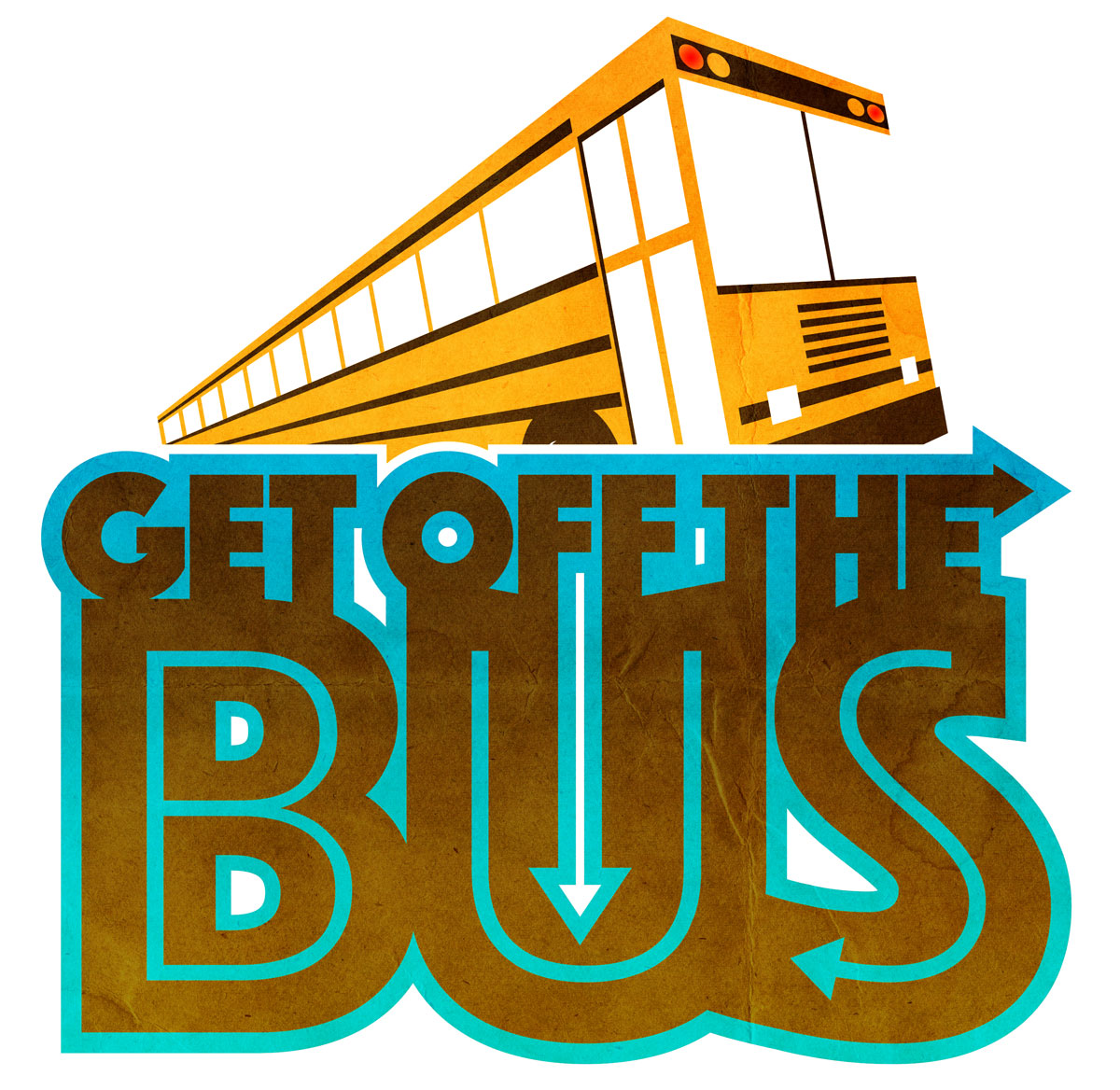
@Kevin-Longueil here it is reworked taking your suggestions, thanks again!
-
Nice! Looks great!
-
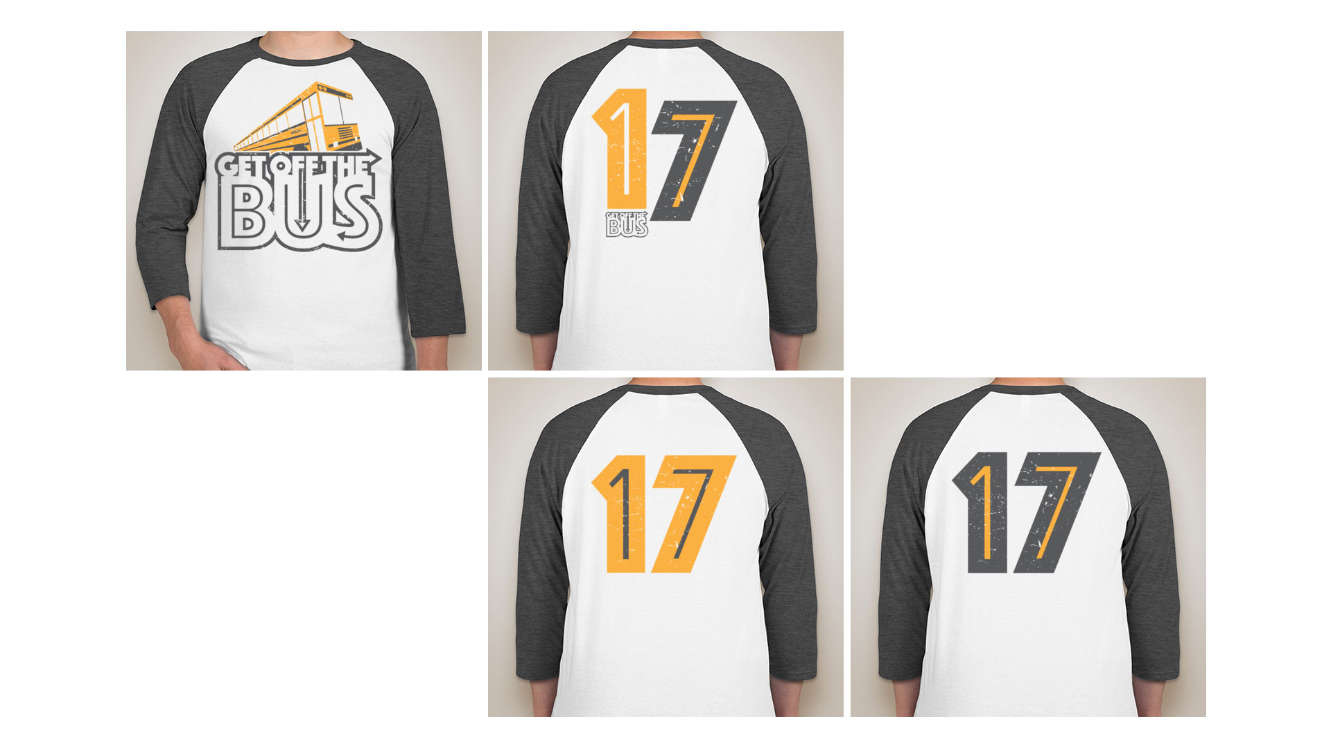
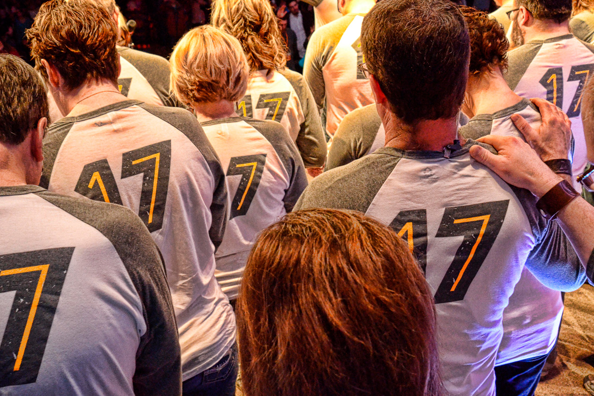
T-shirt design to go with the campaign...
Andy Jewett
ILLUSTRATOR | DESIGNERPORTFOLIO: andyjewett.com
TW/IG: @andyjewett -
@andyjewett really like the retro style - it looks very well done!
-
@Kevin-Longueil Thanks! I do a fair amount of logo and apparel work at my day job so it's always fun to try and come up with something decent... I usually try to make things that I would be willing to wear (when possible).
-
I have been slammed lately with work so I certainly apologize for my absence on the forums... starting to work my way back as I can.
Thought you might enjoy seeing the graphics and stage built bus in the wild... thanks for looking!

-
Looks great.
-
these look nice. great job!
-
Looking good!