"Dottie the donkey" Which one is better?
-
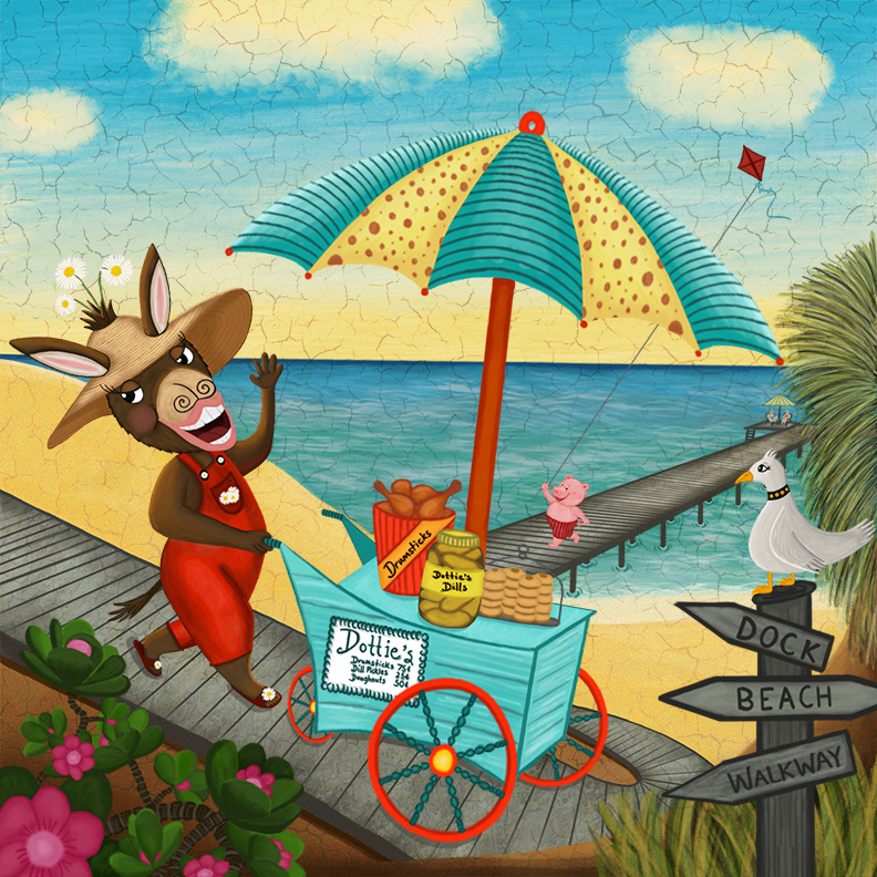
I have been out of commission for a while now and am trying to get back into the swing of things. This is my latest piece and I would love any suggestions or comments. Do you like it better with or without crackle?
-
@Thrace Welcome back! i am surprised by it myself but i think that i do like the crackle on this piece - makes me think of a cool old mural painted on the side of a quaint beachside general store - really nice - i think for critique i would possibly raise or lower the horizon a tiny bit to get rid of the tangents along it (the umbrella tip, the fingers and the inside shape of the ear) - i really like your sky on this one
")
-
@Kevin-Longueil thank you Kevin I will do that!
-
Hey Trace, haven't seen you in acwile! Welcome back. Great illustration! Love the colorsceme as eel, And I would use the craquelé effect for sure! It could be nice if the piglet alreadysaw the donkey, anctious to buy some drumsticks. Butbits just an idea, not really critique.
-
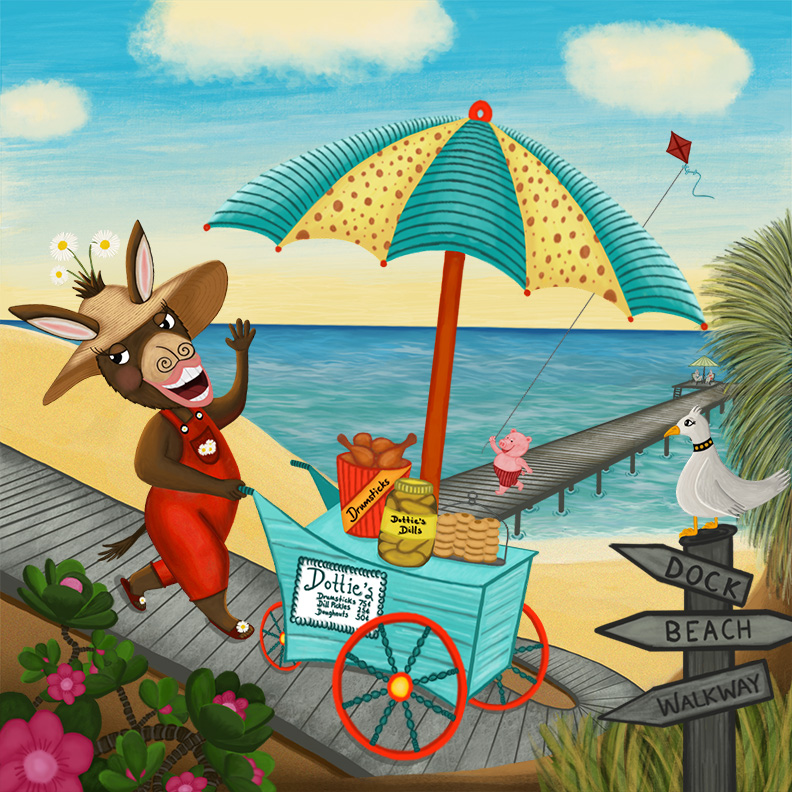
I prefer with out the texture, but if you are going to do it with the texture make sure it is the same amount over the whole piece. Right now it only looks to be heavy at the top in the sky and fades out to nothing at the bottom.
-
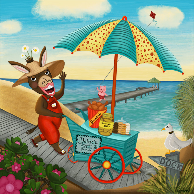
@Thrace Hi Thrace - so good to see you are back!
I really like the texture you have created on the board walk and pier - looks really nicely done. I also think you nailed the look of the water and waves perfectly.
I have some suggestions for you:
Right now you have some nice shading on objects in the scene (the donkey's overall's for example). But then you do not have any shading on the cart. I would imagine there would be some differences in value/light on the different sides of the cart. But right now it feels very flat because all sides are the same. Also it does not seem to be casting much of a shadow below it on the boardwalk I would play around with that as well.
I also think that the containers on the cart could use some more enhancements as well. For example - the glass dome over the cookies would have some shine/reflection on it to help it feel more dimensional and read as glass.
I would perhaps adjust the color of the sign on the cart - it is very white and I think it could be toned down some so it does not become as much of a focal point.
On the Donkey herself - I wonder if some shading/color variation on her lips would help. Because there is shading on other parts of her they feel very flat right now. Either that or maybe make them just a bit darker shade of color? Also where is she looking? Right now it feels like she is looking out of the illustration which leads the readers eye out of the illustration. I wonder if it would be better if she was looking toward the sea gull or something to keep the story within the illustration?
Finally, I wonder if adding a bit of weathering to the lettering on the signs (dock, beach, walkway) would be nice. They are very solid - with a heavy outline and in the foreground and grab a bit too much attention. I think weathering the text and edges or fading them a bit like they have been there for a while would really help.
I know I just gave lots of little suggestions but I really do want you to know that I can see a bunch of growth in your work with this piece - keep it up!
Rich
-
Howdy,
I actually prefer the version without the crackle- the one without gives me the feeling that she is there on the beach, the one with crackle gives me the feeling that she's walking past a beach mural. I'm sure she'd rather be at the beach -
@Rich-Green thank you so very much for the critiques I will work on all of your suggestions because they are spot on! It's so weird how I can't seem to see these things myself, I guess that's why editors or so important!
-
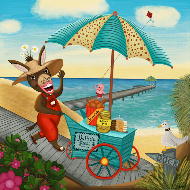
@Rich-Green Just wanted to get your opinion of the updates I made after reading your suggestions.
-
The umbrella seems to be drawing my attention more than the rest of the image. The complementary colors and the hot yellow and red, plus the other elements making that frame is drawing me right to the yellow in the umbrella and then down the red pole. Not sure if that is what you want to happen or not. Very cool image I love the little pig.
-
@evilrobot Is this better?
-
Yes, I think cooling it down a bit helped
Now my eyeballs are going to the donkey, the tires, and then the pig. Nice work. -
@Thrace Hi Thrace!
First of all I can tell you spent a bunch of time going back in and reworking lots of little details and really believe it paid off.
I think the shading on the cart, change in color to the sign on the cart all help push the eye to the parts of the image the viewer should be looking at the most.
I really like the toned down umbrella per @evilrobot's suggestion - I agree it also helps focus your eye on the characters.
I hope you are pleased with update - as I think it looks great!
Rich
-
@Rich-Green thanks for your help and congrats on your new book!!
-
Are you still looking for a critique?