Kids...
-
Thinking about doing the "Design 100 something" challenge and focus on designing 100 kids....another crazy idea probably.
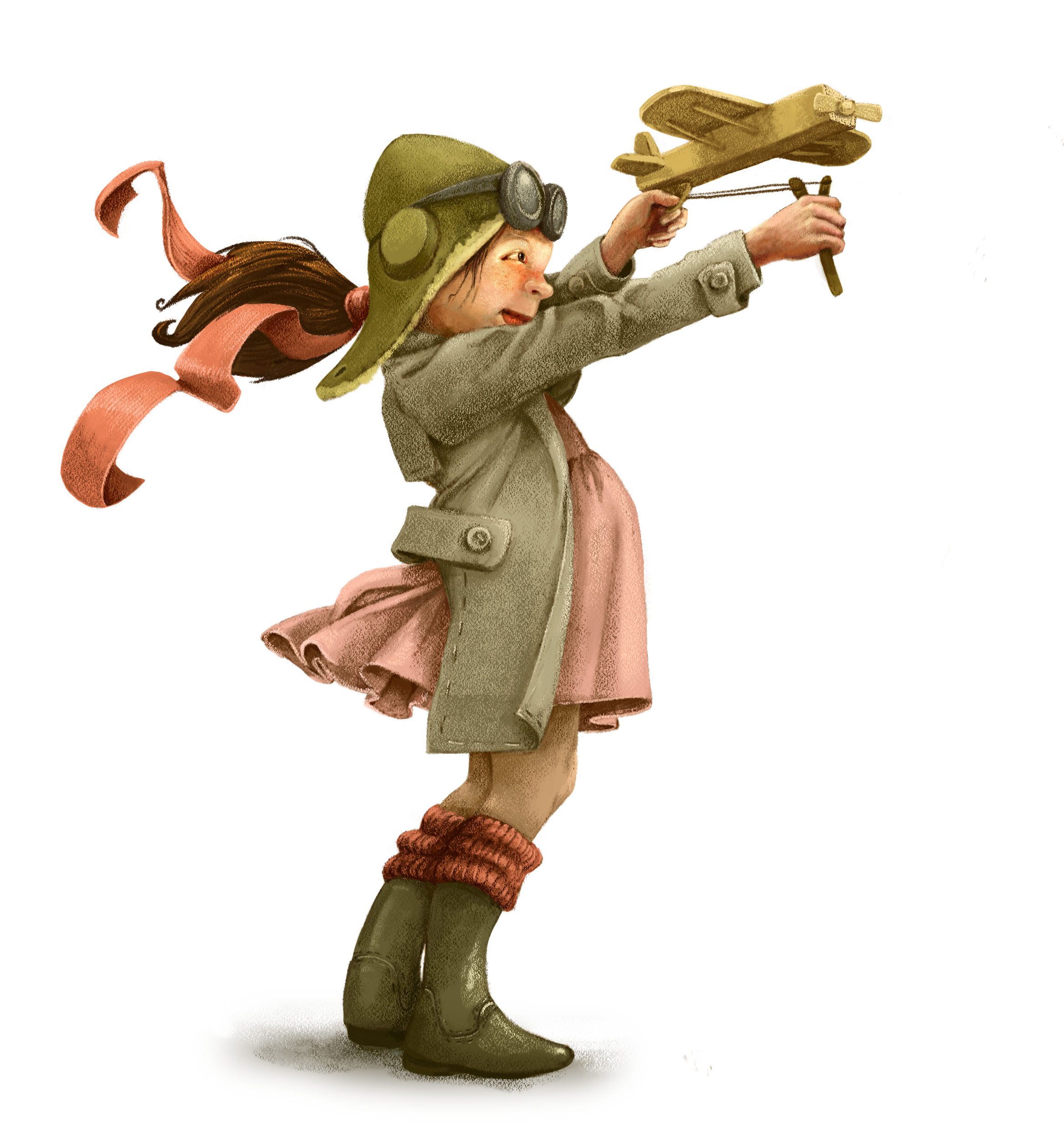
Well, this is actually for this months Character Design Challenge ("Aviator"), and also because I want to add some spot illustrations in my portfolio.
Before I submit, would be nice to know if you spot anything wrong or worth improving!
-
Wow, really nice job. The only thing I see is maybe the texture on the sleeve and ribbon might be a little harsh. Some really great rendering on this one.
-
@smceccarelli great piece the only thing i can see is that the plane is already looks like its taking flight but she still has the string pulled back.
-
I LOVE her outfit! Those boots and socks are adorable. If they are meant to be wellies, they are typically a bit wider at the top not as fitted to the leg, she looks so focused with her toy. fun piece and great idea for #100 somethings.
-
@smceccarelli - I really love the color scheme you have used here. It really adds to an old fashioned era and vibe that really compliments this piece so nicely.
-
Thanks all for the good advice. I have tuned down the texture close to the face - good point there. Here is the final I have submitted - not sure about the leaves.....what do you think? They are on a separate layer, so I can take them off easily...

-
It is a lovely piece - I particularly like the folds in the clothing, like on the sleeve and round her back...and the detailing like the stitching.... it all hangs very well and looks totally real.
I think the leaves are a nice addition, to show a little hint of her location, but personally speaking I would change it a little bit - at the moment there seem to be too many/too many big leaves and it is slightly distracting, eg it takes away slightly from the swoosh of her ponytail. If you made the whole layer smaller it might help, as it's a nice shape overall. The other thing is that although the leaves are lovely with the texture and fadedness, they don't have quite the same level of shading as the girl, and so look slightly detached from the picture. A slight hint of pencil like you have used on the stitching, would tie it all in.
But overall it is great!
-
@Dulcie Thank you! Excellent points - I will do what you suggest!
-
IMO I would simplify the folds a little bit, and shadow colors look a little bit dull and dirty. Also that sling is too little for that plane, or plane is too big. Great work!
-
@markoman Thank you for the feedback! The one above is the version I posted (it takes CDG almost a full 24 hours to approve the submission), but I will use the feedback here to improve it before I include it in my portfolio.
-
Fantastic colour palette,high emotional content,which absorbs the viewer.I found myself wanting to know about who this character was...As I was engaged with the image I felt there were just a few areas of conflict.The angle of the plane felt out of line,which way is the plane going,it looks like its going to the side??Also the back left leg feels too bendy,add a small straight line from calf down to the heel..great girl character......
-
P.s hun...
Is the body just a tad too short,look at the overall length of the body,head to toe,a bit more there would make the area of the arm and head feel less compact,head should go into whole body length about 6 x....hope this helps,not nit picking honest.xxxx

-
@bluesky71 Thank you for your feedback! I will incorporate the corrections that are possible at this stage and move to the next piece.
-
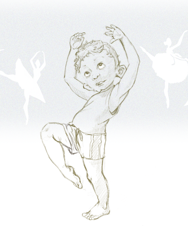
Little Billy Elliot. I have already started painting this one, but I have the feeling there is something wrong with the pose, or the drawing...or something else I can't quite pinpoint. What do you think?

-
I like the pose very much, it has great movement. The only things I see are I think we can see too much of the ear on his right side, and his right arm could maybe be thinned a bit because it's a bit farther away from us. But really, minor stuff. You have a great handle on pose and anatomy.
-
Beautiful drawing hun....what did you feel was wrong?
-
@bluesky71 Not sure...the left shoulder may be too long. Also not sure about the top/bottom balance. The arms may be slightly too long (or the legs too short...). It is intended to look clumsy and a bit un-coordinated, but not sure if the balance of proportions is believable.
-
@smceccarelli I like this a lot! Especially the textures and hessian-y quality and the fact she's shooting against the wind. The thing that bothers me is the positioning of the plane with the catty - would be a lot more powerful visually (and physically work better) if the plane was pulled back further and she was grasping the stick on the bottom.
Great job! -
@smceccarelli Lovely drawing as always...I have a couple of thoughts as to what might help..first thing I'd try is moving the ears up a bit on the head...at the moment they look a little too low down, sort of elvish, and I think that's making the head look a little funny in relation to the body. Hopefully that would fix it..I was wondering if you were going for a slightly clunky, ballet dancer-in-training look, because that comes across! (in a good way)....but if it still looks 'off' you could try raising the head a little bit....the line of action from ankle to neck is lovely...the head obviously doesn't follow that, intentionally I think...but you could lift his chin very slightly if you wanted him to feel a tiny bit more natural in the ballet role. That might not be needed though! All personal opinion though and it's very nicely drawn already!
-
@smceccarelli Love your drawing as usual - i think there is just a bit too much twist in the ribcage just under and to the left (our left) of the chin - if i put my thumb over the characters right shoulder for a few seconds when i take it away it does not match what my brain filled in...does that make sense.... i think just widen the shirt at the top so it extends a bit onto that shoulder and it will reduce the implied twist and shorten the arm that looks a tiny bit too long because of the twist - that shoulder would be raised just like the one on our right is another way of describing the same issue i think - if you showed some hint of the anterior deltoid on that side too it would remove the twist and dipping shoulder issue - really nice drawing!