")
Hi everyone…Thought I’d share what I’ve been working on for the last few days…I’ve been feeling frustrated about some aspects of my art in general.. and so I decided to take a break from the usual stuff and do a master copy of an artist I admire, to see if I can learn something different and get better digital skills.
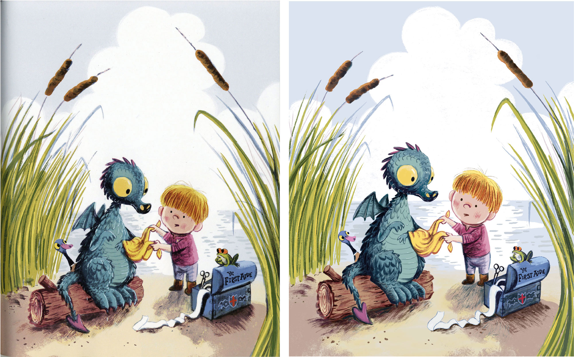
I chose this piece by Benji Davies:
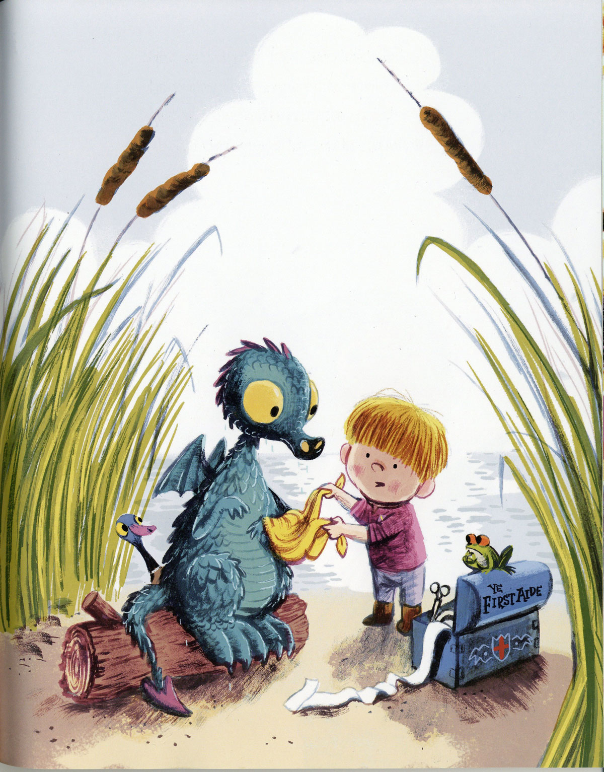
…if you watch 3rd Thurs live, it’s the same artist that Jake mentioned beforehand a couple of months ago, when he showed the Grandad’s Island book. This piece is from Benji’s newest book, The Dragon and The Nibblesome Knight, which is a fantastic book for bedtime for anyone who has young kids btw - fun to read out loud and lovely story too - rare combination! And it features dragons so big win-win for me.
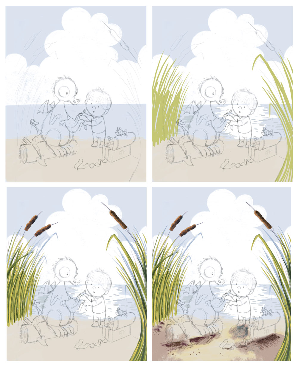
Benji paints digitally, as far as I know, so I did the copy entirely digitally as well, no tracing or colour-picking. Here are some screen grabs of the process:
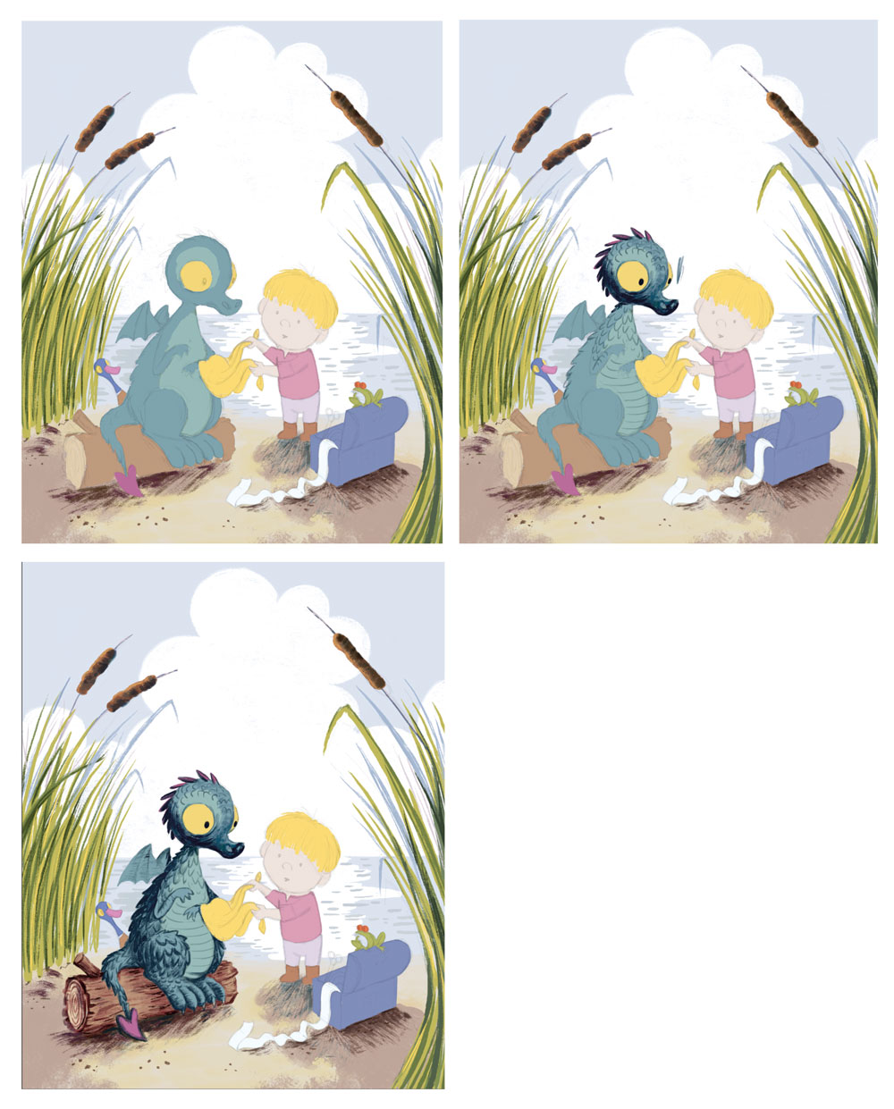
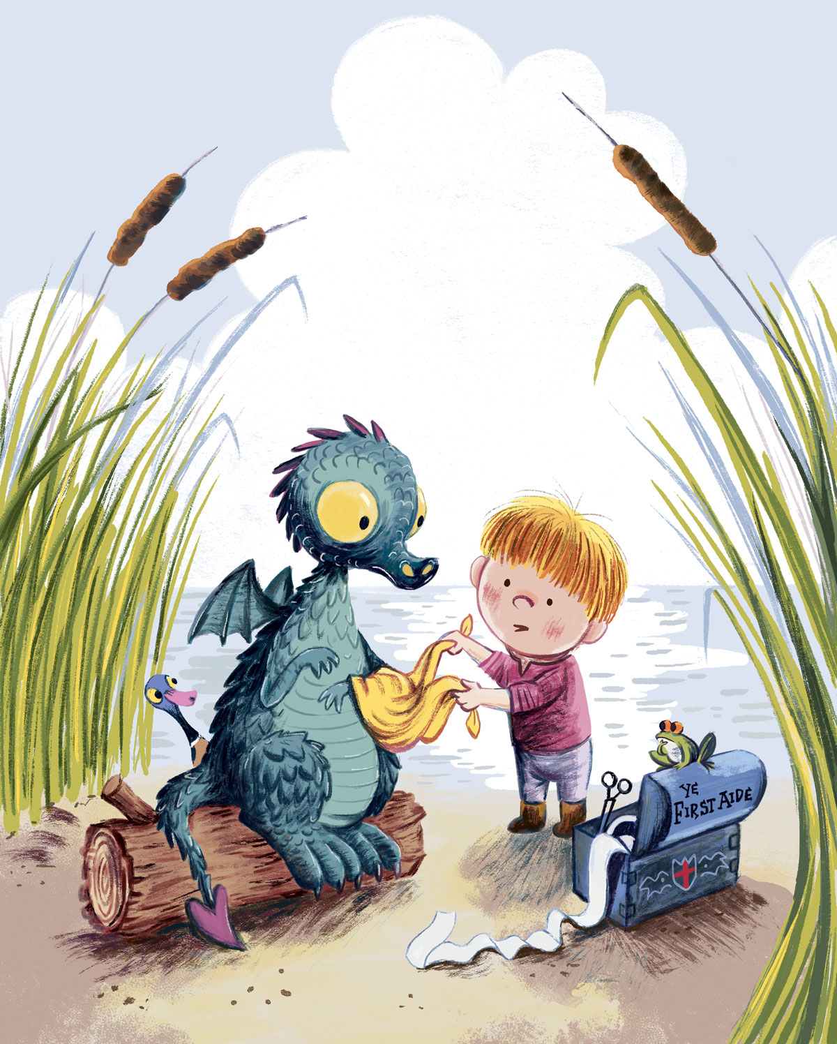
And the finished copy:
Side by-side comparison (original on the left, copy on the right):
Some observations I learnt along the way:
-
Benji uses a lot of dry media brushes - I’m pretty sure he uses some Kyle brushes because I found one texture in there which looked identical to Kyle’s Pastel Palooza brush. But not all of them..there was one brush I found really difficult to emulate, the dry scratchy brush…maybe he made it himself or got it somewhere else.
-
Up super close, Benji’s work has a surprisingly messy look - he doesn’t seem to worry too much about having really sharp neat edges and the process of copying his work felt very natural, like real painting - I really liked it!
-
So how does he ‘get away’ with those messy edges, I was wondering? I think it’s because he really, really knows his values and the contrast is in all the right places to make it work. So it can look clean but fresh at the same time.
-
This piece looks simple but it actually took a really long time to copy, many nights. There’s a lot of detail, careful shading and build up of textures that you don’t really notice full-screen. So it’s not a quick job, even though the design is quite stylised and child-friendly.
So there we go! I had fun, and I quite fancy doing another one….but I think I’ll have to get a bit further along with 3rd Thurs before I can spare the time…