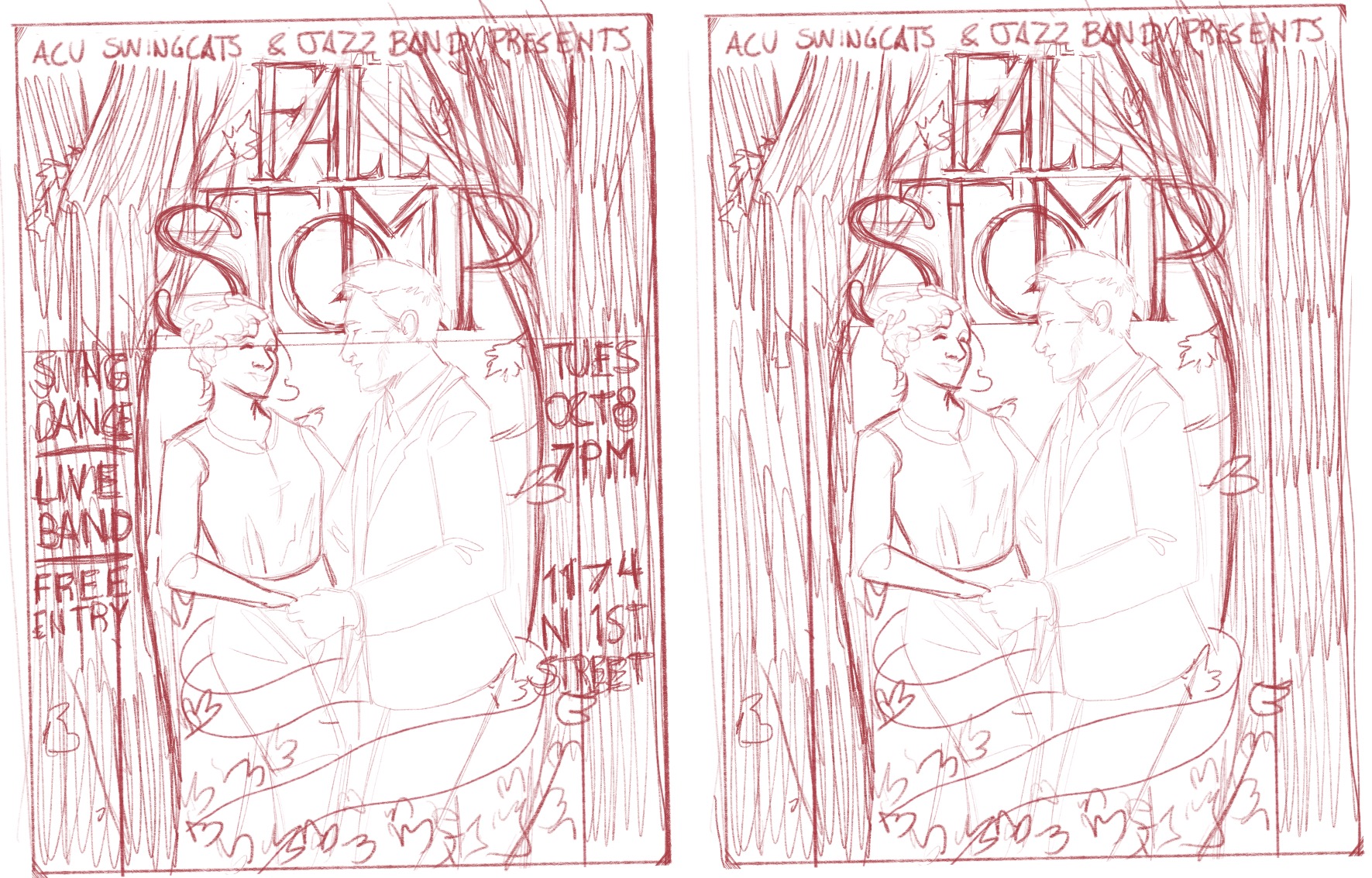
Dance event poster (looking for feedback)
-
Hi! I'm making a poster for a club I'm a part of.
Care to give any thoughts on the design so far?
-
The composition is elegant and the typography looks really nice. What I am not totally sure of is the two characters. They look like straight out of an old film. They seem too young to be dancing that way and dressed in a very conservative way. Obviously I know nothing about the target audience, so it may be perfect for that...Otherwise, the poster has a nice vintage flair to it, and I think the design will look really nice with the leaves floating and - I assume - season-appropriate colors!
-
Yea! Straight from an Old film is really close to my target!
The event is for swing dancing which originates from the 1920s and 30s.And yes! Season appropriate colors. Some reds and oranges. Warm tones. I can't wait.
-
I pictured an art nouveau style poster from your sketch!
Since its a dancing event, I think you could add more gesture into the people's poses. Right now its a little hard to tell its swing dancing because their poses are a bit stiff. Maybe try poses that show off more of that swing energy (example, one of her arms may be up in the air, head thrown back a bit, or her legs swing up, etc.) I would google some swing dancing pictures as reference for your poses. .
If you dont want to change the people then maybe use more curvy wild vines to give the piece some movement. Good luck!