Little Monkey and the Panda's
-
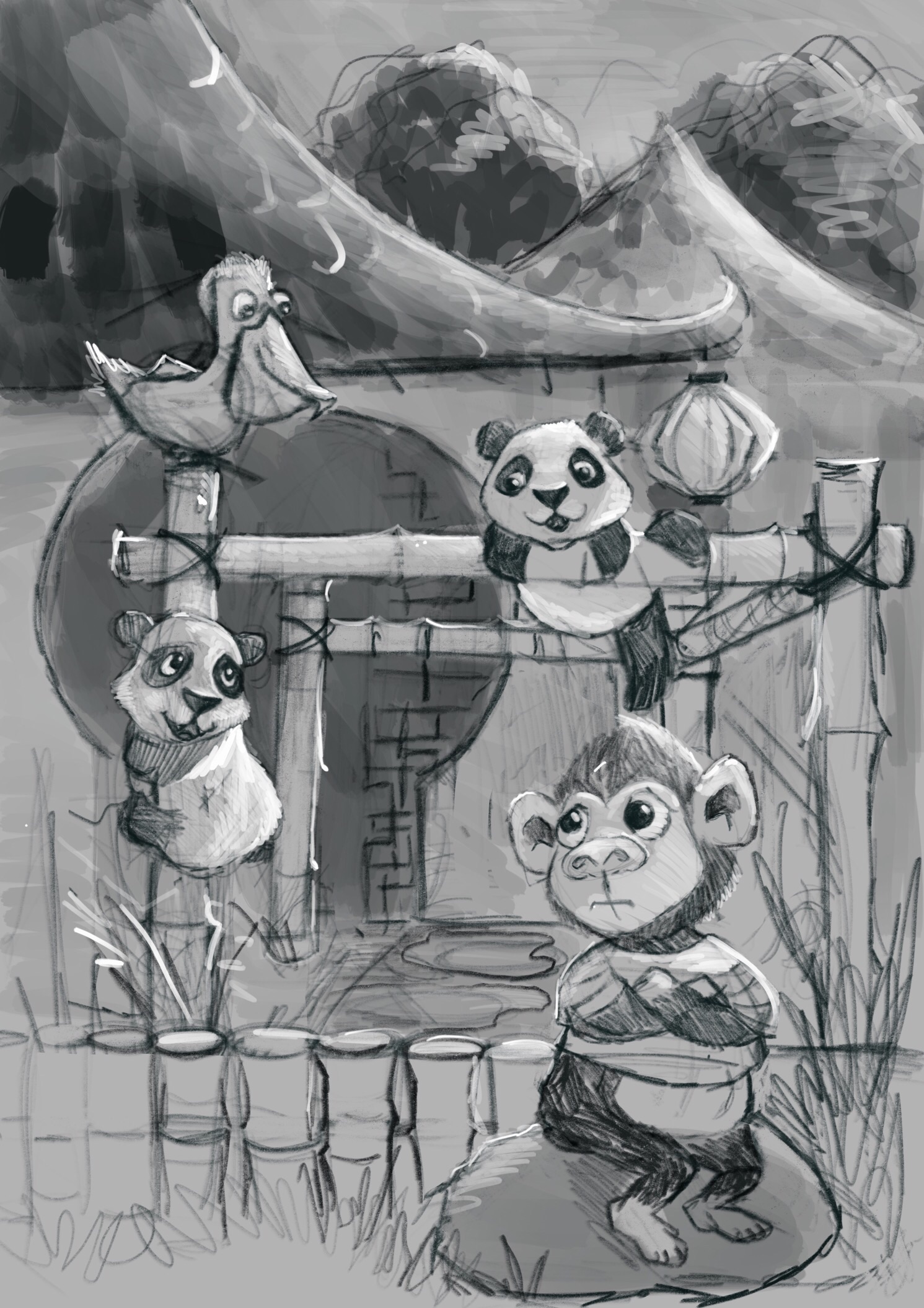
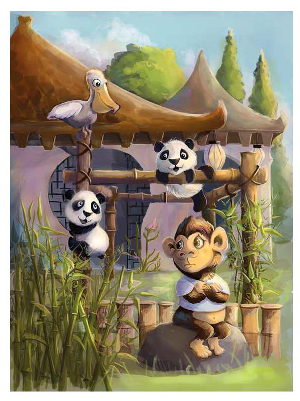
Hi Guy's, its been a wile... Here a new cover for a book design. The story is called ' little monkey and the panda's' he's really not happy when two new animals come and live in the zoo. So he finds lots of reasons not wanting to play with them. Until....any suggestions are welcome!
-
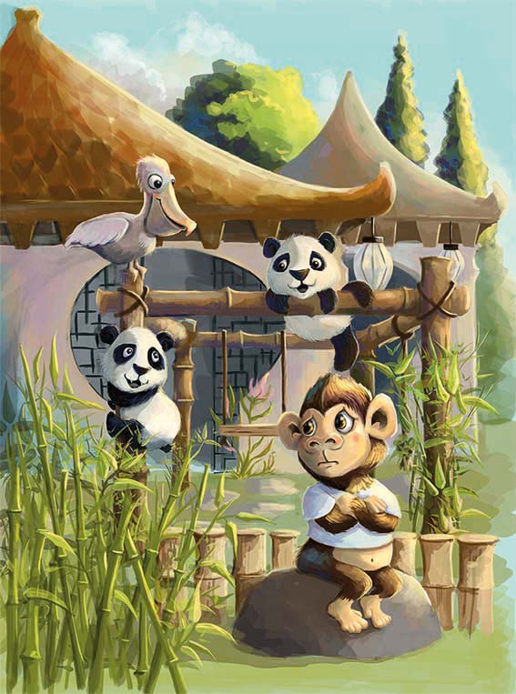
And here's the colored version. Please don't hesitate to comment!Leontine
"A picture is worth a thousand words."https://leontineillustrator.com
https://www.instagram.com/leontine.illustrator/
http://www.facebook.com/leontineillustration -
@Leontine Hi Leontine! I think your character designs are cute as always. I do wonder if you need the pelican though. Right now there are an even number of characters on the screen and that creates some tension to me. Plus the pelican is of equal size and calls a lot of attention but it is not the focus of the story. So I would consider removing the pelican and just having that nice visual triangle between the pandas and the monkey.
The other thing is that I feel like maybe you need to push your values just a little bit further. Perhaps something with the walls of the structure behind them to make it a little darker and more saturated so it really sets off the characters in front of it?
But overall a great job from you as always
")
-
@Rich-Green Thank you! Ill play with it a bit. The Pelican is part of the story, but perhaps I can ditch him on the cover... The values, I have tried a darker background but it seemed a bit distracting, Ill try and desaturate a bit more....
-
I was going to say the same thing about the values. I think it's working great besides that. The characters and the background all have the same value range so everything is kind of merging together. I'd get some more contrast in the foreground and then less and less as you move back into the distance. With the direction of light you have a great opportunity for some darker cast shadows in the foreground.
-
@Leontine I like the brush work here - it reminds me of your flying ostrich that i liked too - the things i will mention for critique would be value and perspective - the play structure that the pandas are on has a one point perspective with the vanishing point somewhere near the swing seat i think - this makes the roofs look off to me and the poses of the characters ( the top panda and the pelican) - Here is a trick that Lee suggested i do to check my values - you can convert to black and white or not but then go into filter gallery in PS and chose cutout - set it to 5 - and it will show us what we have value-wise - here is your painting - really it looks good - but you are looking for feedback
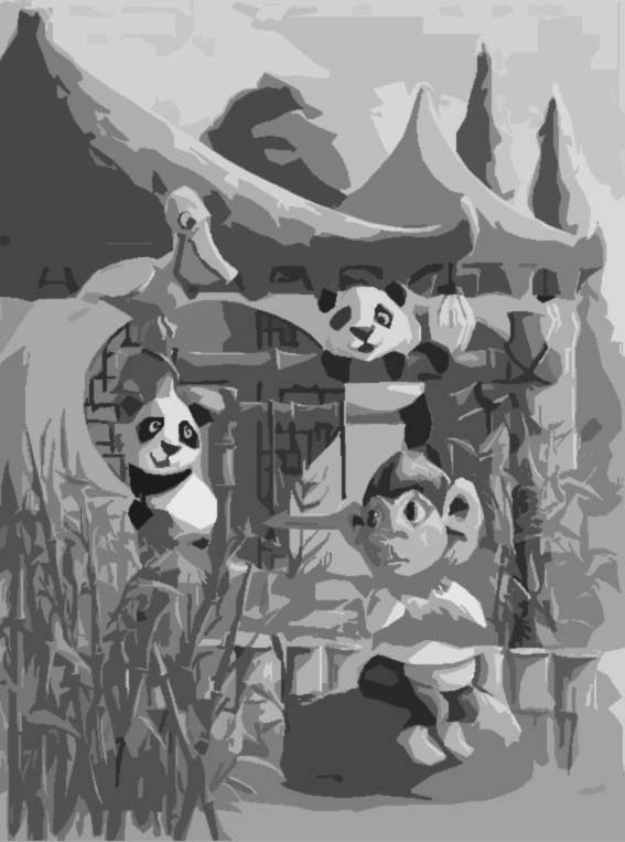
-
Love this work you are doing. I agree with Kevin and evil robot regarding the values. Watch out for "over lighting" a scene. Over lighting happens when you give each thing in the scene a full value range. For example, the tree tops have a light, mid, and shadow value, and each other thing in the scene does too. Try to keep your shapes flat if you can and then render/shade where necessary. I think the overall shapes could use some more tweaking with an effort to get some changes in scale and size.
Here's a quick stab at calming the values down a bit. This was pretty quick, but if you squint you can see the values starting to separate a bit more. You can take this further if you like. : )
Can't wait to see the finish!
-
@Leontine I love it. So cute. I wonder if it might look better if that grayish -whitish-pink contrasted a bit more with the pelican and the pandas-especially the pelican (if you decide to keep it). The animals all might pop a bit more? Like the roof over the pelican is a nice contrast.
Marsha Ottum Owen
-
@Marsha-Kay-Ottum-Owen Oh! never mind, you already darkened it. I really like the new vesion a lot!
-
@Kevin-Longueil Thanks for the suggestion, Ill try that for sure! Keep posted for the results! @Lee-White Thank you, your suggestions are very helpfull as always! Ill go and pick it up, and show the next version!
-
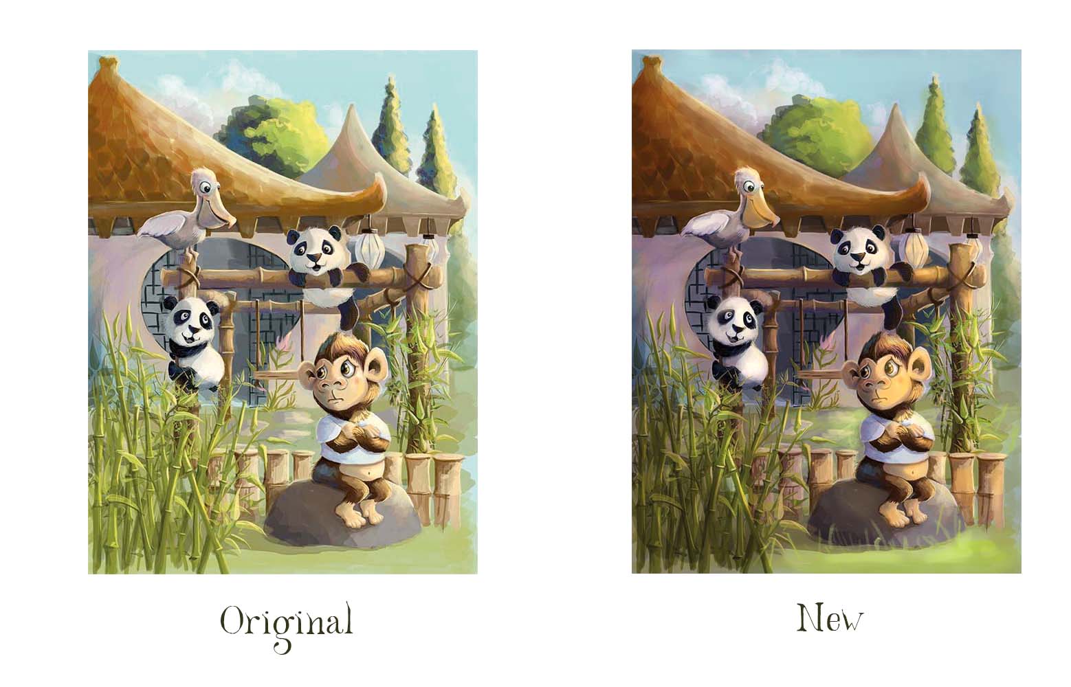
@Leontine It's looking great! Your characters are so cute and painting skills are really great as always... It's probably an awkward time to critique as you're probably half-way through alterations already...but here goes anyway. I think what Lee did was great but I also agree with @Marsha-Kay-Ottum-Owen about the whitish-pink background mixing with the pelican/panda...the colours are really similar and I wonder if a tiny bit of re-jigging where the animals sit would help.
I hope you don't mind but I did a draw-over to show what i mean (using Lee's version as you might have made those changes)...the pelican is moved upwards so that it contrasts better against the roof. Also the doorway previously kinda slides/tangents into the outline of the second panda, and I wonder if it would read more clearly if the doorway line went between the pandas instead...and also with the second panda, I extended the second doorway so that you get the dark grey/white panda cheek up against each other...basically trying to make the white panda bits against dark, as much as possible. Also deleted the swing thing as it looked a bit like it was going into the monkey's ear... there's a lot going on in the details - very beautifully done! ...but you can afford to lose a few bits if it helps the clarity.
BUT of course it's only ideas, in case it's helpful, and it is really looking great anyway!
-
@Leontine , I think the animals pop more and are clearer. Very helpful draw over, IMO.
-
@Dulcie Thank you Dulcie! Thats a really nice suggestion, I still have time to take it further. I Dont know if the pelican fits like this, with the title, but Ill try it!