Book project (June 17th updates!)
-
Congrats. I think your character dev is working really well! Nice work.
-
Your character is darling. I really like the bow...either in her hair or on the dress. This might seem super weird, but I prefer the dress with the top covering her body, like in #1 and the last one. Very nice job!
-
Congratulations on the book work, great news! I also like the last one best

-
Yay!!!! That's wonderful and th hedgehog is so cute

-
Great work! I like the middle and last hedgehog the most... but the last hedgehog seems to have the most character. Keep it up

-
@Marsha-Kay-Ottum-Owen @Dulcie @Carrie @tomshannon @evilrobot @Dan-Tavis Thank you all!!! I will post updates soon

-
@NoWayMe Congratulations on the book project! Will be looking forward to following along in your journey creating it!!!
-
Awesome! Definitely keep us updated
-
Hello everyone! I thought I would post updates on my book and see if anyone has comments/critiques to help me

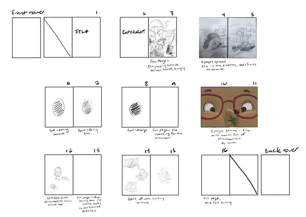
I did a template of my book and I am pasting my sketches as I go to make sure everything works together. For now is mostly notes of where I plan to have spot vs full page illustration. I tried to vary them as much as possible, any thoughts on the flow/rhythm of the book ?
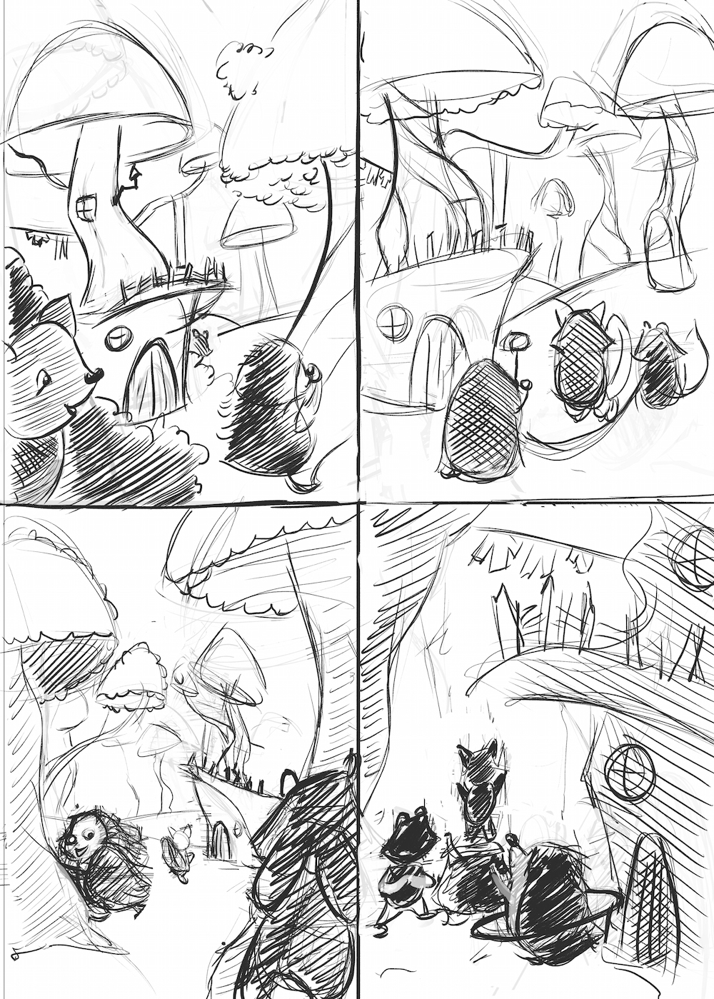
Also, I made 4 sketches for my first illustrations (after doing like 20 thumbnails) and I would appreciate your opinion on them! The first page says that Ella played all day outside and she was hungry. I thought I would show her play with other animals friends, and I wanted to include her house in the distance because I thought it would be fun to design a hedgehog/human house! What do you think ?!
Thanks for helping!

-
First one for me.
-
@NoWayMe I would definitely do not have the character´s back on the first page - I believe you need to show her face, it is the reader´s introduction to the character: it´s like meeting a person, you do not greet their backs
 So I think the bottom left one is the best shot, though maybe you want to frame it differently if you want to show more of the houses (which are nicely designed and a lot of fun!). It´s also nice that we see her friends. Are her friends all hedgehogs or are there going to be other animals too?
 -
Really nice so far. I also like the bottom left most. It really draws you into the picture and we get already an idea how the characters look like. I am looking forward to see this rendered.

-
@smceccarelli Excellent point! I was actually thinking of maybe using the first one, but having Ella where the fox is (I know it doesn't look at all like a fox right now!) and the fox counting with his hands covering his eyes. Or should I go with the 3rd one and make modifications ? I think I need to do more sketches! I'll post them later today!
Oh and there will be a raccoon friend and a fox friend

@Jana, @sam-marrero Thanks!
-
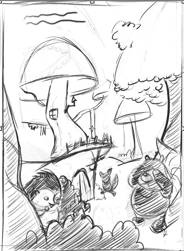
I used the same global composition, but I changed a couple of things and I think it looks better, but please don't hesitate to critique it as I really want it to be a good piece (it's the first page of the book, AND I would like to put it in my portfolio!)
-
I liked picture number three above. The bottom left, that is. I like the animal facing front covering the eyes as the rest are running around hiding. I also like the little house in the background build into a little jutted out rock, it looks like. I actually like the composition of that one than your newer one. It has more depth-the mushrooms are getting smaller. and seem to lead you back into the scene-kind of like you're part of the search. The newer one seems to have too many huge mushrooms hovering over the animals and it doesn't really draw the eye back. I may be way off but that's what I notice. Looks like a fun story with cute animals

-
Thank you @Marsha-Kay-Ottum-Owen, looking at it back, I think you are right, I will have to revisit the 3rd one!
-
Hello again everyone!
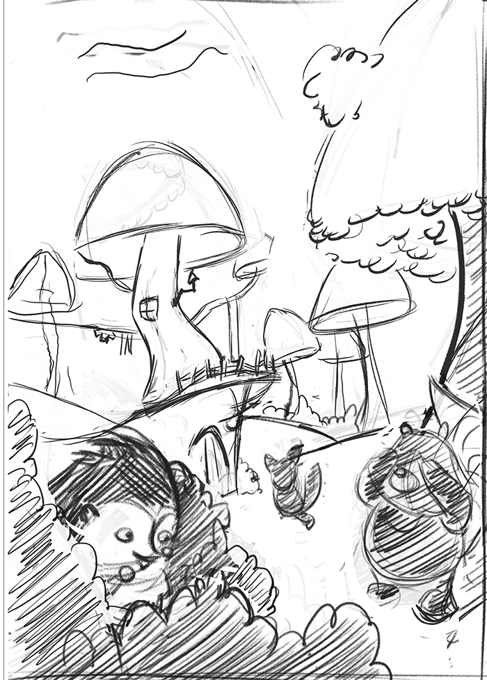
I reworked this composition a little and I think I am satisfied with it now! Any thoughts before I start cleaning it ? I kept the same basic comp, but try to improve the depth as @Marsha-Kay-Ottum-Owen suggested based on the 3rd comp I posted previously.
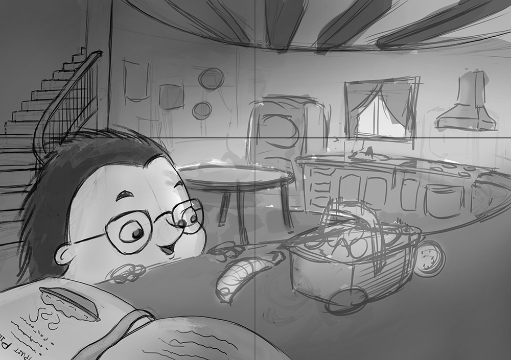
Also, I started cleaning up another sketch for the book and wanted your opinion on it. I didn't post thumbnails and comp sketches for this one because... well I can't really post thumbnails for all the sketches of the book because I will overload the forum haha! But I would really like your opinion on it before I finish cleaning it! There will be text in the upper left and lower right corner (I was thinking of having reverse white over dark text). Also, it's a double page spread. Thanks!!
-
@NoWayMe I like it a lot. Depending on the final style you are going for you could maybe push the forms a tiny bit more to make them more whimsical*. You are already kind of doing it (for example: the window and refrigerator are not exactly perfect squares, etc.) but you could probably push the stairs a bit more (it's looking a little more "exact" than the other objects).
Obviously the really tricky thing is to walk the line between "whimsical form" and "this artist doesn't really know how to draw" but when it's done well it adds so much charm and interest.
*Does that make sense? I can try and explain it better if it doesn't.
-
Hi @mattramsey ! It does make sense and I definitaly want it to be more whimsical! I noticed this morning that in the process of trying to get the perspective right on my staircase, it lost it's charm! I will definitaly work on that, thank you

-
@NoWayMe I like this composition a lot and I think that the other one is good too. I'm not an expert but I like what you're doing
