Third Thursday April 2016 WIP
-
Hi Everybody! This is my first post ever at SVS and the first time I participate in the Third Thursday challenge. I absolutely love the storytelling aspect of it.
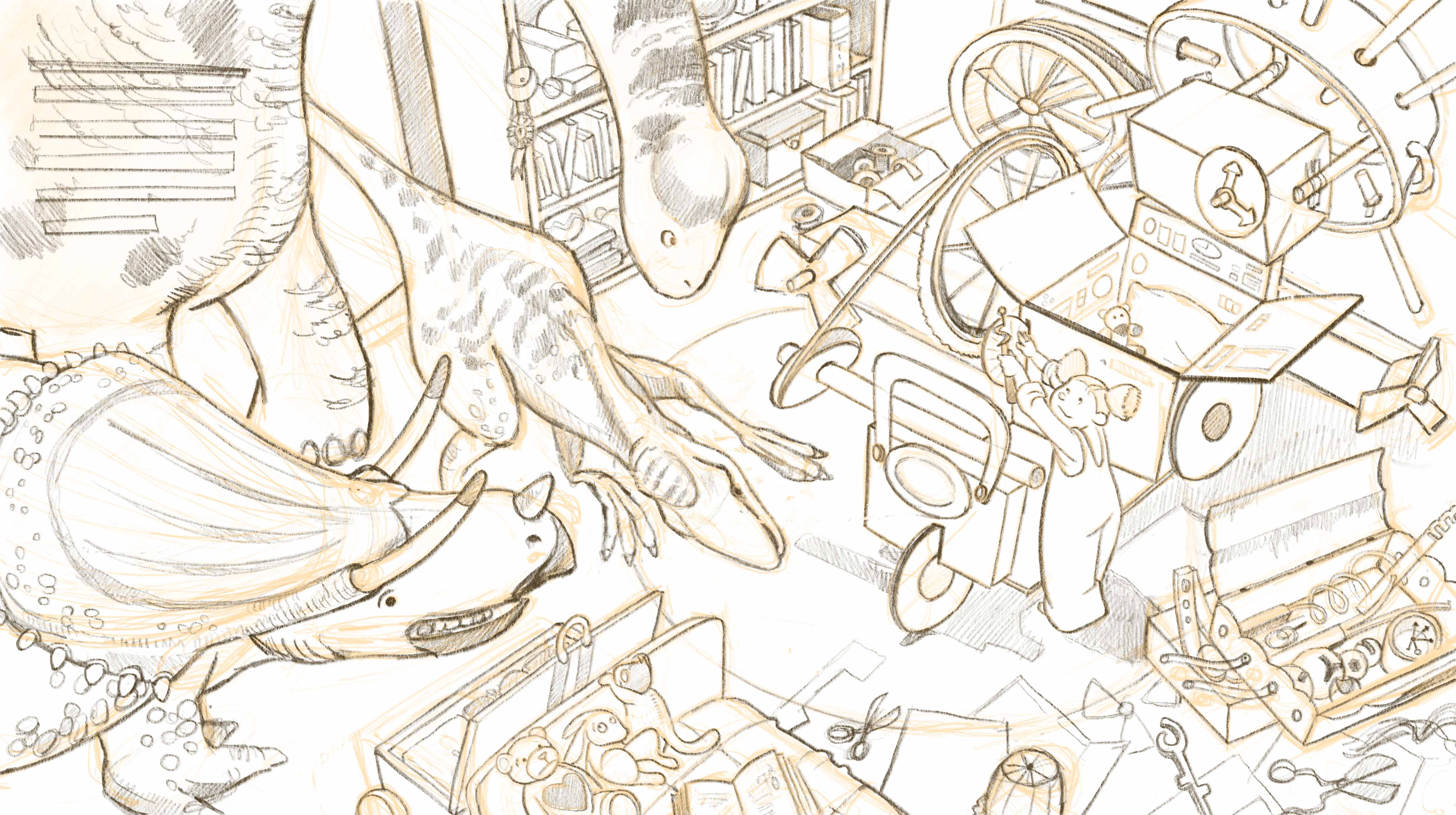
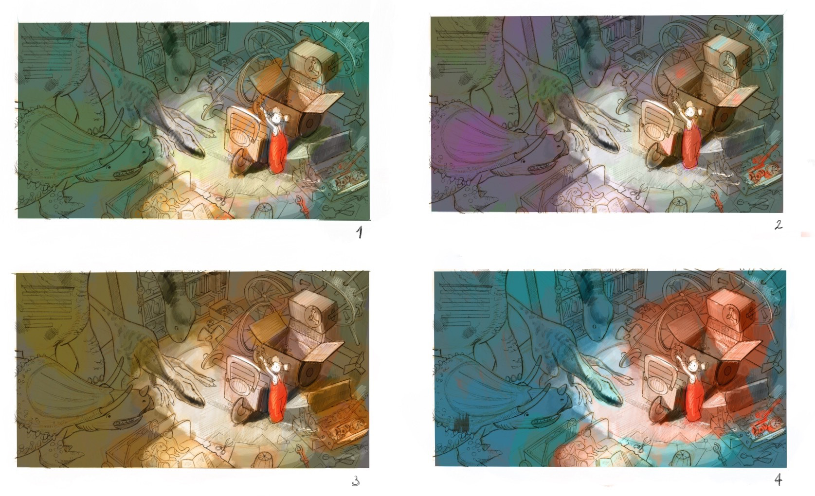
My concept is that Lucy has built a time-machine with her magic toolbox - but this has malfunctioned and brought a bunch of dinosaurs in her room, so now she is setting out to fix the machine...and the situation!I am at the value and color-study stage, and would really like some input on which color scheme to pick - and of course on anything else that could be improved in the design and composition! Thank you!


-
Awesome idea! I think number 4 works best. It looks really strong.
-
Wow, this is massive awesomeness.... I like #2 and #4. Can't wait to see the finish on this.
-
@smceccarelli Just Wow!....Wow...
-
@smceccarelli nice work, I think 4 works best, more complimentaryish colors then the others.
What time of day do you see this being set in is the question though?
Is the light going to be an overhead spotlight thing or is it more directional light from the open? The shadows read more directional.
Great piece can't wait to see it in color. -
I think I like #1 the best, but they are all really great. Very nice composition!
-
@Rich-Chabot - Thank you, very important question. I was imagining this to be an overhead spotlight at night, though I have still to plot the shadows correctly. I always hear that children´s illustration that is too dark is sometimes a problem. Do you feel this may be getting too dark?
-
very nice drawing!
-
Beautiful work @smceccarelli !
I think all of your colour studies work, I personally like #4 though, it really pops for me.
In terms of your drawing, everything looks great to me except for Lucy. I think you have her perspective backwards: she's got a little peanut head and large feet - but looking down on her she should have a large head and taper towards her feet instead. The dinosaurs are simply awesome!
-
@DanetteDraws Thank you, I believe you are right! I will look into that!
-
I prefer thumbnail 1 because of the more neutral box allowing a stronger contrast between Lucy, the boxes (time machine), and the dinosaurs.
I agree that Lucy's perspective needs to be fixed with her head becoming a little bigger and her body getting smaller the further away it is (even if it is only a slight change). This will help her feel more dynamic.
I don't personally feel that that the pictures are too dark for a child's illustration. I especially like thumbnail 1 because it feels the least dark with how you've worked with the lighting so far and because of the warmth of the light that is present.
-

Thanks for all your input! - I chose the most favorite color scheme (number 4) and changed Lucy's proportions as Danette suggested.
Now I need fresh eyes to look at it - I cannot watch it anymore... do you see anything that needs tweaking?
I have done this entirely in ProCreate - a challenging project is my way to learn a new workflow, and this has certainly done its job! I will probably post a "first ProCreate experience" on my blog later next week. -
I think that looks great, The values and composition work really well. Great drawing
-
@smceccarelli WOW! You've really got something special going here!
-
@Suzy-Heitz Thank you! The more I look at it the more I see stuff that may or may not need fixing...calling a piece finished is always a struggle for me.
-
I agree, this is special. I think the dino in the light needs a shadow. I like the splashes of color around the bottom right, could you do the same with the dins or their area? This is a real winner, congratulations.
-
@smceccarelli I think calling a piece finished is an artist struggle everyday! Looks great, tons of details. Well done!
-
Oh, this is amazing!!! I second the hard shadow on the dino in the light, and a bit of rim lighting on the snouts of the closer dinos wouldn't hurt.
-
Thanks for all the input - I have implemented almost all of it!
Sorry for the silly question, but how does it work with the challenge? We just turn up at the GoToMeeting and cross fingers that our work is one of the six selected, or do they get announced before? It will be at 5am in this part of the world... -
@smceccarelli Looking forward to seeing the finished piece! They don't announce anything beforehand, keeps the excitement for the 'live' class
 It's 4am for me too but worth it...if you get to the classroom early there's banter and chat beforehand which I like because it feels like a real class that we're all attending
  But if you can't make it, then the next day the recorded video goes on YouTube.
PS don't think I said hi before..welcome to the forum
