Not really an illustration, but I would still appreciate your opinion!
-
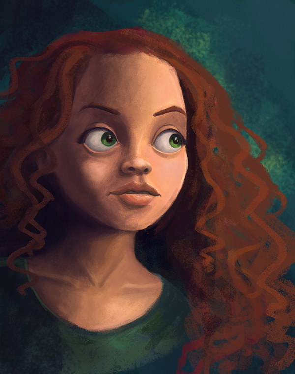
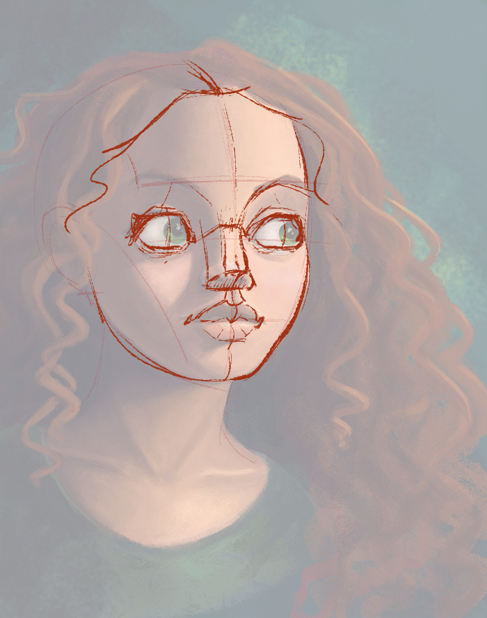
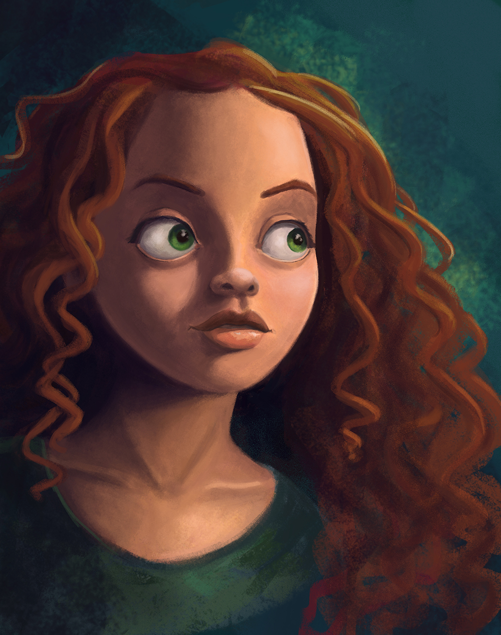
I did this "caricature/portrait" this week-end, started out as a quick sketch, but then I started painting it and I kind of like it... I wanted to share it here to see if anyone has idea to improve it. It is based on my wife, I tried to imagine what she would look like in a Pixar movie and came up with this!
-
It's hard to critique portraits because they are so personal (wifey) Reminds me of Merida from Brave. Great skin and shading. Hair needs more work but I'm sure you aren't done with that. The only thing at gives me pause is the eyes. They seem a bit big (startled) and the green iris seems to poke out a bit meaning it doesn't lay flat with the white of the eye.
Great work so far."Never give up! Never surrender!" ~Commander Peter Quincy Taggert
-
It's a great image. A couple things that might help. You need some more reflections in those eyes. Remember that not only the light source is going to reflect in them the whole background has light bouncing off it..so think of what is around her and reflect that into the eyes trees, clouds, objects in the room...paint that scene onto the eyes in a different layer and make sure it wraps around the the eyes. Then turn that layer down until the reflection looks right.
Then you have the subsurface scattering the light hitting the nose and cheeks some of that light penetrates the skin and bounces around inside...when it comes out a lot of the other colors of light get filtered out but not the reds. The light goes in one color but will come out the other side a lot warmer and it will light up the shadow side a bit (think of a leaf if you look at a picture of a leaf the lit side will be a cooler color because it is lit from the sky overhead but when that light is filtered through the thickness of the leaf and the opposite side of the leaf is a lot warmer). So throw some warmer and more saturated tones right after your light terminator on the shadow side.
You have a little reflected light showing on one side of the face...I would make it a little more pronounced but keep it to the cool side and make sure you also show it in the hair...if it affects one thing it needs to be affecting everything.
Your cast shadow...again if you look at some cast shadows they'll have a super thin line of saturated color running right along their outline.
In the hair remember that towards the root of the hair it will be more saturated (Again because of subsurface scattering the light goes in and comes out warmer and more saturated. So, you'll have the real highlight where the light hits and then the more saturated highlight towards the root where the light has been filtered and comes back out warmer....Also remember the different zones of the face forehead is yellower, mid face and nose is redder, bottom of the face is cooler. Sorry for writing a book. Hope some of this makes sense and helps. I just finished a painting class and this stuff was crammed into my brain. Of course this is only if you want to make it more realistic I'm not sure what your intended direction is for the piece.
-
@Katrina-Fowler Thanks! I am definitaly not done with the hair and I'll rework the eyes also
")
@evilrobot Wow! Great comments! I never took an actual painting class, I did some charcoal portrait studies and I am trying to apply this to my painting, but it's not exactly the same haha! I really appreciate this
-
Just wanted to say I had a look at your charcoal studies on your webpage. That's some beautiful work.
-
@evilrobot Thank you so much
I checked your website this morning as well, nice illustrations! ")
noemiegionetlandry.squarespace.com
noemie_illustration on Instagram -
@NoWayMe @NoWayMe Hey Noemie - I really like your painting - i hope you don't mind i did a quick paint over to try and show what i am thinking - i lost some of the quality that is your wife i'm sure but i think a couple of things might have worked that i tried - mainly i wanted to soften the gradients and add some hard edges - i looks like the gradients are built up with a small brush and i wanted to try a large brush at a low opacity to try to smooth the ares like the forehead and cheeks - the very rightmost edge of her left eye (our right) needed to curve sharply back to show the shape of the eyeball too so i tried that - also tried to sneak more saturated color into the shadows to try and warm things up a bit - i remember Nathan Fowkes saying cool shadow will take the life out of a painting and showed also that areas in shadow on skin are almost invariably warm - @evilrobot explained things so well i feel a bit silly doing the paint over but i think i learn a lot when i try to do these - i just started on her left cheek...it looks flat near her mouth now but i thought maybe i was getting carried away.......and my daughter needs lunch
- really nice image....... it is what inspired me to try to paint my Lucy character sketch 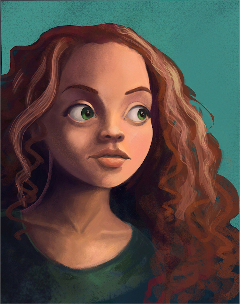
-
Hello everyone!
Thanks @kevin-longueil for the paint over, great tips!
I still have some work to do, especially the hair and adding more warmth to the shadow side but I wanted to post an update anyway!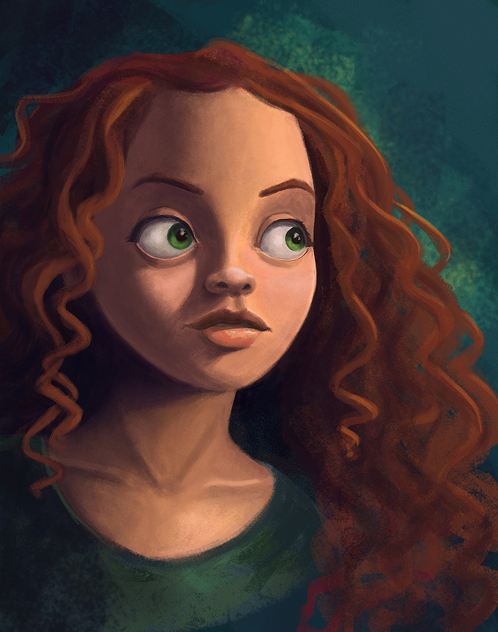
-
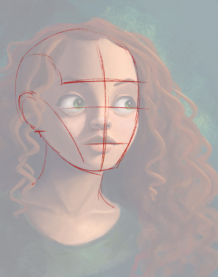
good looking design here! The one thing I wanted to critique is the drawing. It seems your head is drawn sort of from a front view, but has elements that look almost like a slight 3/4 view. So basically you have to figure out your structure.
Based on the head location over the neck, I feel like a slight 3/4 view would work here and your features need to be adjusted to fit it. You could also do a straight on front view, and the features would need to be worked towards that as well. For this crit I did a draw over based on the 3/4 view.
You can see in the basic sketch that some parts work just fine as you have them. However, the nose is drawn too far from the left and off the center line. The nose also needs to be redrawn with that slight angle and not as a straight on view. Same thing for the mouth shapes. Use your center lines as a guide and it will always show you what to do. : )
Here's a quick block in using 3/4 view shapes....
SVS Faculty Instructor
www.leewhiteillustration.com -
@Lee-White Thanks a lot Lee! I am currently away from home (so away from my Cintiq) but I will get back to this as soon as I get back home. I really appreciate your critique, great point!
-
I love the colors you chose! I really like the portrait.
-
I made the changes @lee-white pointed out about construction, and it made a big difference! (thanks!) I might do a little bit more rendering on it, especially background/shirt, but it's pretty much at the limit of my technical abilities right now haha! Does anyone else has suggestion on how I could improve it further ? Does the structure/construction look OK with the corrections I made ?
Thanks!!
-
It's looking pretty nice I'm digging it. Good work.