Thinh Nguyen: Through The Busy Bazaar
-
Hi there!
My name is Thinh Nguyen, and I'm a freelance illustrator living and working in Orange County, California. I also work as an art instructor and creative developer at an art studio for kids during the day, so working with kids has given me a lot of great insight to their behaviors and what they like. I mainly have experience in editorial illustrations, but have explored during children's book a little during college. It's been a challenge figuring out how to translate my editorial/surrealist style into children's books, so I took the Illustrating for Children's Books with Will Terry and Jake Parker earlier in the year. I've started the sketch but never finished the whole illustration until now. The illustration is rendered with acrylic washes on watercolor paper, titled "Through The Busy Bazaar." I'd love to hear any feedback!
")
Best,
Thinh Nguyen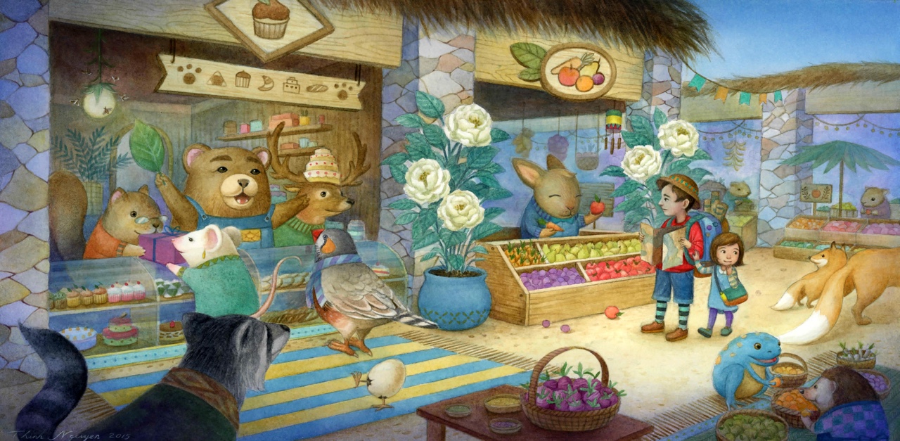
-
very nice. Though the flowers are very distracting, and the main character need more contrast.
-
I agree with Steve...I'm not sure who the main characters are. That being said there is a lot of great things about this image. Well done!
-
Hi Thinh, Thanks for posting your work. I'd like to start by saying how lovely your drawing style is and your control of the medium is quite nice. You look very comfortable with your process and it shows.
I think what Steve and Rob are really pointing at is your focal point isn't defined very well for a number of reasons. You did add the lighting to the dad and the girl, which is a great start, but the lighting falls off of the characters. They look like they are actually in shadow. Then the bears face is illuminated a bit too much so my eye is just jumping around all over the place here. The next thing that might be hurting this image a little is almost all the elements in the scene are practically the same size. You really have to create a dominate shape and then supporting shapes to pull off a complicated scene. That's what Will does SO well and why his images just feel "right".
In this quick paint over I cropped in a tad and lit the figures a bit more. I did it quickly, so it might be too light/dark for a real final piece, but it shows how we can emphasize our main characters a bit more. I darkened the map he is holding to try and simplify the shapes and value. The best advice I ever heard (and give often) is light shapes over dark shapes or dark shapes over light shapes. So watch out for controlling too much value with gradients if you can help it.
Really beautiful work and I can't wait to see more from you!
Cheers,
Lee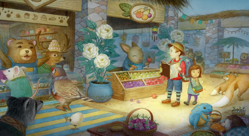
-
I really enjoy those characters and their personalities. Yes focus point will take this piece to another level, and I can't wait to see more!!!
Great work! -
Thank you so much for the input/feedback everyone! And thank you Lee, for the in-depth analysis/paint over! I think the hardest part about working on this illustration was to decide what looks good visually versus what makes sense (in my mind). I wanted the focal point to lead up to the kids, but I also knew that making the left side (the bakery) needed to be warm and inviting. I was hoping the vignette could concentrate the focus even more towards the kids, so perhaps I can push it even more.
Hope to post more works and I'm excited to see everyone's wonderful illustrations! Thanks all!
")