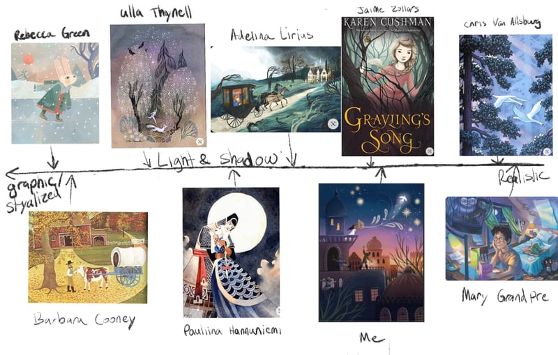
Stylized to realistic light & shadow scale
-
I just finished skimming through the Light and Shadow for Illustrators course, making sure I didn’t have any holes in my skill set (as usual I found a couple!
 ). In one of the last videos in the course @Lee-White showed a scale like this one showing how different illustrators use light and shadow. I made my own like he suggested, using my favorite illustrators, and It was eye opening! For fun I threw one of my images in there too. The real ah-ha moment was when I realized you don’t have to use light and shadow consistently throughout a piece. You can just use it where you need it. So many of the artists I love use light and shadow selectively like this. Has anyone else done this assignment? I would love to see other peoples!
-
This is fascinating! Thank you for posting this! I love SVS
 So enlightening! This is true, light and shadow does not need to used everywhere. And further, I see how it helps to know how this rule applies and how it can improve the way you plan a composition!
I need to get back to doing the courses, you have really highlighted this point for me. THANK YOU
-
@kirsten-mcg Great work! love seeing the assignments and suggestions from the classes. : )
-
This post is deleted! -
@Stephanie-H I just went and looked at yours. It's so interesting to me how some of the most stylized work is placed higher up on the scale, because shadow is used in a more realistic way. Thanks for sharing!
-
@kirsten-mcg Great chart! I've forgotten to do mine but it's a great exercise because it allowed me as well to realize what are the thing you need to keep in mind if you want a more realistic or stylized artwork. Love all those illustrations!