Kamari Wip - which one?
-
Hi guys,
Kamari gave me many ideas, but which one is the best one? I always have trouble choosing, so which do you thing suits best 'Is this the end of the road for Kamari, or is it just the beginning'?
So here goes, bear with me, I have six of them:1
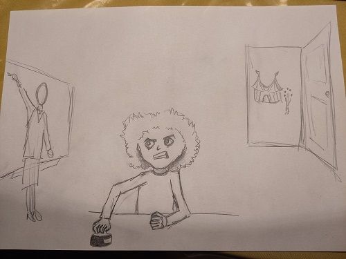
2
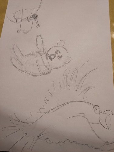
3 - Because you can't see it on the sample, the village sign reads Kamari
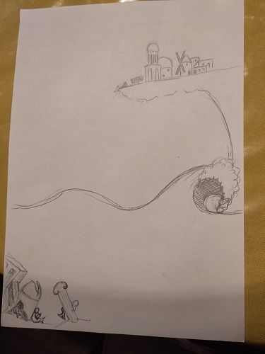
4
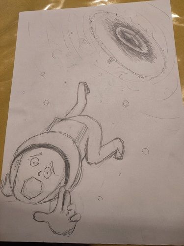
5
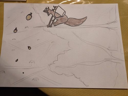
6
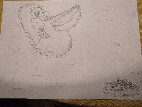
-
@Chantal-Goetheer I love your idea number three, so clever to make Kamari into a town. I am also a huge fan of things balancing precariously on cliffs, so...
 I think that you could do a few alternate comps, though, to highlight the life going on under the sea, but that will come later.
Good work on finding so many angles, I'm struggling to even find one.

-
@Chantal-Goetheer I agree with @Mia-Clarke the town is very clever, I’d try some other angles too.
-
I agree with the others. I like one with the town on the cliff. Its a unique idea. This is one of Brett Helquist’s illustrations for “The Wide Window.” (Its one of the series of unfortunate events.) Its just one house on the cliff, but it might give you good ideas for composition.
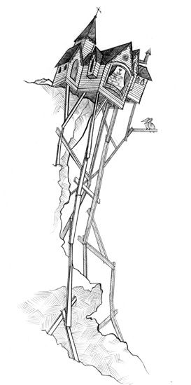
I also like number 2 because I think its easy to read that story. Maybe the bird could be swooping in to save the bear though… just to hit the whole, “maybe its not the end” thing. https://www.google.com/url?sa=i&url=https%3A%2F%2Fwww.bretthelquist.com%2Fun%2520window%2520tippy.html&psig=AOvVaw2TbxgSDL3MxvUoeqfT0Bq7&ust=1667614423241000&source=images&cd=vfe&ved=0CAwQjRxqFwoTCMDAmIu6k_sCFQAAAAAdAAAAABAD -
@Chantal-Goetheer I think your story is most clear in 2 and 3. 3 is my favorite because making Kamari into a town is really unique, and the composition is already so fun. If you go with that one make sure to really push the city-on-the-edge things (cars falling off, tree roots and pipes hanging out underneath, etc.) and make it clear to the viewer that once it's under the water it won't be just a ruined city, but will truly have a new life.
-
@kirsten-mcg @Asyas_illos @Mia-Clarke @Pamela-Fraley thanks so much for your feedback!! I'll continue with nr 3 and maybe also have a go at nr 2. To be continued, lol. Will look into the creative composition classes to help.
-
@Chantal-Goetheer @Asyas_illos @kirsten-mcg @Mia-Clarke @Pamela-Fraley Tried some very general compositions to try to get away from this sideway view I had. Which is your favorite?
The circles on the bottom of the sea have to become mermaid kids building a hut from the debris that already came down before.
In C and D you would see the stuff in the bottom of the sea through the sea itself. I think those won't make a clear story. Love to hear your thoughts!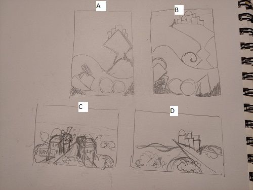
-
@Chantal-Goetheer I think B is the strongest of them all, you’ll really be able emphasize the crack in the rock that way, and you’ll be able to show the under-sea life. You can keep the rendering of Kamari very low, which I think will give the image a nice balance.
-
@Chantal-Goetheer sorry, double posting, I forgot to say though that I think you should shrink the size of Kamari in the B comp, right now it’s a but heavy in the top. Draw the perspective up a bit and shift the town higher into the sky, and I think you’ll have a smashing layout.
-
@Chantal-Goetheer I agree with what Mia said about B. I like it, but I think you could make it a bit more precarious looking. I also really like D a lot though. You can get both the city and the water and there is potential for it to be dramatic.
-
@Pamela-Fraley @Asyas_illos @kirsten-mcg @Mia-Clarke This is the basic lay-out I'm planning now. I like the mermaids building from the rubble. Not quite happy with the wave yet. Is it more precarious looking this way? Any ideas of how to fix the wave perspective? Many thanks for all your help and views!!
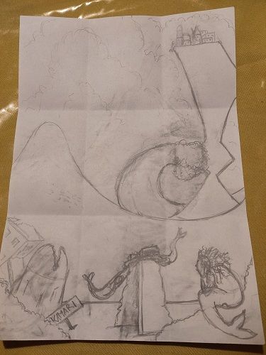
-
@Chantal-Goetheer I think your sketch is very promising. I wouldn't worry about perspective on the wave, but rather treat above and below water as kind of separate perspective boxes, with the water not following either. As I'm typing this I realise I'm not making much sense. Hold on!
(....3 minutes later....)
This is what I mean. Sorry about the rough sketch, I just can't describe it with words.
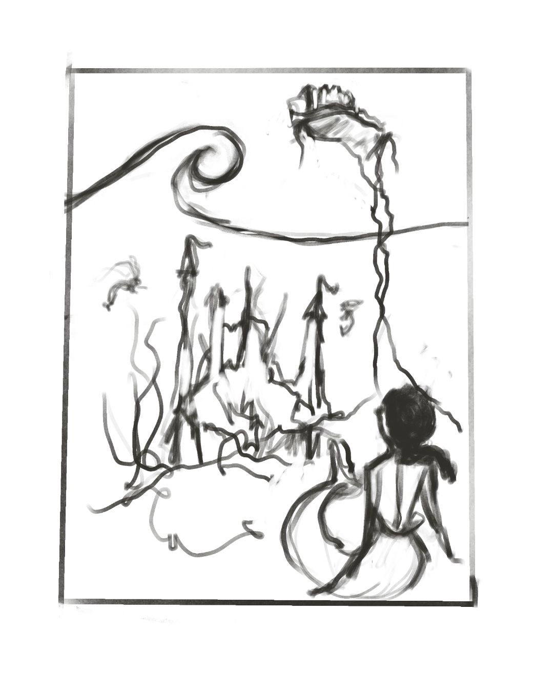
-
@Mia-Clarke thanks!! You're right I get it.
-
@Mia-Clarke Thanks again so much for your help!! I looked at your sketched and instantly saw where mine wasn't working. It gave me food for an other try. So here goes. Much happier with this one. Couldn't have made this next leap without your sketch!
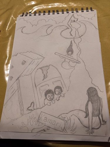
-
@Chantal-Goetheer Great work, and good to hear I could be of help.
 ️
️ -
I think your comp can work with a just a couple adjustments I too did a draw over to show how I would rework it. Hope it provides help in someway
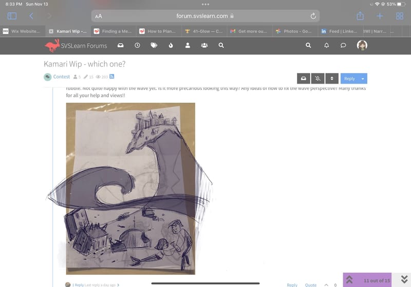
-
@Asyas_illos thanks so much! Always thrilled to see how much better you guys can make my ideas. I should have tagged you in the newer version I made based on Mia's sketch. But this one also looks really nice.
-
@Asyas_illos @kirsten-mcg @Mia-Clarke @Pamela-Fraley Before I'm going to make a final version I'd love to hear your thoughts on this one. I'm struggeling with the rocks looking like a rock and picking colours. Maybe I should define it more as rocks? But it needs to stay a lighter value. I do like the blue/green theme and my waves. My husband thought the rock was a path and didn't feel like the mermaids were under the sea...
And do you know what makes my work always look amateur? Clearly I am, but what should I work on most in general? Many thanks again for all your help!!! Always in awe of your very pro looking work.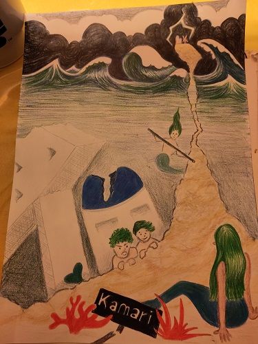
-
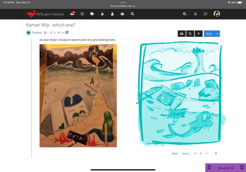
@Chantal-Goetheer yes it does look a bit like a path, you can fix this by adding a clear separation where the top of the water is, and by separating the layers with rocks or debris. By layers I mean background, middle ground and foreground. Right now you have the village very small as if it’s in the background, but it connects to the foreground causing a bit of perspective inaccuracies. Also to help with the feel of underwater you can add fish and have the mermaid’shair flowing. One thing that stands out to me is the two characters peeking over at the mermaid, what are the doing? One appears to be angry and yelling, I only ask because I think they are complicating the story not adding to it. I think if you were to have them interacting with the debris somehow showing how the mermaids are using “Kamari” would show the new beginning.
-
@Chantal-Goetheer Its hard to put a finger on what makes something look “amateurish.” It’s a combination of things working together that make them look professional and when your learning all the things at the same time, sometimes, certain components work better than others. Composition, lighting, line work, value structure, color balance… On one of the Podcasts they talked about it like a golf swing. Theres a hundred things you need to pull off to get a perfect swing, but you can’t focus on learning all of that at once, so one day you focus on how to put your hands on the club and a different day you focus on your feet, etc…
Sometimes I get discouraged and feel like I’m never going to get there. But, it just takes a lot of mileage with your pencil and a lot of studying. Also, a lot of patience with yourself.
For this piece, I think pushing the value to your focal point would be helpful. I also like the draw over Asya did. I think fading that line of the rock and making the waterline go over it would fix a lot. Its a tricky perspective piece to pull off. As for the underwater feeling… Its a little harder working traditionally, but you maybe could do a light wash or something over top of the whole underwater portion. Look at some reference photos - like finding Nemo or something - to see how they did it. Sometimes its that the picture fades and gets darker around the edges, or particles or sunlight in the water… I would make the mermaid in the foreground have more floaty hair too. It doesn’t need to stand straight up, but it wouldn’t be laying flat under the water either. I hope thats helpful!