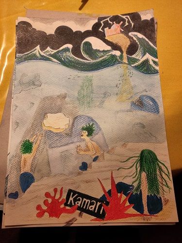
Kamari Wip - which one?
-
@Chantal-Goetheer I agree with what Mia said about B. I like it, but I think you could make it a bit more precarious looking. I also really like D a lot though. You can get both the city and the water and there is potential for it to be dramatic.
-
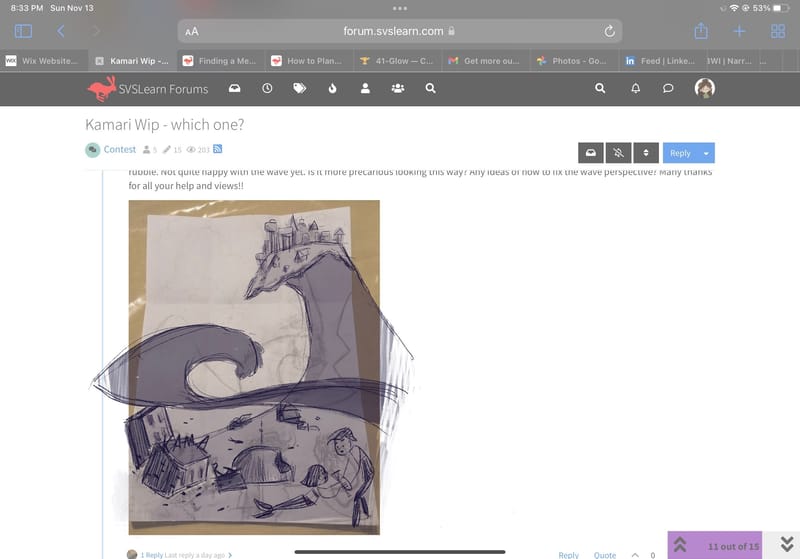
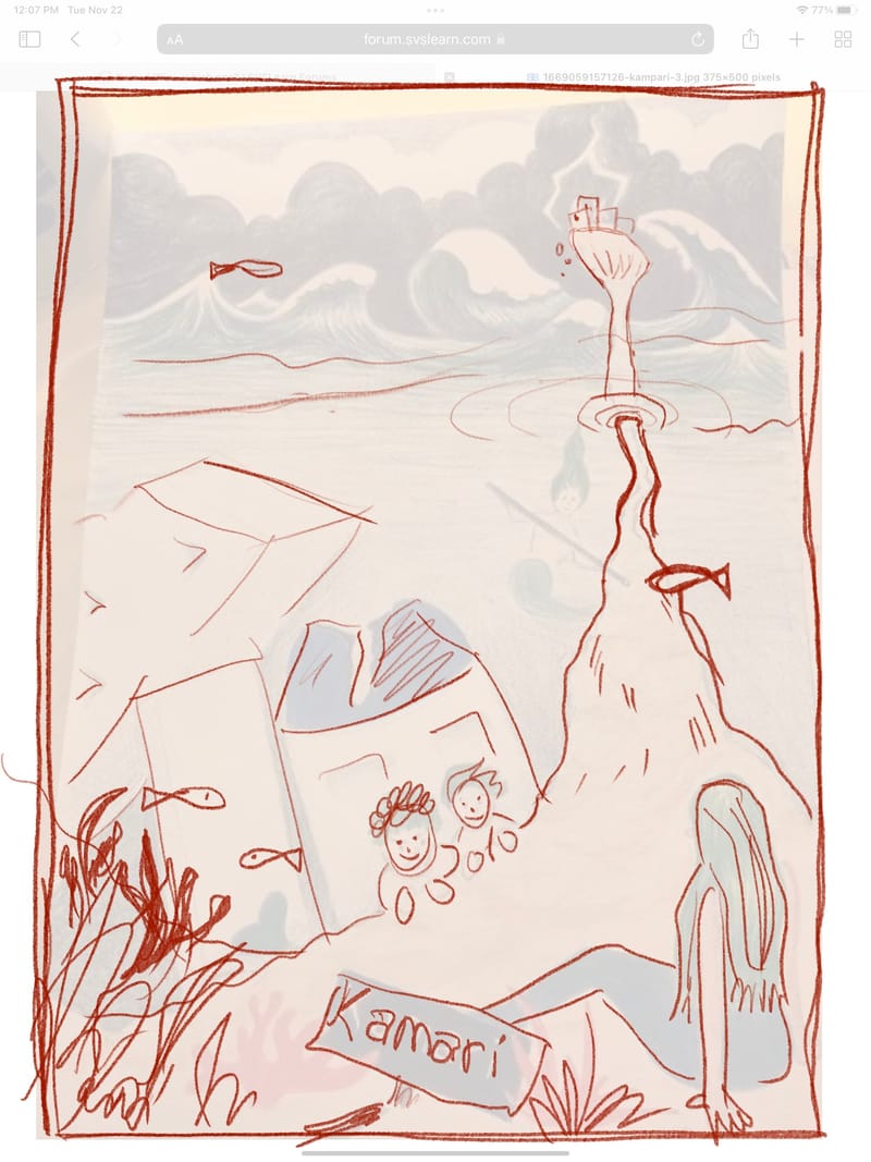
@Pamela-Fraley @Asyas_illos @kirsten-mcg @Mia-Clarke This is the basic lay-out I'm planning now. I like the mermaids building from the rubble. Not quite happy with the wave yet. Is it more precarious looking this way? Any ideas of how to fix the wave perspective? Many thanks for all your help and views!!
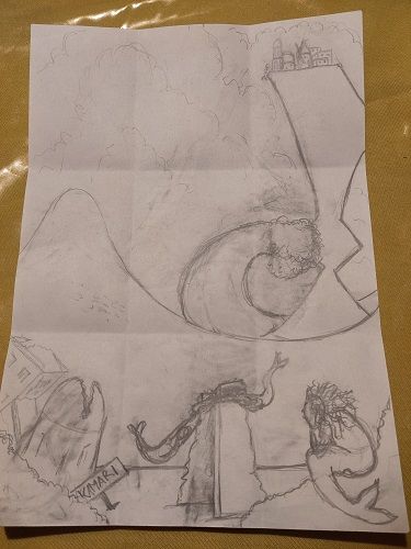
-
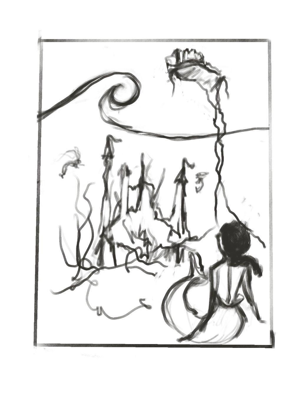
@Chantal-Goetheer I think your sketch is very promising. I wouldn't worry about perspective on the wave, but rather treat above and below water as kind of separate perspective boxes, with the water not following either. As I'm typing this I realise I'm not making much sense. Hold on!
(....3 minutes later....)
This is what I mean. Sorry about the rough sketch, I just can't describe it with words.
-
@Mia-Clarke thanks!! You're right I get it.
-
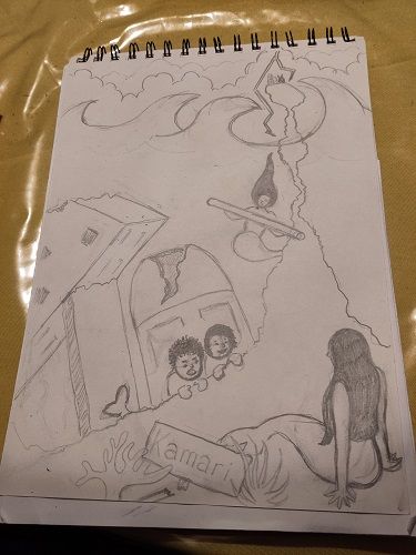
@Mia-Clarke Thanks again so much for your help!! I looked at your sketched and instantly saw where mine wasn't working. It gave me food for an other try. So here goes. Much happier with this one. Couldn't have made this next leap without your sketch!
-
@Chantal-Goetheer Great work, and good to hear I could be of help.
 ️
️ -
I think your comp can work with a just a couple adjustments I too did a draw over to show how I would rework it. Hope it provides help in someway
-
@Asyas_illos thanks so much! Always thrilled to see how much better you guys can make my ideas. I should have tagged you in the newer version I made based on Mia's sketch. But this one also looks really nice.
-
@Asyas_illos @kirsten-mcg @Mia-Clarke @Pamela-Fraley Before I'm going to make a final version I'd love to hear your thoughts on this one. I'm struggeling with the rocks looking like a rock and picking colours. Maybe I should define it more as rocks? But it needs to stay a lighter value. I do like the blue/green theme and my waves. My husband thought the rock was a path and didn't feel like the mermaids were under the sea...
And do you know what makes my work always look amateur? Clearly I am, but what should I work on most in general? Many thanks again for all your help!!! Always in awe of your very pro looking work.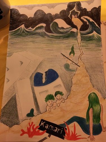
-
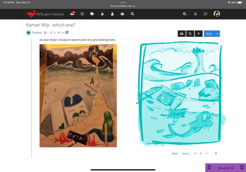
@Chantal-Goetheer yes it does look a bit like a path, you can fix this by adding a clear separation where the top of the water is, and by separating the layers with rocks or debris. By layers I mean background, middle ground and foreground. Right now you have the village very small as if it’s in the background, but it connects to the foreground causing a bit of perspective inaccuracies. Also to help with the feel of underwater you can add fish and have the mermaid’shair flowing. One thing that stands out to me is the two characters peeking over at the mermaid, what are the doing? One appears to be angry and yelling, I only ask because I think they are complicating the story not adding to it. I think if you were to have them interacting with the debris somehow showing how the mermaids are using “Kamari” would show the new beginning.
-
@Chantal-Goetheer Its hard to put a finger on what makes something look “amateurish.” It’s a combination of things working together that make them look professional and when your learning all the things at the same time, sometimes, certain components work better than others. Composition, lighting, line work, value structure, color balance… On one of the Podcasts they talked about it like a golf swing. Theres a hundred things you need to pull off to get a perfect swing, but you can’t focus on learning all of that at once, so one day you focus on how to put your hands on the club and a different day you focus on your feet, etc…
Sometimes I get discouraged and feel like I’m never going to get there. But, it just takes a lot of mileage with your pencil and a lot of studying. Also, a lot of patience with yourself.
For this piece, I think pushing the value to your focal point would be helpful. I also like the draw over Asya did. I think fading that line of the rock and making the waterline go over it would fix a lot. Its a tricky perspective piece to pull off. As for the underwater feeling… Its a little harder working traditionally, but you maybe could do a light wash or something over top of the whole underwater portion. Look at some reference photos - like finding Nemo or something - to see how they did it. Sometimes its that the picture fades and gets darker around the edges, or particles or sunlight in the water… I would make the mermaid in the foreground have more floaty hair too. It doesn’t need to stand straight up, but it wouldn’t be laying flat under the water either. I hope thats helpful! -
@Chantal-Goetheer p.s. I’m loving the way your waves at the top of the water are looking! It looks like you had fun doing that.
p.p.s I’m not sure exactly what you should work on. But, I have found a lot of help in doing master studies, in between my own projects. Lee has a method on how to do them, but I cant remember where that is. Do you remember @Asyas_illos ? -
@Chantal-Goetheer this is a tough one! I did a couple draw overs and really struggles with understanding the perspective. I went and looked up a couple of references and I think I understand better what’s happening. I think in order to pull off a cutaway image like this it would have to be much taller. I did a quick thumbnail so you can see what I mean. That option would require a complete re-draw though.
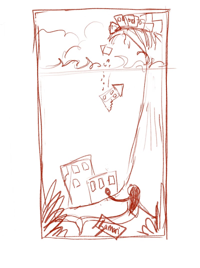 something like this.
For the view you have, I don’t think a cutaway image works. I think you would need to change it so that you’re looking up at the crumbling cliff through the water…which would mean you couldn’t use your cool wave design (which I love!). Something like this.
These are the references I used to see this.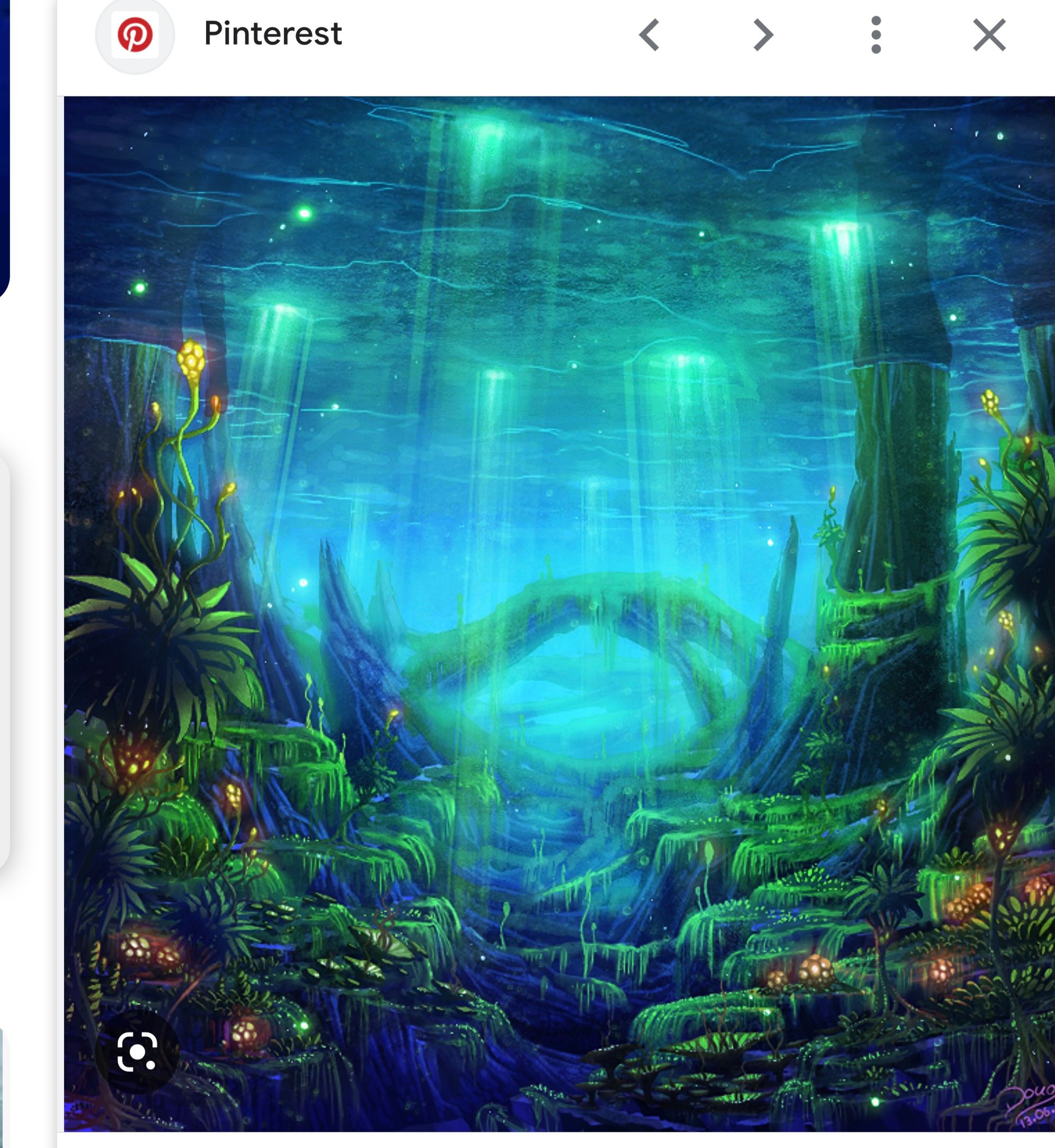
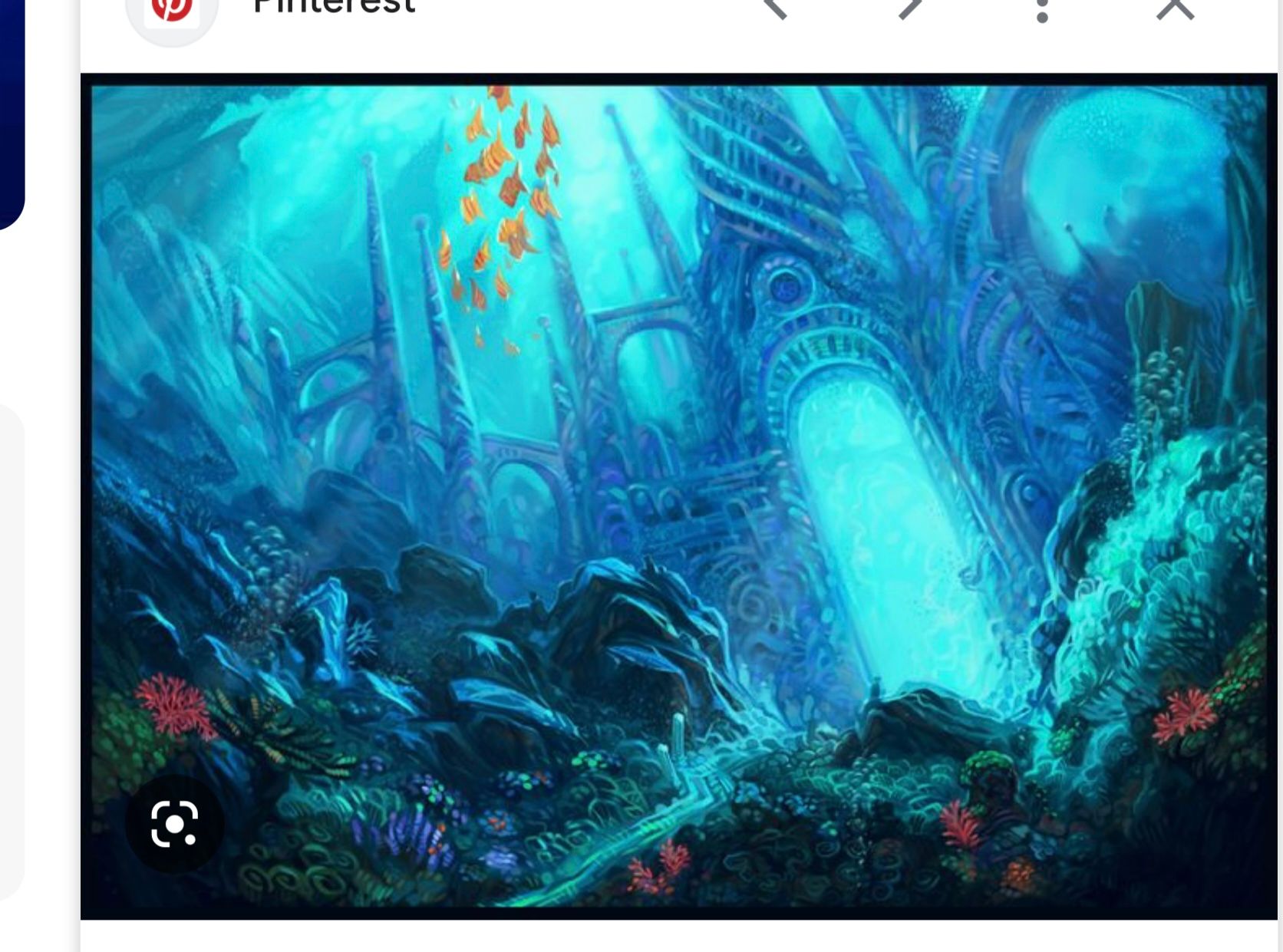
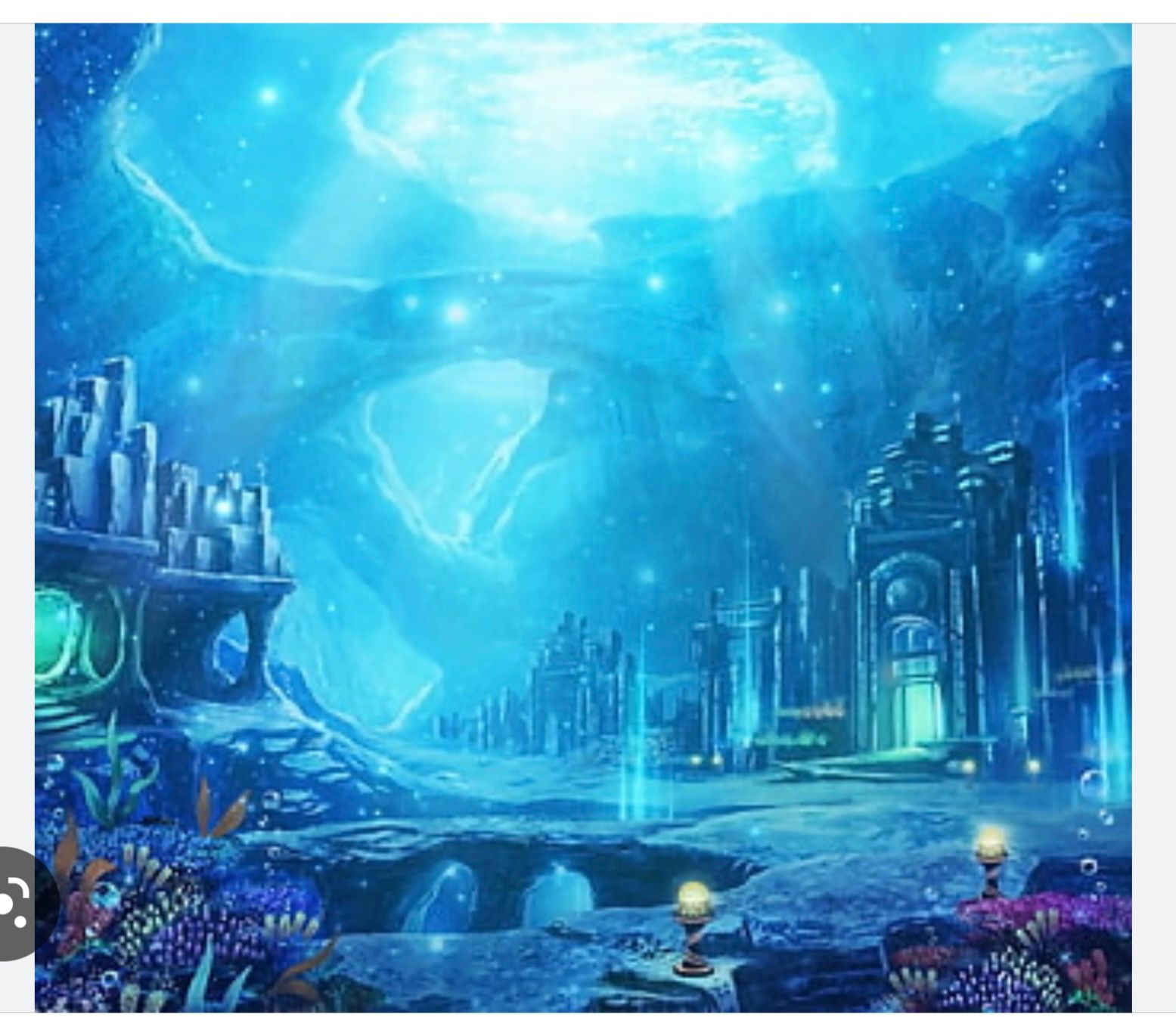
Working traditionally you can do a light blue or blue green watercolor wash over the underwater portion to give it the apprearance of being underwater. Underwater light is very blue.
-
@Chantal-Goetheer I agree with @Pamela-Fraley that it is hard to pinpoint exactly what makes work feel armature. I think there’s a lot that goes into it. I don’t know if you’ve worked your way though the SVS foundations courses yet, but I think those will do the most for you as far as moving your work away from the amateur realm and into the pro realm. I know understanding how to design an image really helped my art progress. Really focusing on those classes and doing the assignments until you feel you have internalized what they are teaching should be very helpful. It’s also just mileage though. Just keep trying and practicing!
-
@kirsten-mcg I like that one you did with the piece of the city falling into the water. I think it makes a really nice connection between the two places and makes it read a lot clearer.
-
@kirsten-mcg thanks so much! I am completely re drawing it again
 . Will see what comes out of it. Sometimes I think I should try digital. Skips all of the many versions, but then it's the same issue with millage as well and Id still need to re-draw stuff often. And don't enjoy sitting behind a computer. I'm working on the foundation courses still. There is always a lack of time. Next month I need to make more of a plan and make the prompt in a way that lets me work on the basic principles more and going for simpler instead of complicated
 .
. -
@Asyas_illos thanks so much!! I'm currently re-drawing again using your draw over as inspiration. It sucks up so much time, but learned a lot from you guys. The draw overs really works so well. Did my own draw over with black marker on my own work to figure things out more. To be continued... cliffhanger

-
@Pamela-Fraley thanks for your help and kind words! I remember the golf episode. Luckily I can happily and with frustration spend hours drawing and thinking about it day after day, so I just keep going. Already Im so happy I broke through my being stuck phase to draw anything because it would not be as I had in mind instantly. It has kept me back a decade. With my chronic lack of time I just need to figure out how to study smarter. I was thinking of master studies and should really start with the simpeler ideas before moving on to these hugely complicated ideas
 . Thanks again!
 -
@Chantal-Goetheer Good for you for re-drawing again! I know how frustrating it is to get part way done and then have to start over. But the 2nd attempt usually comes out so much better. And it's my personal opinion that doing traditional art makes you better at digital. You really learn a lot when you take away the ability to endlessly re-do.
 Keep plugging away at the foundations. Slow and steady wins the race.
-
@kirsten-mcg @Asyas_illos @Mia-Clarke @Pamela-Fraley here goes again. I think this was my last attempt at redrawing it. Not quite happy with the village up on the rock and the face of the kid. But it looks more underwater this way I think. Colourwise it's not quite working all together.
I need to find less textured watercolour paper because the waves and hair don't come out quite as nice and I like the combination of watercolour and coloured pencils.
Do you have any final thoughts on this one?