Help with a board book
-
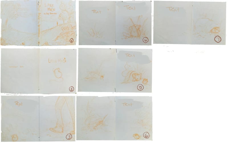
So, I’m doing this project for a friend. And, before people point out all the red flags in a situation like that… I’ll just say, I actually want to do this. Its special to me and I would do it regardless if I ever got any money for it. Its a semi-true bed time story my friend tell his girls about an encounter he had with a mouse. A couple years ago I got inspired and did a little mock up of it. I’m including those pictures because he loved it. (Picture 1) We are talking about just doing a print ninja run of this when its done. And theoretically, it shouldn’t take long since it’s only 8 or so pages.
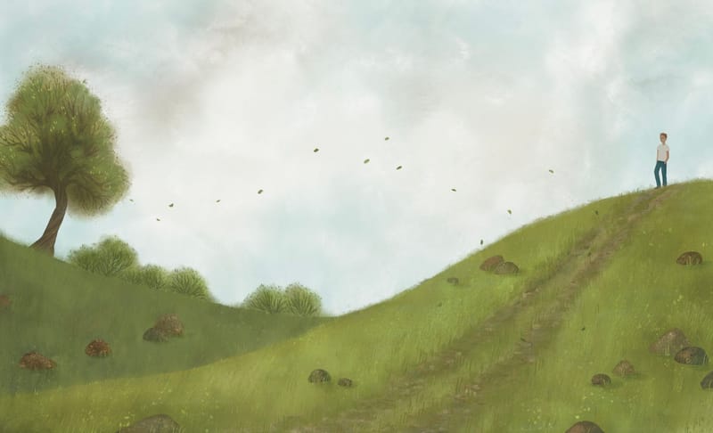
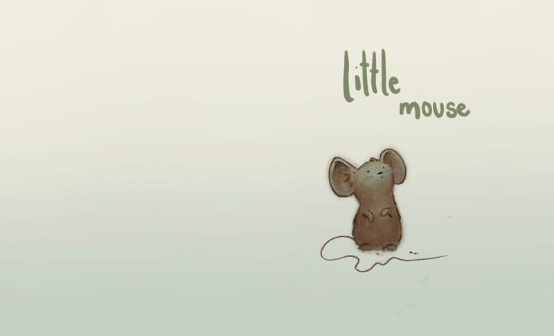
The problem is actually doing it. I’m seeing so many issues now that I’ve been in SVS for so long. Things are too close to the edge of the page etc. But, I still liked the basic idea. I was working on trying to get the cover image done over the last little while, and I couldnt figure out why it was bothering me till I realized how hard it would be to even see the mouse when I drew him - and he’s the whole point. (Picture 2) I’m pretty sure I’ll be scrapping the cover I have, and trying something new. (picture 3). But, now I’m just hating everything. I need some fresh eyes and feedback. I need to do this you guys. I think, psychologically speaking, I need to finish something so I know that I can. It’s been a huge mental battle for me to take on an actual project that involves more than one image. It’s scary.
-
THis really lovely, Pamela. I think you're off to an amazing start! Love the quiet palette you've chosen and the quality of your work is super. The sky is gorgeous and the tree is so graceful and wise looking. I already wanting to see more and more of this project based on your starts.
Have you tried overlaying the little mouse text/image on the hill scene?
-
@Pamela-Fraley LOVE your little mouse! So cute!
This is going to be a board book, you say? If so, you don't really have to worry about the gutter. There is still the 1/8" (0.125") bleed that will be trimmed off, so that does need to be taken into account. And most board books have rounded corners that will also be trimmed, so keep that in mind when you're planning spreads.
You've got a great color palette and such nice, soft scenes. Yes, most of the action on the spread with the man and the tree is happening around the edges so you might want to adjust that if possible. Looking at the thumbnails, it looks like you're leaving plenty of room for text and the flow looks good. (Of course, this is just going on the art, since we don't know the story.)
Keep going, you're doing great! And keep checking in with updates on this project; we'd love to see it and you might find that the feeling of accountability helps keep you moving forward. You can do it!
-
@lidia-ull thank you so much for the encouragement. I think part of the issue is closing the gap between how I see it in my head and what I’m capable of making. Perfectionism is trouble.
As for the cover, I think I’d have to rework the background and force the perspective a little bit more to not make the mouse look gigantic but still be big enough to see. If I put him in now in a way that fits the piece, he’s too small and it makes the title seem odd. “Little mouse” what mouse? You can’t even see him.
I was thinking though about using the original cover spread after the inside title page. Just to put it in there without words to set up the story and give a bigger context before the pages with text… would that make sense? -
@Melissa_Bailey thank you! I will definitely keep updating this. I’m glad the color palette is working too. I’m trying to limit it so it doesn’t end up everywhere, but I’m also painting in CMYK (because of printing) and it’s throwing me off a bit. Weird how CMYK is so much duller. But I like a muted palette, so I guess it’s okay.
 ️I’m glad I don’t have to worry about gutters, but I do need to think about those rounded corners… between me and my friend, we have zero experience with this stuff. It’s the blind leading the blind for sure. Haha!
 -
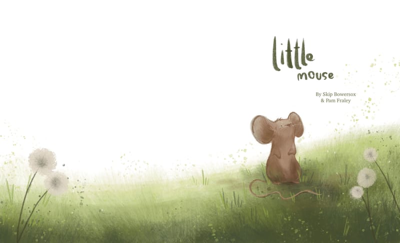
Here’s the revised cover I’m working on… one thing I know I need to improve on is merging the style of my characters with the environments… this still needs tweaking, but I think I like it better now. Any critiques? -
@Pamela-Fraley adorable!
What if “little” was smaller and “mouse” was larger? That might be a cute little tweak to try out…
-
@Melissa_Bailey oh! I will try that!
-
@Pamela-Fraley This is really cute. I love the colors and the softness of the backgrounds. The title is also in a nice font (or handwriting). I can read the mouse better in the previous version of the book cover than this latest version. I feel like I focus on its ears now rather than its cute face.
-
@Pamela-Fraley This is really cute! I think you're being a bit hard on yourself. The only that really jumps at me is that most board books are square (the spread is 1:2 ratio). If you formatted it that way, it would also give you more space and fix the cramped feeling you're talking about, and things being too close to the margins

-
I am on the same page with all the other feedback about your beautiful palette, overall tone, and cute character, and just wanted to add my encouragement and validation. It's totally ok to take on projects just for the sake of it, especially for a friend or for your own personal passion/satisfaction or for a cause you believe in.
-
@Pamela-Fraley i think this looks beautiful. i'd love to see how this project will progress
-
@Pamela-Fraley Really cute, and I can relate, as I also had an encounter with a very little mouse
 Also, I love the idea of making a simple lovely book for a particular child. I did a set o drawings for a friend's child a couple of years back and it was very enjoyable.
 -
@NessIllustration thank you! Its easy to get into that artist brain where I become self defeating. I think I’m starting to see the light at the end of the tunnel, though! It helps to just come and post updates here.

So, right now I have the real dimensions at 5X6 - so 10-6 when its open. I have a couple board books that are like that. And then a few that are longer. I think Goodnight Moon is a 6x8 or so, making it very long when you open it. We have a lot of Square books too. I think Sandra Boynton’s Moo Baa La La La and all her others are square. Do you think I should do it square? That was one of the things I was wondering. If those sizes are picked arbitrarily - just for a certain aesthetic- or if there’s a method to that? I guess we don’t really talk much about board books at SVS. I wonder if the guys have ever done one? -
@Kim-Rosenlof Thank you! Everyone’s feedback is so helpful! You are right about the new image. He’s a little too toned down everywhere. I’ll have to work on pulling attention to the face. Its so easy to get going on drawing and forget about focal point.
-
@Pamela-Fraley There's not really a right or wrong here, as you mentioned there ARE portrait board books that exist. Square is the most common, and personally 100% of my books with publishers they always requested a square format. Perhaps because of my own experience (I've never done a portrait book), the portrait format somehow always feels a bit squished to me, like there's not enough space to spread out! But it definitely could also just be my own perception.
-
@NessIllustration That’s really good to know! My friend and I were just sort of shooting in the dark. I think I’ll try it in a 6x6 and see if we like it.

-
@Pamela-Fraley just something to think about when making the decision on size: make sure that the printer offers that trim size or can print that trim size.
Sounds like you guys are self-publishing, and it's best to make the decision on who will print the book even before illustrations are started, just to make sure that the art you create complies with the printer's specifications. While most print requirements are pretty standard, in my experience I've found that each printer operates a little differently and so has print specifications that are unique to them.
-
Your drawings are peaceful and adorable.

It’s great that you’ve considered the ‘red flags’ and know that this is a good project for you. It will be a lovely book for your friend’s family to enjoy.
I agree that it’s important to decide who will handle the print order, then choose a specific print service & evaluate the options from that vendor to finalize the size requirements, so you don’t have to worry about future adjustments.
It’s great that you are seeing the issues now in the thumbnail stage. That’s what the thumbnail stage is for!
I like your character design in the 3rd image (with just the mouse and no background). I agree with the other comment that you can see the cute little face better & the proportions are better than in the full image, but I also love the background with the dandelions.
I don’t think you need to worry about “merging the style of [your] characters with the environments”. I think your images look good. There are plenty of examples of work where the background is more painterly while the characters aren’t. So if you like that style, go with it.
-
@Melissa_Bailey thank you! Yea. We’re going to print ninja and they have a board book builder on the site. We put sizing in already to make sure they would do it. I know they will, I just wasn’t sure if there were other things to take into consideration. But I think I do want to try a square.