Help with a board book
-
@Pamela-Fraley adorable!
What if “little” was smaller and “mouse” was larger? That might be a cute little tweak to try out…
-
@Melissa_Bailey oh! I will try that!
-
@Pamela-Fraley This is really cute. I love the colors and the softness of the backgrounds. The title is also in a nice font (or handwriting). I can read the mouse better in the previous version of the book cover than this latest version. I feel like I focus on its ears now rather than its cute face.
-
@Pamela-Fraley This is really cute! I think you're being a bit hard on yourself. The only that really jumps at me is that most board books are square (the spread is 1:2 ratio). If you formatted it that way, it would also give you more space and fix the cramped feeling you're talking about, and things being too close to the margins

-
I am on the same page with all the other feedback about your beautiful palette, overall tone, and cute character, and just wanted to add my encouragement and validation. It's totally ok to take on projects just for the sake of it, especially for a friend or for your own personal passion/satisfaction or for a cause you believe in.
-
@Pamela-Fraley i think this looks beautiful. i'd love to see how this project will progress
-
@Pamela-Fraley Really cute, and I can relate, as I also had an encounter with a very little mouse
 Also, I love the idea of making a simple lovely book for a particular child. I did a set o drawings for a friend's child a couple of years back and it was very enjoyable.
 -
@NessIllustration thank you! Its easy to get into that artist brain where I become self defeating. I think I’m starting to see the light at the end of the tunnel, though! It helps to just come and post updates here.

So, right now I have the real dimensions at 5X6 - so 10-6 when its open. I have a couple board books that are like that. And then a few that are longer. I think Goodnight Moon is a 6x8 or so, making it very long when you open it. We have a lot of Square books too. I think Sandra Boynton’s Moo Baa La La La and all her others are square. Do you think I should do it square? That was one of the things I was wondering. If those sizes are picked arbitrarily - just for a certain aesthetic- or if there’s a method to that? I guess we don’t really talk much about board books at SVS. I wonder if the guys have ever done one? -
@Kim-Rosenlof Thank you! Everyone’s feedback is so helpful! You are right about the new image. He’s a little too toned down everywhere. I’ll have to work on pulling attention to the face. Its so easy to get going on drawing and forget about focal point.
-
@Pamela-Fraley There's not really a right or wrong here, as you mentioned there ARE portrait board books that exist. Square is the most common, and personally 100% of my books with publishers they always requested a square format. Perhaps because of my own experience (I've never done a portrait book), the portrait format somehow always feels a bit squished to me, like there's not enough space to spread out! But it definitely could also just be my own perception.
-
@NessIllustration That’s really good to know! My friend and I were just sort of shooting in the dark. I think I’ll try it in a 6x6 and see if we like it.

-
@Pamela-Fraley just something to think about when making the decision on size: make sure that the printer offers that trim size or can print that trim size.
Sounds like you guys are self-publishing, and it's best to make the decision on who will print the book even before illustrations are started, just to make sure that the art you create complies with the printer's specifications. While most print requirements are pretty standard, in my experience I've found that each printer operates a little differently and so has print specifications that are unique to them.
-
Your drawings are peaceful and adorable.

It’s great that you’ve considered the ‘red flags’ and know that this is a good project for you. It will be a lovely book for your friend’s family to enjoy.
I agree that it’s important to decide who will handle the print order, then choose a specific print service & evaluate the options from that vendor to finalize the size requirements, so you don’t have to worry about future adjustments.
It’s great that you are seeing the issues now in the thumbnail stage. That’s what the thumbnail stage is for!
I like your character design in the 3rd image (with just the mouse and no background). I agree with the other comment that you can see the cute little face better & the proportions are better than in the full image, but I also love the background with the dandelions.
I don’t think you need to worry about “merging the style of [your] characters with the environments”. I think your images look good. There are plenty of examples of work where the background is more painterly while the characters aren’t. So if you like that style, go with it.
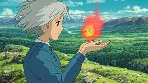
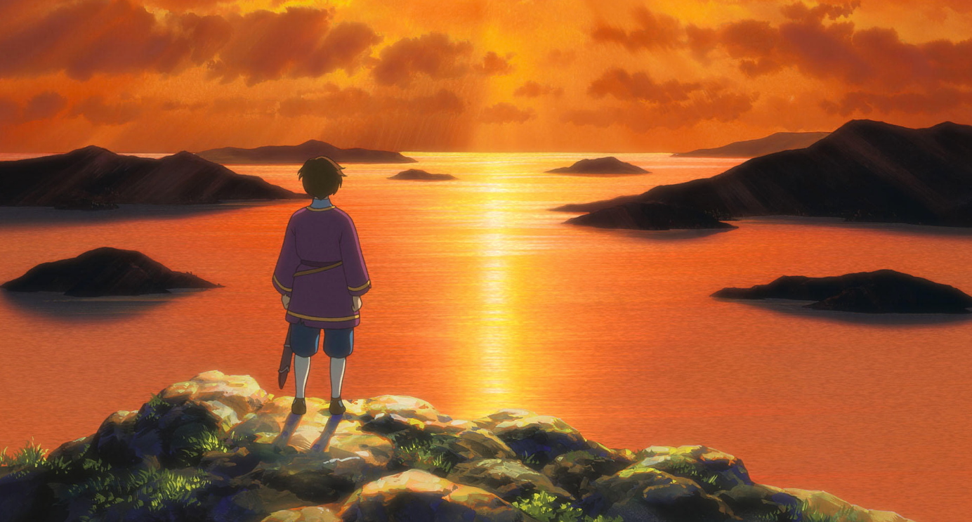
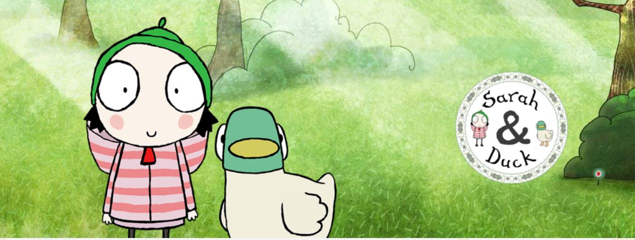
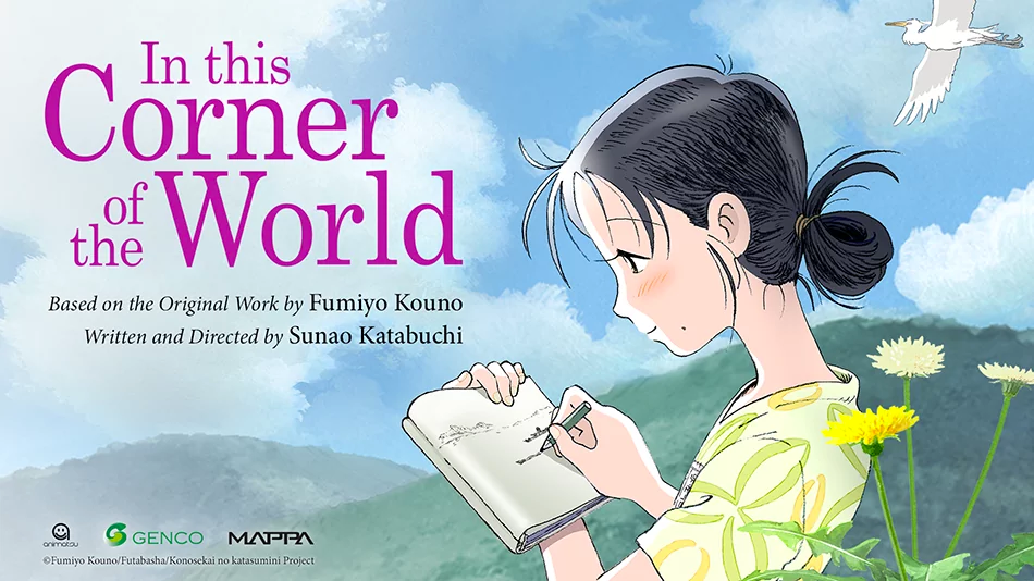
-
@Melissa_Bailey thank you! Yea. We’re going to print ninja and they have a board book builder on the site. We put sizing in already to make sure they would do it. I know they will, I just wasn’t sure if there were other things to take into consideration. But I think I do want to try a square.
-
@Miriam I love all those images! I think it is kind of a regular thing, especially in anime, that the characters don’t necessarily match the backgrounds. Its hard to know when its okay to do that though. Like… when do you know its working or not working? I have received critiques in the past that I need to work on matching better… haha! Illustrating is a confusing business.

I am so thankful for SVS though. Learning how to plan with thumbnails and things has been one of the most valuable lessons. Saves so much time and energy!
Thank you for the feedback and encouragement! -
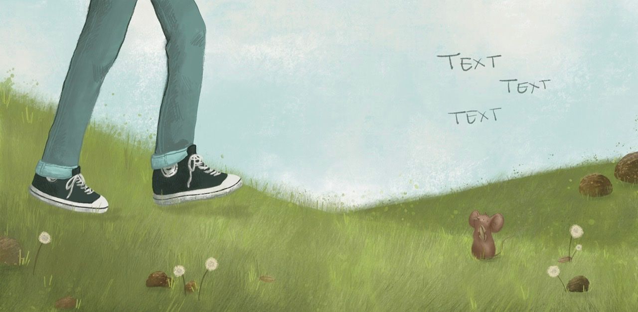
Here’s another page I’m working on. I don’t hate it, but I’m also not completely happy. I welcome critiques!
Things I’m learning…- Making a characters fit an environment is hard! Im fairly comfortable drawing either a character or an environment, but putting them together is really tricky for me. And, I think its actually harder digitally because of the separation of layers.
- Changing the pose of a character is tricky
- Keeping the environment consistent page to page is also hard. Especially when you are “zooming” in and out.
-
@Pamela-Fraley It's so wonderful that you're making this board book! You have some lovely quiet images so far. Some thoughts I have looking at this new composition:
- Have you tried it from a different angle so that the person and mouse aren't almost directly across from one another?
- Adding some red or a few spots of warmer colors could add some areas of interest to the composition if you want to go in that direction.
Hope that helps. Looking forward to seeing how your book turns out!
-
@Stephanie-H
I didn’t even notice that! I might have to go back and look at Will’s creative composition class. I’m honestly being very cautious and safe with this project because I’m just not super comfortable with so much. I think I could push the person further into the background, I just have to remember perspective rules and figure out how to draw feet from a different angle.
  And yes! I want to bring in some more colorful elements. I need some leaves for one of the pages, so maybe I should add them in on some earlier pages too. I think I will really need to go back and push the focal points once I get the initial work done. Thank you for your feed back!
 -
Love your very peaceful and beautiful palette! Very inspiring

-
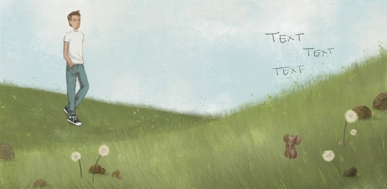
Is this a better composition than the other one with just the feet? Obviously it’s not finished. I just sort of threw everything in and blocked in the guy real quick