My April treehouse(s) wip(s) lol
-
@Asyas_illos I really like this batch of illustrations, the simplicity and the design, and humour, I like that you added the witch to the previous illustration submitted and so the added gnomes make sense to be included in this one. I think it is ok to add words as it is part of the humour. I think the addition of the witch and the gnomes work because they give the the tree a sense of scale.
-
These are great! I love the “carved out” style that leaves the little chips of color…
-
@ThomCharles thank you it’s kind of a new development in my style

-
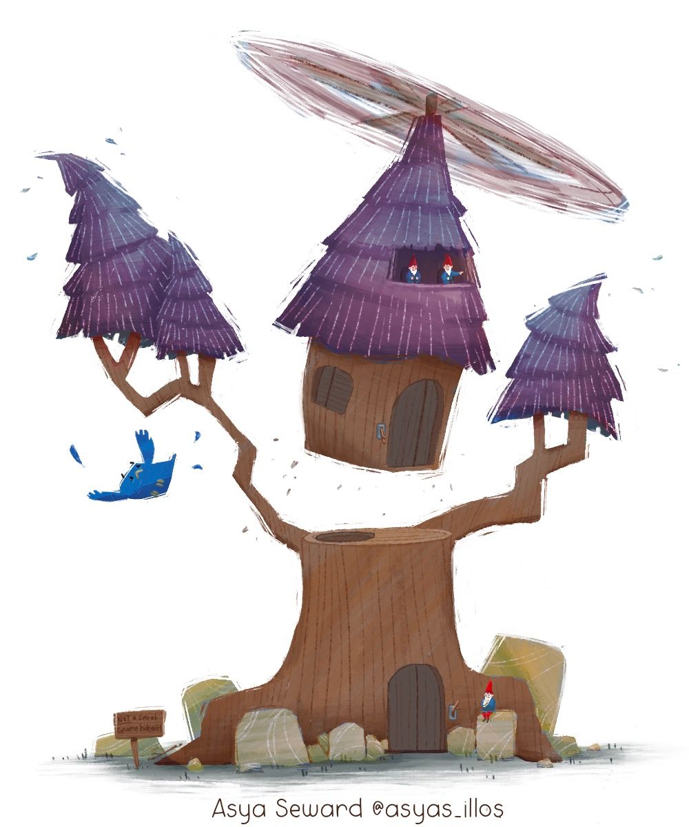
This is kinda an odd color scheme do you guys think it works though?
-
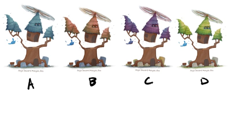
Came up with some more color comps do you guys have a favorite?
-
And one more

i combined the three overlays together and tweaked it a bit for this one -
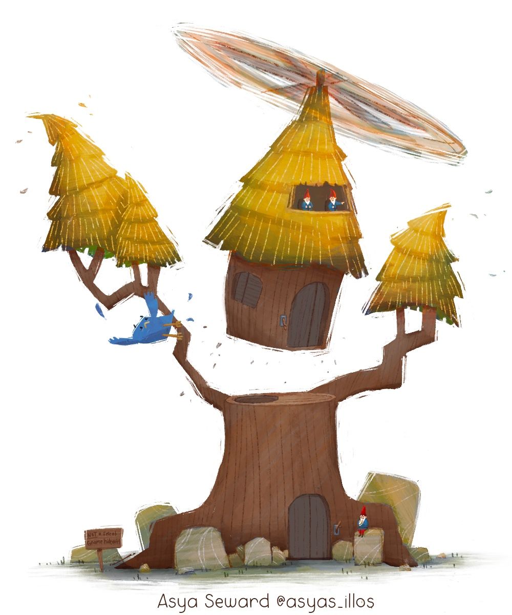
@Asyas_illos This is coming along great! This golden yellow foliage version is my favorite! I'm a bit thrown off or confused by the scale of the bird compared to the tree, and the gnomes. And my eye keeps going straight for the bird, rather than focusing on the tree. Maybe the bird could still be in the tree, but holding on, so it's not so prominent? Also, maybe tone down its bright blue color so it doesn't draws my eye away from your main character, the tree. Such an awesome idea. Wish I'd thought of it:)
-
@Johanna-Kim thank you it’s been fun I’ve been fighting that little bird lol I may try your idea thanks and that was my favorite color too

-
@Johanna-Kim do you think is better?
-
@Asyas_illos I love the flying house idea. I think this colour scheme is my favourite but I agree that the scale of the bird is a bit off - It's a bit big. It's making it the lead character a bit. Perhaps if the gnomes were larger and the bird a bit smaller? I'm just thinking about the scale of the gnomes to the doors - if the gnome sitting on the rock stood up and tried to pull the lever, would he/she be able to reach it? Although I do feel like I'm taking a little bit of the joy away from this lovely imaginary world by trying to make it more to scale with real-life, so feel free to ignore! (especially as I'm the WORST at creating clear focal points)

-
@Asyas_illos With such a unique concept I like the traditional green. but I also like the purple.

-
@lizardillo thanks for the feedback, I understand what you mean about the scale I wanted to make the gnomes a little bigger but then you couldn’t see the red hats in the cockpit they didn’t look like gnomes. Maybe since I added the gnome on the ground you’ll get the idea anyway or change the hats to pilot hats? I’ll play around with it more. Thanks
-

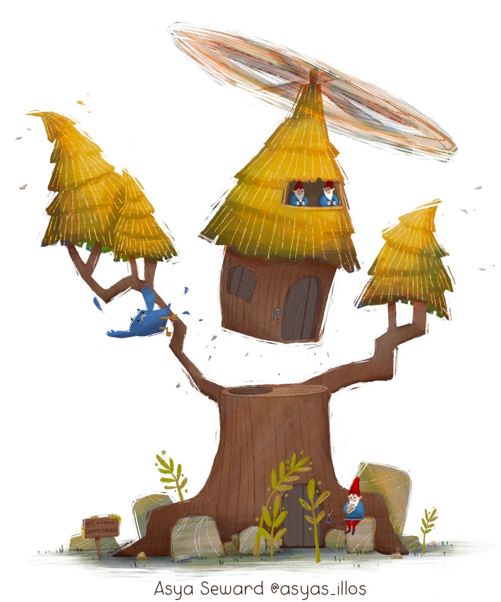
Ok I’ve adjusted the size of the gnomes and the darkened the bird a little, obviously it’s not meant to be a full size tree, it’s kind of dwarfed I guess, which is throwing everybody off, not sure how I can adjust that at this stage though. I think I still need to desaturate the red of gnomes a bit…also can you tell that the gnome on the ground is eating a sandwich? Not super important tho. -
@Asyas_illos Yes, much better! Now I focus on the tree and the bird is an additional side gag. I can almost see it hanging on by just one clawed foot, maybe even angled slightly upside down. But it works, as is, as well. With the gnomes flying the top of the tree house, the one that's pointing is looking at his copilot, but the copilot isn't really looking back at him. I think a subtle turn of his head so they're connecting more would be a nice touch. Also the gnome at the bottom, he's kind've disconnected from the exciting action above. What if he was looking up at the action, or maybe he missed the flight so he's waving his arms like, wait for me! Lastly, the sign below is a little hard to read. Maybe you can make the letters the same color as the golden yellow? Just some minor suggestions, but it looks amazing already.
-
@Johanna-Kim the gnome at the bottom is sort like the “fat security guard” who’s oblivious to everything lol thanks for all helpful feedback!
-
I think I’m done with this project I know there’s not a lot to the actual “tree house”but I’m hoping the concept is enough to drive it home. Thanks to everybody’s wonderful feedback!
-
@Asyas_illos I really like this. It is a very unique take on a tree house.
-
@Kim-Rosenlof thanks Kim
 ️
️ -
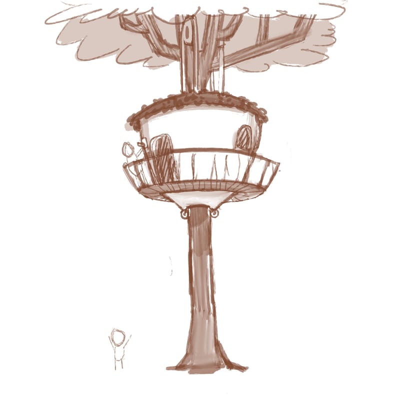
Got another concept here any thoughts?
-
@Asyas_illos The acorn shape makes me think this is a cool tree house for squirrels!