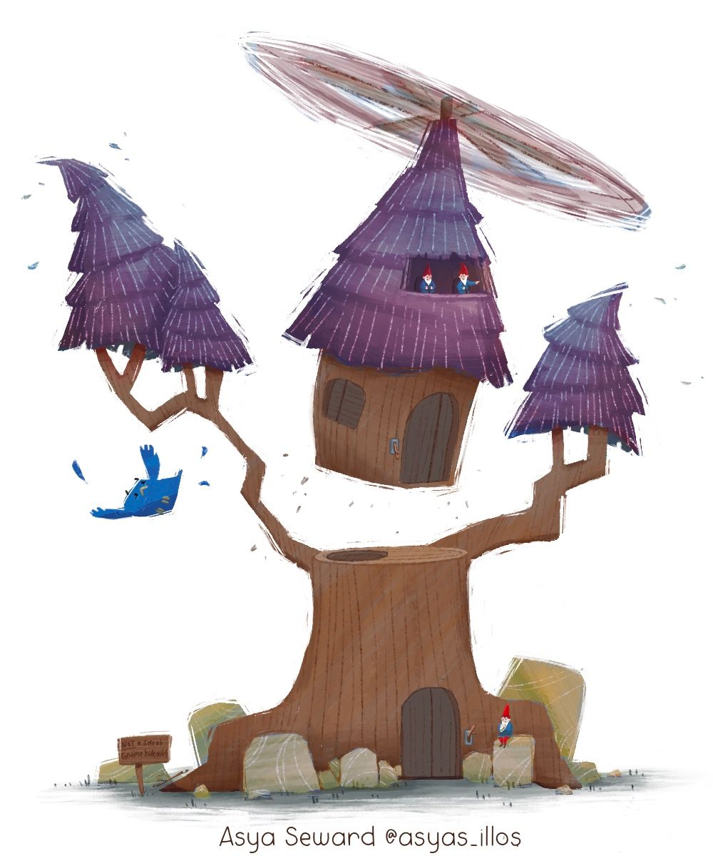
My April treehouse(s) wip(s) lol
-
@Asyas_illos LOVE this idea. Can’t wait to see its progress
-
@Griffin thank you!
-
@AlliFaith thank you
 I’m working on ways I can spice it up!
 -
@Asyas_illos Your creativity is off the charts. I'm always amazed by your ideas. This one is so striking and unique. Choosing colors is challenging; I'm interested to see what you come up with. But one thought--I'm loving the energy of the previous iteration of this piece, without the color. Perhaps it's the scratchiness of the line? Don't lose that as you move forward.
-
@Johanna-Kim thank you and congrats on your win! I feel like yesterday’s critique arena was designed just for me lol I always rush into ideas! And I notice after each illustration the next one is better in some way. I have adhd so when I get an idea I have to roll with immediately because I’m afraid I’ll lose interest and end up with nothing! I’ve really come to love the scratchy edges as my style has progressed almost linographic in way, so I’ll try and keep it up with my finished piece!
-
Think I’m gonna keep the color palette natural but I may still play around with filters also I may decide to omit the water, dock and boat not sure yet…
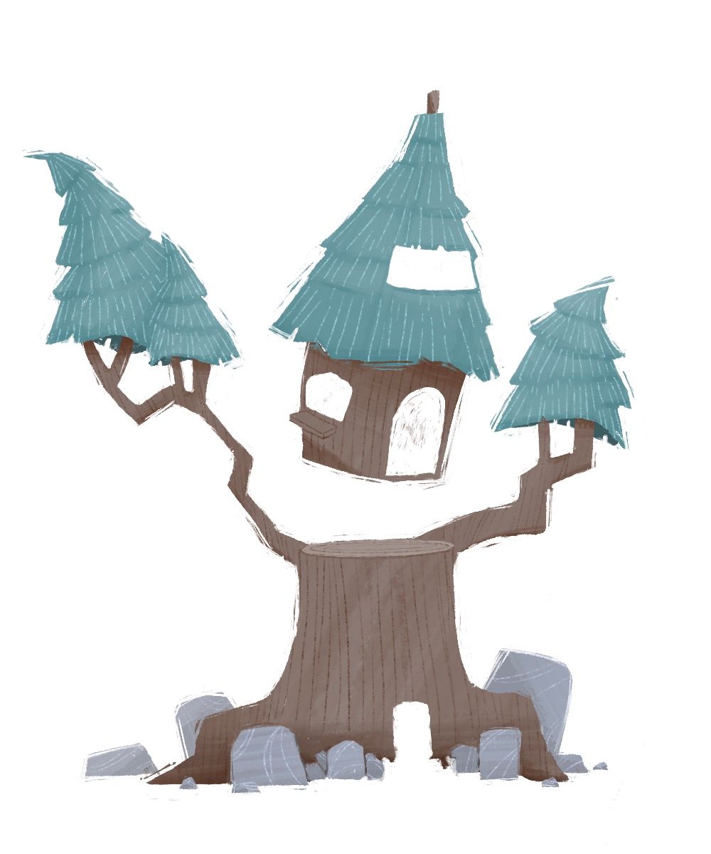
-
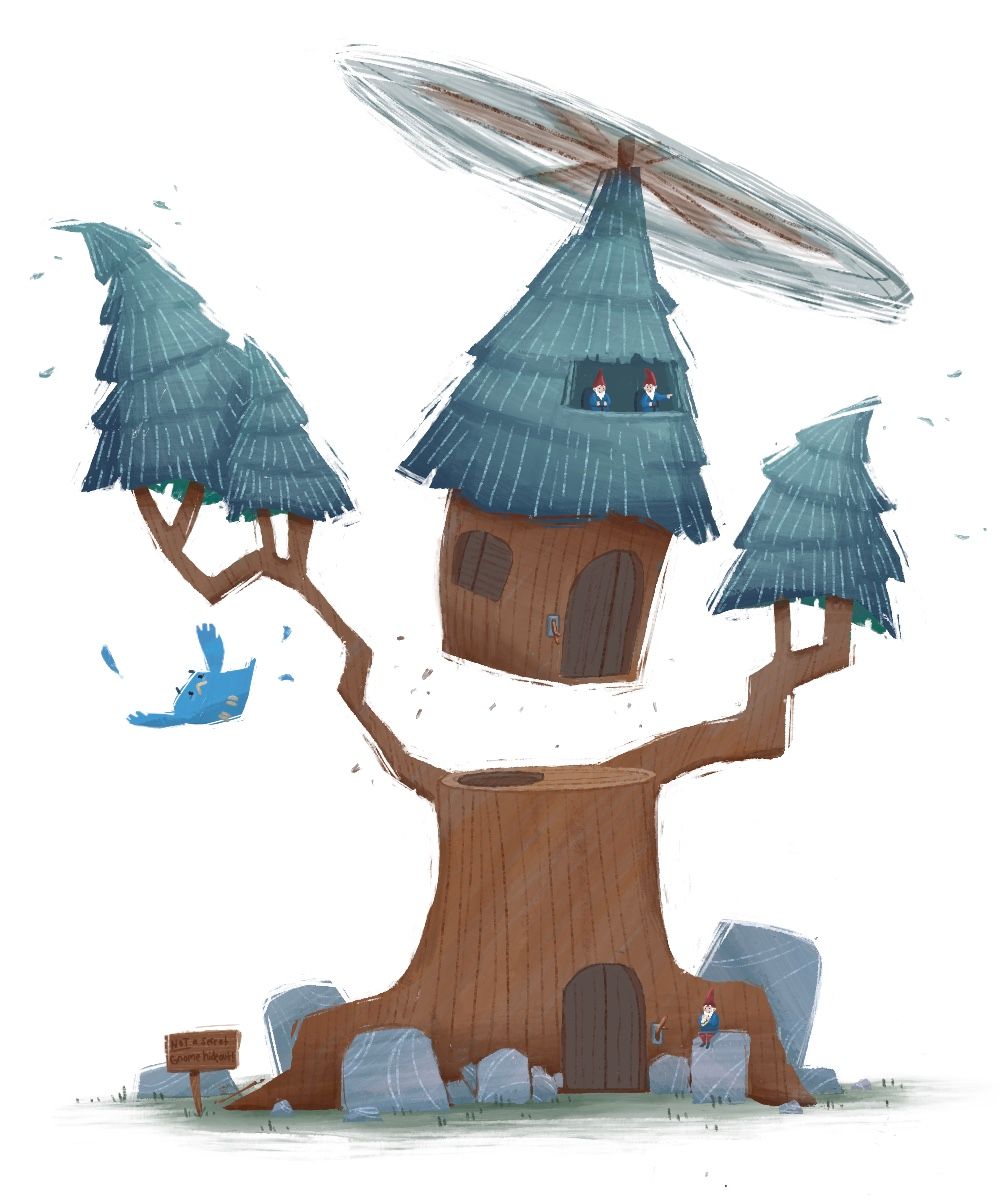
I guess I just need to add some details like the gnomes in the cockpit
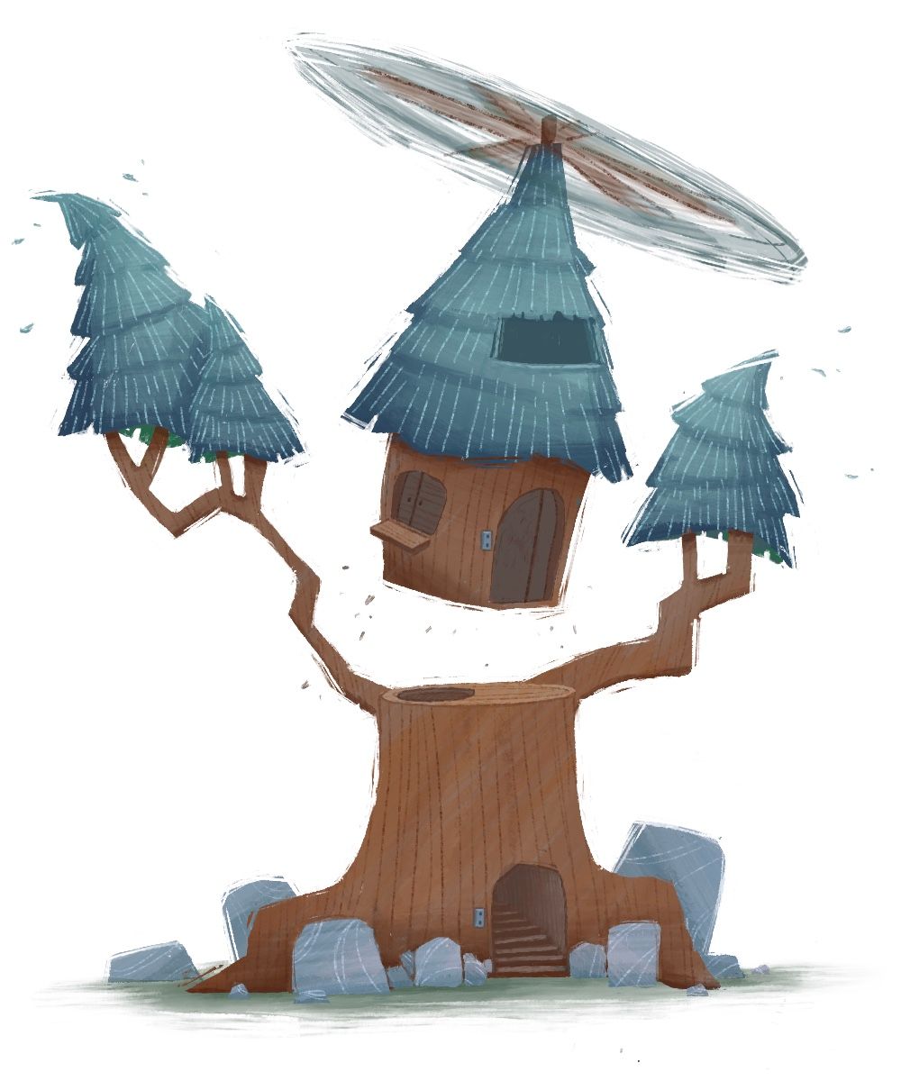
-
@Asyas_illos I really love this design
-
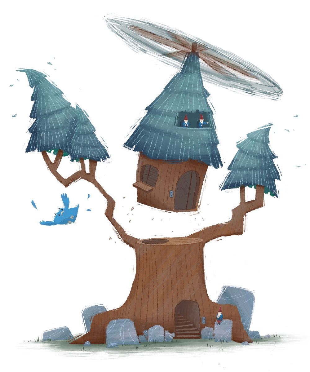
I probably jumped to eagerly into this one again. I feel like the concept there just not sure I delivered it well enough. I’m really pleased with the outcome but if anybody has any suggestions or feedback I’m still open to it. I will probably submit in the next day or so
-
@Asyas_illos Aww, thank you for letting me know! I love the added movement and the little details in your update. The gnomes are adorable. Maybe add more little details like a welcome rug, poster on the wall, doorway lamp, mailbox, gnome, outdoor shower, etc. to make it feel more lived in, gnomey, and add a little more variety in color? This is my favorite of your versions so far!
-
@Jeremiahbrown those are excellent suggestions thank you, I did want it to have a more of a secret hideout kinda feel to it, so I’ll try and incorporate some more elements that might help it read better.
-
So I replaced the switches with a tree branch lever and I know the guys said you shouldn't need to rely on words, but I added a sign… should I take it down?
-
@Asyas_illos personally, I like the sign, but thats just me
-
@AlliFaith I do too. I imagine reading a story with my kids and if they came across an image like this, they would love to read the sign and would get a kick out of it. But I don’t want to be overlooked strictly on the fact that there words describing it.
-
@Asyas_illos there were signs in the design an inn, so I don’t think it’s necessarily a bad thing to have some words in the image. I think if it needs text to explain what’s happening that would make it a weaker image. I don’t think your sign is explaining the image, but contributing to it.
-
@AngelinaKizz cool thanks
-
@Asyas_illos I really like this batch of illustrations, the simplicity and the design, and humour, I like that you added the witch to the previous illustration submitted and so the added gnomes make sense to be included in this one. I think it is ok to add words as it is part of the humour. I think the addition of the witch and the gnomes work because they give the the tree a sense of scale.
-
These are great! I love the “carved out” style that leaves the little chips of color…
-
@ThomCharles thank you it’s kind of a new development in my style

-
This is kinda an odd color scheme do you guys think it works though?
