All Star Illustration Break Down 2021.
-
Hey everyone! I'm still ecstatic and in disbelief of yesterdays All Star competition. I wanted to do a break down of how I got to my final illustration.

I want to include everything I can so you're able to see what steps I took and get an idea of what I was thinking as I went along. I do have a secret weapon, my Wife. She will sometimes help with brainstorming and I'm constantly bugging her to look at the illustration as it progresses. She is very understanding.
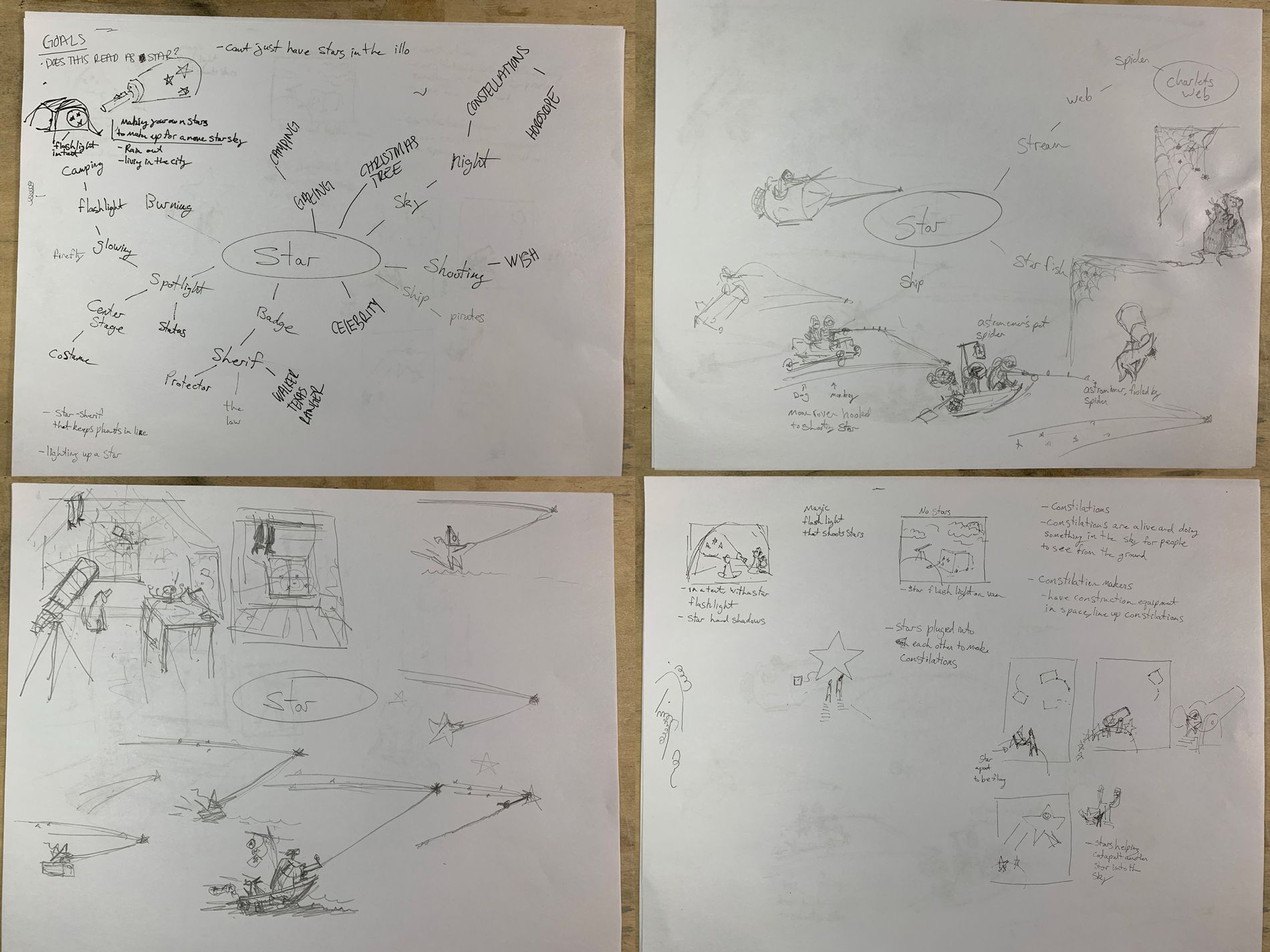
This was a concept that I struggled with. There was already a lot of great ideas that had been done before in various short films and illustrations by other artists. I wanted something that wouldn't automatically remind you of those works.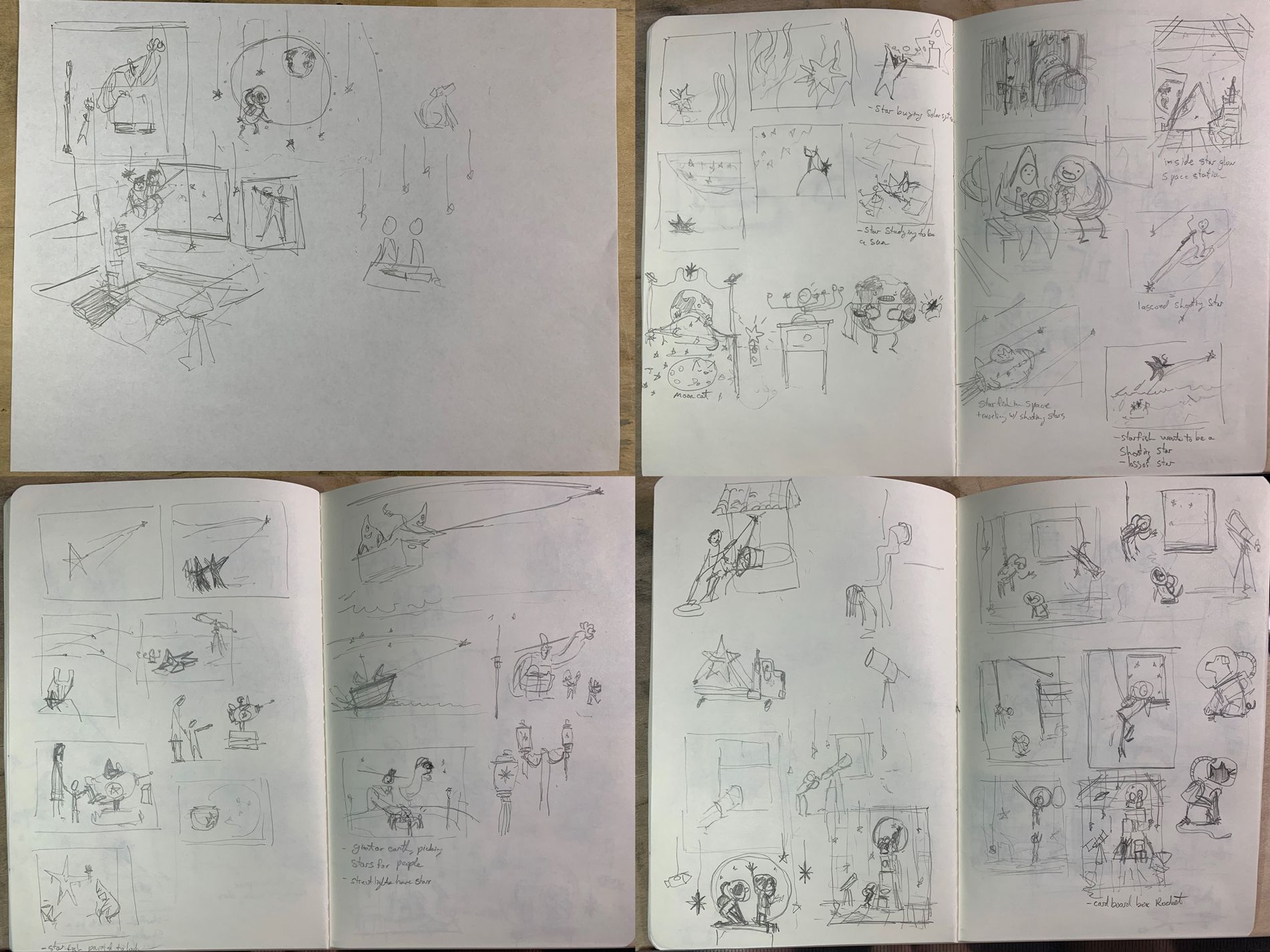
One idea I had played with for a while was stars, starfish, or kids in star costumes wanting to be shooting stars. It was a lot of info to get in one illustration, so it wasn't a route I felt I could go down effectively.I also liked the idea of people hitching a ride on a shooting star, or harvesting them. Constellations were another idea I had played with, but again it seemed like a lot for me to get right in one image. I want to keep it simple.
At some point I ended up drawing this giant that was harvesting stars to help illuminate the town. This is one I was starting to like. I liked the idea of this stoic giant that was dedicated to his work. I wanted his scale to be abnormal, hoping this could add to his mystic. How long has he been doing this?
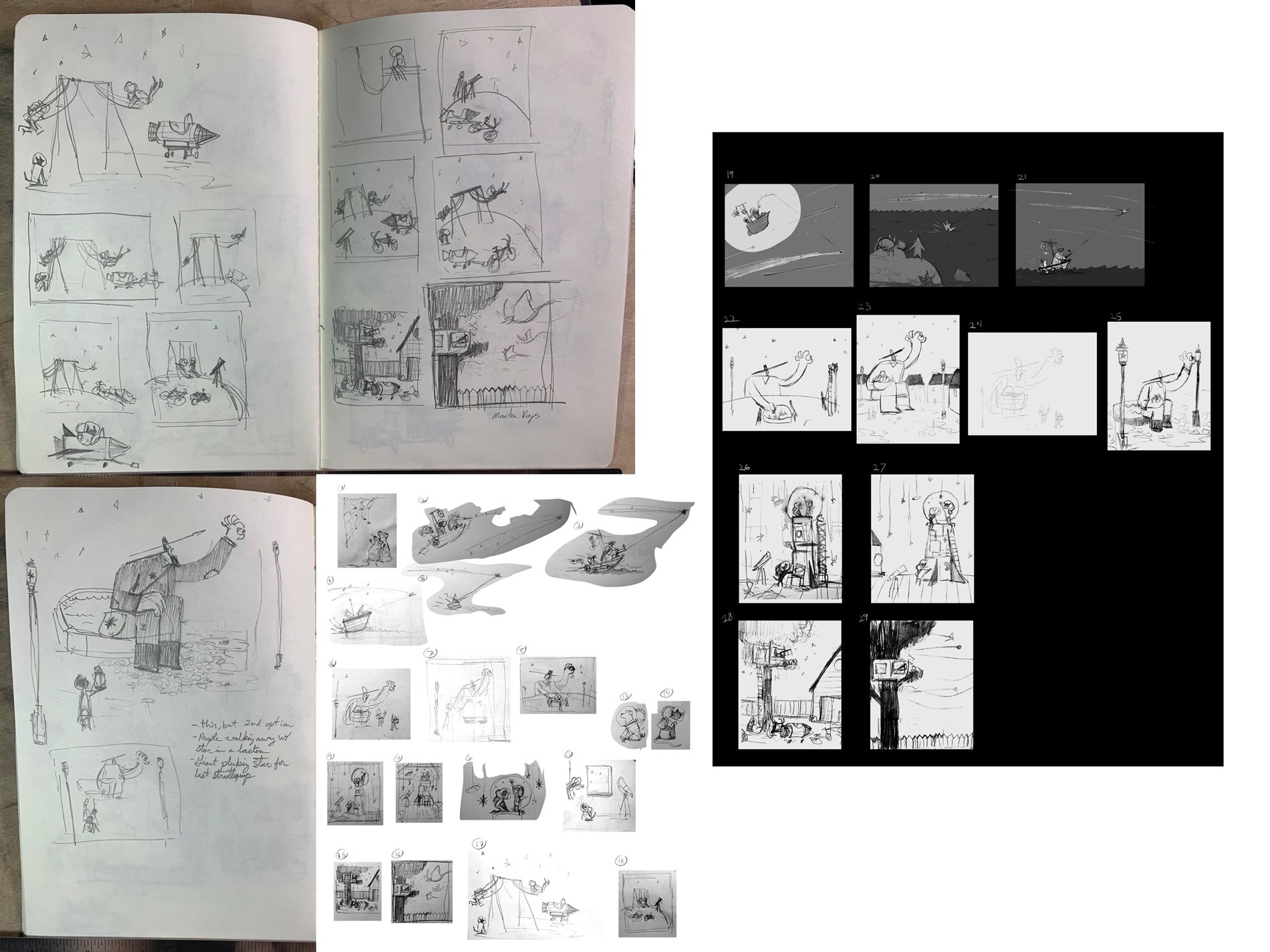
Above you will see the last stages of my thumbnailing process. I like starting on paper and I will then take some snapshots with my phone to quickly get them in my computer. You'll see after the phone scans I do a selects round of the ideas I like most. From there I go digital and elaborate further on the ones I think are best and add some value. Through almost all of the processes I'm zoomed out on the canvas and rarely ever zoom in to draw anything.
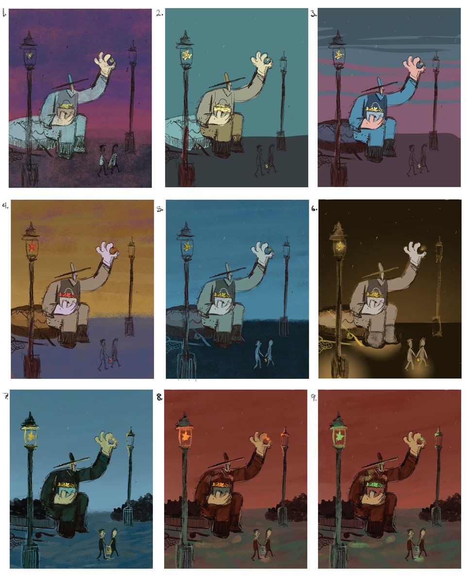
Color color color. I love to focus on the color stage in illustration. I'll spend a lot of time in this phase to make sure I'm happy. I have struggled with nighttime illustrations in the past. I find it hard to find the balance of having it be dark, but not go too dark, and to keep the glow in check.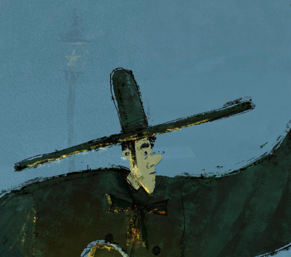
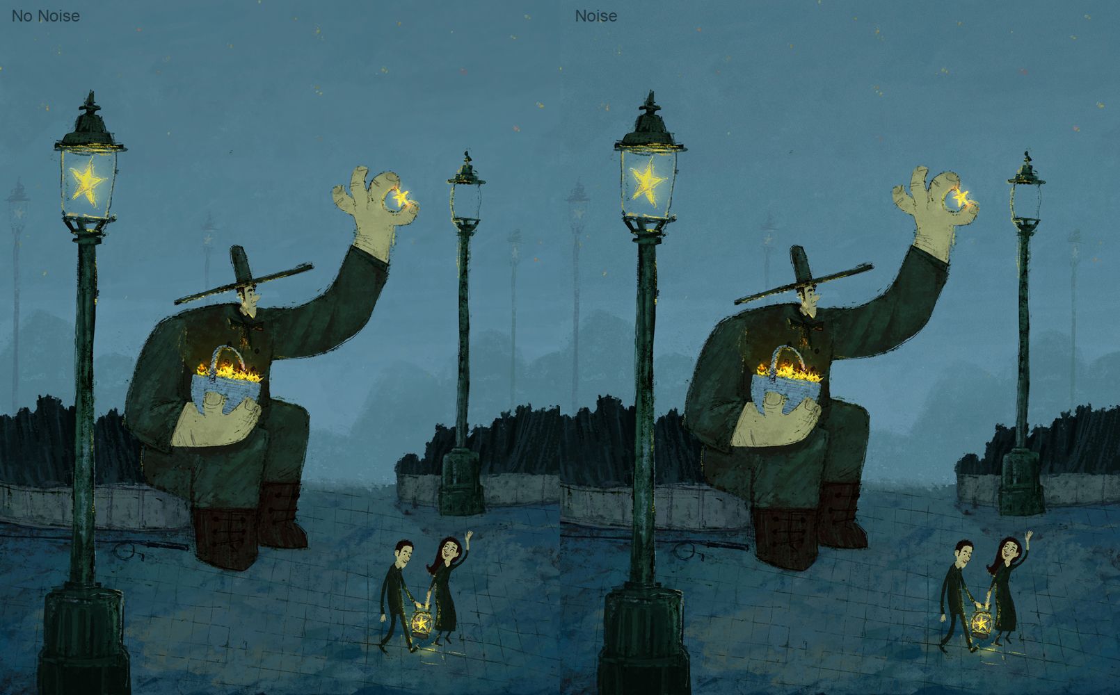
Bring in the noise! This is a little trick I was taught in school by Lee. On the left, noise, on the right, no noise. Often times digital illustration will look too clean. To get this effect. My color profile in photoshop is set to Adobe RGB 1998, I add a new layer and fill it with 50% grey and set the layer to overlay. The 50% grey point will differ depending on what color profile you're in. In the photoshop menus I will then go to Filter > Noise > Add Noise. You can adjust the amount, less is more. I have monochromatic click on. After, you can change your layer opacity to your liking.
At this stage I'm almost done. I will try to give my eyes a break from the piece, get feedback, and think of little things that can be added to help the piece.As far as file management goes. I try to work as nondestructively as possible. I'll keep individual objects in the illustration in their own folders and layers and label them.
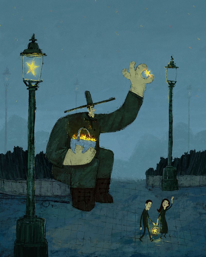
Here we're back to the finished illustration.
I want to thank everyone! I hope you find this helpful and I'm more than happy to help answer any questions.
-
@norman-morana thank you for sharingyour process! I adored your final illustration congratulations on your win!
-
Hi Norman, first of all congratulations on winning, I really love your illustration. Thats so great that you are sharing your process here on the forum. I think this is really helpful to alot of people. I really struggle with getting a clear concept and it is so interesting to see how you get to your final story. Although I do get the impression that it suddenly appeared in your head. But you didnt go for the first idea, instead gave the right idea time to appear. I tend to settle to fast and then ad in to much unimportant stuff.
Greetings -
Thanks for sharing your process @norman-morana! I really love this piece and happy for you!
Definitely inspired!
-
love this piece @Norman-Morana
-
@norman-morana a great process and a great Illustration

-
Thank you @asyas_illos ! Happy to share

-
Hi, @moana-maureen Coming up with a good concept can take some practice. Doing the mind map brainstorm can help give you some ideas and push you into directions you might not have thought of. I tend to have a lot of partial ideas going around in my head, so it helps me to put them on paper so I don't have to worry about them or forget the good ones. It takes practice though.
One of the things I ask people when asking for feed back on my concept is "What do you think is going on here?"
Thank you, and I wish you luck along your journey!
-
@jeremy-ross Thank you! I appreciate that!
-
Thank you @xin-li and @carlianne !!
-
@norman-morana Woah, this is so cool! The first part is especially useful for me, as you have a very divergent imagination and it's fun to see how your ideas develop. I think a star sheriff who keeps the planets in order could have been fun, too! (But like you say, a scene with many elements would a little difficult to portray in one composition.)
I have one question: In your post, you talk about a version on the left with noise and a version on the right without noise. The images posted vertically, though. Are you referring to the next to last and then to the last complete images, or to something else? I also notice that there are also faded lamp posts in the last image.
And lastly, dang it! I need a wife! I think that's where I've gone wrong, as in my experience husbands aren't of much use in critiquing
 !
! -
@norman-morana You did a lot of work and it shows. Gj and congrats on the win!
-
@norman-morana Wow, very helpful! Thanks. And great piece of course.
-
@norman-morana Thank you for sharing this. I love seeing the process of getting to a finished project, it makes it even better!
-
@Norman-Morana this is really such a great piece! Thanks for sharing all this great info about your process!
-
@norman-morana said in All Star Illustration Break Down 2021.:
It was a lot of info to get in one illustration, so it wasn't a route I felt I could go down effectively.
This is golden! I struggle with trying to cram in so much, all the while keeping things simple.
I find it interesting that you start the colour, colour, colour before refining your drawing, that's cool.
The noise is an interesting technique. When your work is large I can't tell, one side noise the other side not. But in the close up I can see.
-
Hi @lauraa sorry, the layout of the post might be bit confusing. I like to go image, text, image, text. The noise example is in the close up shot of the giants head and upper body. I have noise only on half of the image. It might be hard to tell, but that's not a bad thing. I want the noise to be something you feel, not necessarily see.
In the last two images I wanted to show how I do some small tweaks. Such as the added light posts, glow to the basket, and glow toned down on the people. Those edits being done a day or so later.
I hope that helps clear things up

-
I like to think of myself as a lazy illustrator. If I don't have to draw something to tell the story, I won't lol. In this case, I've been experimenting with not refining my drawing until the very end. I was noticing that I would spend a lot of time on the drawing phase, then once I started adding in all my textures, I'd end up not needing most of my line work. So I've been trying out doing line work last and only where the image needs it. I've been liking the affect so far. Plus I'm zoomed out when drawing, the way most people view the piece.
About the noise, you're right. It's something I want people to feel but not see. If the noise was missing from the image when zoomed out, you'd be able to tell. I think it would be too clean.
I'm glad you and other people are finding this helpful!
-
I really love seeing and hearing about people's process, so thanks for sharing! Congratulations on the big win!!!
-
@norman-morana You have an eye for the noise. But thanks anyways, if I keep staring I'll go blind.
I need to work on what absolutely needs to go in, goes in and then if room the odd other thing or two. I'll try to remember laziness can still produce good work, what strange irony. lols
Thanks,