Could I please get help with the anatomy in this illustration?
-
Hello there,
I know many of you have an excellent sense for drawing anatomy. I seem to be stumped when it comes to this picture and the unusual pose of the kid. There’s something off, but I can’t tell what. When you look at it, what strikes you as funny looking or awkward?
Drawovers are welcome if anyone feels so inspired, though just commenting on what you think could be improved is a great help in itself. Thanks in advance to anyone who can help me! It’s very appreciated!
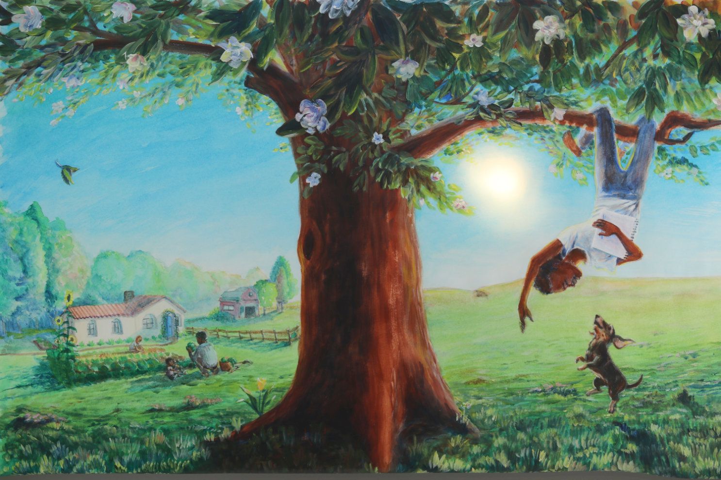
-
@KathrynAdebayo oh this is really tricky!
I think first the leg needs to be more straight back it looks like it's angling to the left a bit
Reference photo:
https://pin.it/2hueua4And then I'd look at where his arm connects to the chest
Reference photo
https://pin.it/6pvs49l
https://pin.it/1xXys0Q -
I think the hips also need to be turned because you have the legs going backward in a three quarter view but the hips straight on. Turning the hips would mean you'd have to twist. the abdomen more. Do you have any kids around who can hang upside down so you can take some pictures? The idea gives me vertigo now but kids could do it.
It's a great painting and scene, and the dog is delightful.
-
@carlianne and @demotlj hit the nail on the head with using and or creating reference. I'd also point out the importance of emphasizing curves that follow the contour of the form. For example, the sleeves and waist are pretty straight/flat. Ignore the anatomy/proportion errors (your reference will fix that!) but here's a quick paint over showing a more curviness to the character giving it a more 3 dimensional look that I think is still in harmony with the rest of your beautifully illustrated piece.
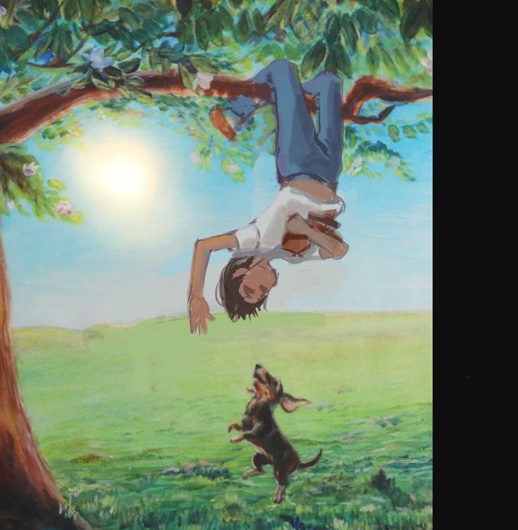
-
@KathrynAdebayo
Hi! It's such a beautiful illustration! I really love the feel and atmosphere of it. Great job!
The one thing that strikes me the most (regarding the kid's pose) is - why is he still holding the notebook? A kid would probably take a notebook on a tree to draw or read, but he definitely would not will be holding it when hanging upside down on a tree, at least I've never saw any kid doing so, they need the other hand free to grab the branch and stuff. So that's what's bugging me the most.
I did a quick draw over, hope it helps a bit. and as @Jeremiahbrown said, emphasising the curves (hem of the shirt, sleeves, etc) is a biggie. It helps to convey the feel of the movement and the unusual pose a lot.
Looking forward to seeing how you'll handle it, your work is so lovely!
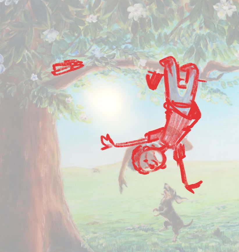
-
@carlianne @demotlj @Jeremiahbrown @mag Wow! You all have helped so much! I'm seeing this with new eyes now. I'll update you all before too long with my first attempt at an improvement.
And thanks to those of you who also looked at this post and upvoted the draw-overs. It's helpful to see the consensus that these tips are spot on.
-
Hello again,
I’ve been working on this, trying to incorporate your suggestions. All of your input has been so helpful @carlianne @demotlj @Jeremiahbrown and @mag. Thanks again!
So, this is still looking funny to me in spots, but i think it’s more natural looking. I’m not sure where to put the notebook yet, but you’re right… it doesn’t seem likely that he’d swing like that with the notebook in his hands.
All input welcome still. I’m not sure if I’m going to repaint the boy traditionally and then add it to the existing image, or try to fix it with digital painting.
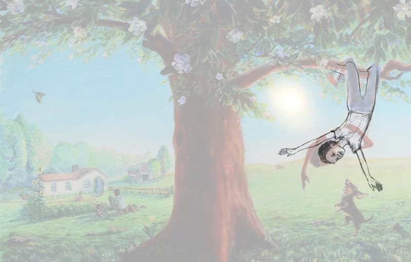
(Edit: changed it again slightly) -
Or you turn the legs hanging in the back, to point the other direction instead of shifting the body, might be easier. Also I know this isn’t really what you asked for but his face seems a bit old too me…I think it looks a little like he’s got some grey hair and goatee.
-
@asyas_illos hi Asya, thank you very much for your input.
 I appreciate it very much. I’d like the feet to lead back into the composition, so that’s why I pointed them that way, but you’re right, I could totally rework his position if this one just isn’t coming together. I think I’m ok with him twisting a bit as he swings, so long as it doesn’t look like there’s something wrong with his body!
And i can see the goatee too on the low def image, haha. Luckily the sketch doesn’t matter much in the end. Thanks again for your comment.
-
Made his head a bit bigger and arms a tad bit different…
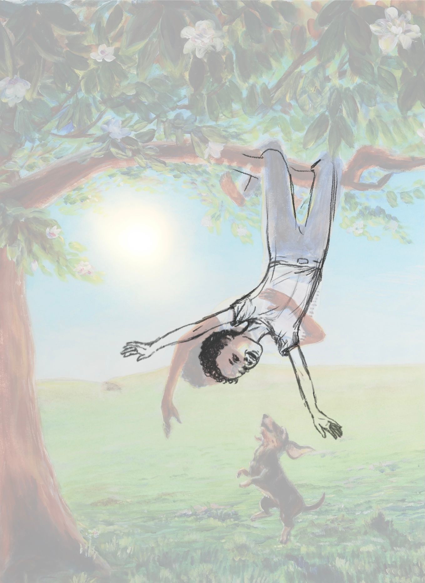
-
@kathrynadebayo Having spent many moments hanging upside down in trees, I think there might be some muscle contraction that would show on the character's left leg to pull his torso up. Also, I tried flexing my left ankle like the character's and it won't go that far which makes your character's left ankle look a bit broken. Maybe find something to hang from and put yourself in this position to feel the muscle contractions, etc.
-
@kim-hunter Hello, Kim, thank you so much! That is a really great point. I’m going to have to try to find myself a tree to hang from.
 Or at least some more good reference photos.
 -
Beautiful warm colors and landscape and secondary characters in the background. The concept is lovely. If I'm not mistaken it also looks like you originally wanted to have the child and the dog make eye contact with each other. With the updated pose, you could accomplish this by moving the dog closer to the foreground.