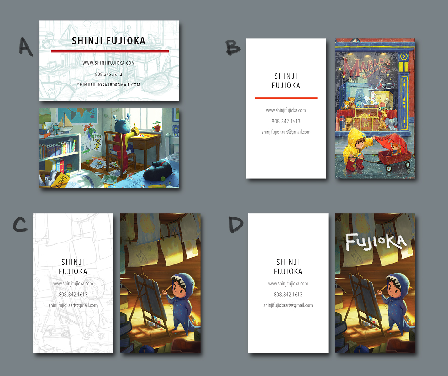
Which business card do you prefer?
-
I'll be attending an illustration conference next week Saturday and want some cards printed up to give to people. A designer friend sent over these four options and I'm having a tough time deciding. Any preferences?
shinjifujioka.com
https://www.facebook.com/shinjifujiokaart
IG: @shinjifujiokastudio -
I vote B - that image is just so lovely and appealing. I also think the colours on that piece are particularly eye-catching for a business card which is going to be a small size, and I also like that with B you have the repetition of the red in the stripe on the other side. But they all look great
") Good luck with the conference!
Good luck with the conference! -
How about making a card with all illustrtions, like a mini portfolio, folded into buisinesscard format? That way you can place even more illustrations....
 Anyway: Good luck !
 -
Have you tested one of them ? My only concern is how well the details of your illustrations are going to read on such a small format... if it reads well, then definitely go for 1 or 2 (my personal favorite is 1 I think...) or with the idea of having them all!!!
I know I said this before, but boy your work is great!
-
All of them. Normally they print in standard page sizes so you can print different versions. The problem is some people, like me, will want all of them

Anyway, the girl with the teddy is my favourite. There are a lot of details that make clear your wonderful and mature skills.
-
Sergio's idea is a good one. I would vote for B.
-
My favorite is C. I think for business card size it reads the best. I would use A or B on a postcard size. No wonder you are having a hard time choosing, they are all so wonderful!! I would agree with getting a test print first
-
Congrats your work looks amazing, I like A, because of how well the values are balanced-they are all great though
-
I vote C with B as a postcard mailer! Awesome work, Shinji
-
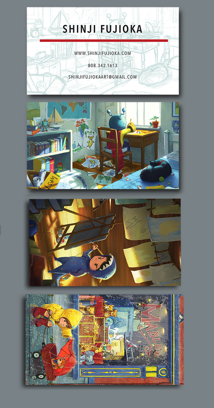
I prefer C. It tells two stories at once--the kid's and yours. It's easy to read in a small format. My eye goes first to it of all the options. B is an outstanding picture, (maybe even a pinnacle piece, as Will Terry puts it?) but it has a lot going on to fit in a small space and I don't think a business card does it justice.
I could be wrong, but that's how I cast my vote!
-
I thought sleeping on it would help me get closer to a decision, but nope. So this feedback helps! It sounds like I can eliminate option D. Thanks for the input!
-
I'd agree to get a couple of test prints. Also, as @anthemsweet mentioned: the girl in the rain may not come across on a small card like that.
-
C is the best read with an image that small. Definitely C.
Ace
-
If you don't go with the mini portfolio idea, I think business card C is your best option for a couple of reasons. First, the portrait orientation grabs and keeps people's attention a little better than the landscape orientation because of how common landscape is. Second, although all of the illustrations you have there are great, the one on C is more focused and less busy. You give the viewer a scene that immediately is recognizable and could even be interpreted as it being you in the process of working. Probably the same thing you were going for in card A. Illustration C is a a nice little piece and I think gives the viewer an appetite for the rest of your work. Also, I think having your name on top of the illustration isn't really necessary since they'll find it on the info side.
Some other thoughts, the sketch of illustration on the info side is a nice touch. I would say that if you want to add that red color anywhere you should put it in your type, make your name and contact info stand out from each other somehow.
Overall, I think this is a great idea for s business card!
-
@shinjifujioka I love all of your work so I can see this is a difficult decision, I would have not been able to limit the choices to these 3, having said that I think C is your best choice because the concept is more in line with you as the illustrator at work. It seems logical to me but that's just my opinion. As I have told you before your are amazing and I hope you get signed soon!!
-
@shinjifujioka For me it is "D" - Quickest read and screams professional - i am usually very distracted by prominent signature size and placement but i think here it is very appropriate - they are all good of course but the color and light of "C" and "D" seems so inviting and in "D" in particular we can see who you are and how awesome your work is in under a second
-
B - cause I adore all that detail. While graphically C works faster... B is something I'd want to KEEP in my possession hoping that a larger version of it will be printed some day. But then I am biased like one of your relatives, I love all your work bro...
-
I like the back images of B and D the best, but I do really like the idea of having the line art behind your info on the front. It definitely brings something unique.
-
I think D will be your best bet. It's clean and simple. Many people try to over design a business card, but it's such a small area that simple typically gets the best result.
-
If you go with Moo.com, you can do all of them. : )