Giving this contest thing a go!
-
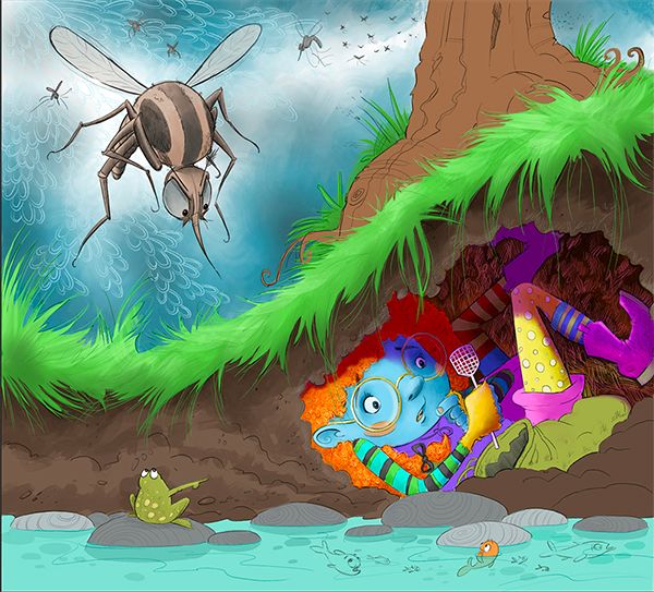
OK, soooooo, do I have her looking at the swatter, the mosquito, or the frog?


-
I would say frog or swatter, but frog would be my first choice. In a kind of “I can’t believe it’s such a telltale!” kind of way.
-
@lizardillo Thank you!
-
Yep I vote frog too.
-
@K-Flagg Woot! Frog wins!
-
First just want to say that I really love this illustration!
And yeah, although we already have a winner, here's another vote for the frog.
It creates a really nice connection between the 3 characters. I notice the frog much easier now and it just makes us feel more the entire situation I think. -
@TaniaGomesArt Thank you so much! You expanation of why that works, makes so much sense.

-
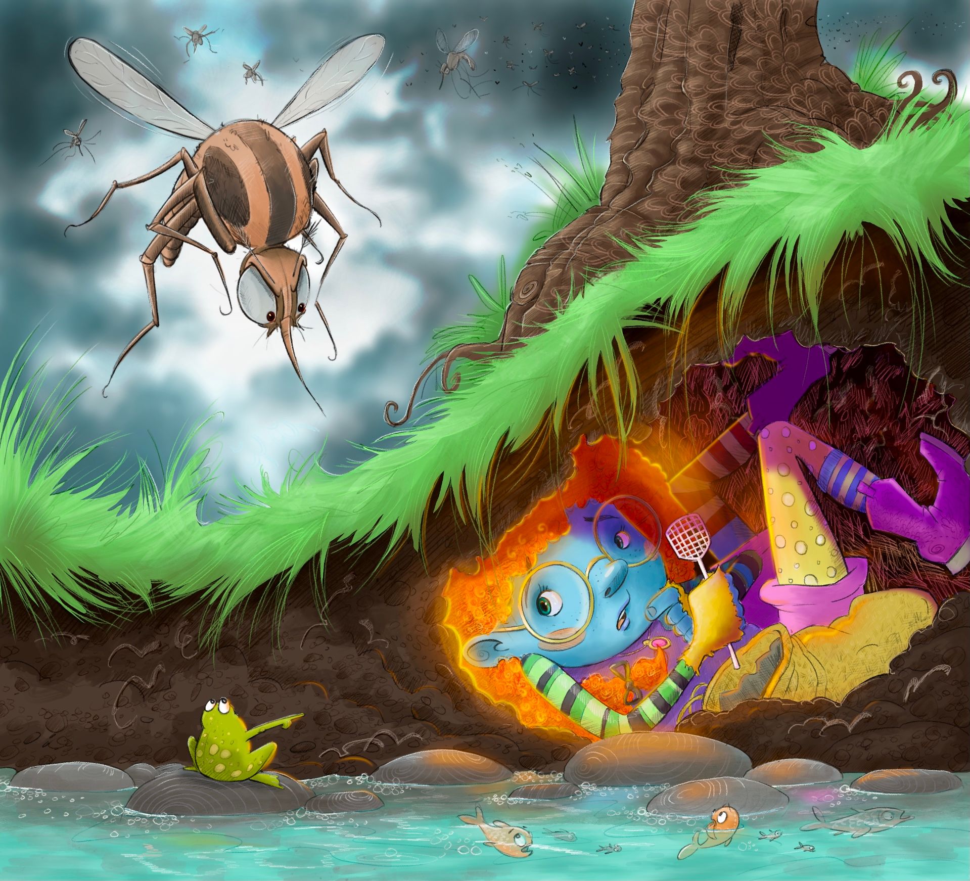
@Janette This looks great! For feedback i would say to maybe desaturate most of the painting and only use the higher saturation for your focal points - the main character, the frog, and the mosquito.
For me, right now, the purple boot / edge of the shorts and the green grass are super strong focal points. If you put a gray "color" layer over the painting in procreate and slowly erase back into the that layer with a soft airbrush you can play with saturation and focal points. I tried it for myself and found that desaturating all of the grass plus the boot and shorts helped with where my eye wanted to go. Take this all as feedback from someone that works mostly in black and white
-
@Kevin-Longueil Thanks! I'll try that. I totally see what you mean though!
-
Hi @Janette, I agree with the desaturating the colour that Kevin mentioned. One thing I’ve noticed is the blue face and blue sleeve kind of merge a little. I have absolutely no fashion sense but could the blue in the sleeve be replaced with something else? Or just the green that’s in there? I can see you want to have a colourful outfit but as her skin is blue it may be best to keep blue off the clothes. I’m not too good at colour theory so feel free to completely ignore this!
::EDIT:: by blue I mean the cyan blue hues, not the dark blues.
-
@lizardillo Good point. Maybe I'll change it to yellow.
-
Is it finished? I'm not sure. Are they ever?! Put the pencil down and step away from the tablet!

-
@Janette Love the glowing hair! The one thing I'd suggest before putting a fork in it would be adding some definition and contrast to the line of grass splitting the image. Next to the beauitful adornments you've put into the tree's bark, the grass is kinda reading as one, solid form to me.
-
@ajillustrates Ah, ok. Will do!
-
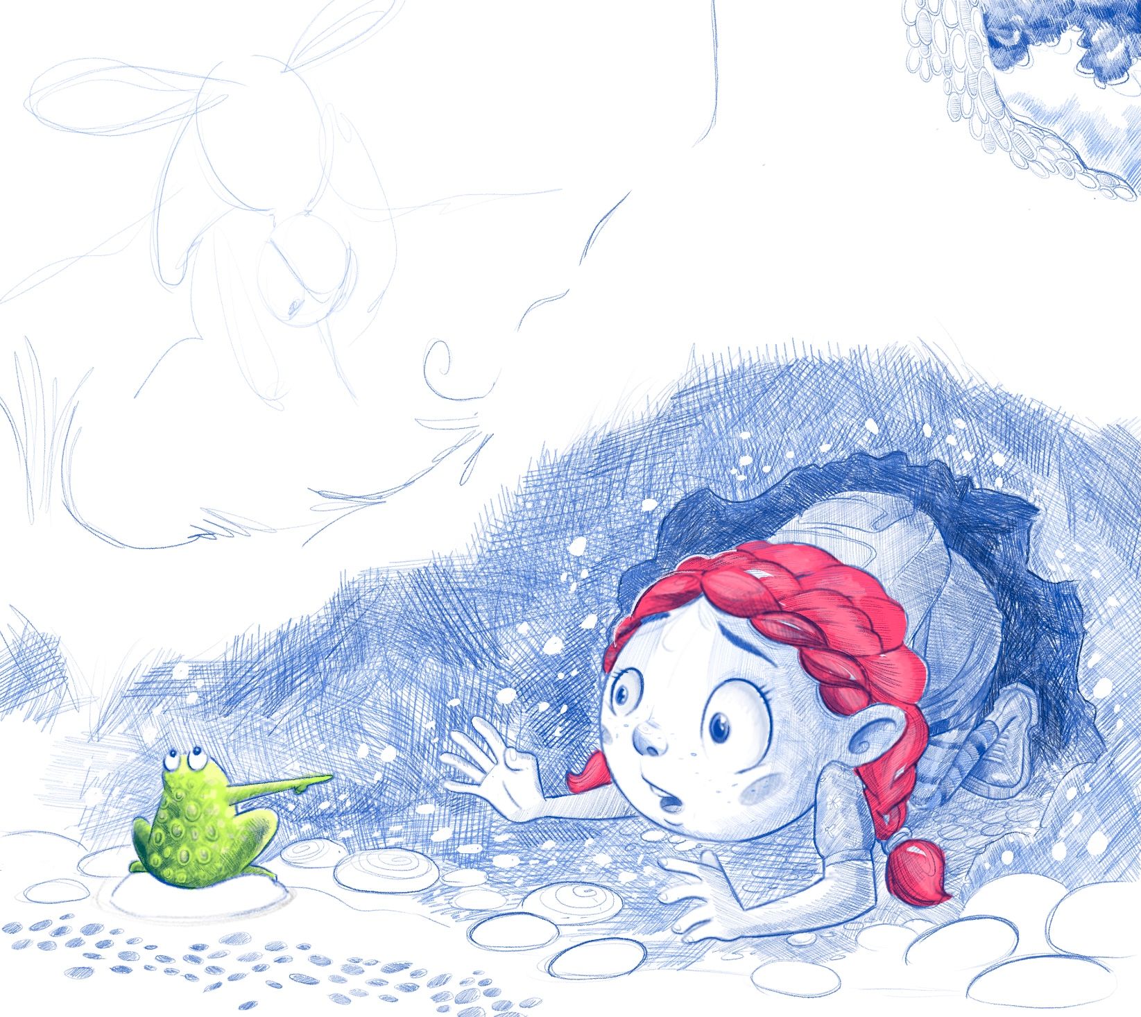
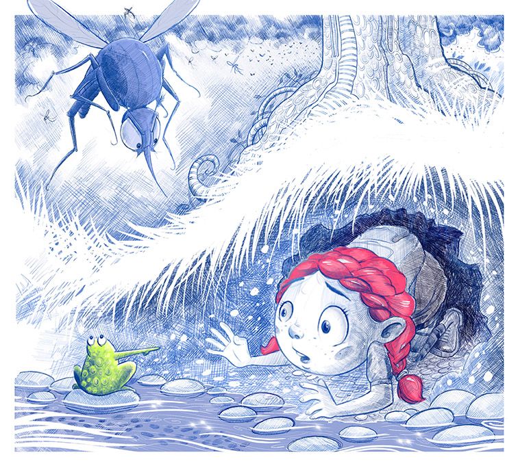
I really struggle with knowing what my style is. Over the years, I’ve been asked to do so many different things in different styles that I don’t know what my true style is. I know there’s a class on that on here, and I plan to do it. I already submitted my piece for the contest and I was pretty happy with it, but something felt wrong. Like it felt too finished or something. Like I was trying too hard. I’m not really sure. I guess part of it felt like it wasn’t whimsical enough. I do really whimsical stuff in my sketch book and for art i put into galleries, but I’ve never really brought that totally into my illustration for work. Anyway, I started a new piece last night. Still based on the original concept, but in a different style and having that hand rendered, pencil look that I don’t intend to have totally finished or polished, really appeals to me. It feels more personal I guess, or maybe more personality? I’m going to try to get this finished in time to submit it, but would appreciate your thoughts.

-
@Janette LOVE this one! Go with your gut and with the style you naturally draw in ... if you look at all the picture books out there, you'll find one in every style. There is no one set "children's book style".
Can't wait to see this one all done ... when you're ready to share it!
-
@Melissa-Bailey-0 Thank you. I do enjoy everything I do, I just really feel like I need to be true to myself and not try to be like others, in every area of life!!
-
I feel a bit like when Facebook first came out. I'm posting on here all the time!!! I suspect this is more useful though! lol
Anyway .. thoughts on this new version vs the original, please.


-
@Janette the values are working better in this new version, and the limited palette is helping with some cohesion. I still like the original sketch with the tiny flyswatter, for storytelling.
-
This is beautiful! I do feel that it has more "soul" in it.
When it comes to this kind of illustration, I'm not even near the "defining my style part", but I've been doing fantasy maps and battle maps for a long time now and in that, I have a very defined and personal style. And honestly I don't have a straight path on how I developed it, but a part was really to just do things in the way it made sense to me, in the way I liked, and not being too concerned with "the fantasy map style".
There are always going to be things we will be inspired in the illustration areas we are working, and there is a certain language to each, but then, within that, there's so much that can be done!!So yeah, I really feel you should embrace what is already you, and evolve from there
