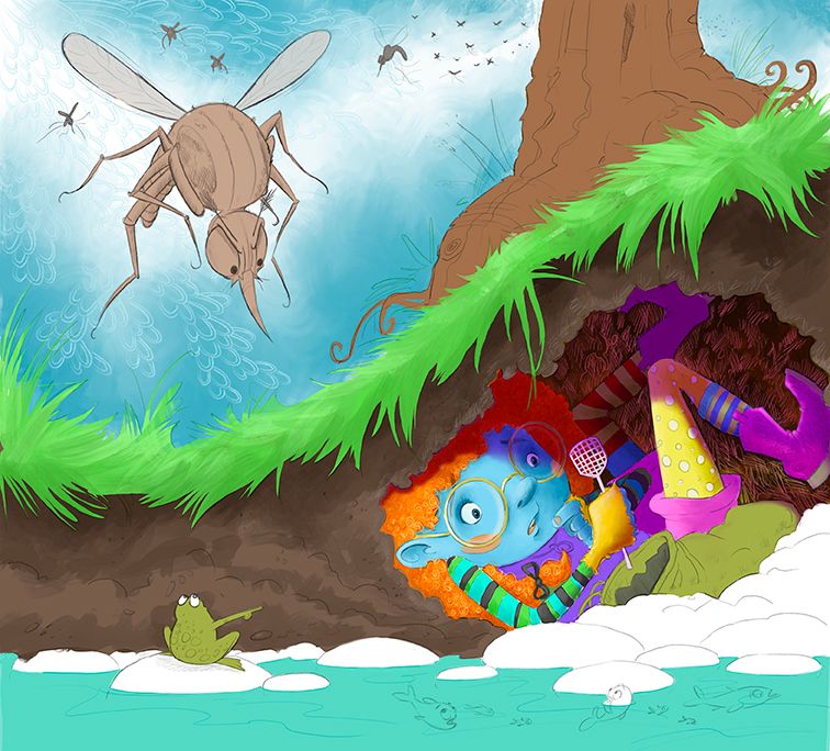
Giving this contest thing a go!
-
@BradAYoo Thank you! I hope I dont mess it up when I come to the inking now!
-
This is looking so good! And I just love the little frog
 Can't wait to see the finished piece.
 -
I love this piece. My only suggestion is that you might have her eyes looking up and back a little as if she is considering the mosquitos coming at her instead of looking at the swatter. Other than that, it's got such great characters and dynamism and story elements -- it's really stellar.
-
@demotlj Oh, yes, I went back and forth about that. I think I settled on her looking at the fly swatter to emphasis the 'this is not going to be enough' thought. But, I'll play with the eyes and see which ones looks better. lol pardon the pun.

-
Here's a progress image. I've been working in Procreate for a year or so now, but have always done more of a softer, watercoloury style. So this painterly thing is a bit new to me, as is adding the shadows! Yikes! lol But, yay for learning and growing! Lots more to do still.

-
I love the way you're using pattern in the fields of color like the sky, dirt, and hair. Very cool!
-
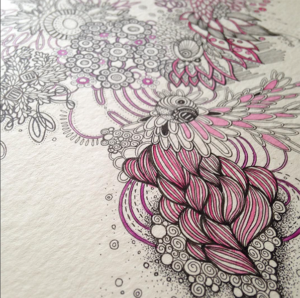
@Valerie-Light Thank you! I do these crazy tiny detailed abstract ink drawings (see below)
 for fun and art shows and I've been wanting to try and combine the two styles for a while. Trying to make them a bit more unique. This is only the second time I've done that. Encourged by your comment
-
@Janette Wow! Do you scan these patterns in to use in your illustrations?
-
@Kim-Rosenlof No, I just use the pencil brush and do it on a separate layer in Procreate.
-
OK, soooooo, do I have her looking at the swatter, the mosquito, or the frog?


-
I would say frog or swatter, but frog would be my first choice. In a kind of “I can’t believe it’s such a telltale!” kind of way.
-
@lizardillo Thank you!
-
Yep I vote frog too.
-
@K-Flagg Woot! Frog wins!
-
First just want to say that I really love this illustration!
And yeah, although we already have a winner, here's another vote for the frog.
It creates a really nice connection between the 3 characters. I notice the frog much easier now and it just makes us feel more the entire situation I think. -
@TaniaGomesArt Thank you so much! You expanation of why that works, makes so much sense.

-
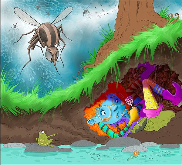
@Janette This looks great! For feedback i would say to maybe desaturate most of the painting and only use the higher saturation for your focal points - the main character, the frog, and the mosquito.
For me, right now, the purple boot / edge of the shorts and the green grass are super strong focal points. If you put a gray "color" layer over the painting in procreate and slowly erase back into the that layer with a soft airbrush you can play with saturation and focal points. I tried it for myself and found that desaturating all of the grass plus the boot and shorts helped with where my eye wanted to go. Take this all as feedback from someone that works mostly in black and white
-
@Kevin-Longueil Thanks! I'll try that. I totally see what you mean though!
-
Hi @Janette, I agree with the desaturating the colour that Kevin mentioned. One thing I’ve noticed is the blue face and blue sleeve kind of merge a little. I have absolutely no fashion sense but could the blue in the sleeve be replaced with something else? Or just the green that’s in there? I can see you want to have a colourful outfit but as her skin is blue it may be best to keep blue off the clothes. I’m not too good at colour theory so feel free to completely ignore this!
::EDIT:: by blue I mean the cyan blue hues, not the dark blues.
-
@lizardillo Good point. Maybe I'll change it to yellow.