Hummingbird Watercolor Ink Help
-
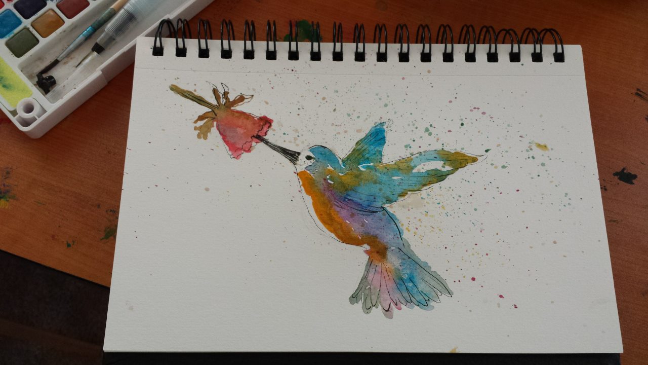
Here is a hummingbird, but I'm feeling like it is a little under done. I wonder if I should add another layer of color even though it is mostly dry already? I'm afraid to touch it again though lol
Happy Creating
www.charlieeveryan.com -
@Charlie-Eve-Ryan I am certainly no expert but I think the colors are saturated and bold and your line work is what is getting a little lost - like in the wings for example. And those lines would help define the shape a bit more if they were slightly bolder perhaps? Not sure.
What I do like is that you added in movement with the splatters and allowed them to mix into the birds coloring as well! Its fun watching you experiment with this!
-
Loved it. I'm unaware about watercolor pieces requirements. So I can´t contribute. I only can say that there is a little imbalance in the composition but it can fixed easily by twiking the framing. Thanks for sharing.
-
Nice sketch work Charlie Eve!
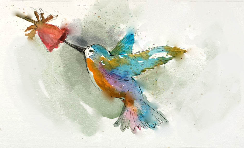
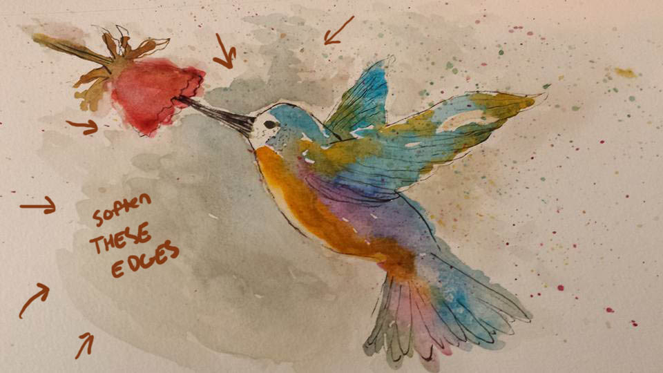
Don't forget that even in sketch work you want to have a focal point. for watercolor, you need to figure out where you want to hold an edge and where to let it go. It's tough because it can go bad SO quick! : )
In this paint over, I made the head/beak/flower the focal point and let the paint bleed around a little bit as I moved away from that area. I added a slight background tone too. You want to watch our for hard edges at the edge of the paper (like the stem of the flower). The splatter is cool, but think of it as Habanero sauce. A little goes a long way. (It can get gimmicky really quick).
Great work. Keep it up!
Hope that helps a bit.
SVS Faculty Instructor
www.leewhiteillustration.com -
@Lee-White Oh fading the edge on the flower and adding the light toned background really helps make the white near the eye pop. Wonderful paint over and tips! Thanks so much Lee! I'll work on that.
Thanks @Rich-Green and @Sergio I'll keep that in mind about the composition tweak and maybe add a bit more detail to the feathers!
-
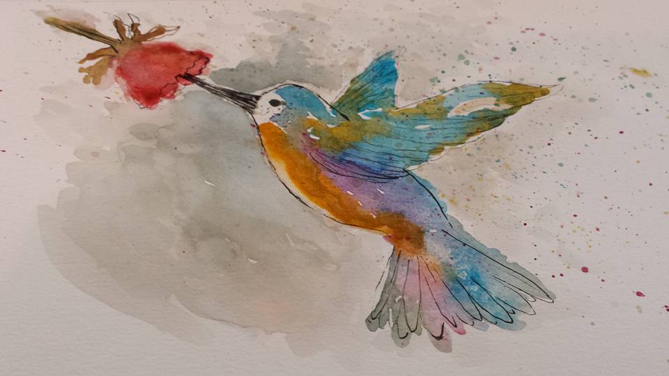
Round 2 with @Lee-White's advice and added a bit more ink too per @Rich-Green. Thanks guys!
-
One more mark to help define that wing

Happy Creating
www.charlieeveryan.com -
@Charlie-Eve-Ryan it is amazing what an impact that background tone, that Lee suggested, adds to the piece overall. It really does give it a sense of place to the whole thing. Wow today has been a great learning day here at the SVS Forums! So much good stuff to pick up on!
-
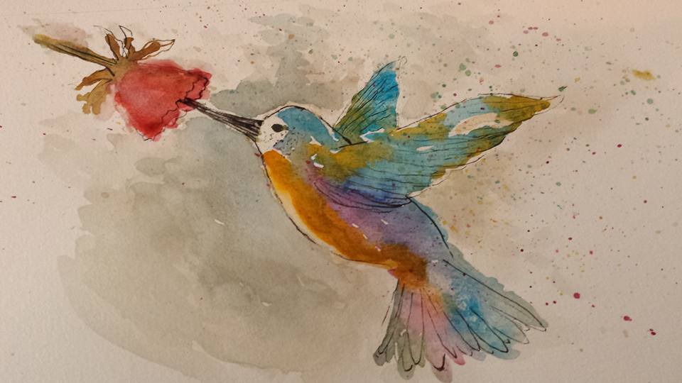
Much better. When laying in the background, you need to control the softness or hardness of the edge. Wet the paper first and the paint will do the work for you.
At this stage, you can get a soft edge by wetting a bristle brush using CLEAN water and lightly scrub the edge. Pat dry with a paper towel. If it doens't come up on the first try, dry the paper with a hair dryer and do the same step again. The reason for that is scrubbing wet paper will start to destroy the paper.
-
Wow @Lee-White thanks for all the input, so helpful!! PS attempting to fix a watercolor painting is both exhilarating and terrifying!
How's this one working?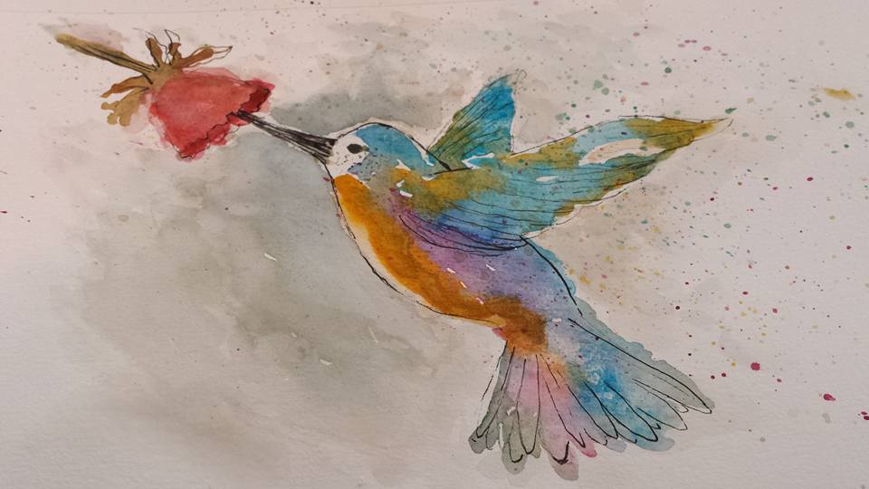
-
there ya go! nice!
-
Thanks Lee!!
-
So cool to see the feedback and progress. It looks awesome!
-
@Spencer-Hale Thanks Spencer. Lee is so generous with his time and always gives really concrete advice. SVS rocks!