Second Narnia piece--can I get some fresh eyes on sizes and placement, please?
-
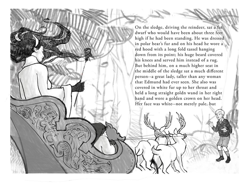
I've been working on the second and third pieces in my Narnia series. This one is Edmund meeting the White Witch. I'd say this is at the rough drawing stage and before refining the drawing I'd like to know if the sizes and placements look plausible.
Sizes given in the book's description: The Witch is 7 ft. tall, the dwarf 3, the reindeer are the size of Shetland ponies (3.5 ft. tall), and Edmund as an average 8yo boy should be about 4 ft. tall or a little more. When I drew through, the Witch is sitting in the right place in the sleigh, but it keeps looking small to me. Does the small sleigh make her look properly 7 ft. tall or does it just look out of whack? I have my ideas about what needs changing, but thought I should get some fresh eyes on this before doing anything else.
Other comments also welcome, especially about placement of text, gutter, gestures, values, etc. The figures are definitely going to get several more passes.
Thank you!
-
@LauraA I thing this looks really good! - the mix of differing scale is explained in the book so I think it works - one visual cue that you gave us is the little reindeer is looking slightly up at the boy - this is a nice touch! I think the image looks great but if I had to come up with something I would maybe wish that we were seeing a bit of her knees ...I think they would be there especially with her seven foot stature - the flowing folds of her garments could add some nice lines leading slightly away from her toward the boy - maybe separate the dwarfs silhouette a tiny bit from the sleigh and imply the beard a tiny bit more....lastly the pose of her wand hand...is there a way to relax her grip and have the wand pointing more into the frame - I did a quick draw over and it seemed to work well with right forearm resting and the wand held loosely...not threateningly...but still...basically pointed at the boy...resting her arm makes her look a bit more imperious too I think....this is only if I had to come up with something! Really nice drawing and composition!!
-
@Kevin-Longueil Those are all really good points! Although I like having the wand showing, somehow with this last pass she looks less imperious than before--too much like the Lady of the Lake! Since she's in profile and you can't see her expression that well, I really need to make the gesture pop. Thanks!
-
It is a lovely composition. I can see the all eyes are leading towards the boy.
I have some small comments:-
maybe it is an idea to draw less tree in the background? Right now the layout feels too full. it might be nice to have a bit more white space. Maybe the shape of the trees can also be something feels dominating, use the environment to enhance how the boy feels about the witch.
-
I wonder if the witch can be pointing towards the boy with her staff. it could add more clarity to viewers eye movement.
-
I would try to design the value which the most contrast would be on the boy. I feel that is the main point of your illustration. The text seems to have a lot of description of the witch, and you have chosen to illustrate how the witch made an impression of the boy, which is really cool.
Drawing figure from almost back angle is a super challenging one (For some reasons, I did a lot of that in the last book). But you handled figure in this angle really well.
Looking forward to see this one coming along
")
-
-
@xin-li Thanks for your pointers! That's a very good point about the trees. They look very busy scribbled in like that. I had in mind making the final trees look more delicate and placing a faded out area behind the text, but maybe I should also make them narrower and remove some of them.
The witch was pointing before, and I think maybe I liked that better. I'll give it another go!
Good point about Edmund and contrast. In fact, I wasn't quite sure if the emphasis was more on her or him. It's her, but from his POV.

-
@LauraA from the point of view you choose to illustrate, I feel the emphasis is on his emotion, rather than hers. If you want the emphasis to be on her, maybe it is an idea that you draw the scene from the back of the boy, so having her facing the reader.
-
@xin-li Good point!
-
From the text, it's all about the woman and the dwarf (which we can't see in this picture at all)
IMagining myself as a kid, or reader, I'd want to see the woman and the dwarf. (the fantastical things)
I've already seen schoolboys lots and lots of times. I would flip the composition arouund, and have the woman and the whole chariot thing powerfully looming over him. With the camera behind the boy.