Opinion about this speech bubble?
-
Hello guys!!
This is an artwork I ve done for Inktober day 14,ARMOR.
Which speech bubble do you thinks sits better and why?Thanks!!
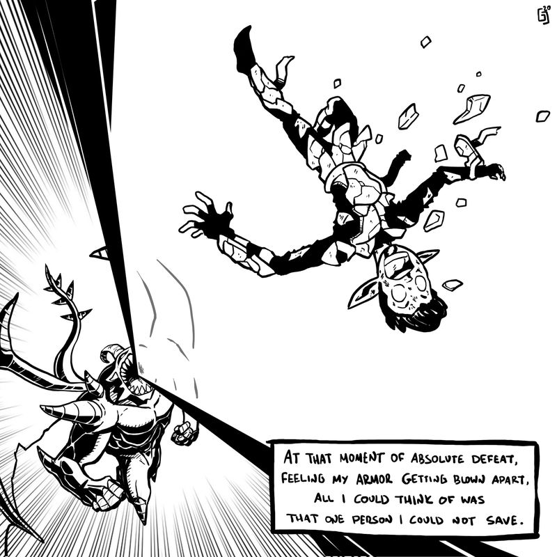
Instagram : https://www.instagram.com/g.chris.artwork/
Deviantart : https://www.deviantart.com/g-chris -
@Georgios-Christopoulos i like the 2nd better because it enhances the composition more
-
I'd say I like the 1st one more as it gives more space to displaying the fire (?) blast
-
I think that it depends on what comes after this page. If this is a comic and the next panel is on the next page, then the first one might be a better fit, due to its long shape. If the next panel is underneath, then the taller shape might help a reader's eyes travel downward. If this is neither of those cases, then I think that I agree with Nyrrel Cadiz on this one. The second one feels like it has better eye flow.
-
@Nyrryl-Cadiz
@Gary-Wilkinson
@Jason-SakuwaThanks guys!!to tell the truth, I lean towards the second one, composition wise, but in the first one, I like the fact that the sentences are not interrupted and are more readable.
Thanks for the opinions!!
-
The first has my vote.
Going by pure aesthetic I’d say the second because of the composition as a whole looks better. However the first reads a lot better. And as the image looks like a panel in a comic I personally would rank readability before form.
-
@Niels thanks for your comment mate!!
-
@Georgios-Christopoulos i think the first box breaks up the line and distracts me. The second seems to fit better and takes nothing away from the image,
-
@Georgios-Christopoulos I like the second one becomes I find there's too much empty space in the first that the second covers up.
-
@Georgios-Christopoulos I agree that I like the composition of the second one better. As for readability, I think the line breaks do affect how people read it but it this case it just seems like the "pauses" make it more dramatic. So I don't feel like it takes away from the meaning. It just forces the reader to kind of feel that "slow-mo" feeling in the middle of the action scene which I think is the point