Critique my style (periodic checkin)
-
Hi guys!
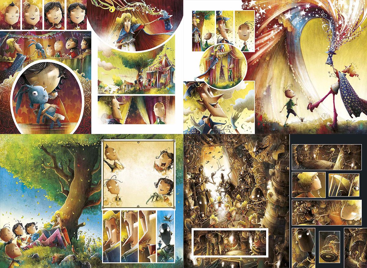
A while ago I posted some samples of my art and asked for some direction on the evolution of my style. I think it's time to ask again.
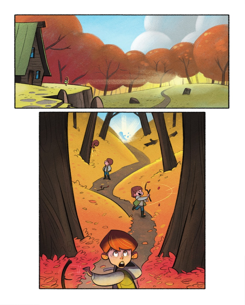
I've been manufacturing some graphic novel samples. The basic process is that I paint first, and then add lines and characters at the end.
If love it if you could give me some feedback on:
1.) Does the method of fading the lines to nothing as the image recedes work? I think it's works fine for picture books, but for graphic novels is this approach a good idea?
2.) Is there too little detail? Any ideas on artists I could look at to draw inspiration from to add some more? (assume I'll be using this for picture books as well)
3.) Any general advice would be awesome, too.
Thanks for taking a look


-
Hi @Braden-Hallett, I think both styles work really good, but generally think line-work looks best in your graphic novel pieces. Always enjoy looking at your work. Less detail in the background is definitely preferable to keep focal point on the action.
Nice work!
-
@Braden-Hallett Very nice work! Everything reads very smoothly!
Here are my answers to these qs you asked:
1.) Does the method of fading the lines to nothing as the image recedes work? I think it's works fine for picture books, but for graphic novels is this approach a good idea?
I think it works in some situations better than others and in different ways?
For example your panel with the round trees and the house on the left of the picture plane. The trees form a big solid mass. I dont know if you want that but it also takes some of the depth away from the trees. I know you tried to compensate by painting them with some variation in value But i think maybe an incomplete line would work for the more foreground trees better. Not a full contour around the tree just perhaps the bottom of the foliage mass and have the line slightly overlap the tree behind it, and not for all the trees maybe the first 1 or 2 that are in front.
Some areas the masses are very good! Like the shadows of the mountains. But I think try a tiny bit of line at the bottom where the mountain is rising off the ground, on the shadowy side and it doesnt go al the way up the mountain just enough to create a feeling of comic. I dont know if that makes sense.
2.) Is there too little detail? Any ideas on artists I could look at to draw inspiration from to add some more? (assume I'll be using this for picture books as well)
The details are just fine! I dont think you need to worry about adding or taking away detail unless you’re focusing in on something, like the leafy group in the foreground of the kid frolicking in the road.
3.) Any general advice would be awesome, too
One other thing I think that would separate this from a kids book, even with the graphic painterly approach to backgrounds is remember this is a graphic novel so you got more tools than a kids book to use, not just art, but the ways in which you break panels to show transitions or movement. You dont want any ambiguity (or as little as realistically possible, so you gotta use your comic tools. For example, this is a personal preference of course, for the kid in the forest, to show the transition, I would have taken that panel, and broken it up into several panels wherever the kid shows up. That way theres no ambiguity at ALL about whether this is the same kid or different kids. I would take that same environment, not redraw it or copy it over or anything, just take that panel and cut it into another panel every time that kid moved. It would a good way for you to show your skills with graphic novels.
Of course none of this is set in stone, it all looks good but these would be things I think about when im doing thumbnails for the transitions
Edit:
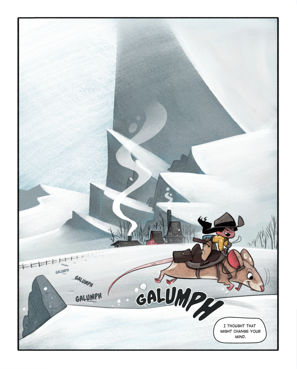
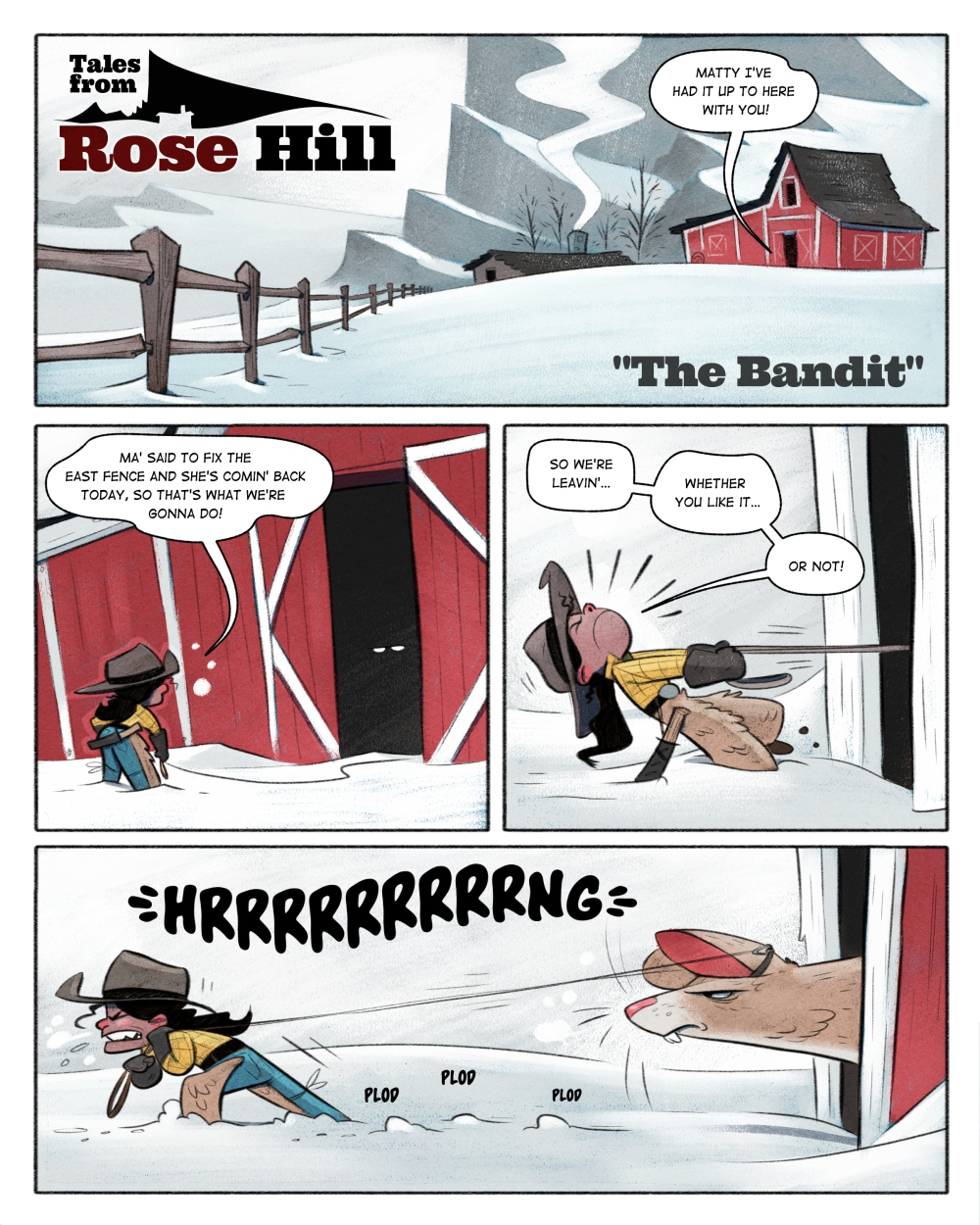
I didn’t realize the first few were older ones! All the snowy ones are great!instagram and twitter: @artofaleksey
alekseyillustration.com -
@Jeremy-Ross I'll second that.
It's looking awesome, Braden, hurry up and get a graphic novel finished so I can buy it and read it. -
@Braden-Hallett I agree with @Jeremy-Ross and @ArtofAleksey
I also think it could work for both.
Anyway, love your work! -
@Jeremy-Ross said in Critique my style (periodic checkin):
Less detail in the background is definitely preferable to keep focal point on the action.
Cool cool. Definitely what I was hoping for. Good to know it's working
")
@MattBaker said in Critique my style (periodic checkin):
hurry up and get a graphic novel finished so I can buy it and read it.
You'll be one of the first to know, lol
@jsnzart said in Critique my style (periodic checkin):
@Braden-Hallett I agree with @Jeremy-Ross and @ArtofAleksey
I also think it could work for both.Cool cool! Thank you
-
@ArtofAleksey said in Critique my style (periodic checkin):
But i think maybe an incomplete line would work for the more foreground trees better. Not a full contour around the tree just perhaps the bottom of the foliage mass and have the line slightly overlap the tree behind it, and not for all the trees maybe the first 1 or 2 that are in front.
Some areas the masses are very good! Like the shadows of the mountains. But I think try a tiny bit of line at the bottom where the mountain is rising off the ground, on the shadowy side and it doesnt go al the way up the mountain just enough to create a feeling of comic. I dont know if that makes sense.Coooooool! This all makes much sense
I think it's something I'm gonna have to dial in (since I'm not used to working backwards)@ArtofAleksey said in Critique my style (periodic checkin):
For example, this is a personal preference of course, for the kid in the forest, to show the transition, I would have taken that panel, and broken it up into several panels wherever the kid shows up.
i always forget that I'm 'allowed' to do stuff like that in comics! I'll definitely play around with that.
Thanks for all your feedback!
-
@Braden-Hallett im glad it was helpful. You are very skilled and constantly improving!
-
Hey, Braden--Rogerio Coelho, an illustrator from Brazil (and one of my personal Top Five Inspirations), did a graphic novel (Luoca-Fuga, or "Crazy Fuga") that took the repetitive image of the same man and put individual box frames around him to show the transition of him moving. I know you know how to do that, but I thought I'd share his example.
It appears his particular approach for that book was probably less "comic" and more "fully rendered children's illustrations using the loose structure of comics"... It reminds me of your work, though, as you don't use the more mainstream pen-and-ink approach to comics/graphic novels, either. Coelho seems to lean heavily into his children's illustration style unapologetically, and I wonder if doing so offers a real richness and depth one can't get otherwise. You seem to be taking a similar approach with your work, and that enables a softness to the rendering when you want it that (to me) is really appealing.
Children's Illustration Portfolio: https://www.coreyartusillustration.com
Art Portfolio: https://www.coreyartusimagery.com
Mastodon: https://mindly.social/@Coreyartus
Pixelfed: https://pixelfed.social/Coreyartus -
@Coreyartus said in Critique my style (periodic checkin):
that took the repetitive image of the same man and put individual box frames around him to show the transition of him moving.
Aw nice! yeah that's exactly what @ArtofAleksey was talkinga bout I think
I'll have to add that into that first page.Thank you for showing me this! Very inspirational. I'll have to check out their work.
-
Mannnn, it's just all freaking great!
The only thing I'd ask you about is one thing about the character designs. You draw all the details inside the shape of the character, without anything really poking out of the lines making up the main forms. I personally like breaking those lines. Any reason you don't?
-
@kylebeaudette For some reason I love silhouette and clean shapes. I used to try and really get some deets breaking the lines but everything would come out muddy
-
@Braden-Hallett it works, I'm just looking for things to say

Can't wait to have a Braden Hallett graphic novel in my classroom

-
@kylebeaudette said in Critique my style (periodic checkin):
Can't wait to have a Braden Hallett graphic novel in my classroom

-
Here's my terribly un-informed response. Having grown up on comic books, poured over Asterix books as a teen, and having read a few of the more current graphic novels, I think that there is more stylistic expectations in comics than in graphic novels. In other words, I think the "appropriate style" for a graphic novel is whatever style the author brings to it.
The fact is that, in my opinion, "Braden Hallett's style" -- whether you decide to fade lines or not fade lines, break the outline or not break the outline etc. -- is already delightful to look at and the tweaks you are experimenting with are at this point really more for your own artistic sensibility than for your readers because as far as I'm concerned, anything you do is great. Like others have said, I'm just waiting for you to publish something so I can have your work on my shelf.
Laurie DeMott
instagram.com/demotlj -
@Braden-Hallett said in Critique my style (periodic checkin):
1.) Does the method of fading the lines to nothing as the image recedes work? I think it's works fine for picture books, but for graphic novels is this approach a good idea?
I love this idea. I think it really creates depth to the image. I generally thought graphic novels usually rely heavily on linework, because it is generally faster to do. But there are some european graphic novels which are very painterly. I will send over to you next time I saw something like that pops up on my IG feeds.
I also recall studio Ghibli's movies use line work only on characters, and the environment is very painterly. It is really beautiful, and the create a very present feeling with the envionment.
2.) Is there too little detail? Any ideas on artists I could look at to draw inspiration from to add some more? (assume I'll be using this for picture books as well)
I think the images for snowy scene do not feel lack of details at all. I can feel the texture of the character's cloth, the materials of objects. The autum scene do feel lack of a tad bit of details. I think it has more to do with the variation of texture, rather than details. I think you can make the image rich by finding ways to show that objects and things are made with different materials, and they feel different. Right now, the organge trees and cloud feels made of the same materials. I hope this make some scene.
-
@demotlj said in Critique my style (periodic checkin):
Here's my terribly un-informed response.
no such thing
Thanks for the kind words! I do think it still has a ways to go, though
-
@xin-li said in Critique my style (periodic checkin):
I will send over to you next time I saw something like that pops up on my IG feeds.
I see them from time to time too. I'll be interested to see what you gather! Thanks
@xin-li said in Critique my style (periodic checkin):
Right now, the organge trees and cloud feels made of the same materials.
Interesting! They very much do look like they're made of the same stuff. I'll have to keep working on how to convey texture with my brush sets.
Thanks for the feedback
-
@Braden-Hallett yeah i think your style is fantastic. Like you’ve got it down it seems. I think you can benefit from thinking about the medium of comics more as you’re creating your layouts. How you can use the various elements of comics (panels, word balloons, sound fx, etc.) to enhance the story telling. Otherwise, why comics?
instagram and twitter: @artofaleksey
alekseyillustration.com -
@Braden-Hallett Hi Braden! Your work is amazing and I believe it will fit both graphic novels and trade books. However, in graphic novels, you are going to make a lot of images. Your style needs to be something you can churn out fast and efficiently. If the line-less backgrounds are something you can produce quickly, then go with it. I wish you all the best!
Portfolio: nyrrylcadiz.com
Instagram: https://www.instagram.com/nyrryl_cadiz/
YouTube: https://www.youtube.com/channel/UCbJCF1Im8ZO7hpGWTKOJMuA