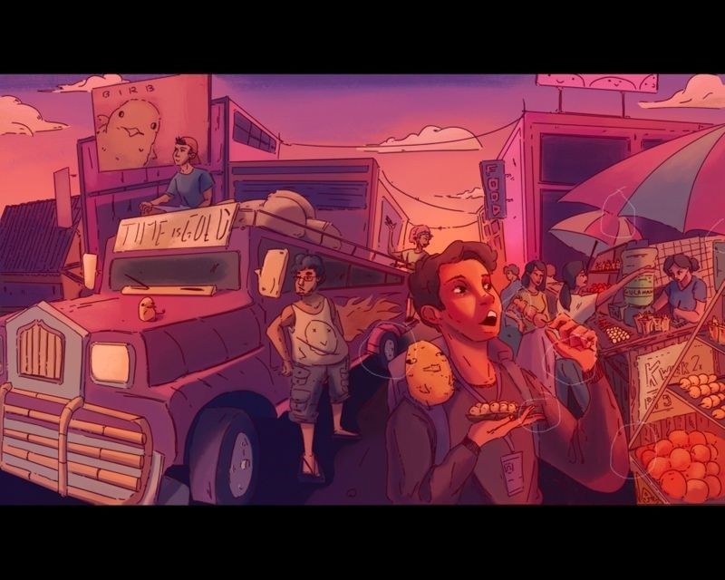
Crit my art please :>
-

Hi! i'm looking for critic for my artwork here and any tips that i could improve on would be greatly appreciated!

-
@Manuel-Mal hi Manuel! What sort of critique are you looking for? It helps to ask specific questions about specific things.
For example, are you wanting advice about composition? Color choices? Storytelling? Rendering? Etc.Over all you have a nice color palette going. Your characters are good. I’m not sure what story you are going for. It looks like a snapshot of a marketplace rather than a story. There is no clear focal point. I cant’ tell whether the truck or the guy eating is the focal point because they are symmetrical on the page. Does this help? It looks good, though.
-
Hi. So these are small tangents I circled below on your work in a thin white pencil, might look around and see if there are other.

-
How can I not crit with your profile thumbnail is begging me to? Overall this scene is so cool. I really want to walk around there and go shopping and eat some street food. Love the colors and the mood.
@chrisaakins brings up a great point. What is your focal point? I want to say it's either the guy in front eating the street food or the guys and the "Time is Gold" limo thing.
-
If it's the guy in the foreground, I want to see him stand out more- and the food he's eating- maybe play with where he's looking.
-
If it's the other guys, I'd de-emphasize the guy in the foreground, maybe extend the canvas to the left and add more foreground people.
-
If there is no real focal point and it's about the scene as a whole, I think you should also extend it to the left and add more people.
I'd also think about adding even more signs and advertisements in the back, to really lean into the busyness of the scene. I'd add more graphic elements to the birb sign at least. Maybe add more birbs around the scene in general since you already have 2. I want more storytelling with the birbs to clue us in on this birb world. Maybe make it even clearer that the flames are on the limo-struck instead of coming out of tank top dude.
Just throwing out some thoughts. It really is a cool scene.
-
-
@Manuel-Mal Hi, Manuel! It's so good to see your post in the forum!
-
@chrisaakins thanks for the advice, i’ll definitely be mor specific the next time i ask for critic

-
@Manuel-Mal This is a really cool piece! I like how ambitious it is and the color scheme you used. I think your weak point is composition and that when you make such a complex scene you have to do more planning so that you have a clear focus point and breathing room in between points of interest to keep it from being messy. In this case your character is all tangled up in many other characters directly behind him. I think you might have made the piece longer to space out the elements more, give more breathing room to your character, make the street wider. This would also help the perspective feel less wonky. Spend more time on the planning stage and this will definitely improve your art!
-
@Heather-Boyd this is really helpful! i never really noticed al of those tangents xD. thanks alot!
-
@NessIllustration yeah, i guess i didn’t plan enough beforehand

 , thanks for the great advice tho!!
 -
Thank youuu and thanks for the great suggestions duuude
 i’m really happy with all the great constructive criticism from the site

-
II like this. Thanks for posting it. Actually, while I agree with the comments about tangents and focal point, I really like the composition in general. You've obviously worked hard in that area and I think you've done well getting all the elements into the picture, establishing distance, and creating a chaotic marketplace vibe. Maybe attention to hierarchy of shapes, color temperature and value are techniques that could emphasize your main character and help the details read in order. And you may want to take another look at the awkward angle of the kid's right hand. A really fun bit of storytelling!