Lee's Light and Shadow class work
-
Okay so Hi. I understand what Lee is getting at with local colour tone and with a lighter background verses darker characters and vice versa.
But I do get stuck with a few things so if you guys can help clarify that be fabulous.
This may seem silly but lets use soil as an example, there are different types of soil (as in colour and also dry soil is lighter than wet soil). How then do I determine the right local colour tone? Is this too nit picking?
Below are two examples of works, 1 has a real solid dark figure on a light background and the other is not so much.
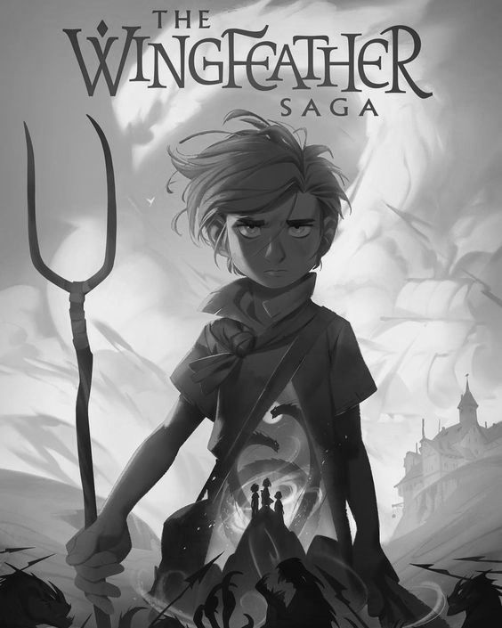
I've just realized for the above one that all character parts are in the darker range and the environment is lighter. I got stuck because inside the character there was lighter parts -but it dawned on me that it represents the environment.
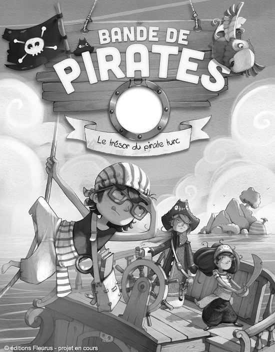
So for this second one just above the characters are darker than the background but why is it okay for some character objects also be in the range of medium-light and even white? This confuses me. And the boat is also relatively the same value as the water. I assume the boat is considered part of the background.
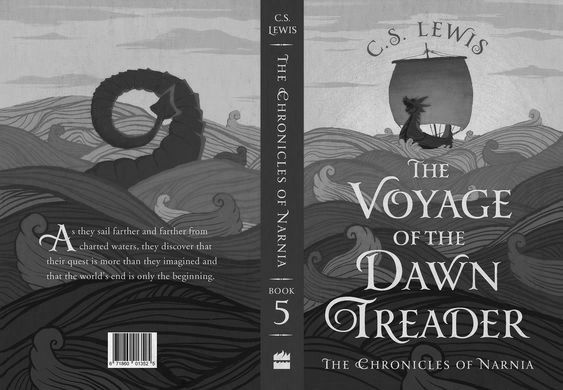
This one below has a nice silhouette but I am lost how the waves can move from medium to dark (front) while the ship, though it stands out, still sits in the same medium to dark range?
The first part of assignment #1 was fine when selecting objects in my own space/environment and noting local colour and tone and what wouldn't work but because the second part asks to look at other people's work that have shadow and light and colour attached, I find it more challenging.
Thanks guys,
Instagram: www.instagram.com/heatherboyd.illustration/
Website: https://heatherboydillustration.ca
Shop: https://www.inprnt.com/search/products?q=HeatherBoydIllustration
Ko-Fi: https://ko-fi.com/heatherboydillustrationBe blessed,
-
I have a question so I'll just add it here:
I don't use Photoshop nor have it on my computer -how do I go about opening the psd file for Assignment #2 -which has the drawings of the 6 scenarios I believe? @Lee-White or anyone else who could help me, much appreciated. -
I'll take at stab clarifying things. I haven't taken the class and I'm no expert, so just take things with a grain of salt until someone more experienced can answer!
For the soil example- yes soil values vary, so you just pick the local value that works for your piece or for the environment design.
For your first illustration example, the character is in the extreme foreground and looks mostly back-lit so he will be darker. The background has atmospheric perspective- since we are seeing the background area through layers of atmosphere the dark values will be lighter. The character may have less overall value contrast because he's mostly in shadow and his character design choices just have less local value contrast between his clothes, skin, and hair.
The second illustration looks like a different lighting situation. Your first one looks like either a foggy day, or late day scene. This pirate one looks very sunny and bright- more in direct sunlight- so lighter values are going to be lighter. Light will also bounce around all the surfaces and potentially make some shadows lighter. This piece is also utilizing line work to help with contrast and is not just relying on light and shadow. The artist looks like they chose the value of the wood of the ship, so he/she could contrast the characters off of it. Just like the soil example, wood can have different local values and you can choose the one that will give you the best pay off. It also looks like the artist is using some atmosphere or light bleed onto the ship in the lower left side to lower the contrast of the shadow on the ship and keep the focus on the characters.
The third example- first I think it looks more graphic and you can really play around with values without worrying about realism of light and shadow with graphic styles. But for this one atmospheric perspective can be at work on the waves. The ship is also mostly running perpendicular with the ground plane and could be back lit, while the ocean is running more parrallel with the ground plane and light could be washing over it's surface more.
If you DM me your email, I'll send the files to you in a non psd format.
Website: www.tessawrathall.com
Instagram: www.instagram.com/tessawrathall_art/
-
@Heather-Boyd Hi! I think in the 2nd image you are meant to look at the characters' faces while not so much on their clothes/props. that's why the faces have darker values than the clothing.
Portfolio: nyrrylcadiz.com
Instagram: https://www.instagram.com/nyrryl_cadiz/
YouTube: https://www.youtube.com/channel/UCbJCF1Im8ZO7hpGWTKOJMuA -
@Heather-Boyd krita, which is a free drawing/art program can open photoshop files too. maybe thats a option for you.
-
@TessaW This is super comprehensive and I know I have so much to learn still. I really appreciate you writing this up! And I will re-read several times again. These examples aren't nec. my style (though the last is closer) but were the easiest to get my points across. I will send you my email.
-
@Nyrryl-Cadiz Thank you, I agree a lot of focus with contrast is around their heads. Thanks
-
This is a really good question and one that I can address more about next week. But in short, color and saturation will start to come into play once things start to move towards a finished stage.
The concepts from my class help you get broad values established and get the work moving in the right direction. But once you are going to take something to color, the values can actually come together more than they would if they were staying in black and white. For example, if you have a big circle in the middle of a square as your composition and you are working in black and white, the circle needs to be lighter or darker than the background. But if the image is going to be in color and the circle is bright red and the background a muted green, they can easily be the same value because color and saturation are doing all the work.
The best case scenario is when value AND color/saturation are doing work to keep things separate (but harmonious) in the image. Also, There will always be images that work and DON'T fit into the scope of what I'm teaching in the class. And that is where the 'art' of all this comes into play. I'm giving broad outlines that work MOST of the time. Now your job is to test those boundaries and see what works for you.
Hope that helps some. : )
SVS Faculty Instructor
www.leewhiteillustration.com -
@Molambo Thank you I will consider this for the future!
") I work mainly off digital so a free alternative is preferred.
I work mainly off digital so a free alternative is preferred. -
@Lee-White said in Lee's Light and Shadow class work:
The concepts from my class help you get broad values established and get the work moving in the right direction. But once you are going to take something to color, the values can actually come together more than they would if they were staying in black and white. For example, if you have a big circle in the middle of a square as your composition and you are working in black and white, the circle needs to be lighter or darker than the background. But if the image is going to be in color and the circle is bright red and the background a muted green, they can easily be the same value because color and saturation are doing all the work.
I understand this and found it out turning this work into grey scale:
Instagram: www.instagram.com/heatherboyd.illustration/
Website: https://heatherboydillustration.ca
Shop: https://www.inprnt.com/search/products?q=HeatherBoydIllustration
Ko-Fi: https://ko-fi.com/heatherboydillustrationBe blessed,
-
@Heather-Boyd Great example of what Lee described! It's interesting right‽
-
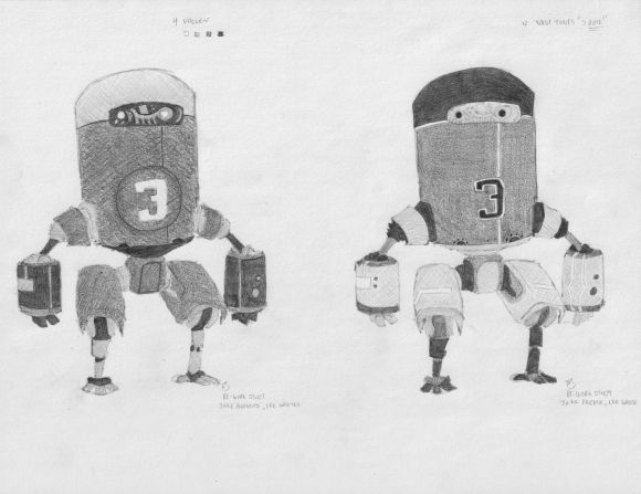
So I have gone through the six images in local colour. I wanted to return to the robot (Jake's/Lee's) and try two variations. I did alter some design elements for fun. I have always found pencil work relaxing and Lee is right once I know what local colour goes where filling it in is relaxing too. So I want to share my two other robot versions (below). It's a bit blurry due to my scanner.
-
WOW so nice
-
@Sara-Nilsson thank you, I really appreciate it! -I just need to up my drawing skills some more. But I will proceed in pencil drawing, stick to what you love as your foundation.
-
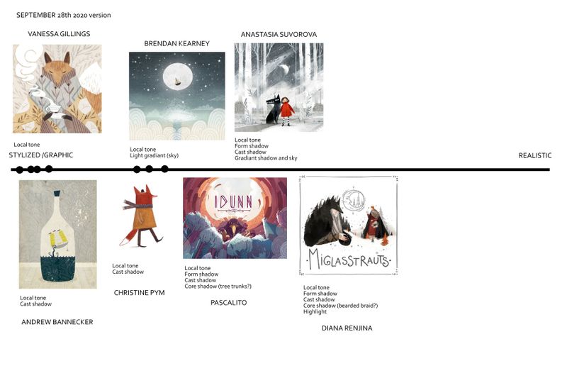
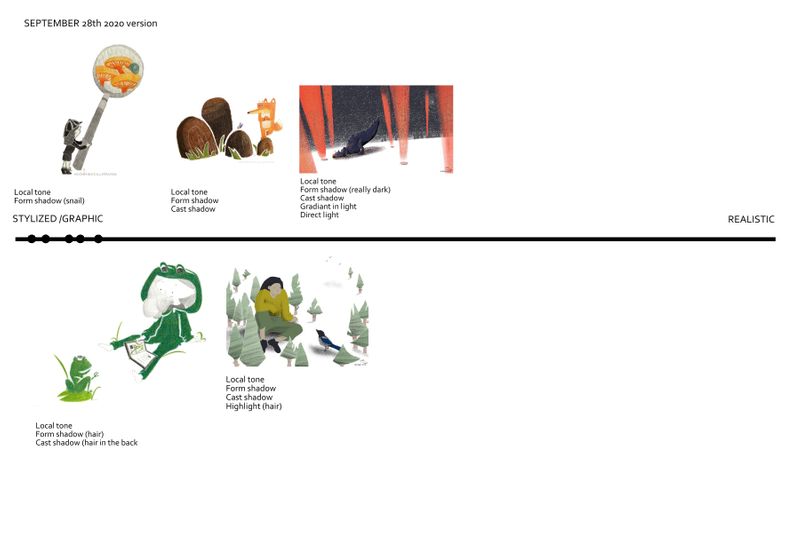
I wanted especially to thank Lee for the Favorite Artist Comparison assignment. I realized that artists that I thought were not using a lot of the light and shadow components, were, in fact, using several of them, and vice versa. It was very interesting also to find the same artist with works all over the line. After this assignment, I am seeing illustrations in a whole different "light". So, thank you, Lee!
-
I think this is Assignment #4 Favourite Artist Comparison Assignment. And then I followed @Lee-White 's in video recommendation and did my own work on the line. Not sure how accurate my dotes for both are but I get the idea. I also think my distance shifted a bit comparing my own work and comparing the other artists, but anyways. It was an extremely helpful class and useful (and calm my realism fears) assignment. Thank you.
Instagram: www.instagram.com/heatherboyd.illustration/
Website: https://heatherboydillustration.ca
Shop: https://www.inprnt.com/search/products?q=HeatherBoydIllustration
Ko-Fi: https://ko-fi.com/heatherboydillustrationBe blessed,
-
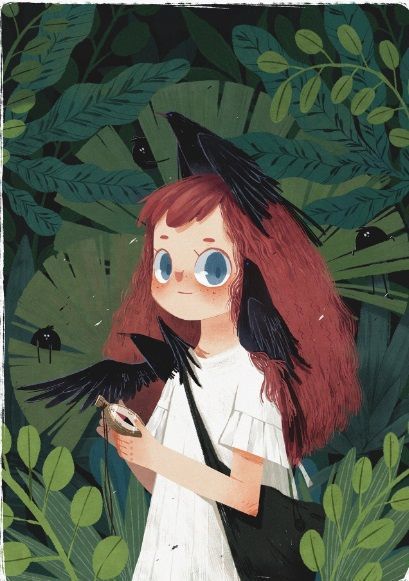
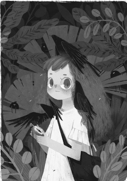
@Heather-Boyd who is the artist on this image of the girl? I love the style!
-
@Coley the girl with the wolf? Anastasia Suvorova. I am sorry if the text is a bit blurry, all the artists names are either above or below the image.
Instagram: www.instagram.com/heatherboyd.illustration/
Website: https://heatherboydillustration.ca
Shop: https://www.inprnt.com/search/products?q=HeatherBoydIllustration
Ko-Fi: https://ko-fi.com/heatherboydillustrationBe blessed,
-
@Heather-Boyd it's the girl with the big eyes and the crows in her hair. Red hair, green background. You turned it to gray-scale.
-
Instagram: www.instagram.com/heatherboyd.illustration/
Website: https://heatherboydillustration.ca
Shop: https://www.inprnt.com/search/products?q=HeatherBoydIllustration
Ko-Fi: https://ko-fi.com/heatherboydillustrationBe blessed,