My comic
-
i love this!
-
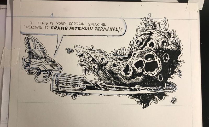
Ok second go around seems to be better already
-
Was able to find time to get back at it again
-
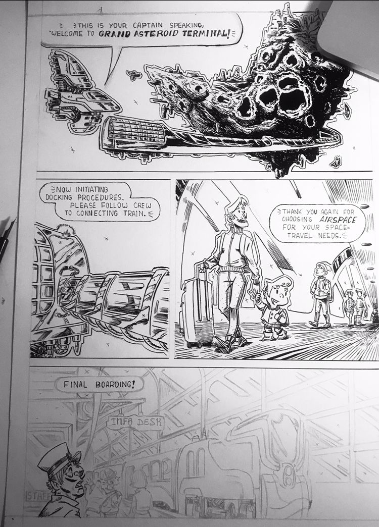
Page 2!
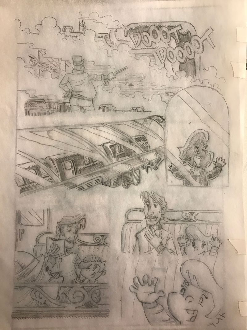
Ive figured out a process that works for me! I printed out a small template of a miniaturized version of a comic page to do my thumbnails and roughs. Then scanned it and lowered the opacity and enlarged the image, printed it out and traced over it on tracing paper. The next step would be to scan it and enlarge it again, and reprint it on 11x17 paper then ink it
-
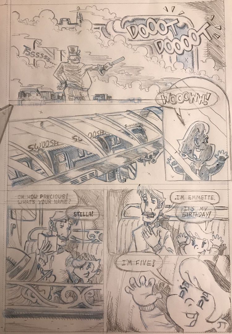
Penciled update
-
This is super fantastic work!! I'm super impressed with your background details - your setting feels so real! I can't wait to see more.
-
@korilynneillo do they really? Haha i really struggle with environments so thank you.
-
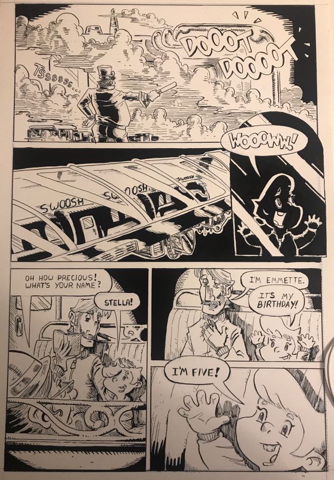
Gettin better at inking and figuring out a process. I think the lighting came out a bit too dynamic haha.
-
@ArtofAleksey that's how I have currently done as well that process: thumbnail, scan, edit, resize, print.

-
@ArtofAleksey all the panels aside from the swoosh swoosh one look good. Swoosh swoosh train one is harder to identify because there is so much dramatic contrast. Perhaps the kid one as well.
-
@Heather-Boyd gotchya thanks heather. Hopefully it will be easier once I color it. Maybe I should just keep things simple with this comic. You think I might be overdoing things?
-
@ArtofAleksey you are able to alter the value strength of black to a grey in other parts so keep what has to be black darkest (space) and vary more the areas that are not, like the darker side of the train may need not be black etc.. That and did you forget to put in stars? I see x's in areas in the roughs -were those star placements or meant to mean solid black areas which I am thinking now you did.
-
This looks great! The flow of your compositions are awesome!
-
@Heather-Boyd thanks these are great points.
Maybe starting with values rather than sketches
@K-Flagg thanks!
I also realized that while i like the drawing and my progress and improvements, im definitely feeling weird about something i cant put my finger on. After talking to a few people, they helped me realize that what’s missing is the mood. What is the audience supposed to be feeling other than “this is where the story takes place” I’m gonna take another pass at my work and see if i can do it again
-
Ok! Major break through. I put my pencil down and started doing research and thinking more and more about what kind of design do i want to use in my comic? I kept trying to reinvent the wheel and ended up covering up parts of my art with masses of ink or lots of hatching.
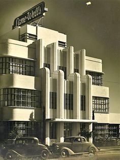
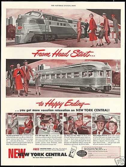
So ive been researching 1950s designs because i really like that aesthetic, color palette, architecture, even their ridiculous retro futuristic designs for space ships. And i can recognize it better. Art nouveau is too much for me to understand and too difficult for me to be able to design into something practical design wise without spending too much time with it. So im going simple.
For architectural designs i think the best way i can explain the inspiration is with this image:
For cars and trains and stuff this vibe:
I think clothing will pose the toughest challenge because im not super great at clothing even after taking the clothing drawing class (might take it again)
But having something concrete will be way easier to go off of. -
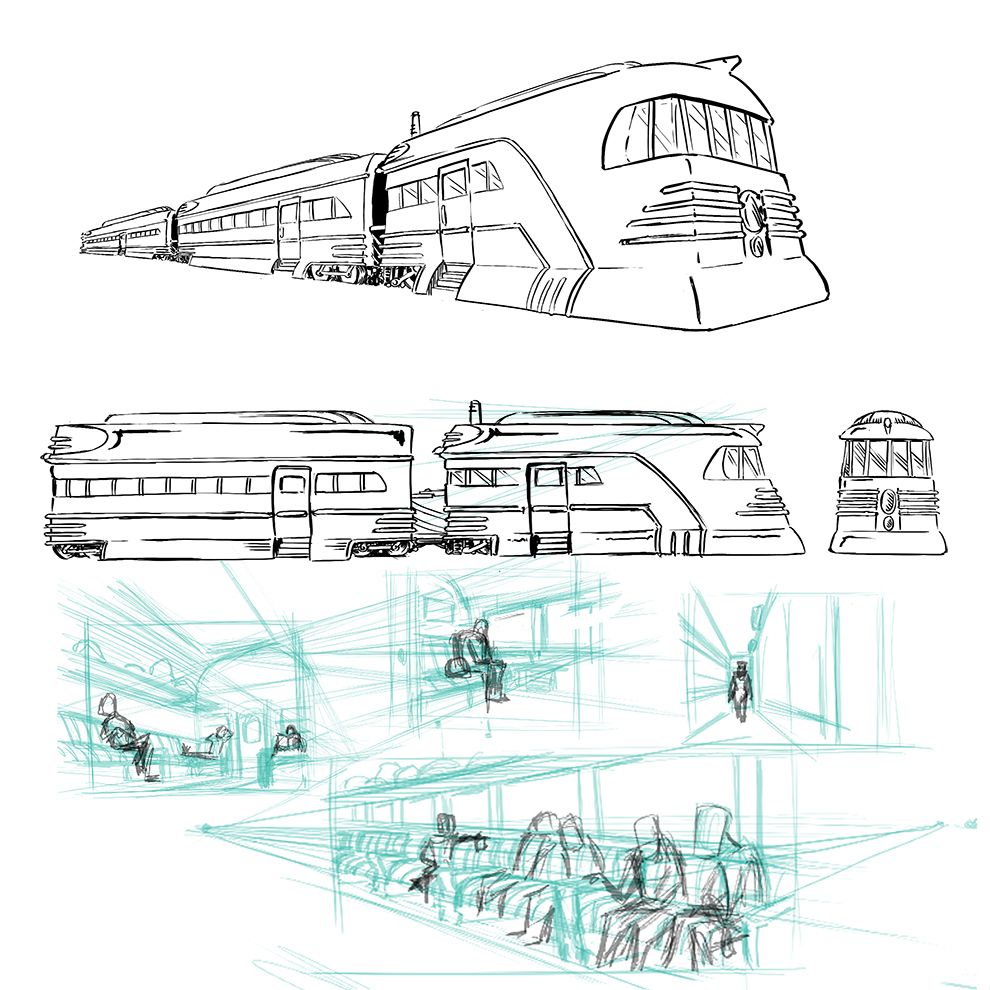
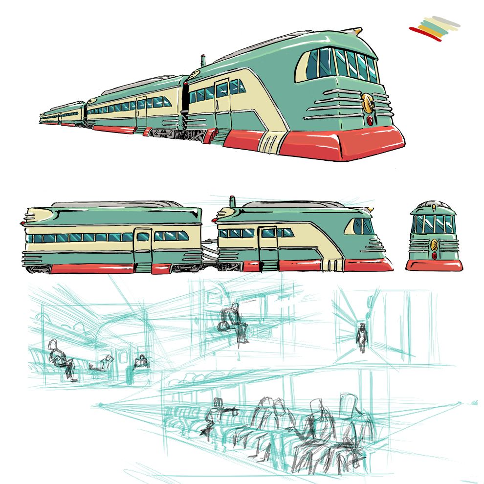
So instead of just doing some arbitrary train, heres my train design
-
Looking good . Many thumbs up to you.
-
@ArtofAleksey I agree with @Jonathon-B-Baker-0 and of course you. It's great you have found a better footing for your style and able to comfortably and confidently go forward! I am really looking forward to your intertwining the 50's era in your futuristic designs. Always love what people choose to include when they mix eras together.
 Also dig seeing your sketch perspective work. These perspectives really make me feel I am apart of your story and alive, like it is real, or very much could be.
 -
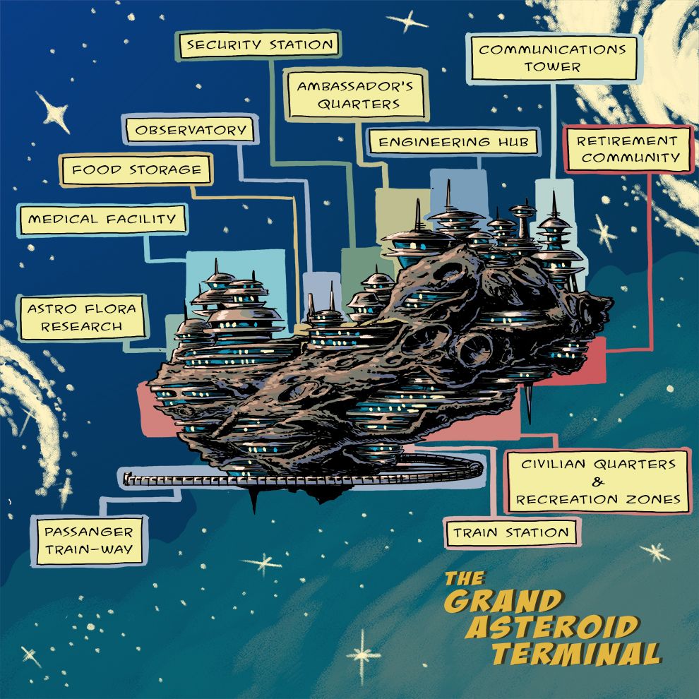
Ok heres the finished version of the asteroid with the retro style buildings and the colored version of the train.
Next up are the buildings on the inside!
-
@ArtofAleksey wow this really looks good. I definitely think you captured the aesthetic of the fifties space retro in your train. And the asteroid looks great. I am definitely hooked on it and want to know what is going on in the story.