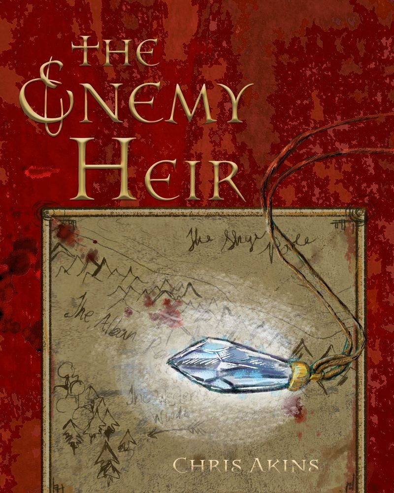
COVER ART for a book I am writing... Critique requested
-
@chrisaakins I agree, the second one is better. Giving the title space is good, but the font is tough to read. This will potentially be on a display shelf, so you'll want the title to read fast. You have seconds to keep someones attention. The are a ton of fancy old style fonts that may read better and still give you the fantasy look.
-
-
Does the cover make you want to read the book?
I think it's pretty cool! You could possibly try work a little more decoration in somewhere, something that has to do with the book's story? (e.g. some kind of symbolic border) -
What do you think of the font?
I think the font is okay, I had a hard time reading Heir on the first cover, but it's easier on the second version. It matches the mood of the cover well! -
Does the hand-drawn map look like a pic of an old fashioned hand-drawn map?
I think so, although I'm no expert on old maps heh. -
How does the pendant look?
Looks pretty good to me! Although I guess the texture might be a little rough for a crystal pendant, but that could purely be a stylistic choice. -
Suggestions for layout changes? (I'm not 100% happy with the placement /layout of the title)
Hope you don't mind me scribbling all over your cover, heh, I was curious what it would look like if you flipped the colors of the background, the text, and the map border. I also darkened the map slightly to draw more attention to the pendant + I felt like the map illustration overpowered the whole cover.
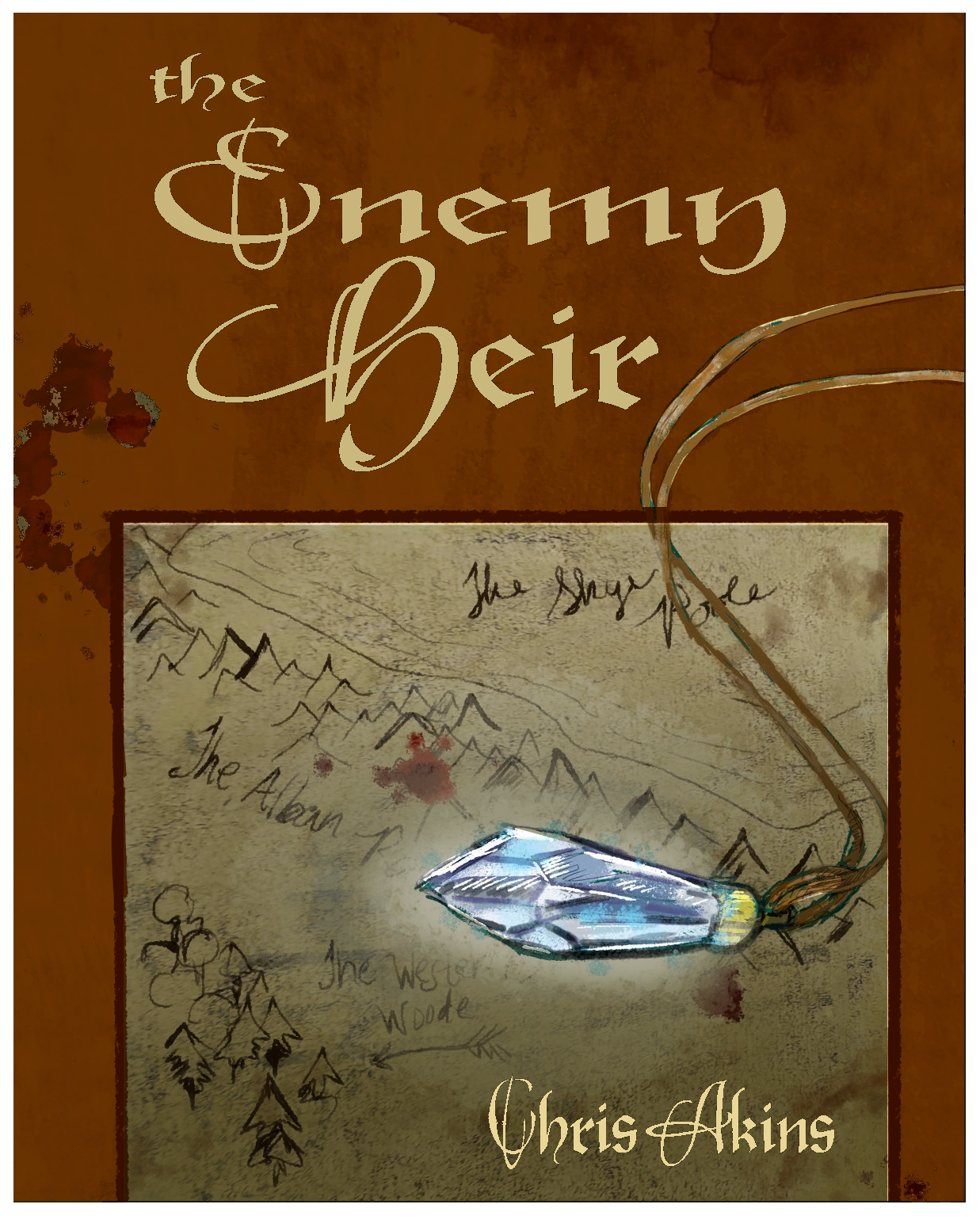
-
-
@jwing ooooOOOooo I like it. YOu can't really see the blood spatter but it is a definite improvement.
-
@jwing @burvantill How is this? Red is always a catchy color. I like it so much better!
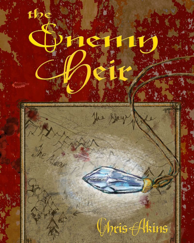
-
Here is a version that passed my adult children's muster, who have actually read the book:
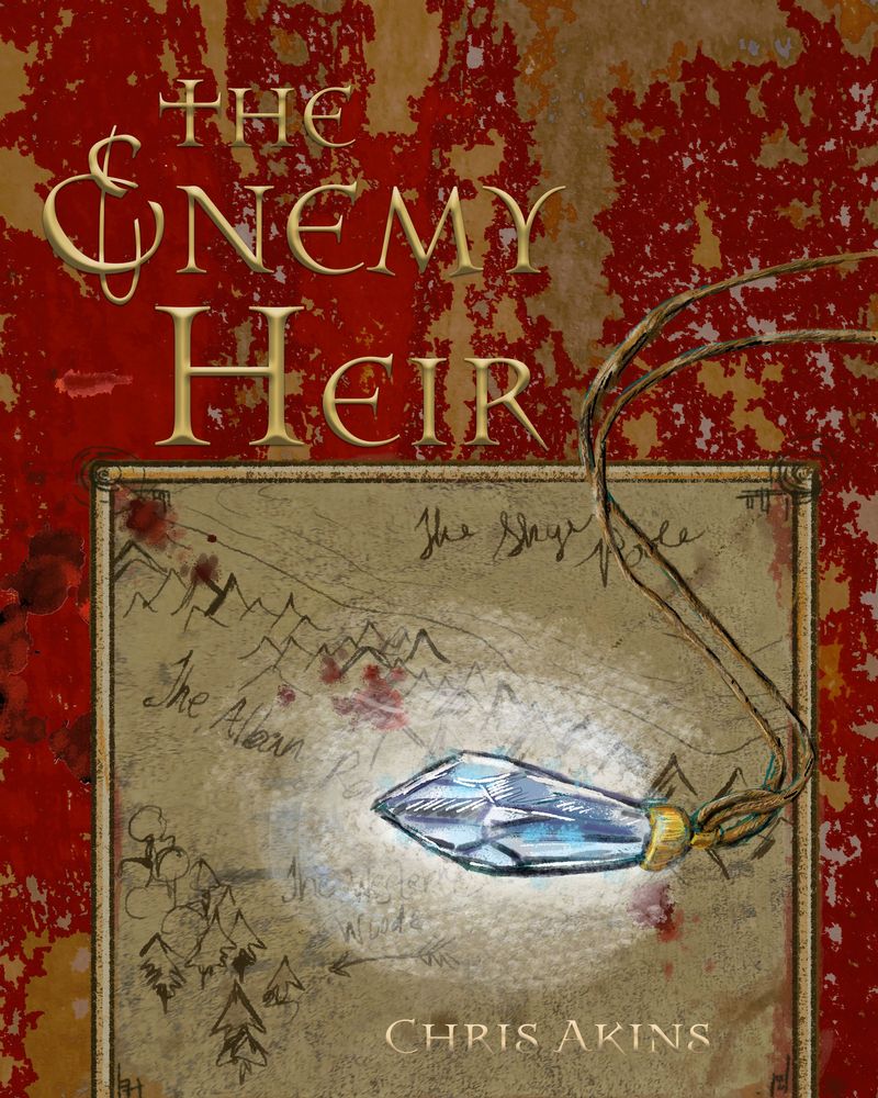
-
@chrisaakins
 . The font is better but I still think it could be played with some more, the rest of the cover looks awesome.
 -
The new font is sweet! That red is awesome but I feel like the background itself is too strongly patterned, it looks a little chaotic and distracts from the title. What if you kept everything as it is, but put a color/layer over the background to mute it somewhat? like this I guess
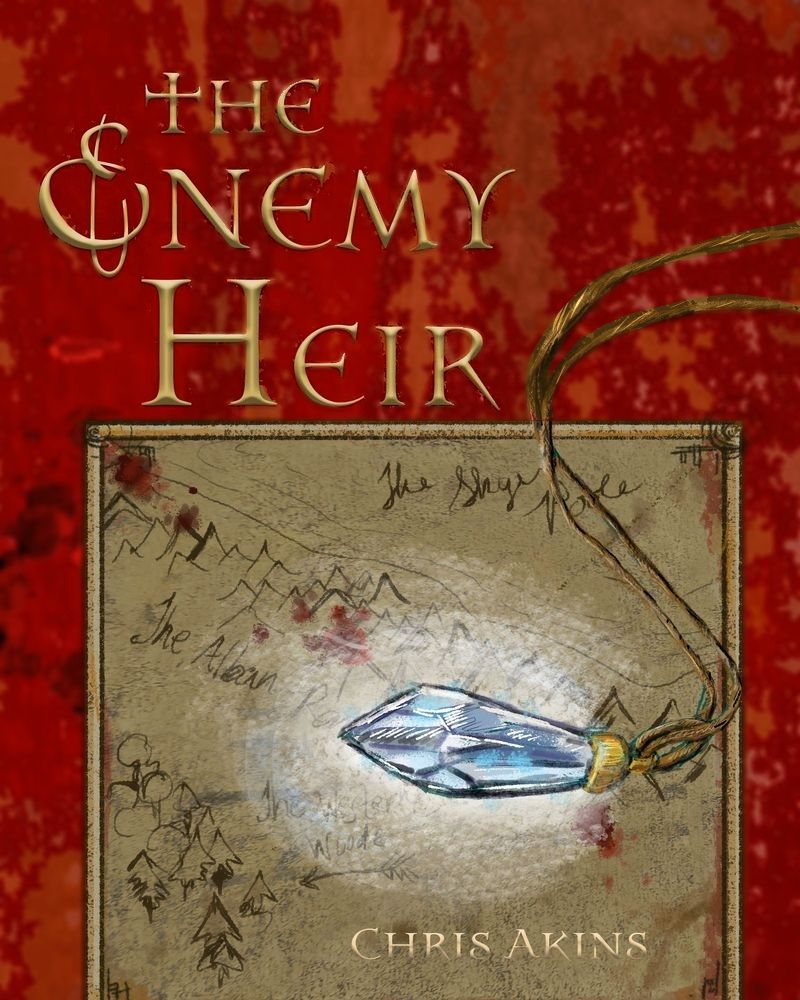
or
Also a small point but the color of 'Chris Akins' blends in with the map, a darker gradient might help it to pop out more!
-
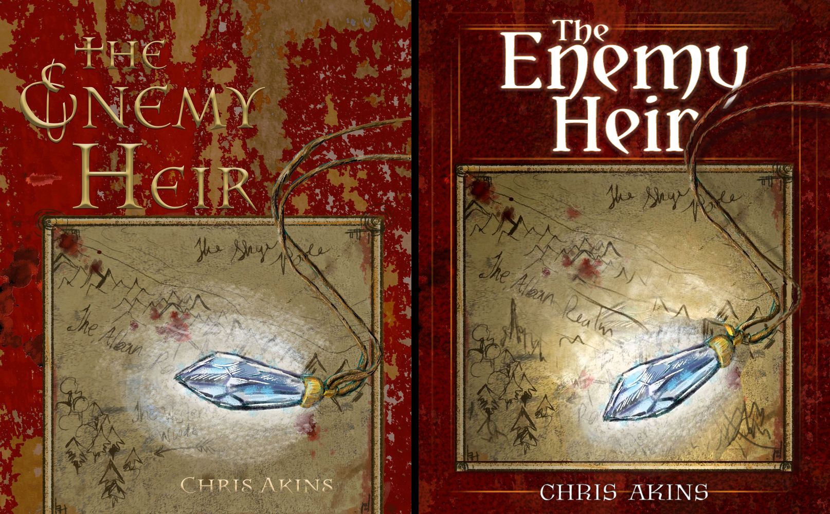
I made this quick edit to maybe inspire you. Notes
Title should be readable at thumbnail size, especially if you are selling on Amazon and such..
Darker textured background, with a brighter more legible typeface. The top felt extremely heavy, pushed up the map to balance out the red a bit, and have a nice spot to feature your name.
Pendant was straight across for the most part, I angled it down to make it seem more interesting, it also leads your eye to the beginning of your name.
Tangent with the rope on the map, so I pulled it out a bit. Added a drop shadow to the pendant.
Overlapped the title for added flair.
Darkened and brightened the map to make it seem like the glowing pendant is actually a light source.
Added a bit of a border to break things up and tie things together at the same time.
I'm not a pro designer, these are just thoughts.

-
This post is deleted! -
@CLCanadyArts wow you are so good at this! What font did you use? I really like the edits you made. I will work on making it more like that.
-
@chrisaakins Yataghan for the title - free.
Krasomila for the author name -free.
Can't wait to see what you come up with.

-
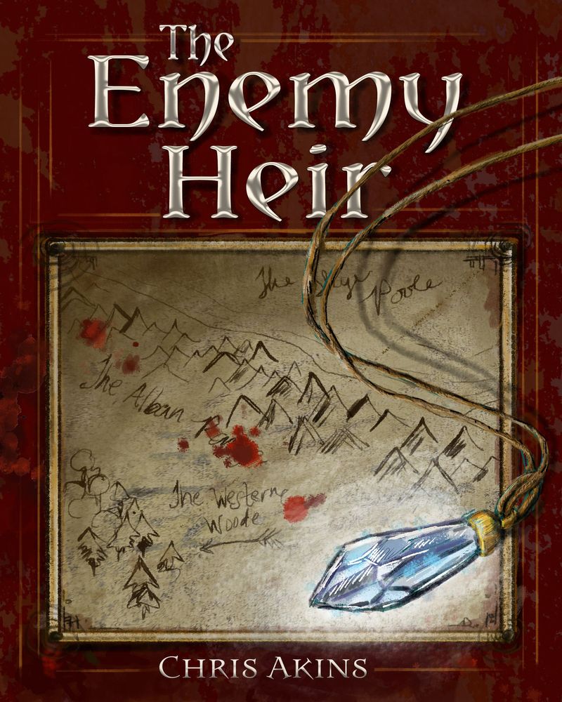
Okay... Here is the final-ish version I think. Thanks to @burvantill @jwing @CLCanadyArts for your input. The font was exactly the one I was looking for. This was my first serious attempt at cover art, so I thank you for your patience. I learned a ton with your help. Let me know what you think, if you don't mind.
-
@chrisaakins Great job


 This looks very professional to me.
 -
@burvantill thanks Lisa!
-
@chrisaakins Nice!

-
Awesome (and very educational) to see the evolution of this. The final iteration looks great!
-
@Casual-T Yes, this is what the forums do best. Help us to learn and grow. We have amazing people here.
-
All cover options for the book are beautiful. I think you should feel with your heart which one is the best.
-
@CLCanadyArts That redo looks awesome. I think it would look really cool if the text was made to look like it was embedded/embossed into the leather of the book.
-
The cover really came together after you workshopped it with the group, wow! The final version is eye-catching and mysterious. I love old maps and jewelry with potentially magical qualities... I would very much be arrested by this cover & want to learn more about the book. Outstanding work!