Dream Portfolio and growing as an artist.
-
So here it is, my journey to find my style and who I am as an artist. If you followed some of my past posts I have struggled to find my artist voice. So following the assignments I have put together my top 20 pieces as well as the top 20 dream portfolio. Much harder then you think. There are so many artists I look up to and find their work amazing. But I narrowed it down and here is what I got out of dream portfolio.
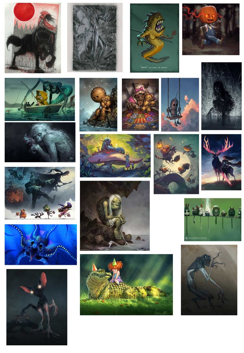
Looking at the images, most of them are based more on character development and emotion then actual story telling. I am sure there are stories to be told with the images. But I get more emotion with the pieces. The colors are pretty much all in the same color range as well as being somewhat flat. Not vert saturated.
There are many pieces from Matt Dixon. I love his style and characters. Also a handful from Aaron Blaise. I have loved and followed both of them ever since I jumped into digital painting. I have learned so many little tips and tricks from Aaron Blaise over the years.
Now my top 20:
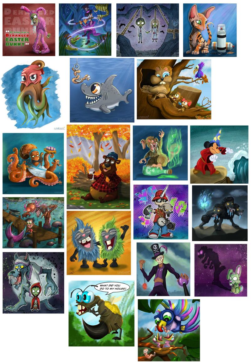
First thing I notice is the colors in my pieces. I really pump the saturation on them. The other is the backgrounds, I think I spend to much time working on the backgrounds and elements around the characters and not focus enough attention on the characters.
As far as style, I have tried to mimic Aaron Blaise somewhat with my cat that is painted like a tiger and the fur balls laughing.
I started working on a master copy of one of Matt Dixon pieces. When I am done I will post it here. I also plan to do a master copy of one of Aaron Blaise's pieces and probably one other out of the bunch.
Let me know if you notice anything different I didn't mention. I will open another thread for my slowvember which I am working at the same time.
-
@Chip-Valecek this is a cool move Chip, I love this assignment.
Do you have a favourite piece? -
I've been looking forward to you posting your dream portfolio! A couple more things I'm seeing-
First- There's a stronger intentional use of lighting and atmosphere in your dream portfolio. It feels believable, but also pretty staged in many of the pieces. Several of the pieces in your current portfolio are heading in that direction- but it isn't quite hitting in the same way. I think saturation has a little to do with it- but it might be valuable to study the value structures of the overall elements of the piece, as well as what's happening with the shadows, midtones, and hightlights of the characters themselves.
Second- Your dream portfolio plays more with the proportions of the characters. You do play with proportions to a certain extent, but a lot of time the different elements of the characters will end up balancing out in their visual weight, and we don't quite get the contrast that your dream portfolio displays.
Don't know where you want to go with lighting or character design- but I figure it was worth pointing out.
I'm excited to see your masterstudy.
-
Very good Chip. This is a VERY usable bit of information you have here. Comparing and contrasting your work vs work you picked will answer a lot of questions for you. Do the master copies, then do some of your own •as if that artist was doing it•
That way you start to see your work through their lens (if that makes sense). Then take what you want from them and do some more master copies from the next artist, and so on.
After you have gone through this cycle at with at least 3 different artists, you should then try making something for yourself and see what comes out. Analyze that and see how it feels and it will lead to what is next.
Keep fighting the good fight. It's worth it.
-
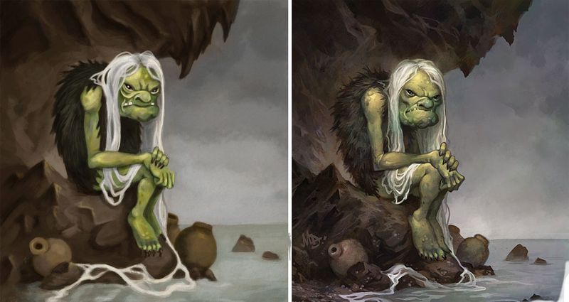
@peteolczyk I have so many favorites here LOL. I am working on the master copy of Matt Dixon Orge sitting in the cave. Mainly to understand how he goes about painting it. I have a few gumroad tuts from him which is helping me understand his process. I do really love the John Loren piece with the frankenstien and kids.
@TessaW I agree with the characters. I need to push mine more. You mention about where to go with the lighting and character design. I want to mash both Aaron Blaise and Matt Dixon. That is my goal right now.
@Lee-White thanks for the constant support and uplifting words!
-
Apart from the saturation difference that you mentioned the main thing that really stands out for me is the difference in approach for eyes. The eyes in your pieces are almost all very prominent features - large and colourful and shiny. In contrast, the majority of the eyes in your dream portfolio are small and subtle, some can hardly be seen at all. I think this gives the characters a darker and more serious/sinister vibe.
Nicola Schofield
Twitter: twitter.com/NSchofieldArt
Instagram: instagram.com/NicolaSchofieldArt/ -
@neschof nice catch, I do love big eyes.
-
@Chip-Valecek that is a cool ogre, will you post your mastercopy?
-
@peteolczyk yes I plan on posting them here.
-
First master study and its a fail LOL. After I was done and I put them side by side I saw so many things wrong from the construction of my drawing all the way to the technique. I thought I should fix it all. But then I would spend hours trying to fix it. So just like any sports team, you lose you get back up and play again. So with that I am going to take this one as a loss and do another. Hopefully the more I do the better I will get and hopefully win one. So here it is.
-
@Chip-Valecek said in Dream Portfolio and growing as an artist.:
After I was done and I put them side by side
Are you not doing the study with the original picture already side by side with your white canvas?
vanessastoilova.com
instagram.com/vanessa.stoilova/Check out my Youtube channel for tips on how to start your career in illustration! www.youtube.com/c/ArtBusinesswithNess
-
@NessIllustration Not side by side, i think that is were I went wrong. I had it on another monitor and I think I used it more as a reference then a copy

-
@Chip-Valecek Don't beat yourself up! It's really hard to do a master copy not side by side so you did amazing, plus next time you know what to do to make things easier on you
") I also suggest you use the color picker to see what colors the artist uses. You may be surprised! On the creature's arms and legs, there not a lot of actual green. It's a lot of grey and yellow that only looks green because the rest of the picture is so desaturated.
I also suggest you use the color picker to see what colors the artist uses. You may be surprised! On the creature's arms and legs, there not a lot of actual green. It's a lot of grey and yellow that only looks green because the rest of the picture is so desaturated.vanessastoilova.com
instagram.com/vanessa.stoilova/Check out my Youtube channel for tips on how to start your career in illustration! www.youtube.com/c/ArtBusinesswithNess
-
@Chip-Valecek This is pretty good. You're starting to capture the painterly quality and the mood of the piece. This is a cool dream portfolio also. Keep at it!
-
Eh, only you can say whether it's a failure or not, but I think you are being too hard on yourself. You've got the overall comp, values, proportions, and rhythm down. Comparing and contrasting between your piece and the original can still be really valuable. Arguably more so than if you had gotten everything perfect, but had been thoughtless while doing so.
-
I think this wasn't a failure at all. I think it was a solid try toward copying the masterpiece. I really like how you captured a lot from the original. So don't beat yourself up :). Having it right the first time is rare if not improbable. I want to see your next try ^^
-
@Chip-Valecek Really cool Chip. Nice collection. You can see how your work will move into the direction of these pieces. This past month I started thisproject and what I'm doing now is looking and at each piece and making mental notes on a laptop just before I go to sleep. Some how, where I want to move towards is starting to sink in, it's a long journey ahead of course. Good luck with this and your journey.
Website http://www.judyelizabethwilson.com/
Instagram https://www.instagram.com/judyelizabethart/
Sharing positivity through art.
-
@Judy-Elizabeth-Wilson long journey indeed. I am glad so many of us are on the same one right now. Feels good to be with other artists traveling the long dark path together
-
@Chip-Valecek I think this is great! you've hit all the main components - just small differences in tone and detail - and I bet you've already learnt so much from the process!
I really should try and do a master study... -
@NessIllustration I think this could be really valuable. The copy is warmer and more saturated, which is also the standout difference between the dream portfolio and the images in the OP, as you noted Chip. I heard recently a piece of advice about fixing work which stuck with me: instead of trying to fix everything at once, ask what the biggest problem is and tackle that first. Rather than a problem it's just a difference in this case, but you might get satisfaction tackling this first?