Business Logo - Share yours here
-
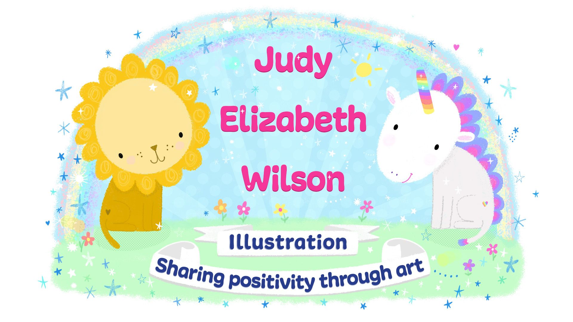
Thought I'd share my new business logo with everyone. I'd love to see your business logos so share here and inspire people who are working on their own logo ideas.

-
Your logo is cute. I like the unicorn especially.
This is my illustration logo.

I have a version that has text beside it, but I never know what to call myself. TwiggyT Studios? TwiggyT Illustration? Tracy Wilson (booooring) illustration? So the T is a staple, but I haven't decided on the text to go with it.
-
Here is my logo.
The name I use is "The Prairie Fox" and my tagline is "jesse norman bergstrom - author, illustrator, printmaker"
A couple of thoughts I had when designing the logo (I have designed a few others before I did mine.)
- Will it reduce well? does it have a good silhouette? (I really like I can use this as my avatar on social media and forums, it helps others connect everything back.)
- What will happen when I go to greyscale and B/W (I have a B/W version) as I may need to do that? (High contrast really helps.)
- Is it memorable? (The glasses I wear are commented on frequently, so adding that to the logo helps to reinforce who it is related to.)
- Does the picture reflect the name & tagline? (It is a fox and I use colors associated with foxes and prairies.)
- Is it giving the feeling I am trying to project? (I had some other very interesting designs but they didn't give the Kid-Lit feel, they were much too aggressive.)
- Do the colors/style reflect your style and/or approach? (I think this is important for artists and illustrators, not a question most businesses have. I like working with a muted color set and large shapes.)
I come from a business background, that really helped inform me as to why we have logos and how to use them to effectively build your brand. Hope some of these notes help others as they work out their logos and branding.

-
@Judy-Elizabeth-Wilson That's adorable Judy! Very representative of what you do

I use my cat with pink glasses.
-
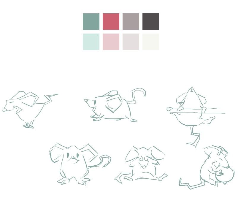
My logo, I draw the mouse and the bought the font on creativemarket

And my branding colors and some illustration for the website:


-
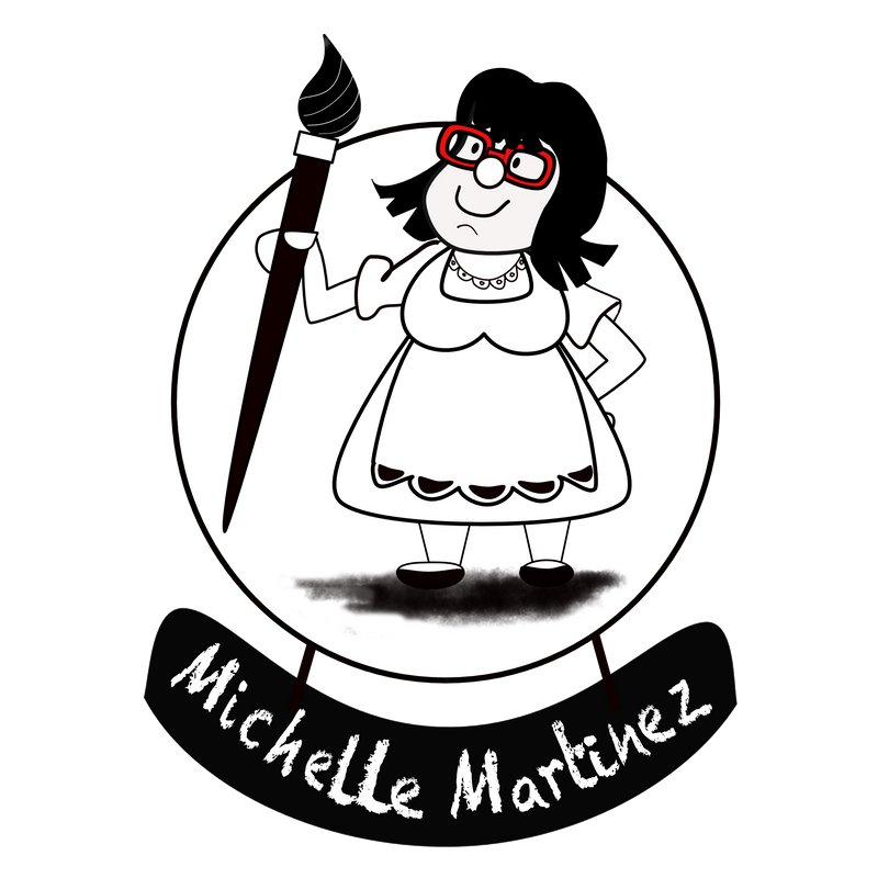
Mine is a self-portrait - I removed a few chins for vanity’s sake


-
My background is in graphic design. I've designed many logos over the years. I needed a logo for myself that could easily be used for the different types of creative projects and jobs I do like web design, graphic design, illustration, and comics. So I opted to focus my logo completely on my name.
I used Gotham Ultra font from Hoefler&Co.
I don't have a color version of the logo—though any color could be applied.
-
I’m still working on mine, but is there another program other than illustrator which I have but don’t know how to use to get a logo made?
Thanks
-
@Heather-Boyd I used Inkscape. I have used it for years. You really want your logo to some sort of vector graphics (like Illustrator or Inkscape) long term this helps you be able to scale it.
Inkscape will take in a bitmap and convert it to vectors. Mine started as an ink drawing and I converted it in Inkscape. I am pretty sure Illustrator has the same functions (I just haven't used it.)
Here is a link to download Inkscape: https://inkscape.org/
-

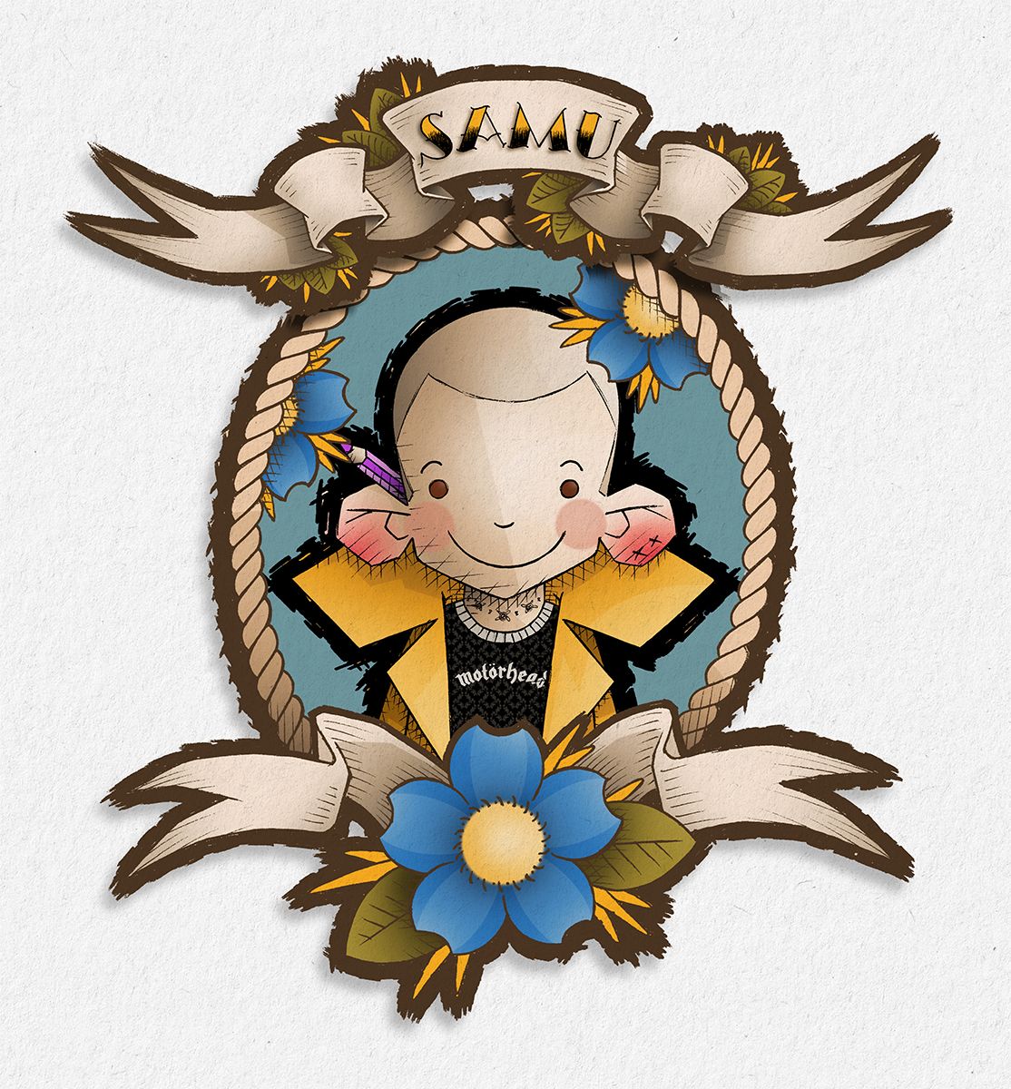
Though I don't consider this a "logo", more like an avatar.
-
@Heather-Boyd There's alternatives to illustrator, Inkscape one of them, just google it. But you just going to end with another program that you have to learn to use it. If you have illustrator, I'll recommend to sit through some youtube tutorials and learn to use it. It is worth it!
Unless you want to use Photoshop, the vector tools in photoshop are real good today and if you only want to create a logo don't need to learn a new program.
Have a nice day!
-
@Samu Brilliant avatar, great to use across all your social media and forums so you are recognizable .

-
@krisblack Really nice Kris!
-
@TwiggyT Thanks Twiggy. Over time I will simplify the logo, I will always use a lion and unicorn.
Your name is lovely! Doesn't sound boring. Tracey Wilson Illustration. Sometimes keeping it simple is best. But I know what you mean when you want a different business identity. Good either way. It's smart using the 'T' like Jake Parker uses his 'JP' in black and white. Bet everyone in illustration knows his logo!
@theprairiefox Love your fox, shape and colour are stunning! You are a fountain of knowledge. Thank you so much for taking the time to write all these points down. I'm certainly going to take them into consideration when simplifying my logo in the future. I know lots of illustrators will be thankful too. Keep you posted on how my logo evolves.

-
@MissMushy So fun! I love the humour in your character. Really great.


-
@NessIllustration Thanks Ness. Your cat is precious and works so well for the world of children's illustration!

@MichaelaH Hey Michaela. Thanks for sharing. Really nice, clean and I love the little field mouse! It's a great point to mention thinking about the colour pallette you choose.

-
I use a moniker for consistency in handles and urls (and because no one can ever remember or spell my name).

-
@Judy-Elizabeth-Wilson thanks I hope it communicates what I try to do with my images - give people a laugh

-

I vaguely use this as my business logo. My surname means 'crane', like the bird. But it's a bit outdated, I haven't given too much thought to an update to my business branding

-
@Heather-Boyd I used Affinity Designer to create mine using vectors. Not free but very very cheap and fairly easy to learn I thought. Lots of YouTube videos to help on that front.