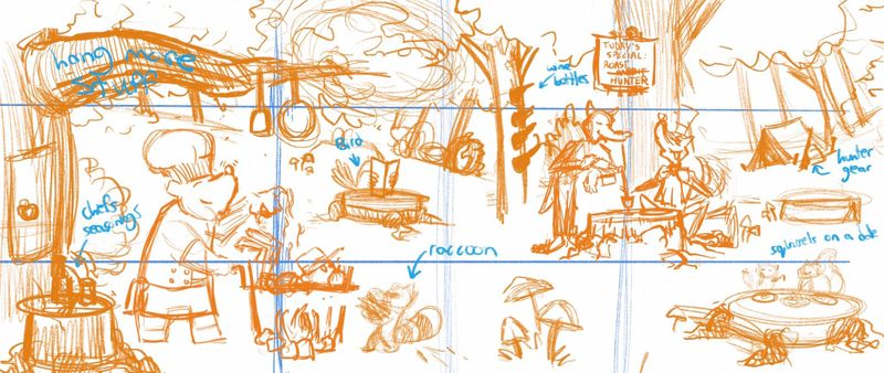
July WIP never hunt for sport
-
@Braden-Hallett good thoughts! Very much along the lines of what I was thinking. Might turn a tree into a “wine holder” the thing with holes for wine bottles. I really like the raccoon stoking the flames idea haha that would look hilarious
-
I think a spread is the way to go. Spaced out the characters, added some more stuff around. Put the hunters stuff in the background. If I do a night scene I think it would be a good idea to add like little fireflies and candles and stuff. What do you guys think? Any feedback welcome

-
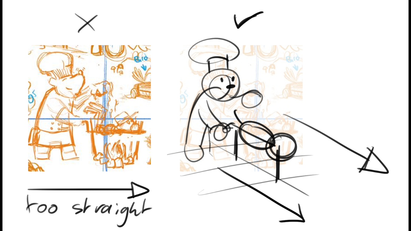
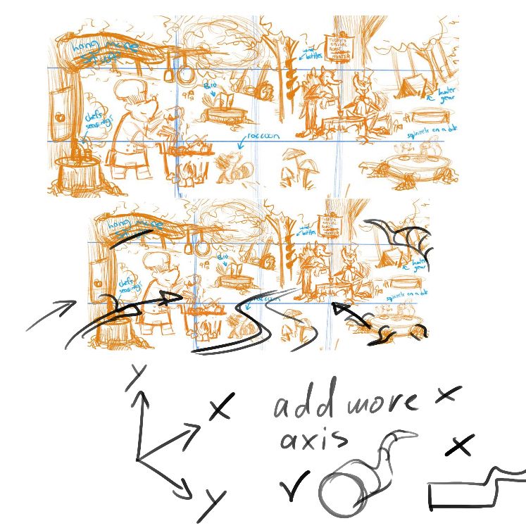
Just got some good feedback from someone i support on patreon, Mitch Leeuwe
Im awful at doing this so im so grateful he pointed this out.
I have an issue with creating depth every looks flat, when im working digitally especially. So I thought I’d share this on here.


-
@Aleksey I follow him on Instagram, his tutorials are fantastic! That is great feedback he gave you.
-
@Erin-Cortese yes! He’s giving away a drawing backgrounds book so i signed up
-
@Aleksey Great feedback, would never thought of it.
-
@Aleksey Are you on patreon from Mitch Leeuwe? How is his patreon and what do You get there? He does great tutorials, I am always watching his posts on isntagram.
-
@Aleksey Great feedback you got there. Thanks for sharing that.
-
@MichaelaH for his patreon you get the discord channel where he sometimes critiques the work people submit. He does the same tutorials as he does on Instagram but in more depth, there are also assignments that if you do he may critique in a video. It’s 5 bucks which is pretty cheap relative to the help you get. There are also lots of artists that are very helpful on discord.
-
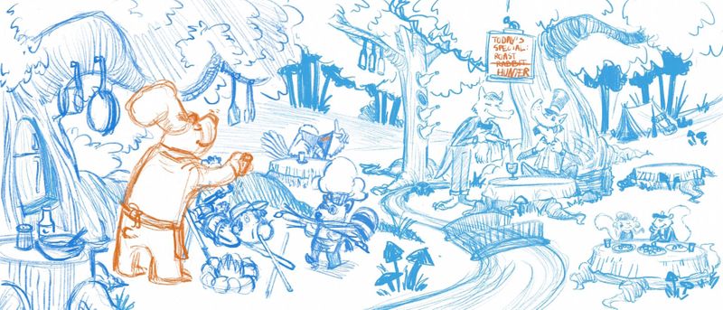
Ok updated version. Looks way more alive!
Gonna tweet it a bit more but any feedback??

-
@Aleksey It looks great. Like the trees and the helping raccoon. I don't like the bridge and the brook (hope it is the rifght word for it) not so much. Maybe without both or, if than only the little brook, the bridge looks very small for me beside the big wolfs. Or othe idea.
-
@MichaelaH hmmm very good points
-
@Aleksey the drawing is looking very fun, interesting, and great storytelling, but I think it might need one character bigger in the foreground. Thinking in terms of big, small, tiny. Right now everything seems to be similar sizes.
-
@Aleksey Wow, that is a huge composition! It looks like a lot of time and hard work went into it, I can’t wait to see it with colour. There is so much to look at, but it doesn’t seem to feel cluttered at all.

-
@holleywilliamson good points! That is definitely a concern I’ll have to address.
@Erin-Cortese thanks! Yeah gotta fix some stuff then ill be able to do values and colors.
-
@Aleksey I like the brook, but I see what @MichaelaH is saying with the bridge! It does kinda get dwarfed by the characters. I wonder if changing it to a different kind of bridge would help. Maybe a couple of boards or just a fallen log. Maybe it's the railings that throw it off. OR maybe just adding a smaller animal, like a mouse on the bridge would make it work. But I just love how much is going on in the comp overall! I'm looking forward to seeing it in color!!
-
I just wanted to say that I love this and your progress is looking great!
What about just having a log for the bridge? Or a simple plank?
My dad used to hunt. When I was in high school I made a couple of little booklets for him about an inept deer hunter named Ralph that was always one-upped by the deer. This drawing reminds me of that, although yours looks 100x better than mine ever did!
-
This is looking awesome! Great feedback from Mitch. Just wanted to say I am enjoying watching the process on this one.
-
@TwiggyT ohh interesting idea. Thanks ! Getting one upped by a deer sounds hilarious
-
@Aleksey
I am really happy you pulled the stream off to the right side and not down the middle. I like these changes of depth.