Critique on composition
-
Hi Guys!
anyone is up for a critique of this piece I'm constructing ?
It's a story about pond, frogs, and paper boats. This is my first proper attempt to a composition after watching the Composition class.
It's just a sketch so I hope it's readable enough. I'm not sure if the position of the main objects( little frog and boat) is good. The background will have lily pods to set the scene.
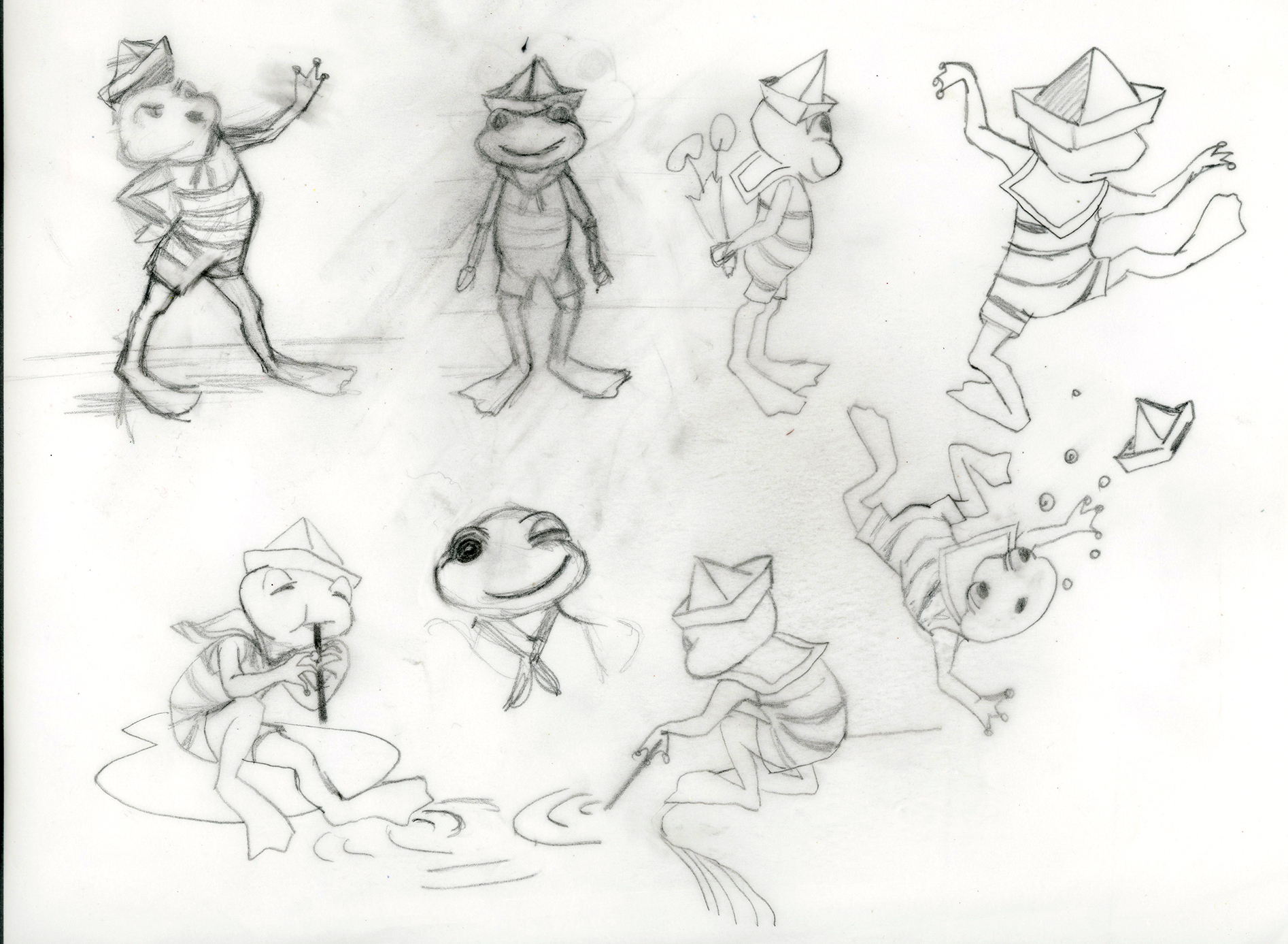
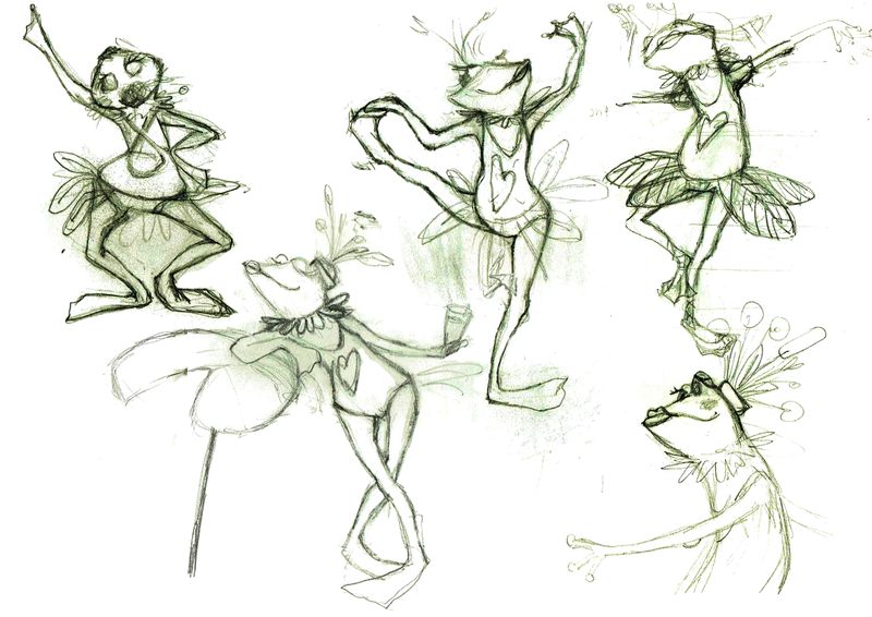
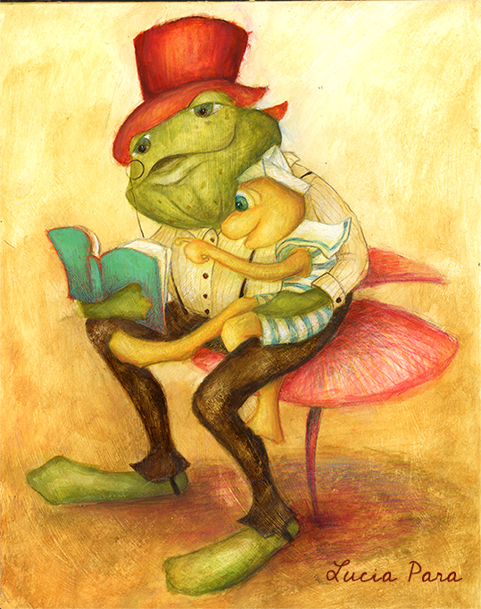
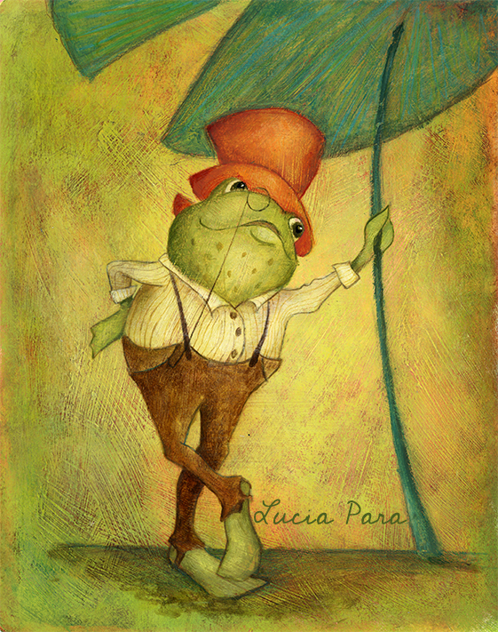
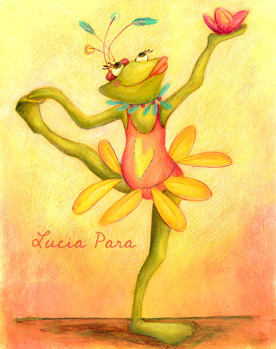
Next step would be to add values. Meanwhile I also am studying about characters, I have done some characters sheets and trying a dry brush technique. For this technique I'm looking at Sonja Wimmer .
Thanks in advance for your comments!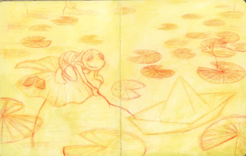
-
I like how dynamic your character designs look and the finished pieces are great, too. I hope you don't mind that I did a composition draw-over, just to show you what I'm thinking.
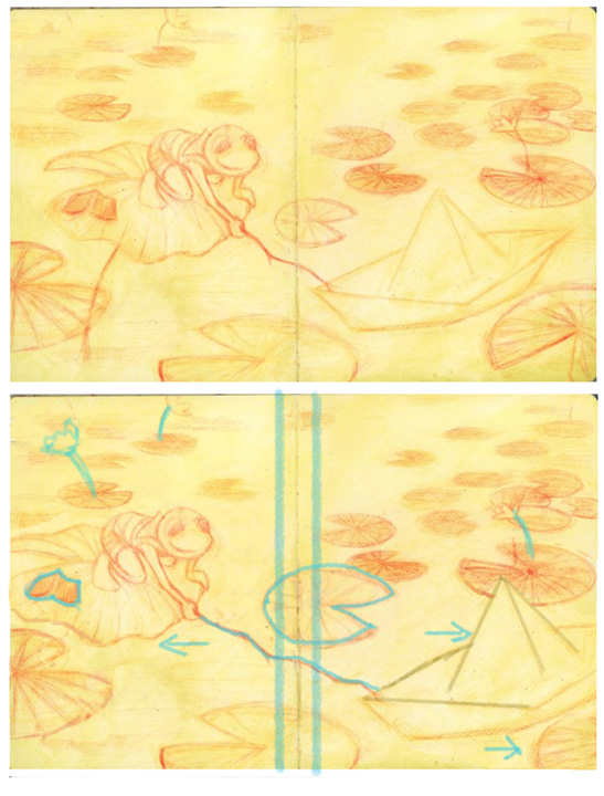
All my suggestions are in blue. The first thing that caught my eye was the gutter and how your main character was on the edge of being to close leaning into it, and how the delicate end of his stick and the corner of the paper boat are also a bit too close. The way I've drawn the blue lines on either side of the gutter shows the danger zone that I like to avoid placing important objects within. So, I've shifted your main character and his lily pad to the left, and the boat and lily pad in front of it to the right. The effect also also emphasizes how he's reaching. I've also shifted the book to the right because it got too close to the edge after my change.
The line under the frog's lily pad felt distracting. It looks too similar to his stick and none of the other lily pads have them, even though I know there would be a stem/root for each lily pad. I just took it out. When you go to color, the water might be too dark/murky to see the roots anyway.
The lily pad in the middle of the spread is very small and could easily get swallowed up by the gutter. So I just made it bigger and shifted it a bit to the right.
Two of the flowers you drew are working in that they point to the main objects. I added a third closer to the frog.
Lastly, I made the boat a bit bigger so it overlaps the lily pad behind it, just to add some depth.
Hope some of this is helpful. I've learned from draw-overs from other artists in this forum to my own work and found that it's an effective way to get my notes across. Looking forward to seeing your illustration develop.
-
I completely agree with the last points made! The only other thing I would add is that the flower on the lily pad was THE FIRST thing I looked at when saw the sketch, causing my eyes to scramble to find the main character. Maybe removing it would keep the focus on the frog?
-
Thank you Joanna and Alex for your help! I will try some of your suggestions! I didn't really think to cut through the main objects... so the boat looks like is entering the scene.. clever! I thought a stick under the main lily pad would show that the frog is higher , but maybe is not needed …
-
Hi, @Lucelfo , I think your frog character is adorable and you've done a great job with the paintings! I don't have much to add regarding composition, but one thing I noticed is the lily pad that your frog is sitting on. When a lily pad is out of the water, it will have the curvy edges like you've drawn. But if you decide to have the pad sitting on the surface of the water, the edges should be a smooth oval just like the others in your drawing. Not a big deal, but I thought maybe that little detail might be helpful. I really like this image!
-
@Kat you seem to have read my mind... I was thinking the same thing about the lily pad .. thanks for pointing it out! I think also I need to give consistency to the shapes, so if I keep it out of the water with this shape, I might need to add just a few others .. thank you so much for the encouragement, sometimes is just what we need when starting out on a new thing!
-
@Lucelfo love the Victorian looking frog characters. I took some pics of Water Lillies at Kew Gardens in London that I thought might be useful for you as reference.


-
might not be such a helpful comment but they are SUPER cute!!!!!!
-
@sigross what a fantastic forum is this! it's indeed very useful thank you so much! Also your camera angle is just as I thought of in my illustration... and I love Victorian age of illustration : ))
-
@Coley thank you! I have to say that SVS is helping a lot : )))